I think I engaged well at the beginning of the project researching a wide range of artists and took well to researching the specific concepts I wanted to include in my work. When I started developing work I felt I could easily move from one idea to another exploring different mediums including different combinations of modrock/plater/clay. However, towards the end of the project I lacked drive and was struggling with how I was going to present my idea as a final piece. The final work itself lacks shape and doesn’t engage you to move around the work. I Could have experimented more with how to present the final outcome and played around with how the work could move. As well as this more of my development work could have been presented in order to show the movement from each stage as I feel my final outcome of work felt really underwhelming in comparison to the amount of research I had done at the begging of the project. One successful element to my final outcome I think was the colour pallet as it related heavily to my research and concept. If I had had more time, I would have also considered it being interactive with the viewer, this would also make the final outcome more engaging and meaningful.
Daily Archives: 3rd Jan 2020
2D CONTEXT: ARTIST RESEARCH
Alan Davie

Born in 1920 Davie studied at Edinburgh college of art in the late 1930’s. His painting style is not purely abstract but manly focuses on childlike shapes and symbols. As well as painting he also produced screen-prints. In his working method he would often add so many layers of paint to the point where the original image had been covered over many times. He also stressed the importance of improvisation. The artist travelled widely and in Venice became influenced by Paul keel, Jackson pollock and Joan Miro. He explored themes of nature, tradition, family, wonder, illusion and dreams while most of his inspiration for his paintings came from his surroundings; weather that be a hillside or a piece of graffiti.
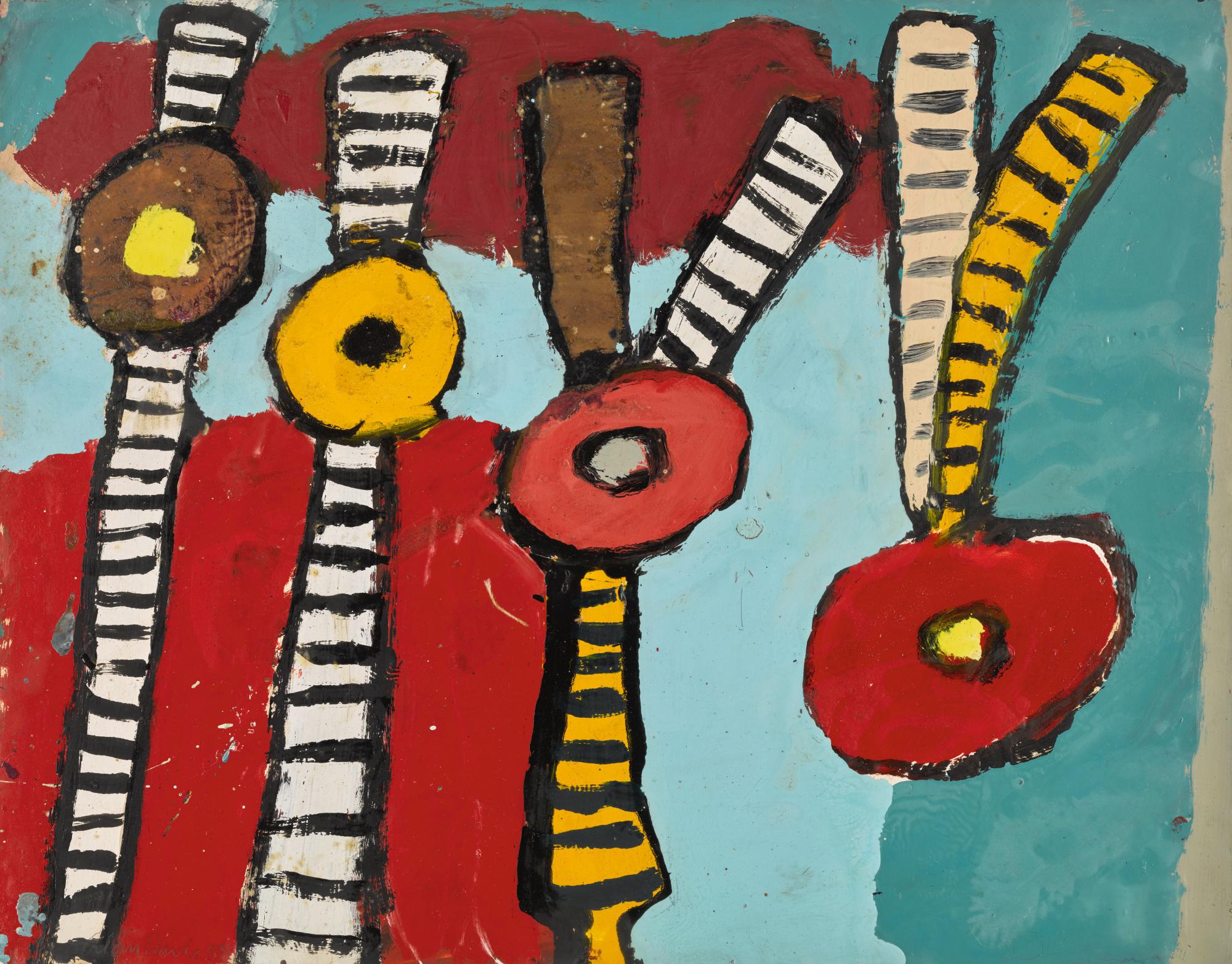
As well as these it is thought that Davie was heavily influenced by Zen philosophies, his paintings consist of responsive and spontaneous primitive compositions painted with obsessive, conglomerate mark-making to form images that slip in between abstraction and representation. Davie’s roster of references and influences is extensive, and includes Jungian psychoanalysis, Pictish symbol stones, contemporary abstract painters, and his lifelong passion and aptitude for playing music. All these influences can be seen clearly in his work. I enjoy the artists use of pattern and texture the most how overwhelming and manic the pieces seem despite the basic shapes and colours.
Barbara Kruger

Born in 1945, Barbara Kruger is an American conceptual artist and collagist best known for her black and white images overlaid with block red and white text. She is also best known for her feministic critique on society and western ideals. Her work analyses mass consumerism. Stereotypes and media. Her work was manly influenced by graphic design and modern advertising, she explores themes of feminism, rebellion, consumerism, media, power, desire and class Her works examine stereotypes and the behaviours of consumerism with text layered over mass-media images. Rendered with black-and-white, red accented, Futura Bold Oblique font, her works offer up short phrases such as “Thinking of You,” and “I shop therefore I am”. Kruger uses language to broadcast her ideas in a range of ways, including prints, T-shirts, posters, photographs, electronic signs, and billboards. As she says “I’m fascinated with the difference between supposedly private and supposedly public and I try to engage the issue of what it means to live in a society that’s seemingly shock-proof, yet still is compelled to exercise secrecy,”.

The thing I find the most interesting about her work is the bold and unapologetic style of her work. Because of this you would think that the messages within her work would be obvious but the viewer still has to think deeper around the words themes and imagery the artist is presenting us with.
Richard Hamilton

Richard Hamilton was an English artist known for producing some of the earliest works of Pop Art. Though he used a wide variety of techniques during his career, his most recognizable works were done in collage. Born on February 24, 1922 in London, he worked as an apprentice at an electrical components firm when he began taking evening art classes at Saint Martin’s School of Art. Entering the Royal Academy at the age of 16, Hamilton was later expelled for not following the school’s regulations. “Just what is it that makes today’s homes so different, so appealing?”; this work become a seminal image in Pop Art history. During the mid-1960s, the artist became increasingly interested in the work of Marcel Duchamp, and reflected his interests by attempting to proliferate his own art in various forms of media. Over the following decades, Hamilton focused on producing prints as well as incorporating new technologies, such as computer software, into his practice.
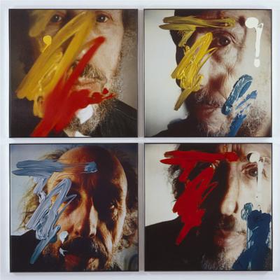
His works focus on themes of consumerism, media and advertising, using striking images to create layered images and meanings. He introduced the idea of the artist as being an active consumer of culture as well as a contributor. He immersed himself in pop culture movies, television, magazines and music. He wanted to bridge the gap between high art and consumer culture as he too was influenced mainly by surrounding pop artists and pop culture.
John Bellany

John Bellany was born at Port Seton in 1942 into a family of fishermen and boatbuilders. He moved to London in 1965 to study at the Royal College of Art, his paintings consistently centred around the complexities of the human condition and became anchored in the rich landscape of the of sea. Bellany’s work also explored Scottish symbolism and histories. “What he was doing in the mid-1960s in many ways changed the course of Scottish painting,” Keith Hartley, the senior curator of the Scottish National Gallery. Almost entirely figural, his paintings regularly feature themes of Christianity, Adventure and the female figure, drawing inspiration from Scottish primitive painters such as Alan Davie and Robin Philipson. In the 1970s, when his personal life was in turmoil, he embarked on a journey of self-destruction, which is reflected in the angst-ridden images in his paintings of the period. In the late 1980s, after overcoming serious health issues his work became more optimistic in spirit.
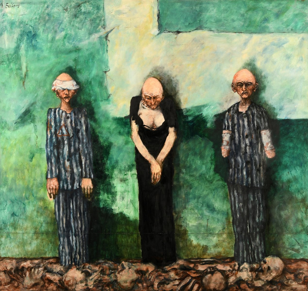
Despite the repeated setting the artists work always seems to depict I find the detailed menacing figures he creates the most interesting. His use of colour and ability to convey such emotion makes the viewer almost feel intrusive to these paintings as if interrupting them in some way.
3D CONTEXT: ARTIST RESEARCH
Phyllida Barlow
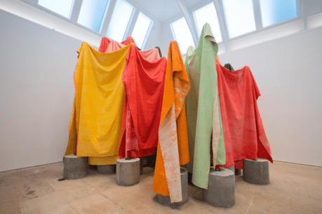
Although born in Newcastle upon Tyne in 1944 Barlow was brought up in a London where she studied at Chelsea College of Art (1960–63) where she was able to learn that the act of making was in itself an adventure. A sculpture that falls over or breaks is just as exciting as one that reveals itself perfectly formed. All the acts of making are valid. She creates work with the intention of making something larger than herself, reflecting and contrasting with her environment as well as attaching new meaning and purpose to existing material’s. She also explores the relationship between her work and space it occupies. She repeatedly questions whether the space dominates the work or the work dominates the space.
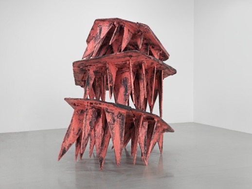
I like the artists use of scale and playfulness, her work is almost childlike and messy never appearing truly finished or polished. Her careful and exciting use of bold colours also add to the child likeness of her work. The sculptures and instillations encourage the viewer to move round and through it from all angels. The artist uses the space to its full potential and considers every aspect of the space it will fill. I also like the artists inexpensive use of materials such as cardboard, fabric, timber, polystyrene, plaster, scrim and cement.
Sara Barker
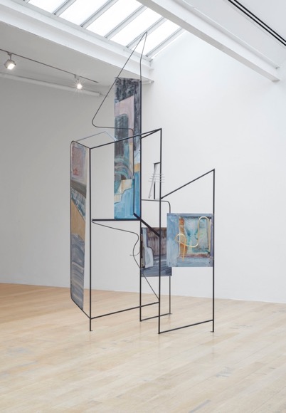
Sara Barker was born in Manchester in 1980. She studies at Glasgow School of Art in the city of Glasgow where she now lives and works. The artists work braks the boundaries between painting and sculpture. Skeletal structures in aluminium and steel presented in wonky rectangular shapes with contrasting lines, as though uncertain of themselves. Their surfaces are then coated with layers of oil paint, gouache and watercolour. The artists colour pallet resembles that of a landscape watercolour. Barkers work evokes ‘that top-heaviness and precariousness’ of sketching in three-dimensional form. As such, her combinations of bespoke materials challenge traditional perceptions of structural solidity, the lightest often providing the weightiest support for the basis of the sculpture”. Her liminal streaks of colour provide what she describes as ‘cracks in a door’ or glimpses into another realm. Her sculptures are completed by the spaces in which they are installed by implementing the negative space around them; resulting in abstract dream-like sequences of materials.
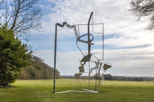
I find this artists combination of materials the most interestin, using each to their full potential as the colours of the paint always compliment the light and the space in which the work is presented. Also the artist’s use of shape and how these large geometrical forms ply and interact with the surrounding environment.
Zoe Leonard
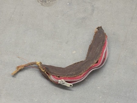
Zoe Leonard (born 1961) is an American artist who works primarily with photography and sculpture. The now New York based artist merges photography, sculpture, and installation. By employing strategies of repetition, shifting perspectives, and a multitude of printing processes, the artists practice probes the politics of representation and display as well as exploring themes such as gender and sexuality, loss and mourning, migration, displacement, and the urban landscape. Her photography work invites the viewer to contemplate the role that the medium plays in contributing to history. Her work always encourages the viewer to reconsider the act of looking itself, presenting it as an ongoing process.
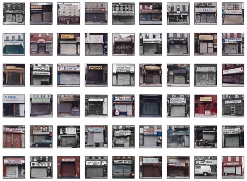
I like this artists work as she explores interesting diverse themes such as societal roles, gentrification, injustice and daily life. This makes us the viewer reflect our own environments and behaviours. Her sculptural work always inhabits the space in an almost non-invasive way. It is almost presented neatly like a passing idea or question. This further engages the viewer to think of her work outside of a gallery context and within the real modern world.
Gordon Matta Clark
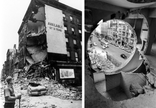
Gordon Matta-clark was born in 1943 in America and trained originally as an architect. He is best known for his spectacular ‘building cuts’ that are often seen as an outright rejection of the architectural profession. Dealing with themes of metamorphosis and resistance towards the commodification of art, he went on to study architecture at Cornell university from 1963 to 1968, where he met Robert Smithson who influenced his interest in using non-art materials. Moving back to New York, he experimented with both food and photography as well as documenting the burgeoning graffiti-scene and the sewers and subways of the city.
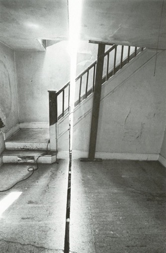
I find the artists use of medium the most interesting as well as his use of space. His ‘building cuts’ are site specific and his work was often illegal and destroyed directly after completion. This element of impermanence to his work is interesting also, the idea of creating something just to have the intention of destroying it. The impermanence i find playful and it makes his work somehow feel more special and outlandish.
 CHARLEY MILLAR ART