Category Archives: Uncategorized
COMFORT: Artist research
Mike Kelley

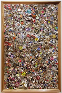
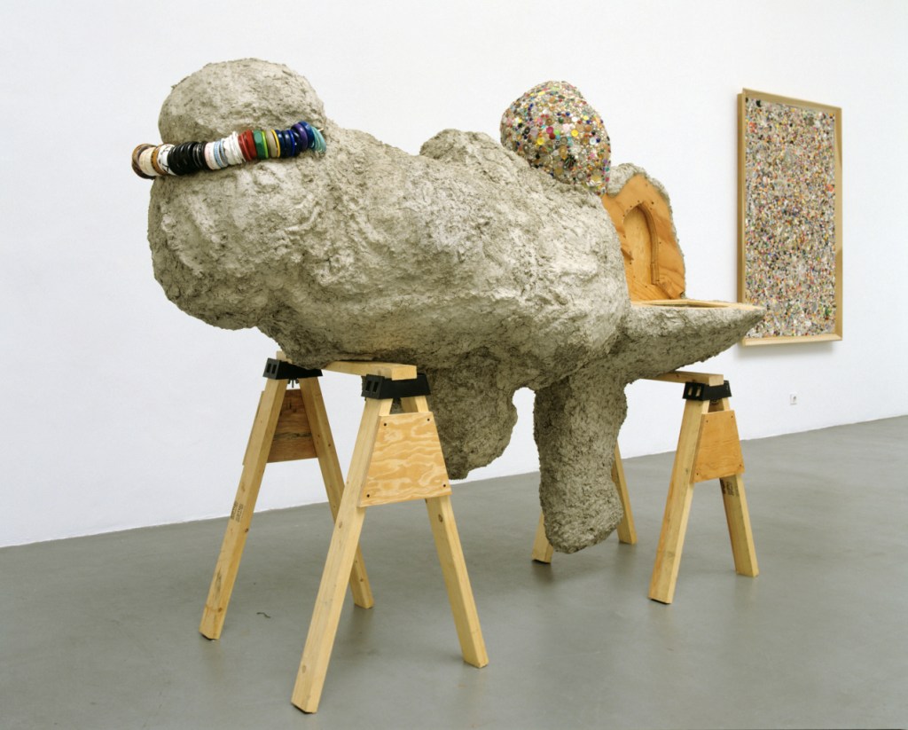


American artist, Kelley is regarded as one of the most influential artists associated with the Conceptual Art movement. His work explores themes of youth, class, and the divide between high and low culture. His art is both playful, childish and disturbing. by using found objects like soft toys and knickknacks in contrast with the exploring the history and nature of the objects the artist investigates societal norms and how we place value on inanimate objects. His work spans across multiple disciplines drawings, paintings, soft sculpture and film.
“I think they’re really standardized kinds of repressed things in the culture—embarrassing things, like sexual dysfunction and the scatological,” he once said of his subject matter. “I started seeing throughout my work that a lot of these traditional, low comedy forms and subject matters were operating. I wanted to start to deal with that in a more conscious way.”
Kelley often assembled works of different media into installations of various constituent parts. In doing so, he helped to debunk the traditional expectation that the artist must be a master or expert of a particular medium. Instead, the unifying factor in many of Kelley’s heterogeneous installations and sculptures became above all conceptual rather than formal. His use of soft materials and how he repurposes objects is something i’m really interested in and am exploring in my own work. object making and adding meaning and context to inanimate objects is something iv explored and thought about a lot throughout my project.
Annette Messager
HyperFocal: 0 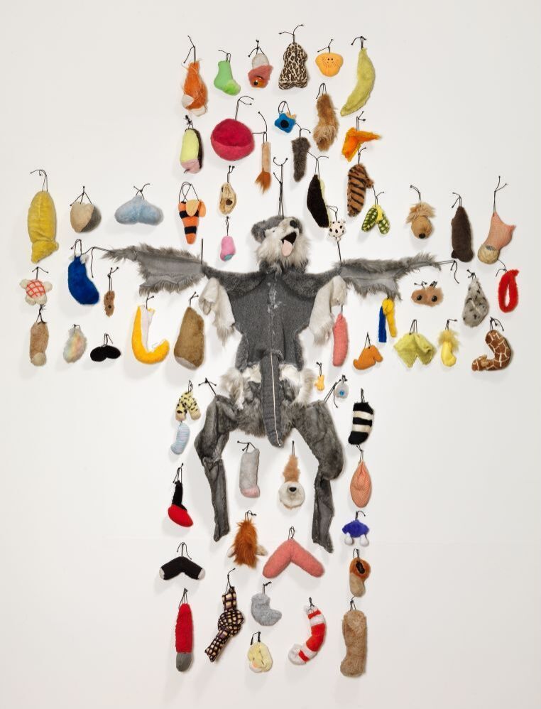


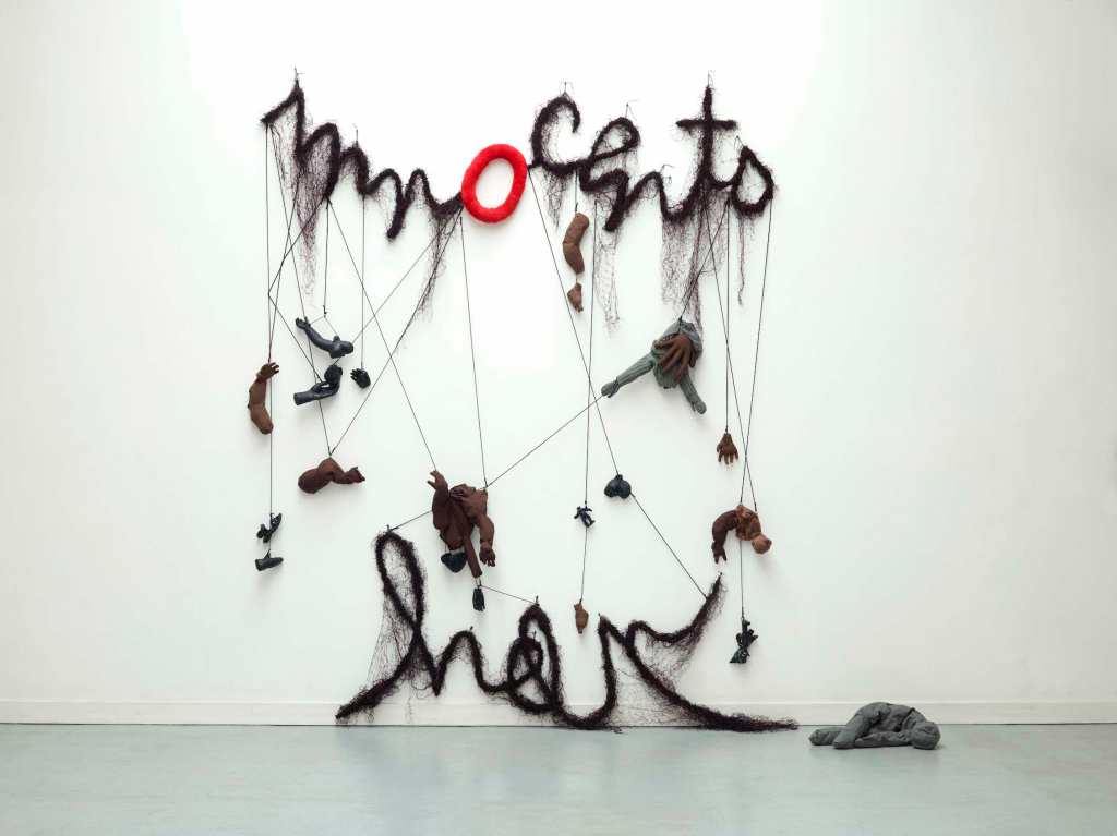
Born in 1943 in France, Annette Massagers work focuses on the perceptions of women by individuals and by society as a whole. Her earlier work focused on domestic objects such as textiles, toys, and found objects similar to the materials and things i am investigating in my current project. She consistently continues to question traditional notions of femininity and masculinity. “At first, I felt proud when someone said, ‘Your work looks like a man did it.’ Then I realized that was stupid,”
‘The Pikesis‘ is an instillation comprises an arrangement of more than a hundred long, spiked poles or ‘pikes’, propped up against two adjacent walls, each of the pikes either supports or impales a variety of objects as well as images. Small bodies made from doll parts, stuffed limbs, headless torsos and internal organs are placed in tights, or pierced by pencils and hung with images of torture instruments along side their victims. Other pikes show colourful drawings of limbs and figures as well as maps showing various contemporary political entities in Africa, Europe and the Middle East.
Messager’s used a wide variety of techniques and materials using photographs, drawings, text and found/made objects, embroidery, knitting and painting. Her works explore expectations of power in the relationships between male and female, vulnerability and aggression. ‘Pikes‘ a time when chaos and disorder is briefly allowed and the boundaries between civilised and uncivilised actions blur. “Showing parallels between the potential cruelty of children’s play and that of modern social and political structures, using a combination of pathos and violence. Evoking sympathy while suggesting sadism, her objects and imagery illustrate the paradoxical complexity of human relations on both personal and political levels.”
This contrast of using soft ‘innocent’ traditionally feminine materials in a serious and brutish context agin is something i’m interested in and have explored throughout this project.
COMFORT: Artist Research
Cildo Meireles
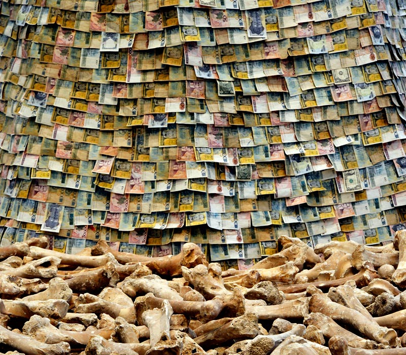
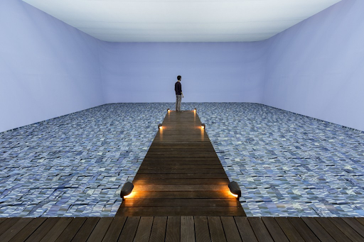
Cildo Meireles is a Brazilian conceptual artist, installation artist and sculptor. He is noted especially for his installations, many of which express resistance to political oppression in Brazil. Experimenting with different techniques and conceptual strategies, in his sculptures and installations he uses a whole range of objects and materials, which he chooses for their symbolic significance. He explores human perception in its entirety, addressing universal and sometimes dramatic themes such as dictatorship, colonialism, globalisation, and the repression of human rights.
“I am interested in this relationship between the work of art and the viewer. Of course art can exist without a viewer, but it wouldn’t be so useful.“
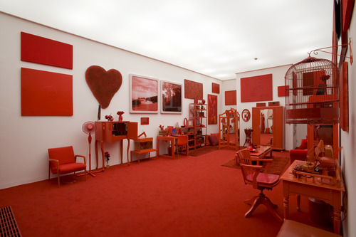
‘Red Shift‘ is a piece which spans three rooms. The first room, entitled Impregnation, could be someone’s living room, yet everything except the white walls, is red. This work specifically I found interesting for its both simplistic but overstimulating qualities. Meireles describes the initial concept for the work as imagining ‘a place in which someone, for some reason – whether due to preference, mania, imposition or circumstance – would accumulate in a given place the greatest possible number of objects in different shades of red.’ The artist expertly explores themes of space and our perception of time. I am most interested in how the artist used and explores a pace how he communicates complex issues with simple materials and clean imagery.
Sheila Hicks
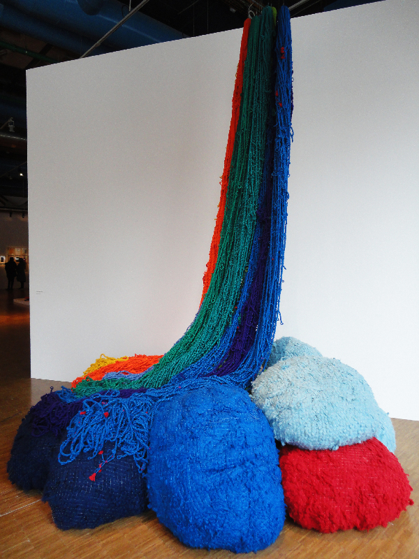
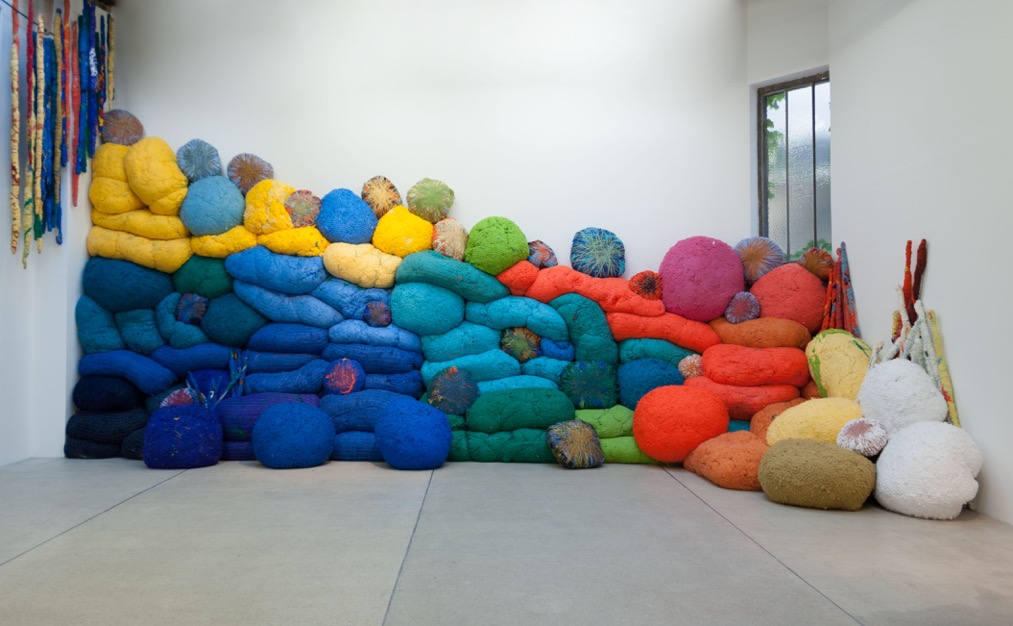
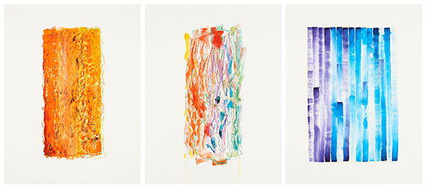
Sheila Hicks is a contemporary American artist known for her innovative use of weaving and sculptural installations. Ranging from small scale wall hangings to enormous site-specific works and installations. Hicks’s works blur the distinction between fine art and craft. Hicks colour pallet evokes this childish exciting and stimulating within any space it occupies. The texture of her materials further create a sense of childlike security and comfort – themes im discussing in my current work. She has traveled extensively throughout her career: setting up workshops in Mexico, Chile, and South Africa; developing commercially woven fabrics in India and tufted rugs in Morocco; and realizing large-scale commissions in the United States, Japan, and Saudi Arabia. In each place, she has mined local knowledge to inform work that transcends geographic boundaries.
“Textile had been relegated to a secondary role in our society, to a material that was considered either functional or decorative,” she explained. “I wanted to give it another status and show what an artist can do with these incredible materials.”“Textile is a universal language. In all of the cultures of the world, textile is a crucial and essential component,”
Her use of materials is something i am going to consider and experiment with going forward. I love how she fills a space with playfull forms and creates these interesting shapes with objects and colour. Hicks uses intensely saturated colour and the raw materials of textiles—wool, synthetic thread, linen flax—in works that are rigorously constructed by wrapping, piling, and weaving her materials.

Kazuko Miyamoto
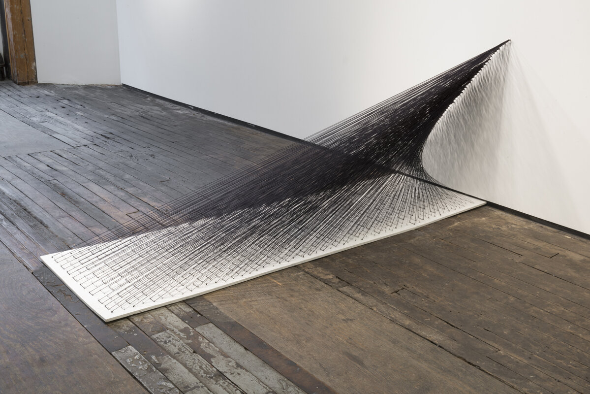
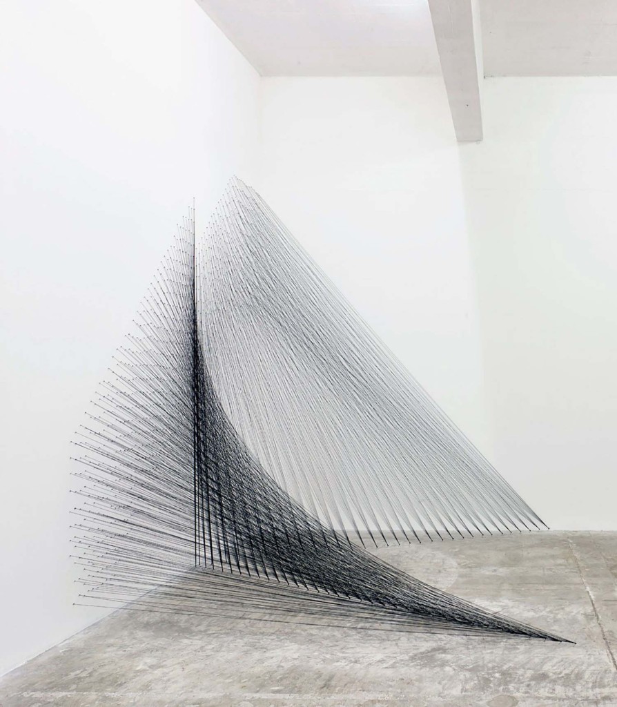
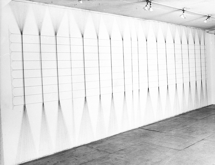
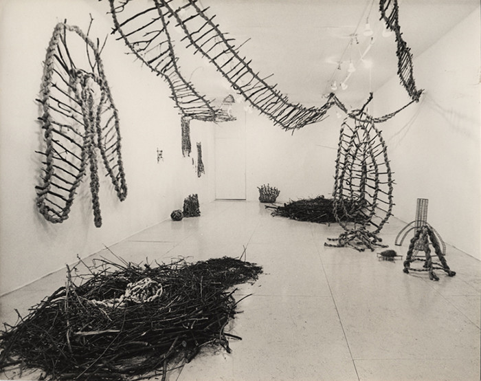
KAZUKO MIYAMOTO was born in Tokyo in 1942 where she studied art at the Gendai Bijutsu Kenkyujo (Contemporary Art Research Studio). She moved to New York in 1964 and attended The Arts Student League of New York. Her work further explores our perception of space, weight and materials. Her work is characterised by her use of industrial strength cotton thread. The strands of thread are stretched taut often between multiple points at parallel, horizontal, and oblique angles. Once assembled, the strands form lines that alternately overlap or run parallel to one another. She creates an optical shimmer where the shape and texture changes dependant on where it is perceived in the room it occupies. Her work surrounds and almost embraces the viewer. Resembles a nest or cocoon, inviting associations with security and shelter. The contrasting elements are the things i find most interesting; the regularity and irregularity, hardness and softness, and lightness/ heaviness.
Nike Savvas
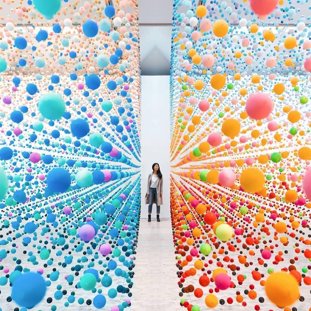
Nike Savvas is a senior Australian Artist based between Sydney and London. Trained as a painter, she works across scale and materials completing numerous large-scale installations
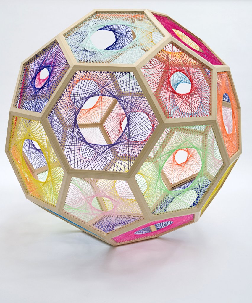
Drawing her inspiration from Op Art through to kitsch, her work often reflects patterns and complex mathematical algorithms – drawing attention to both the tangible and the abstract at once. Her objects and installations often invite the viewer to partake in the active experience of her work refocusing and moving around the space in order to understand the work. Her art is never still, rather Savvas creates fluctuating, moving objects that captivate and mesmerise the viewer and space.
Her materials span across installation, sculpture, kinetic and light-based media that challenges perceptions and demanding an active participation from her viewers. To me she draws a lot of similarities to Bridget Rileys work making math and formula into physical space. Music is often transposed into colours, and her palette often derives from the Australian landscape.

WAWWA WEEK 9
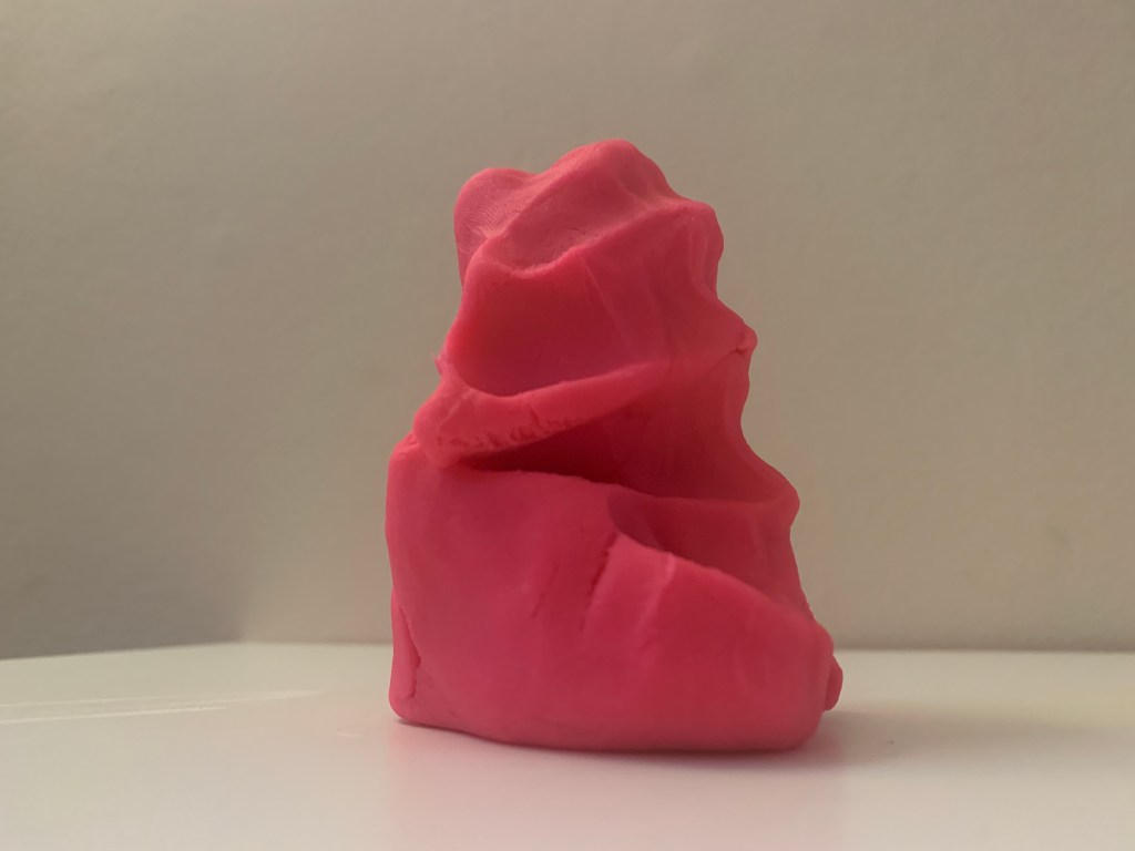
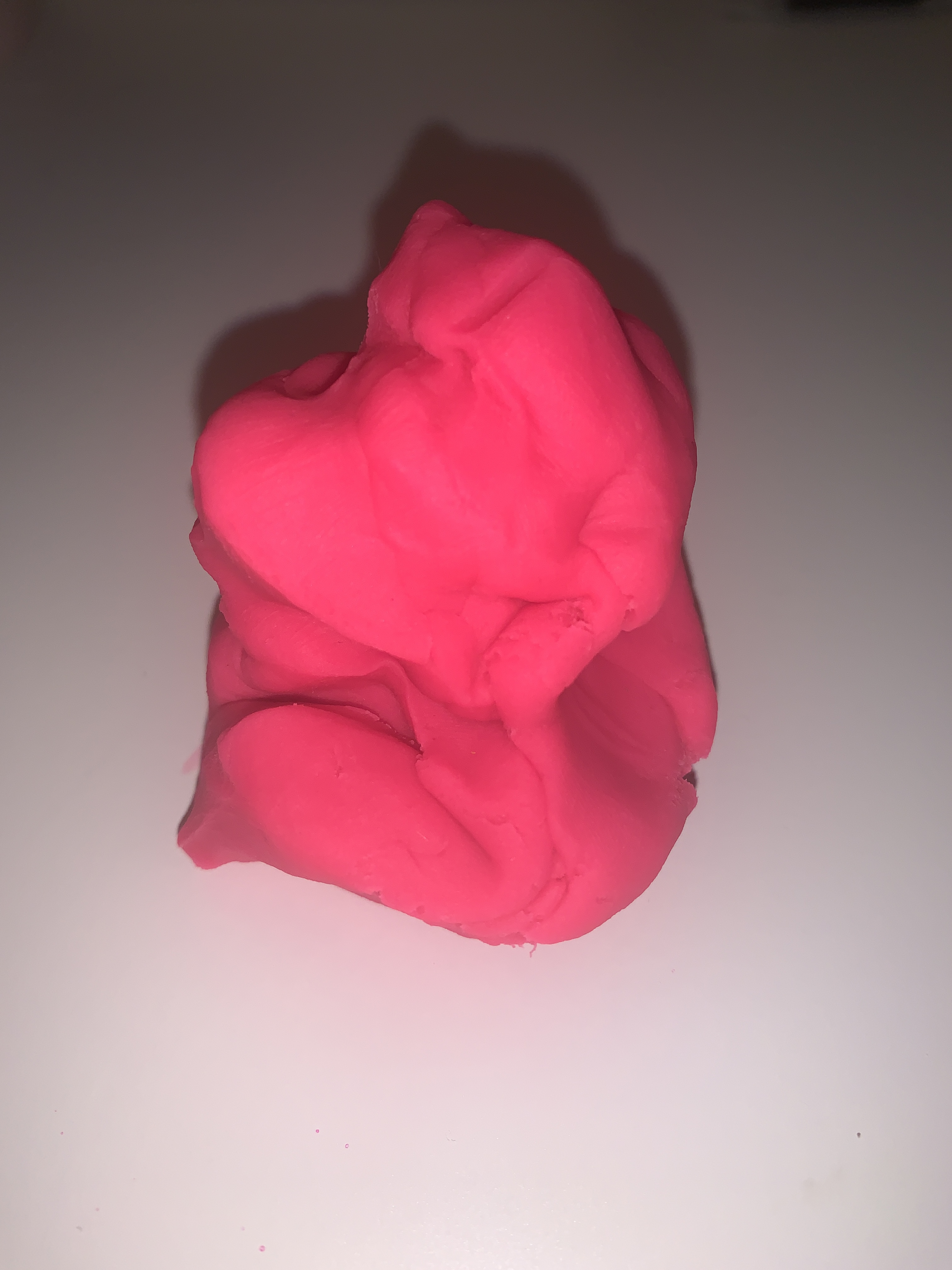
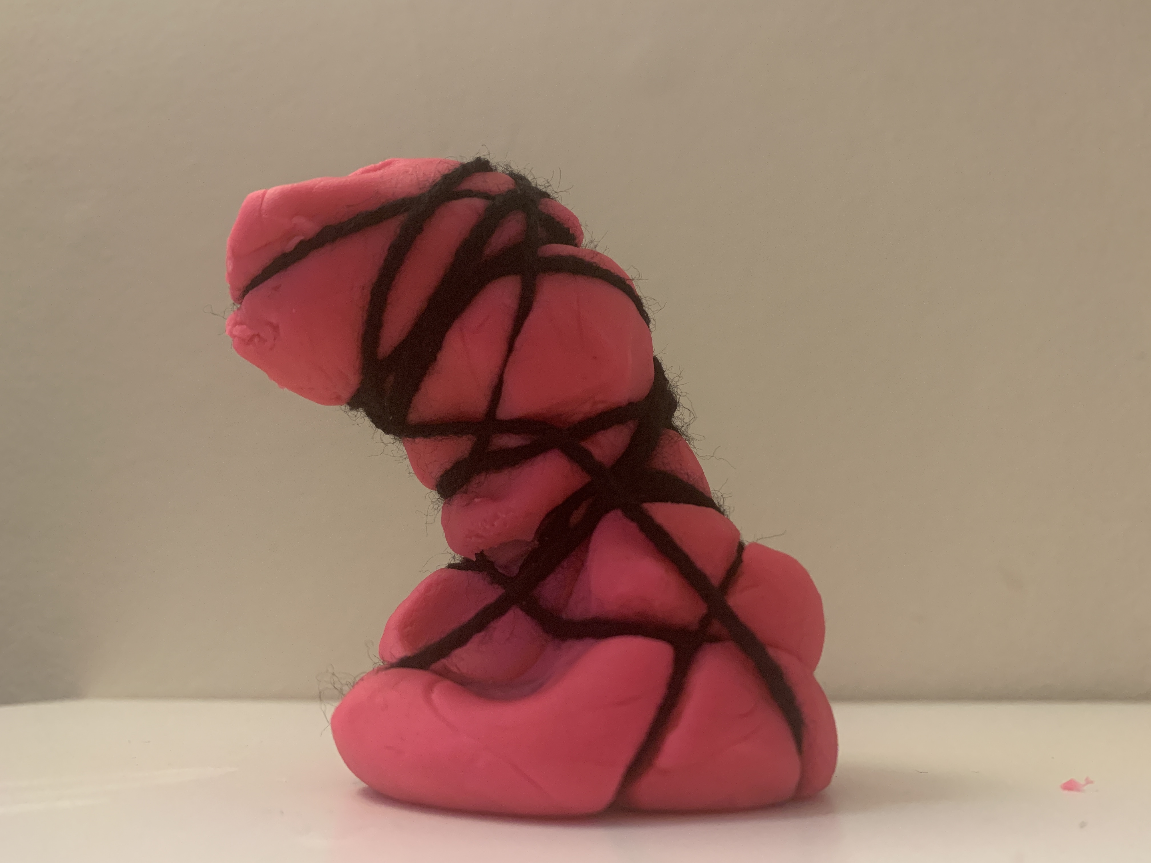
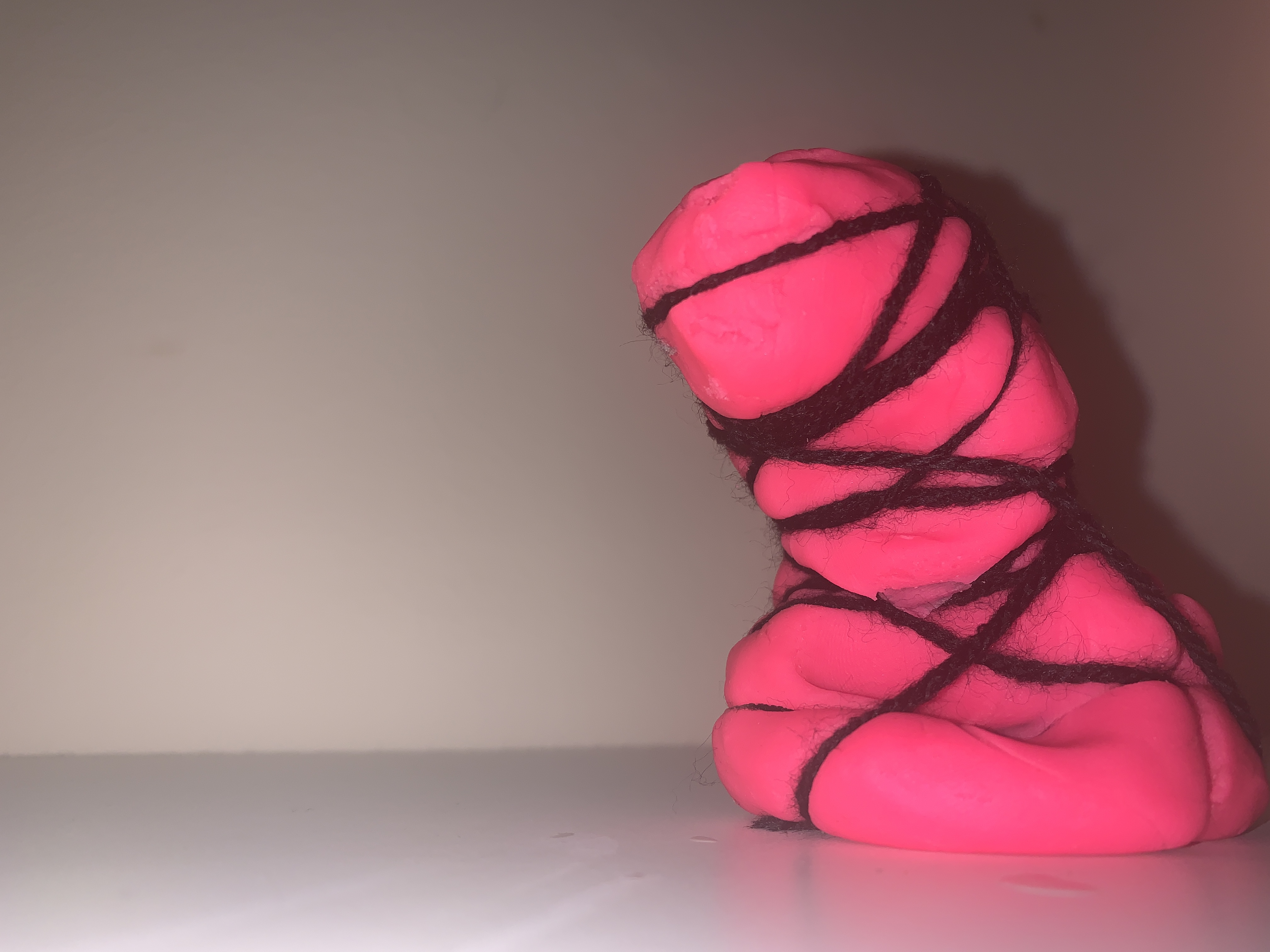
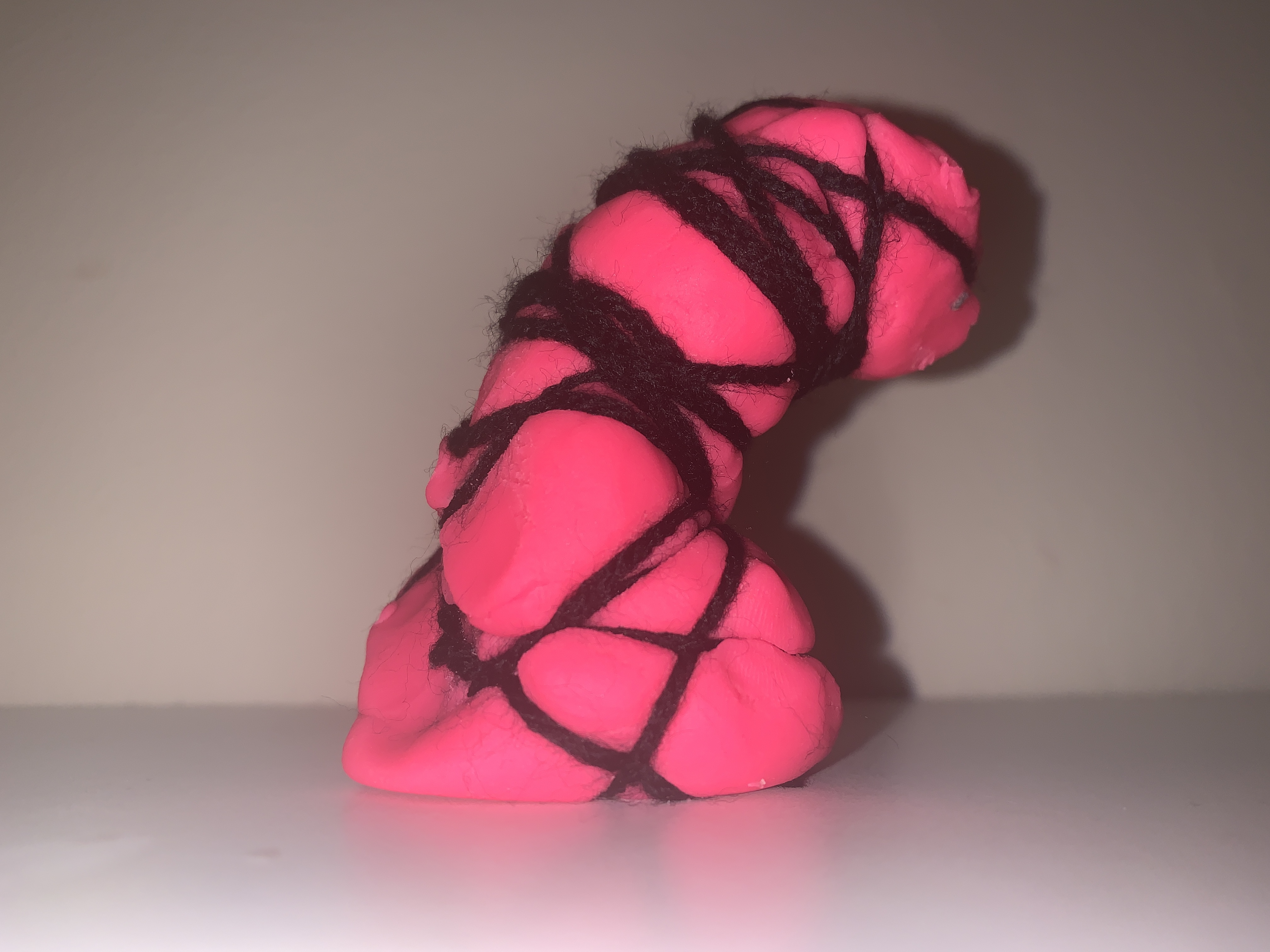
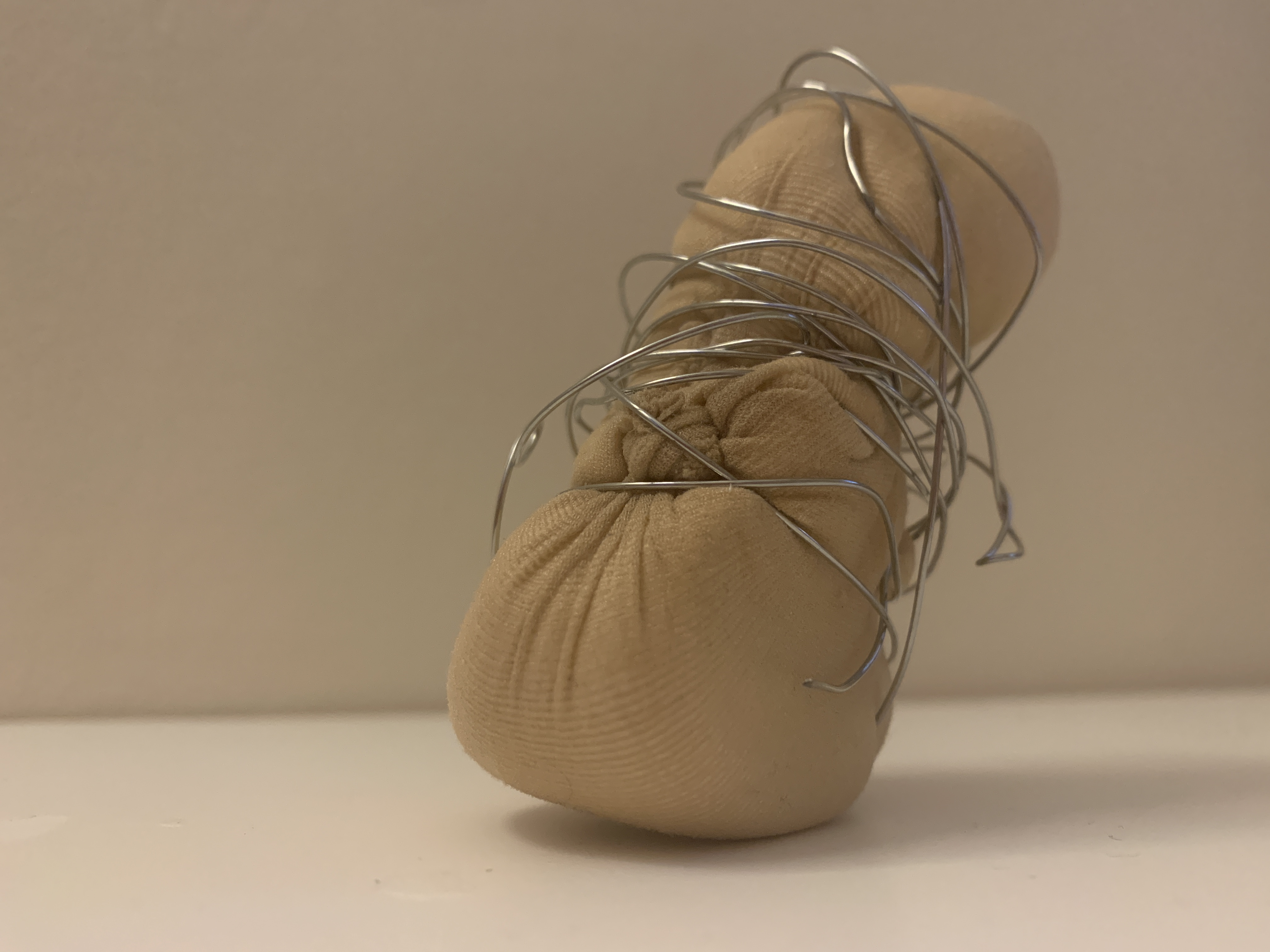
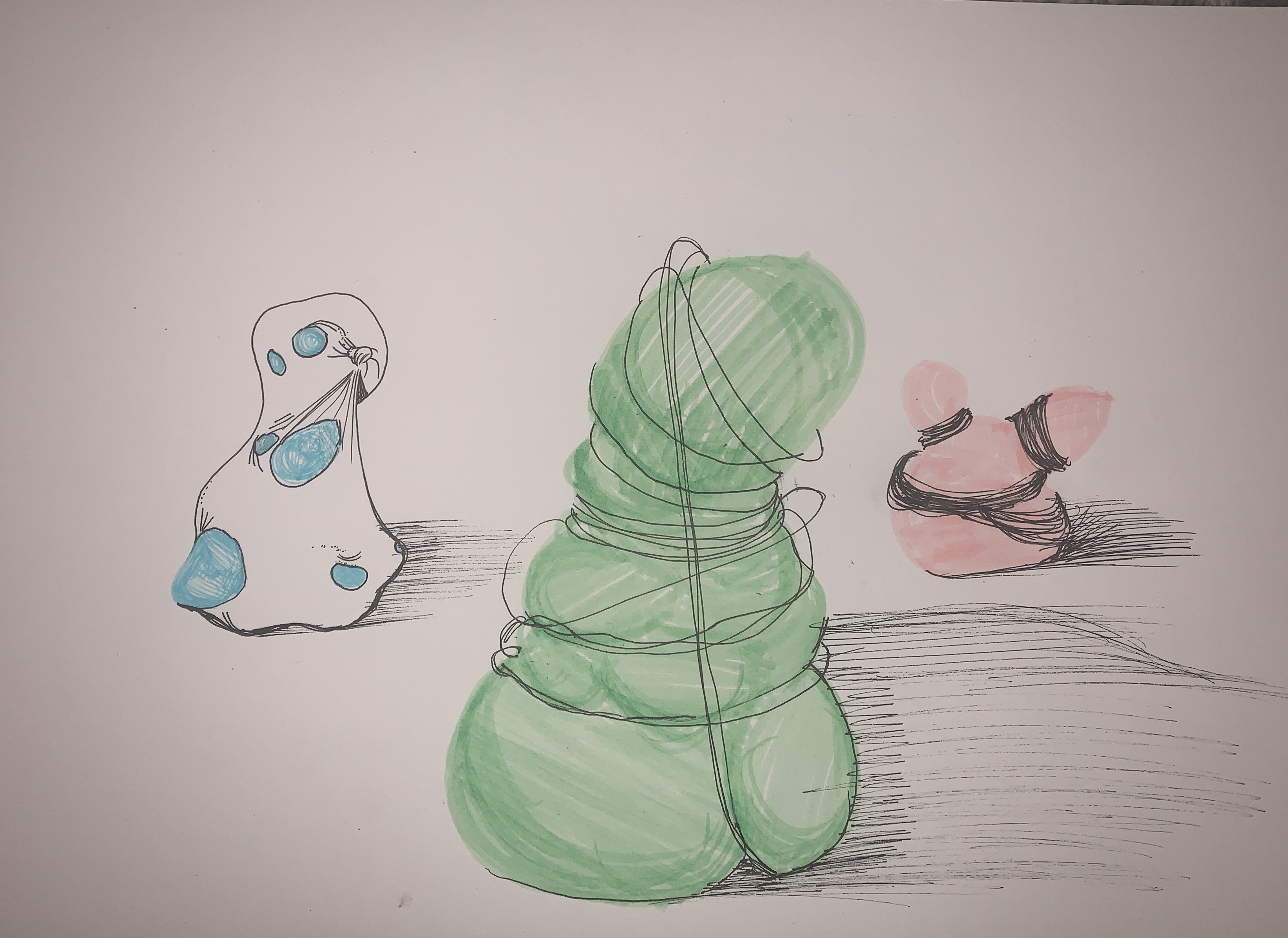
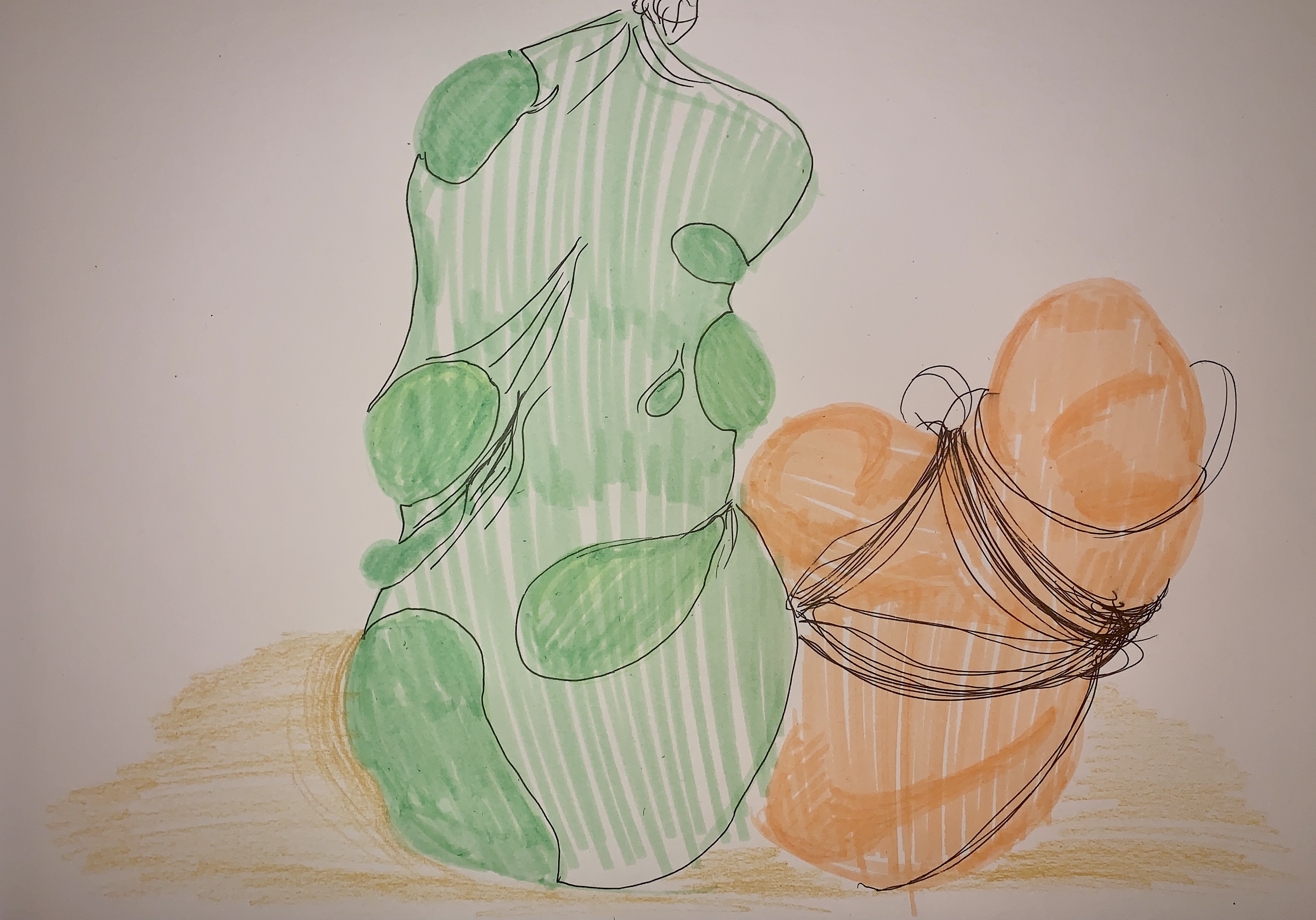
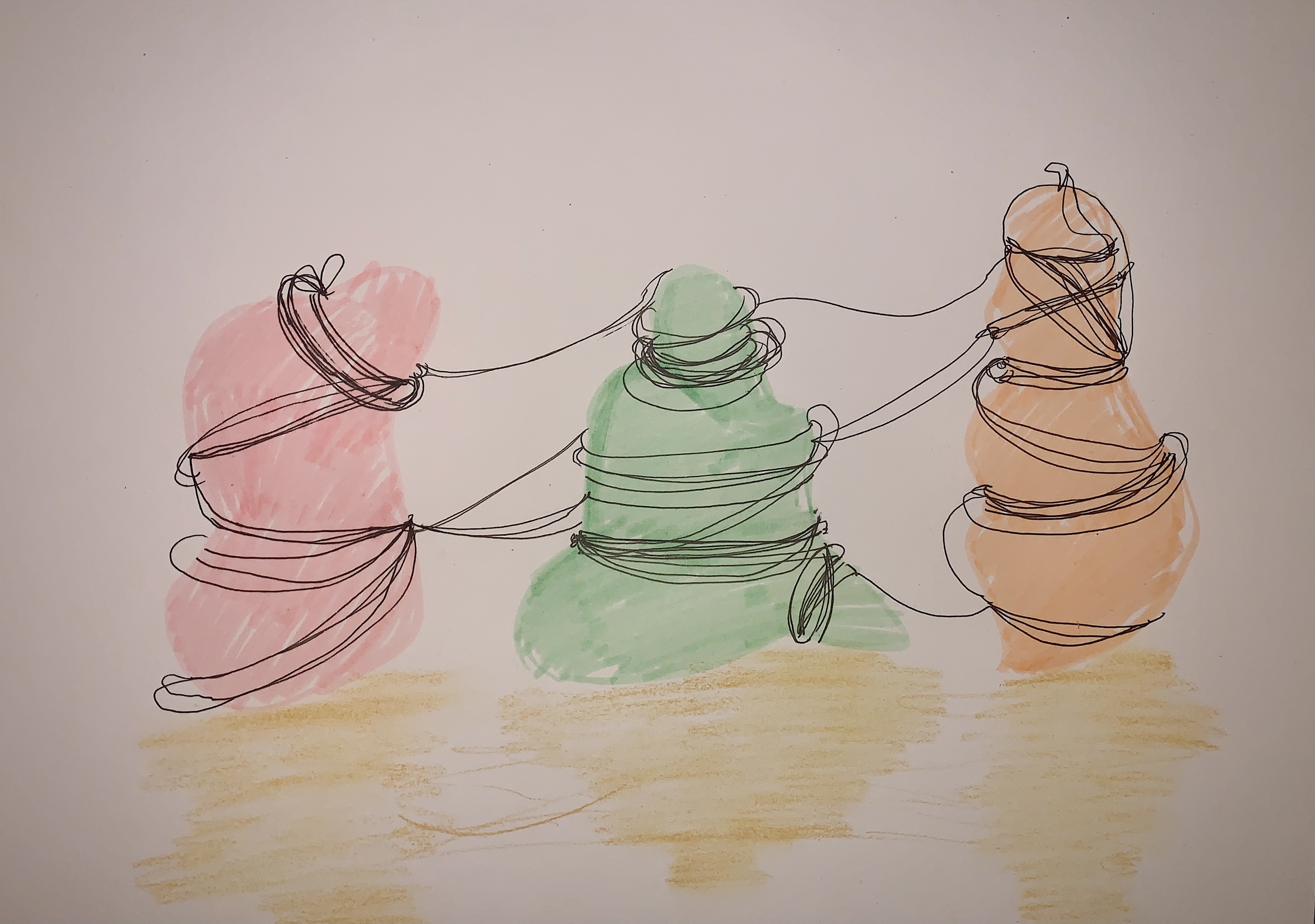
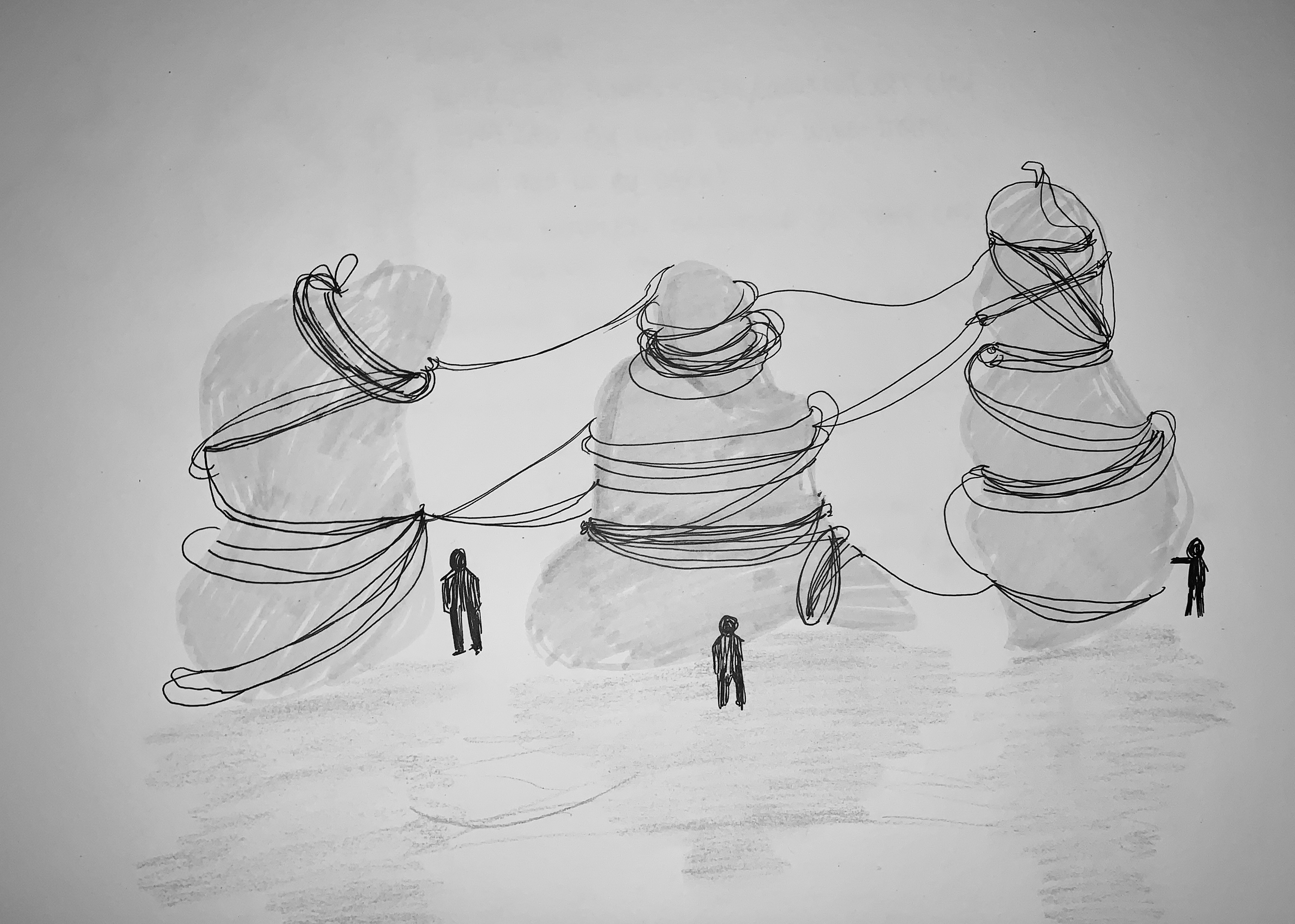
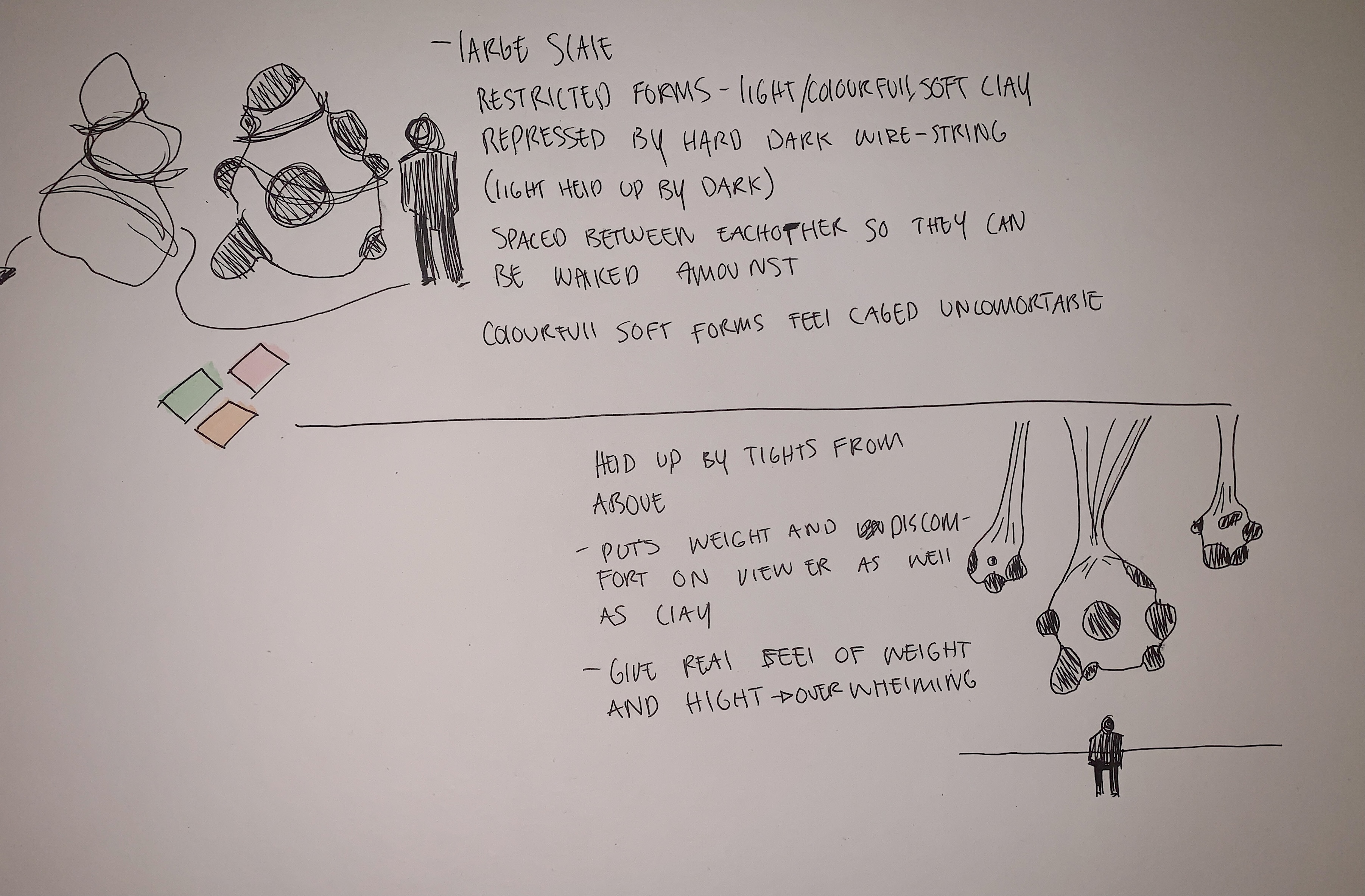
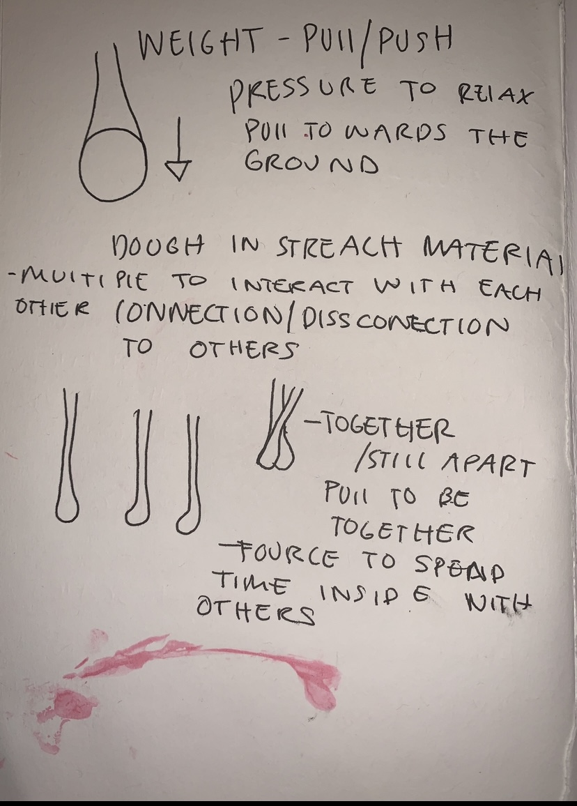
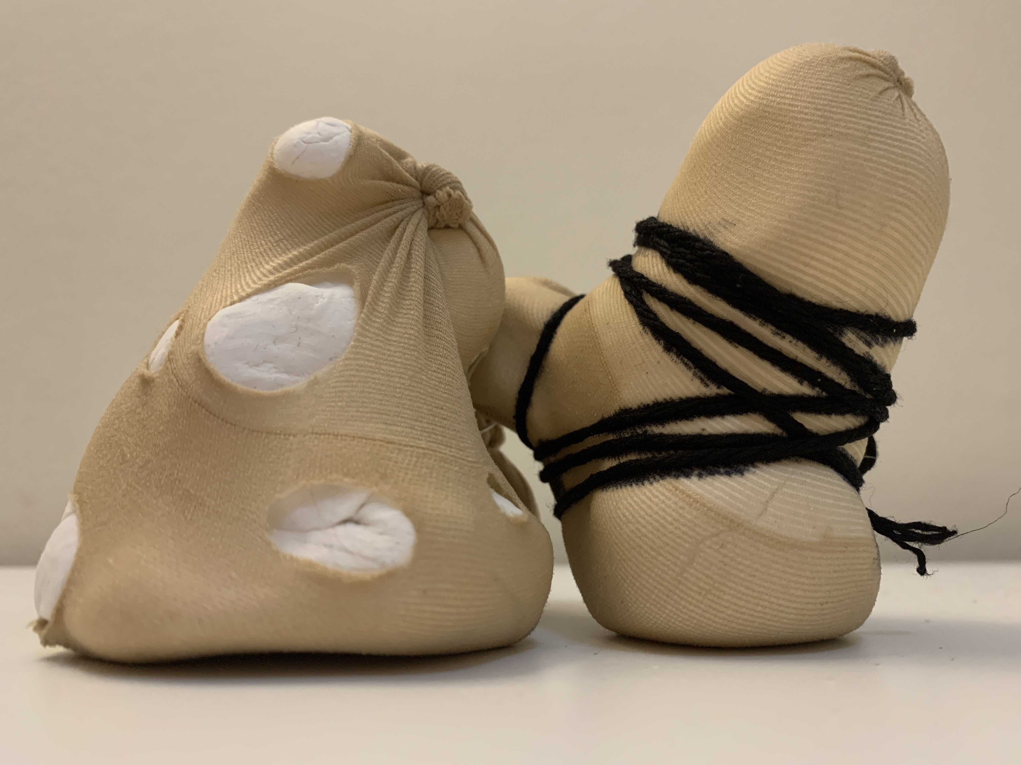
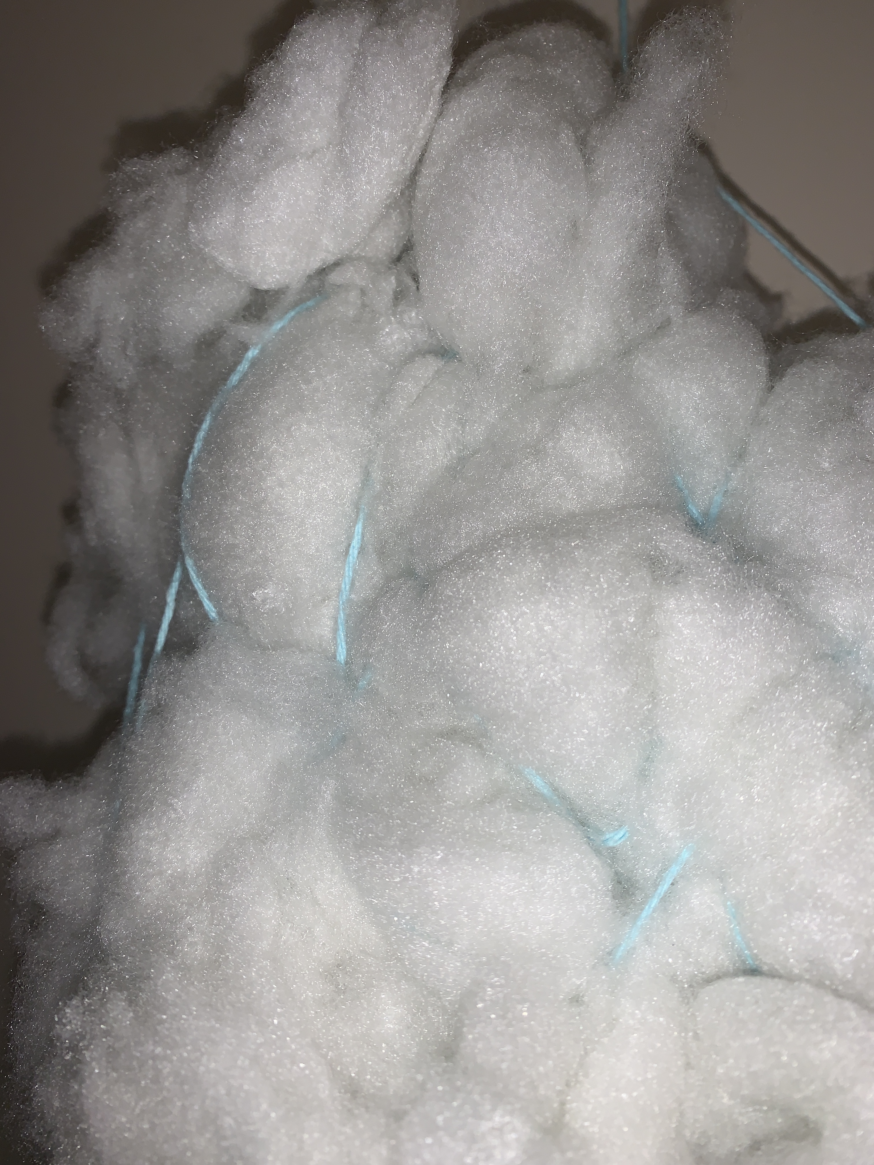
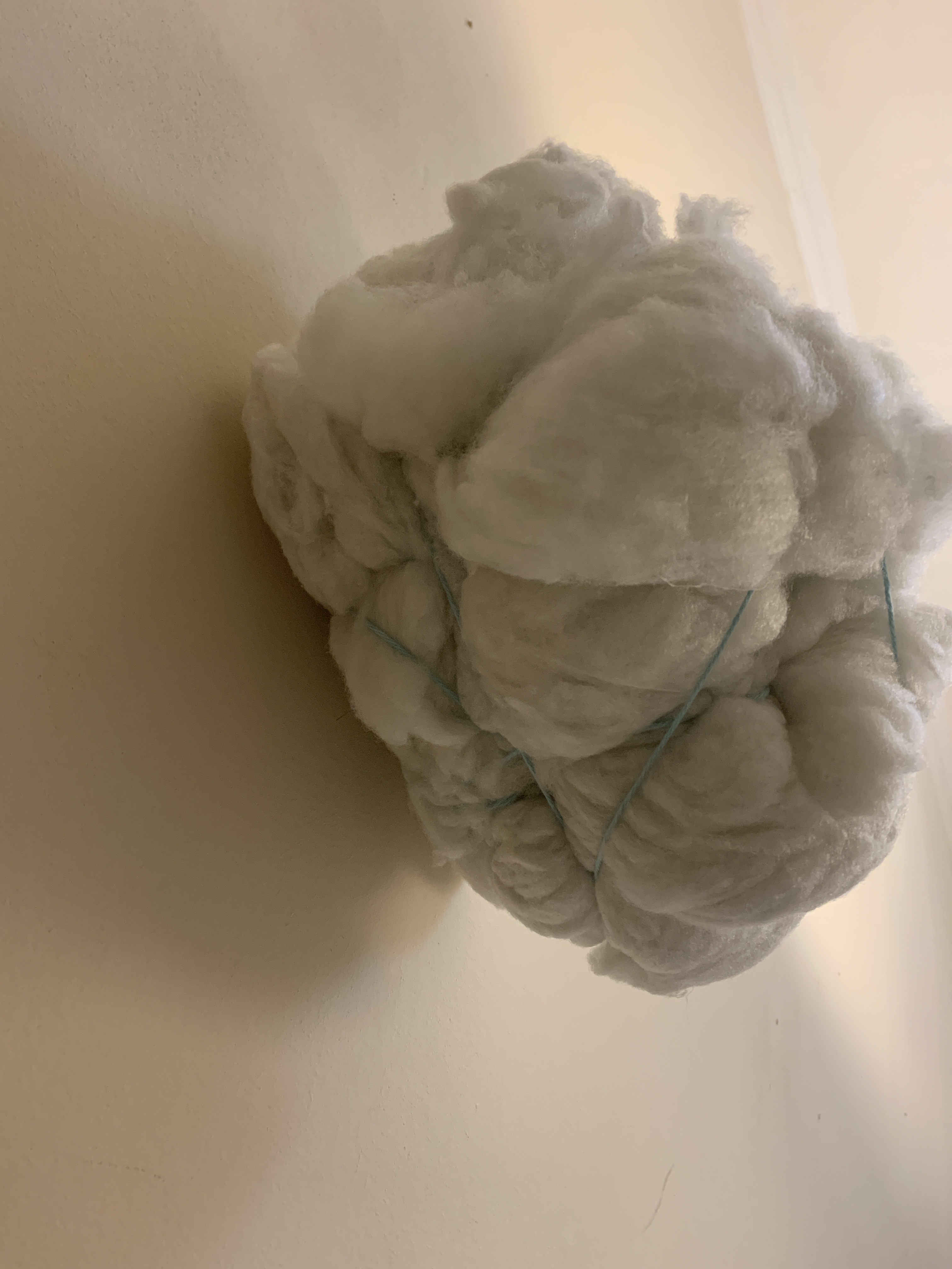
In response to my final crit I decided to make more dough models this time using pink dye. I played around with forming a shape I was happy with before wrapping around wool to contort and restrict its form.
Of course I only have access to make these models at such a small scale but ideally I would like them to be presented on a much larger scale about 6ft and spaced out from one another so you could walk around them full 360. I could have multiple of them in the same room almost interacting with one another.
I feel this project had been successful in the sense that I have produced a large quantity of work surrounding the theme of restriction moving between 2d mark making, photography and 3D model making. I have also touched spin themes of sexual frustration, comfort and discomfort which I feel are all very relatable given the current covid 19 circumstances.

WAWWA WEEK 7/8
Comfort/ Discomfort on the body
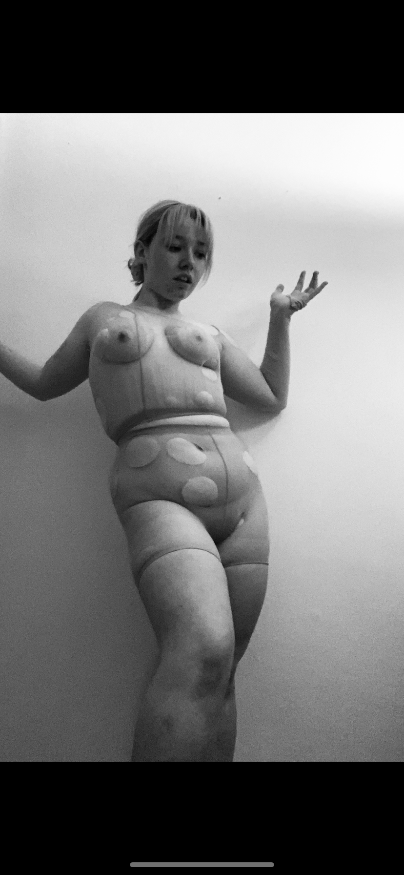
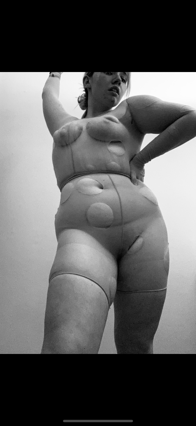
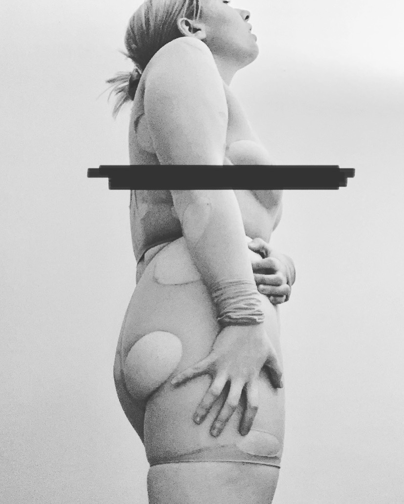
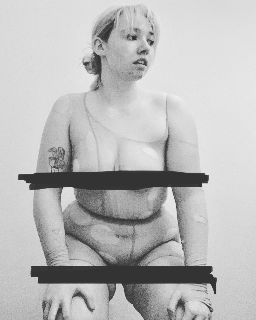
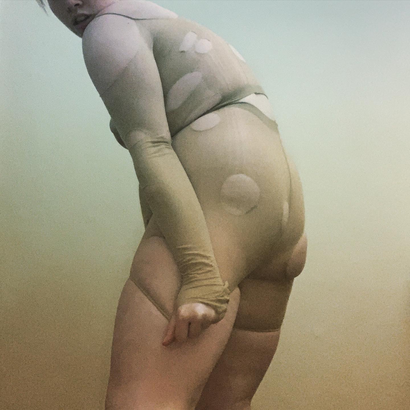
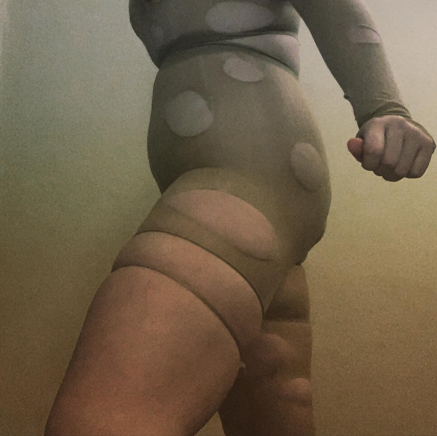
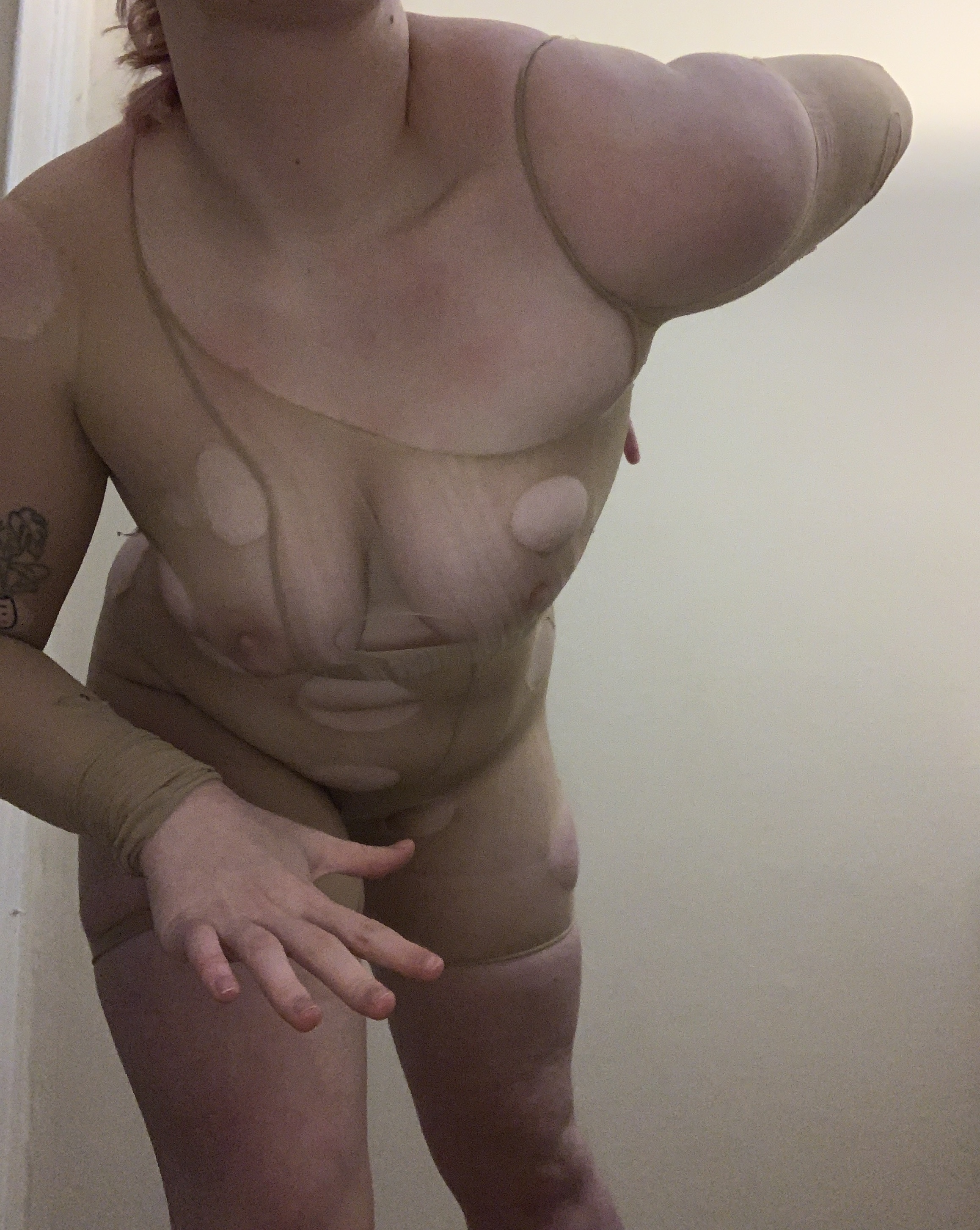
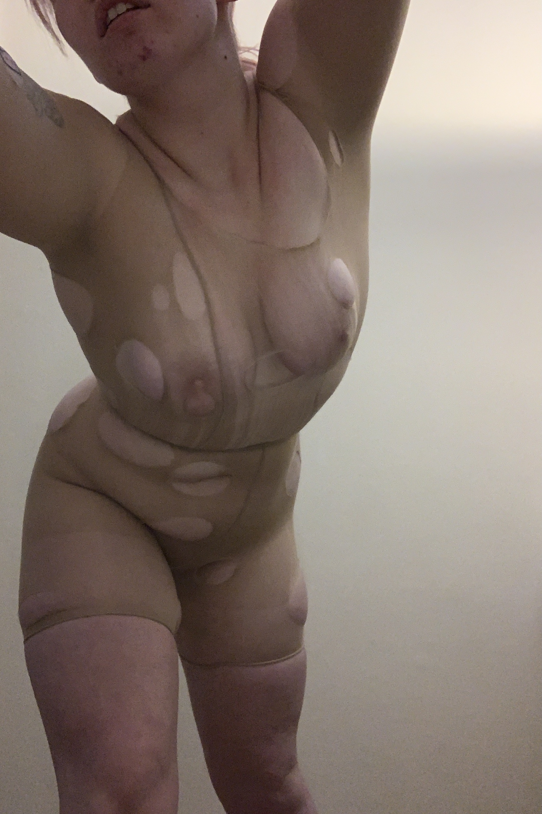
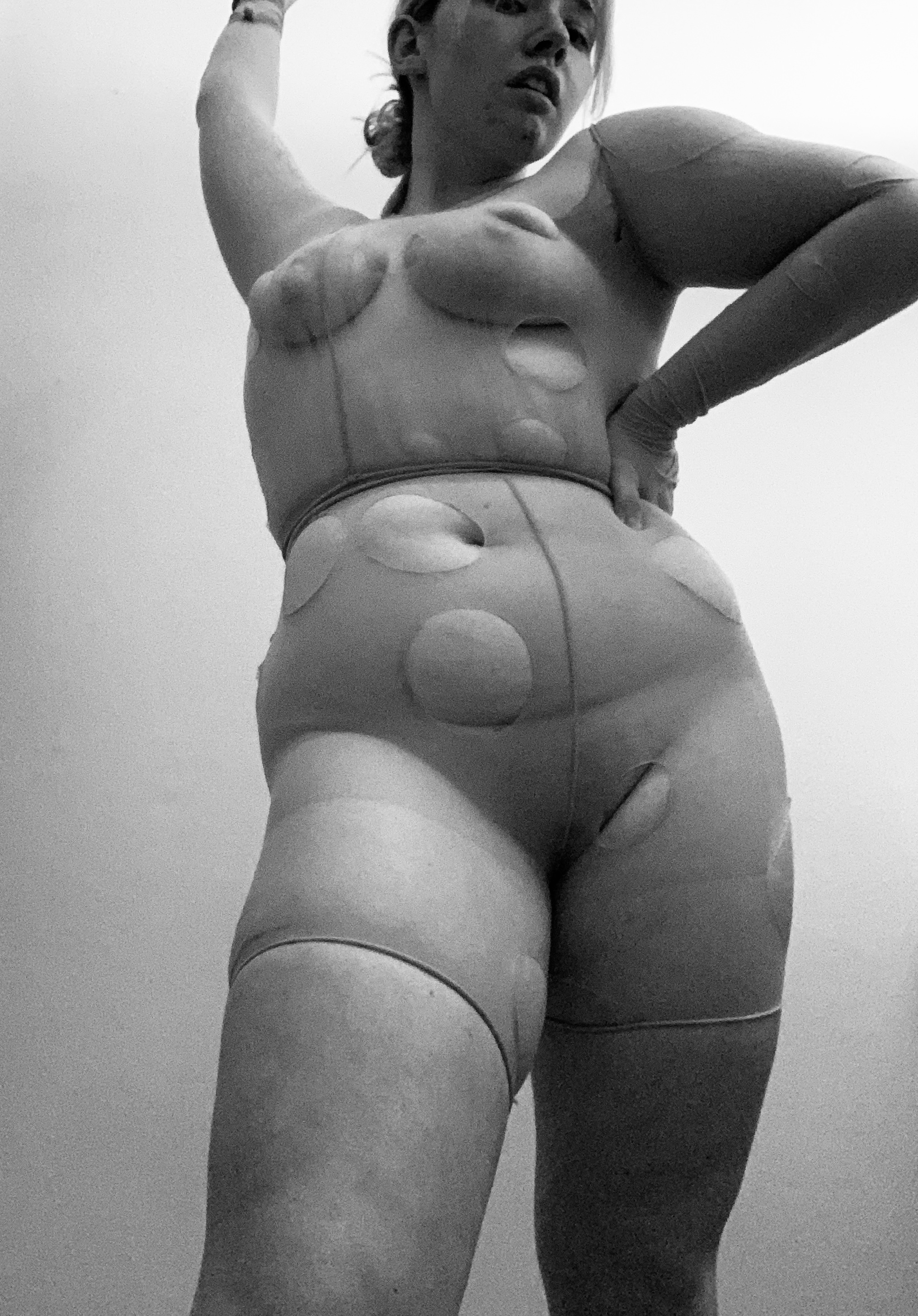
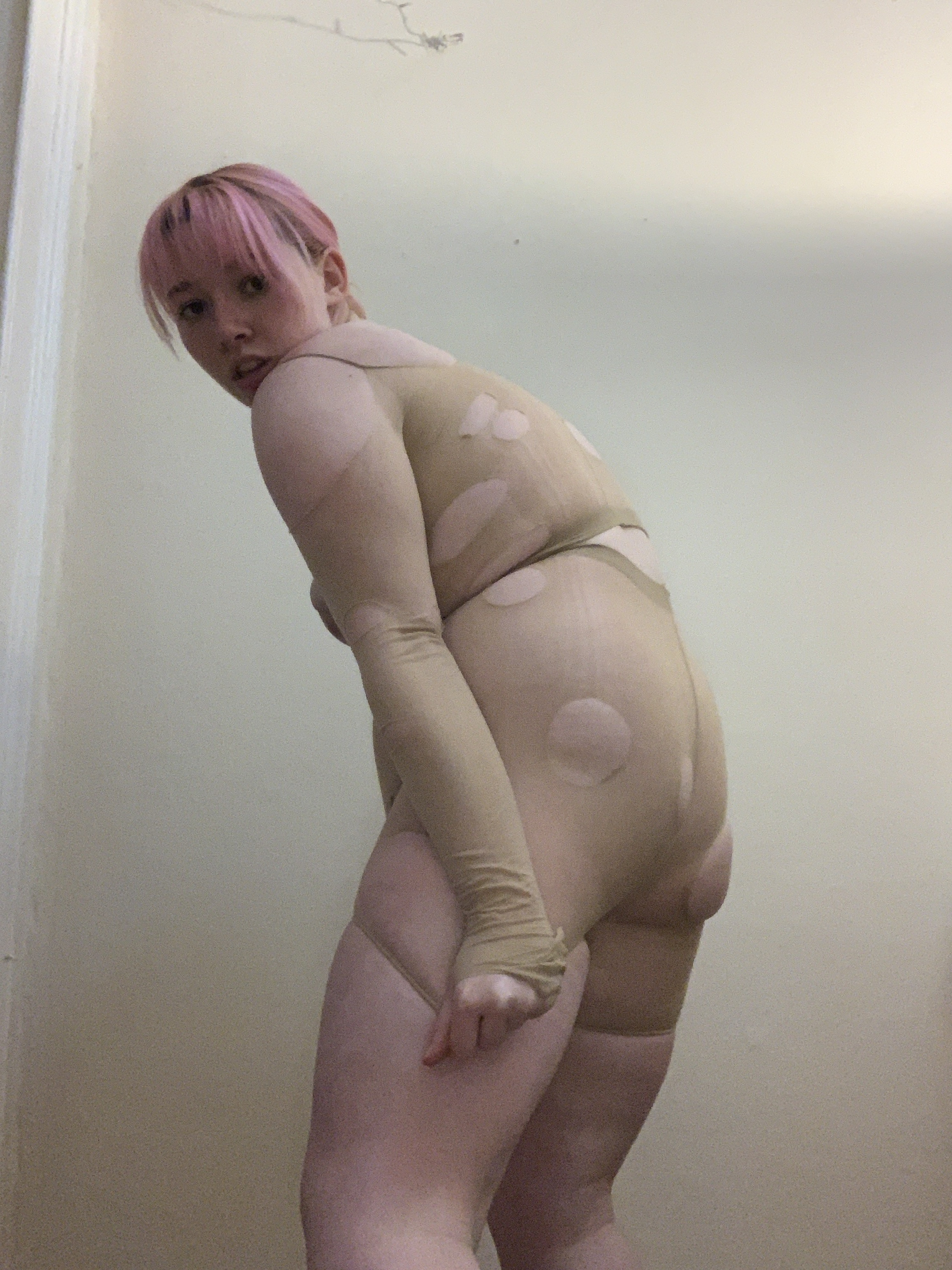
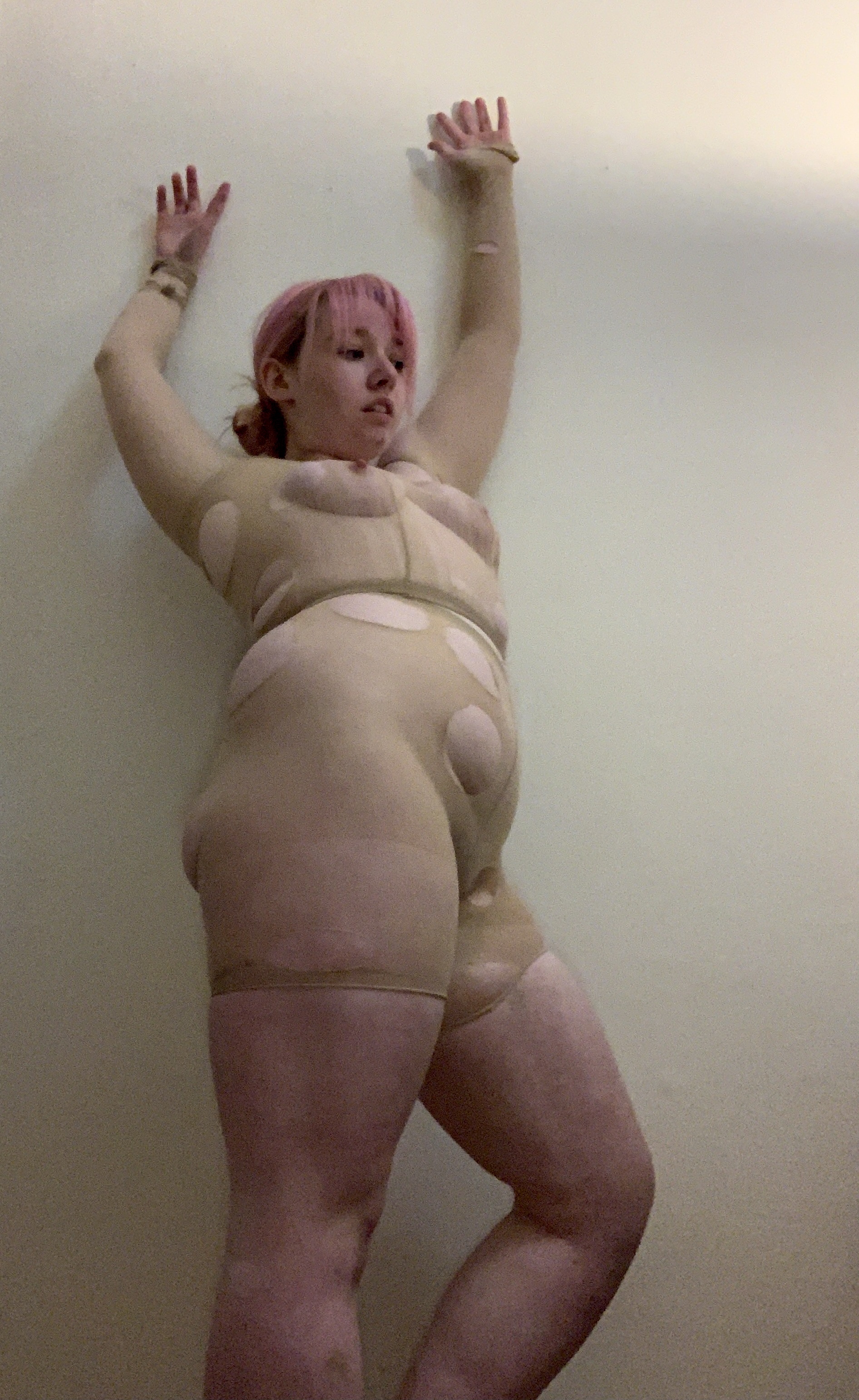
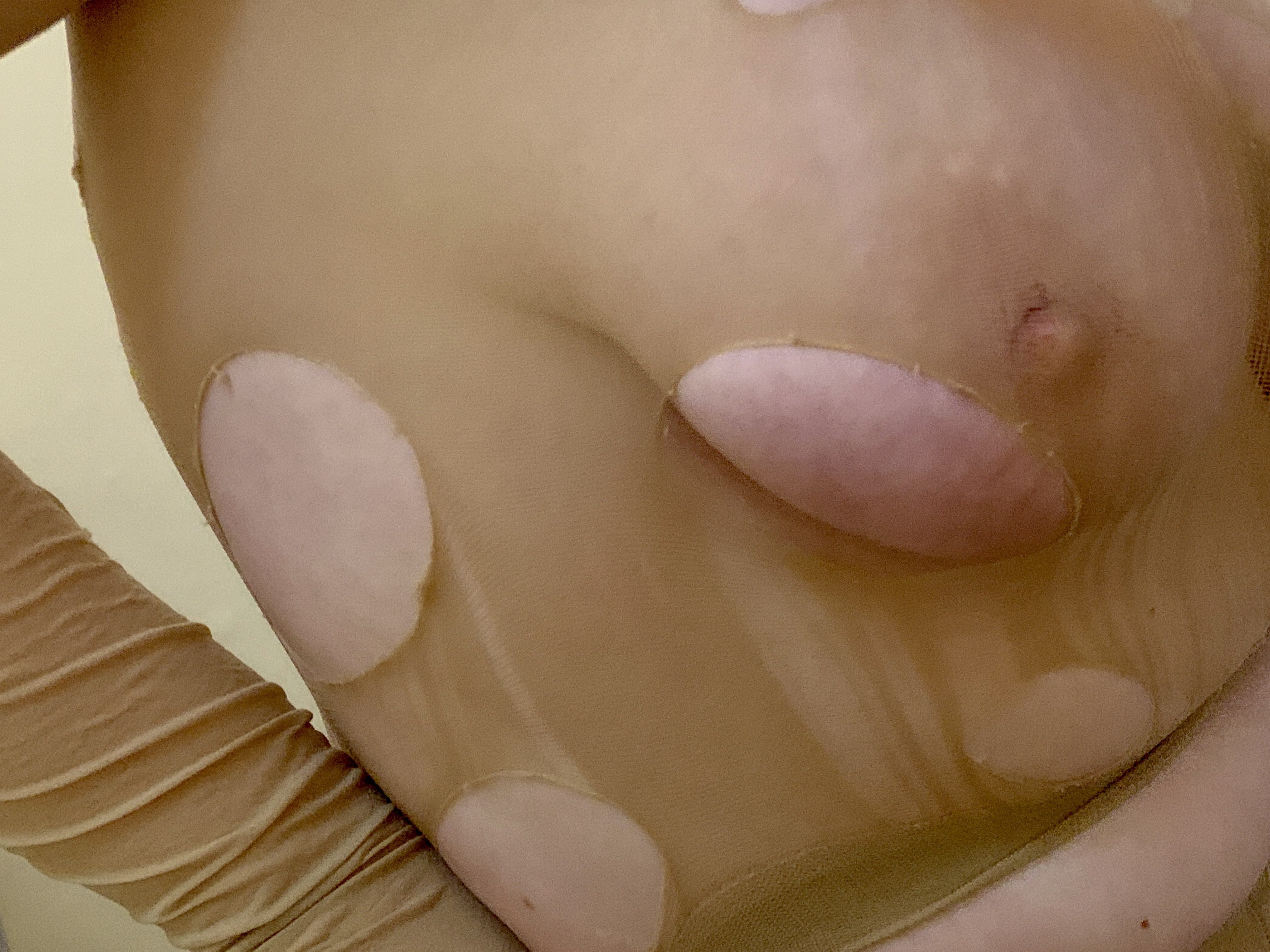
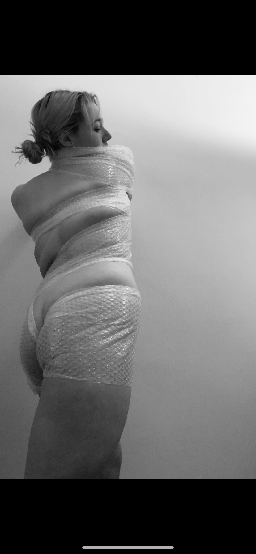
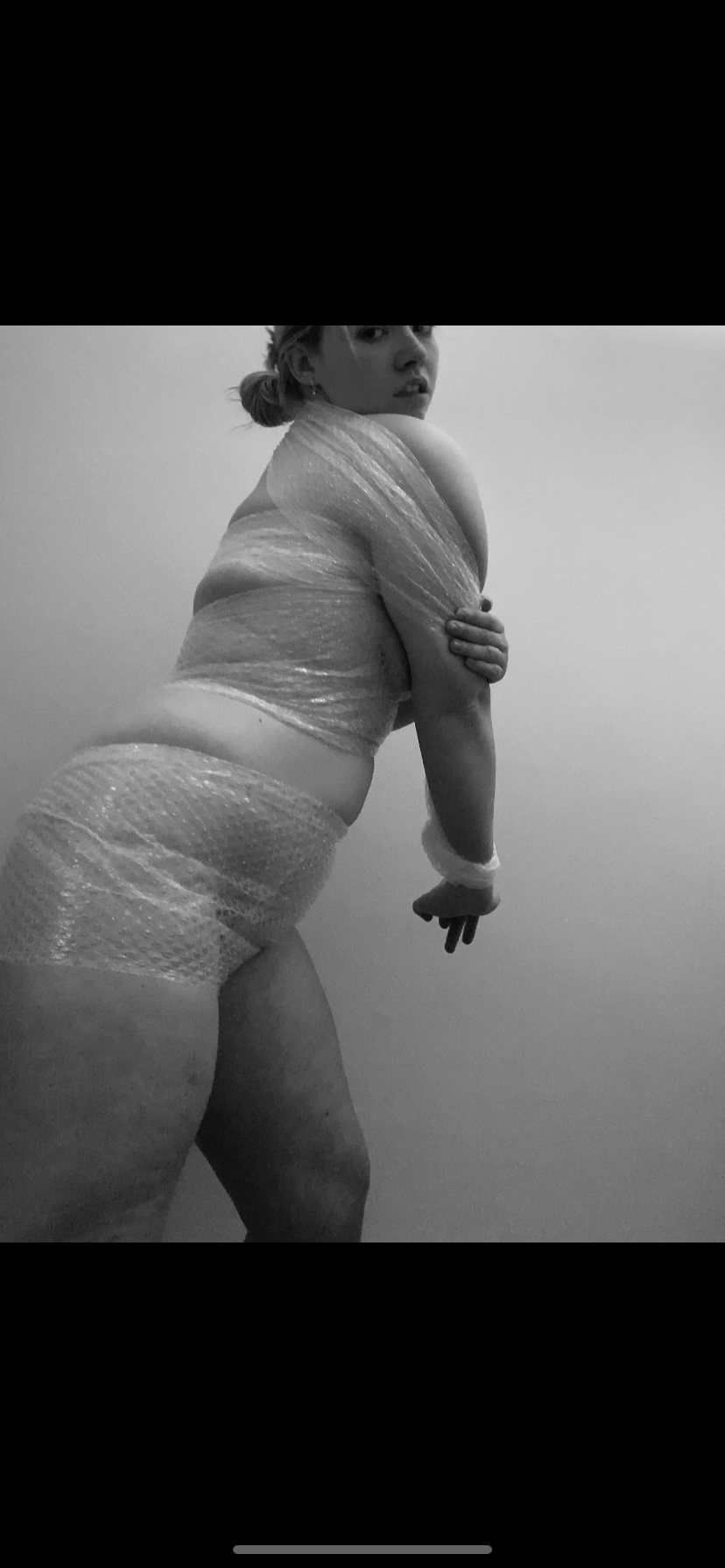
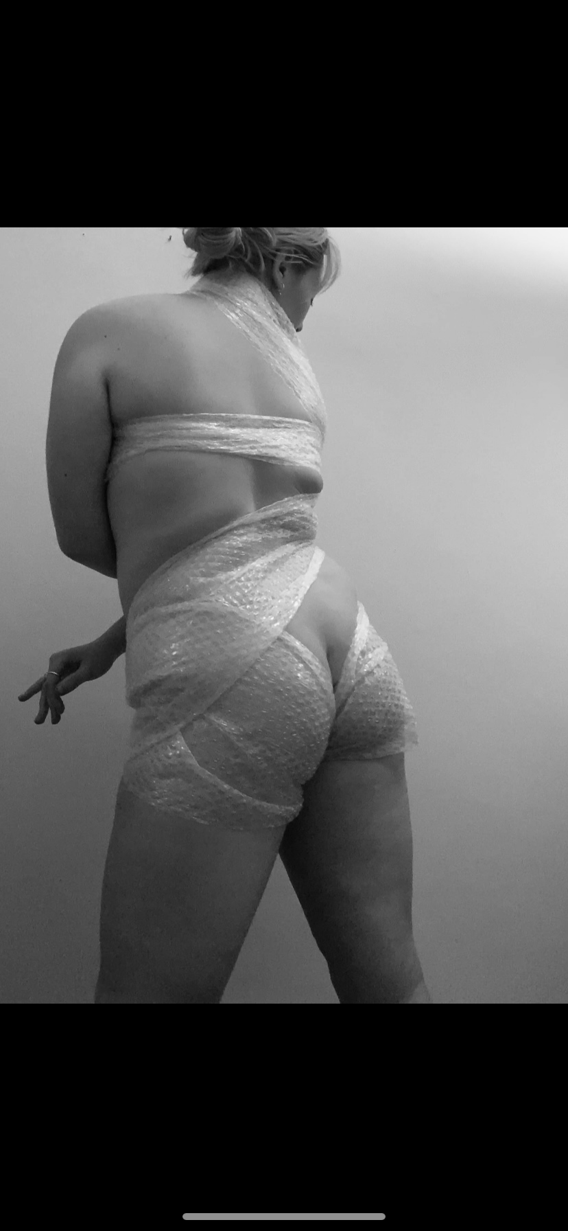
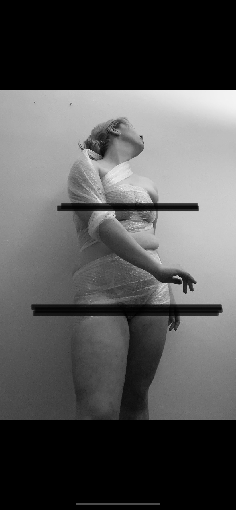
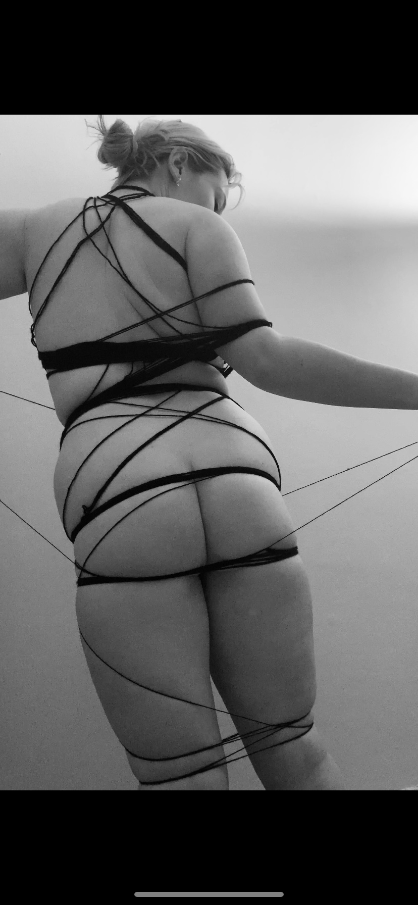
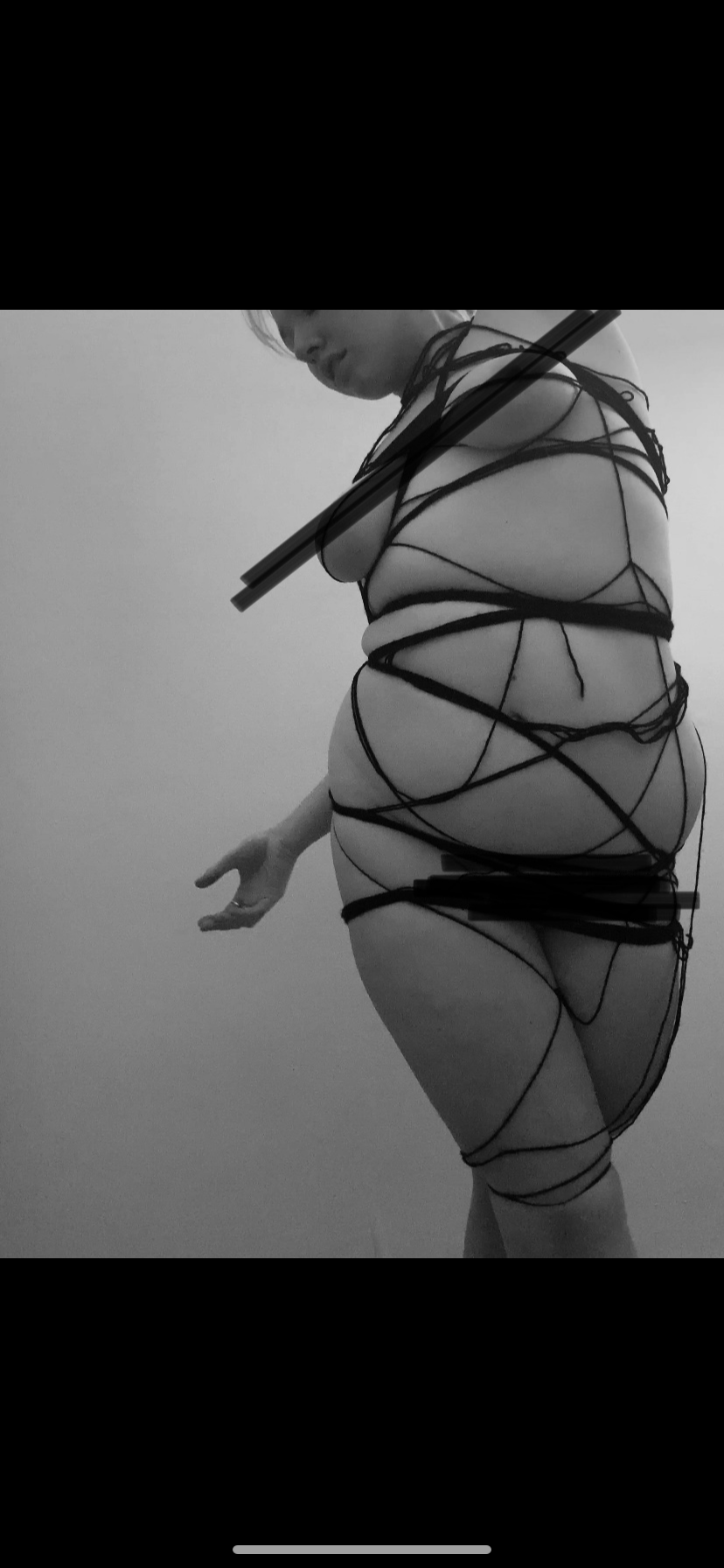
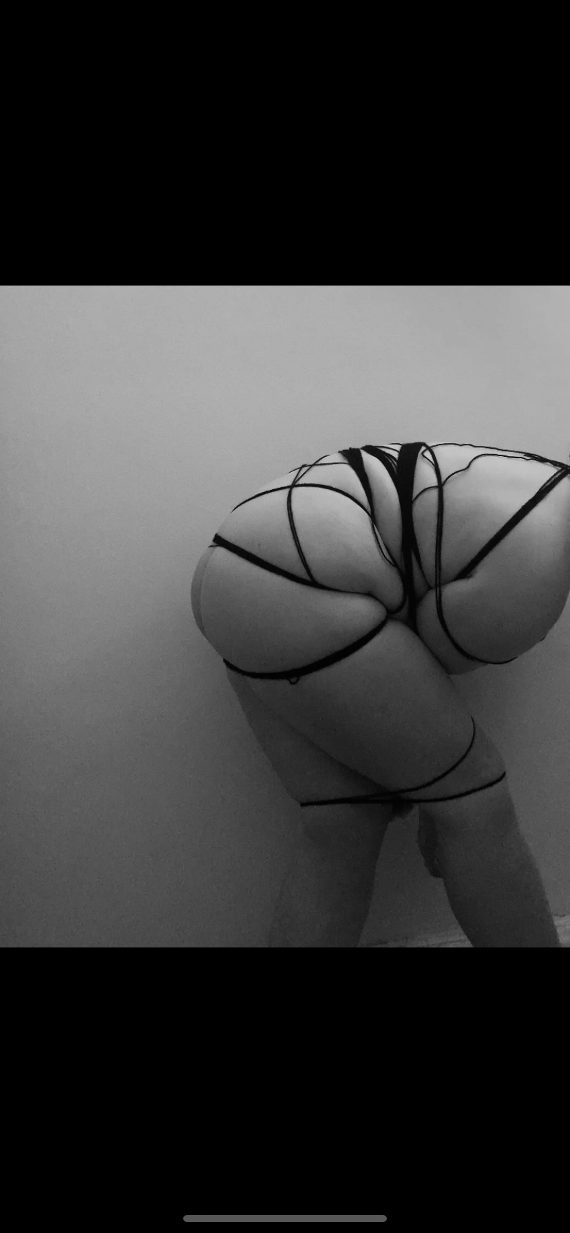
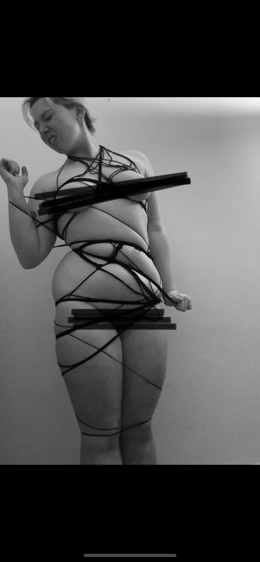
Starting off the week I wanted to further manipulate my body to feel restricted and uncomfortable. Playing around with different materials I wanted to appear uncomfortable while almost being held by the materials i was using. I think my favourite images came from when i used tights with the cut out sections as they show an almost relief from being held and pulled in all the time.
I wanted to use soft materials that are traditionally used to keep things warm and safe – wool, tights, bubble wrap. Things that on there own don’t carry feelings of being uncomfortable. But used in these images they pull and contort me to the point it appears painful and manipulative. The contrast of comfort and discomfort is a re occuring element to this project that i think enforces feeling restricted.

Abstracting The Form
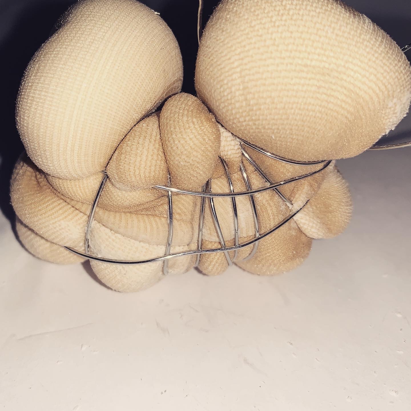
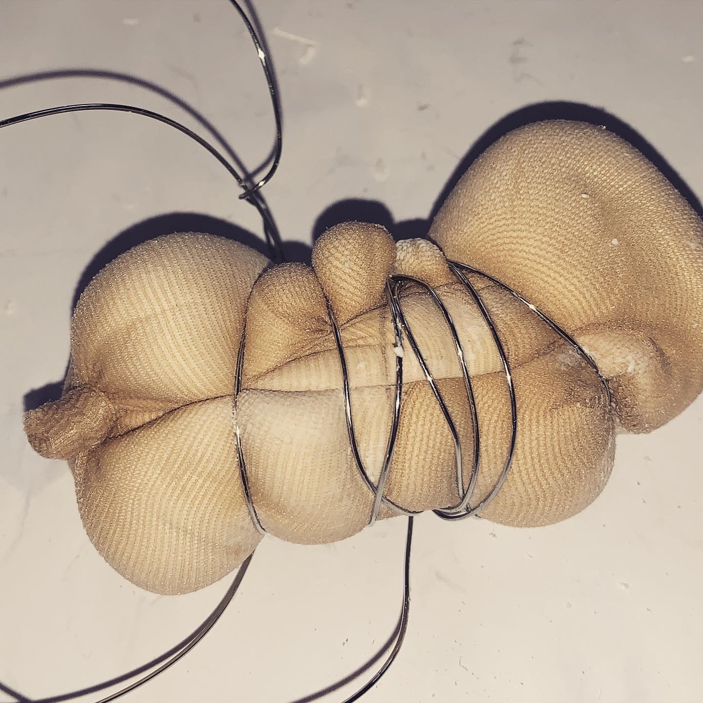
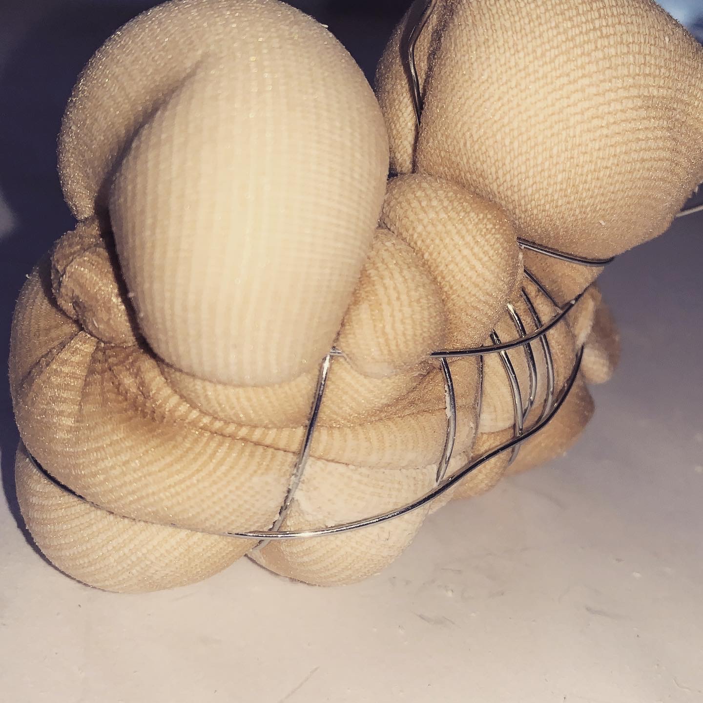
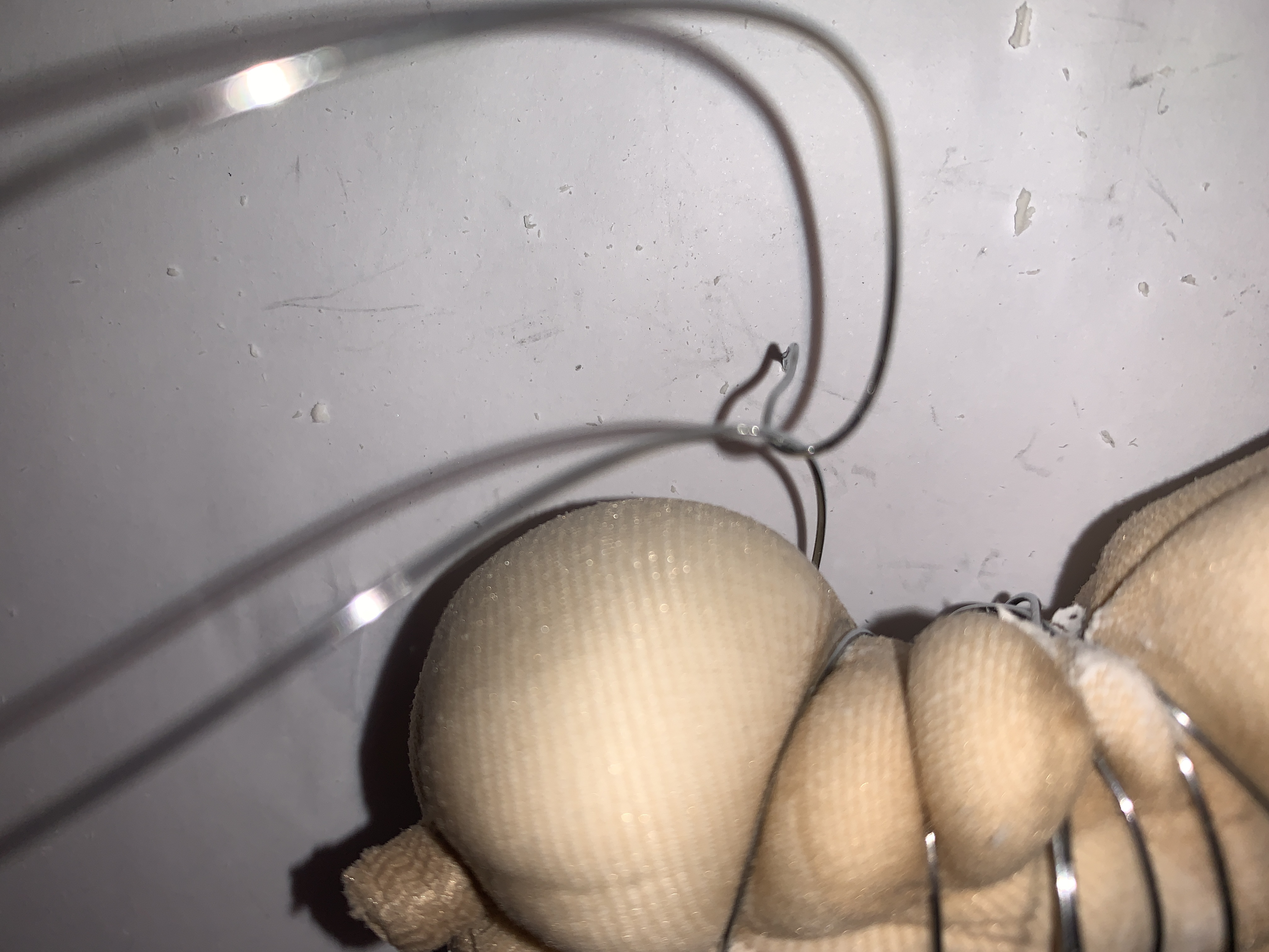
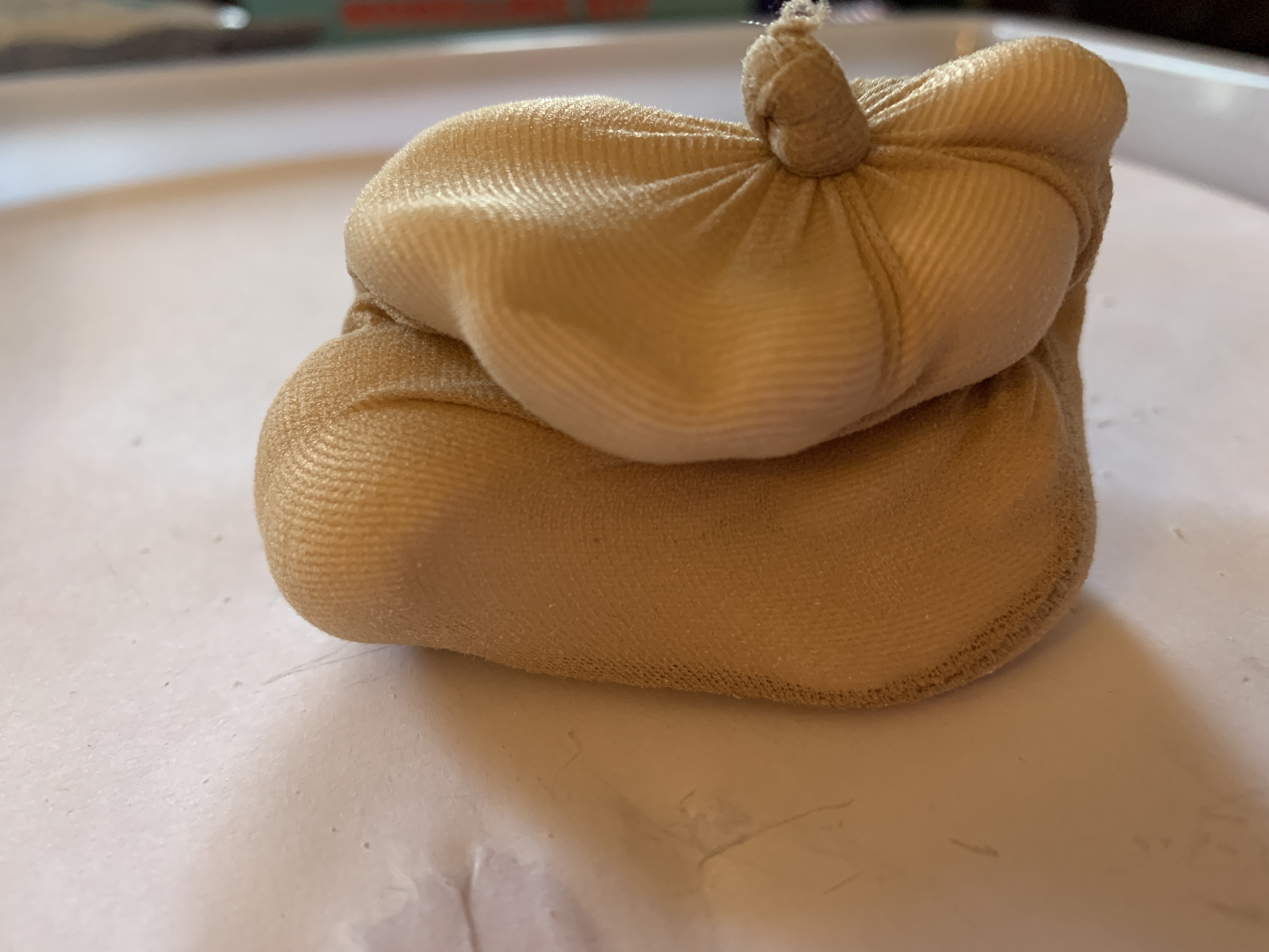
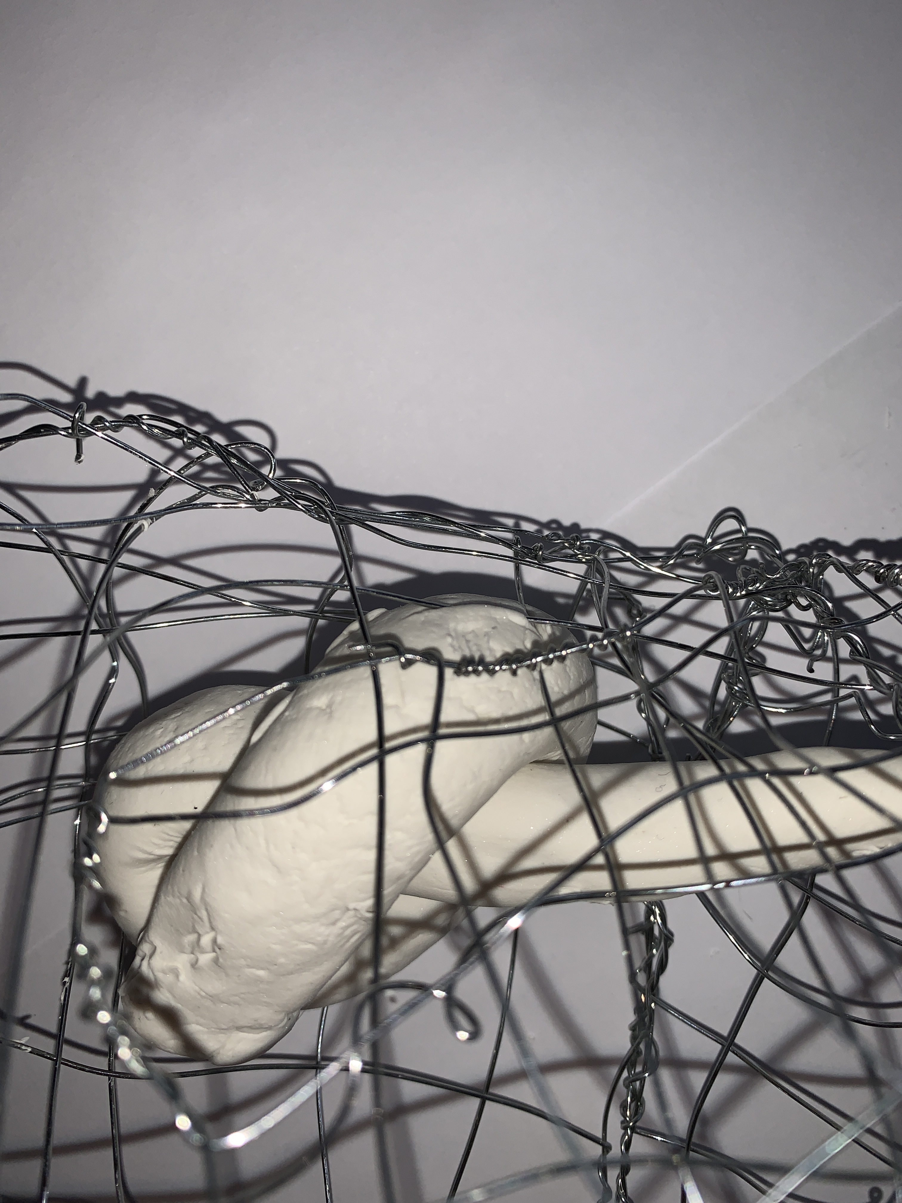
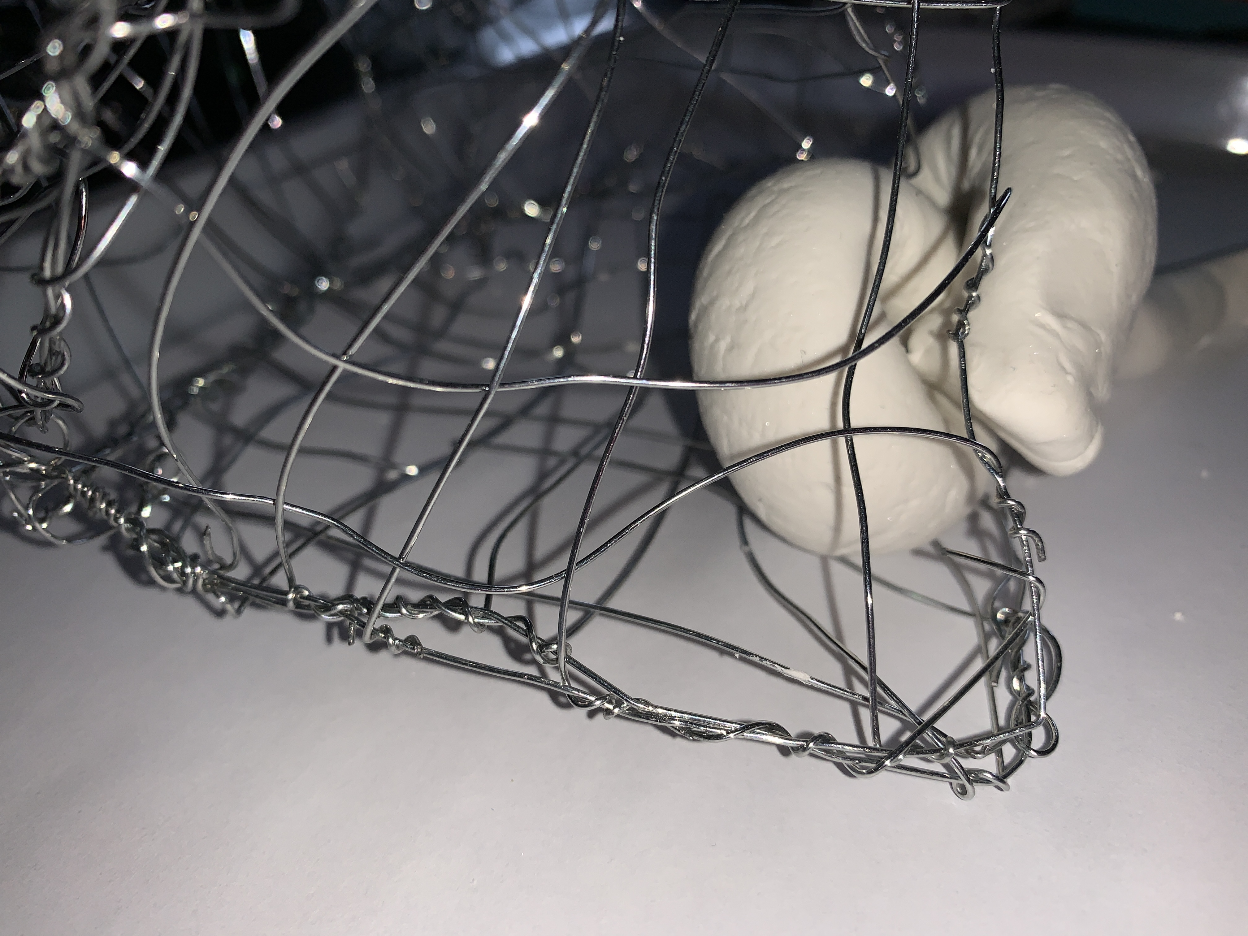
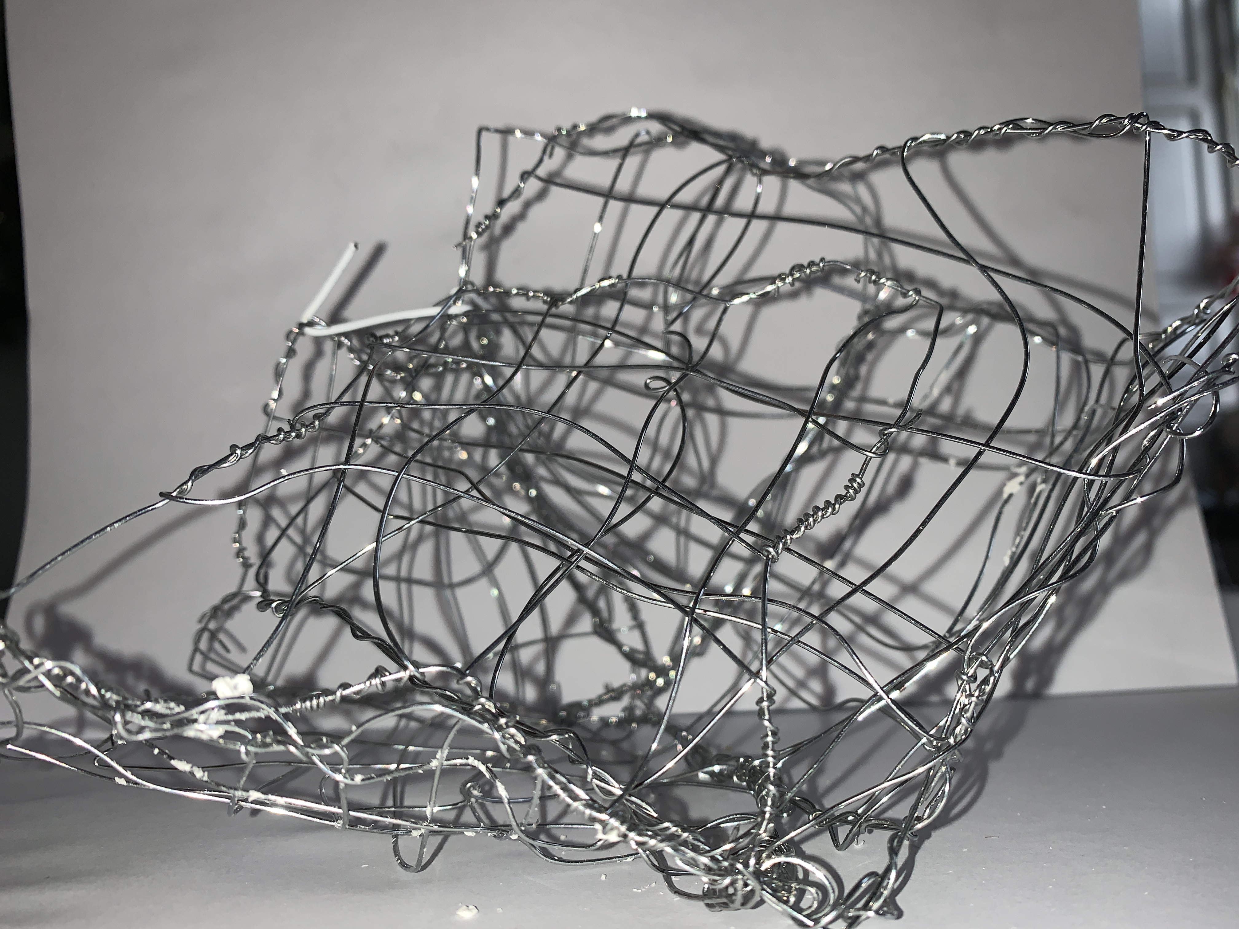
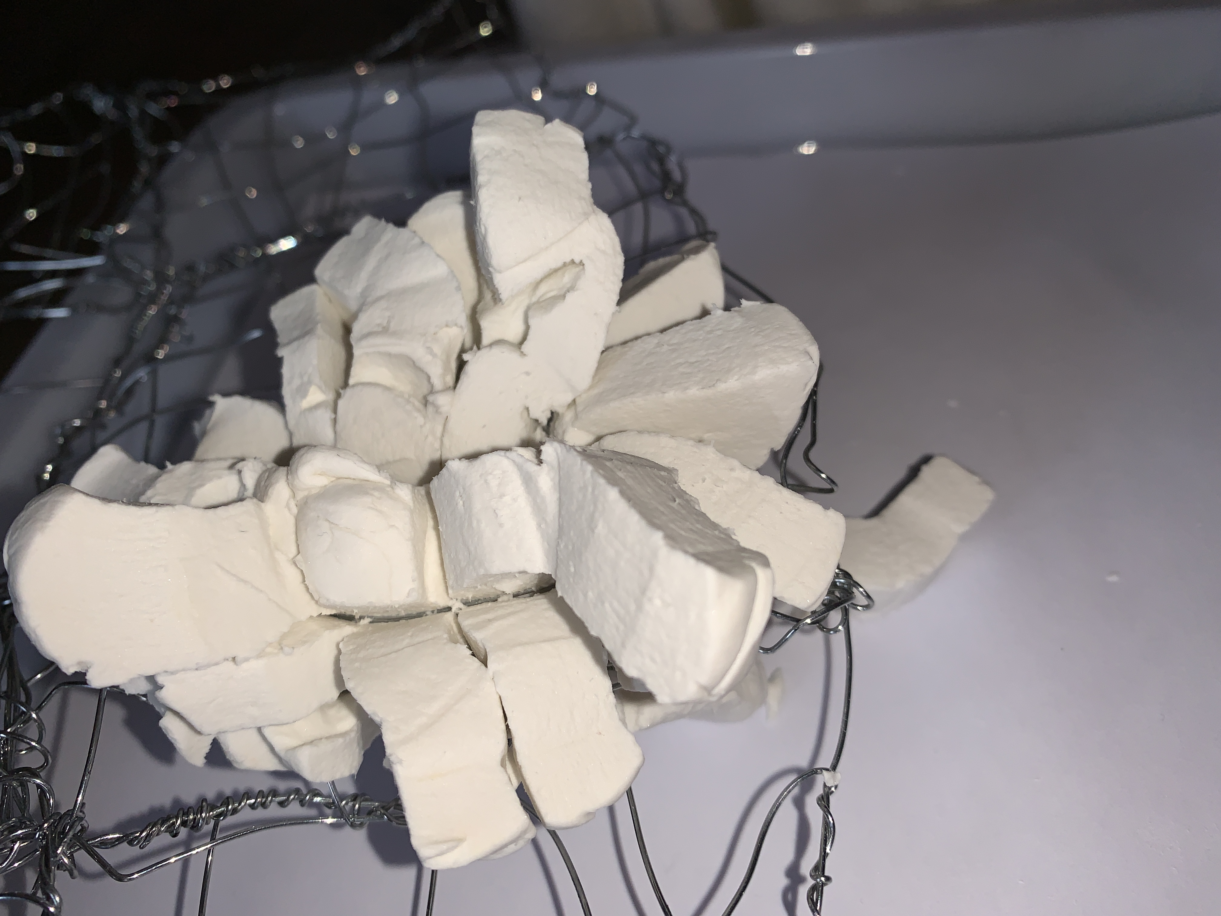
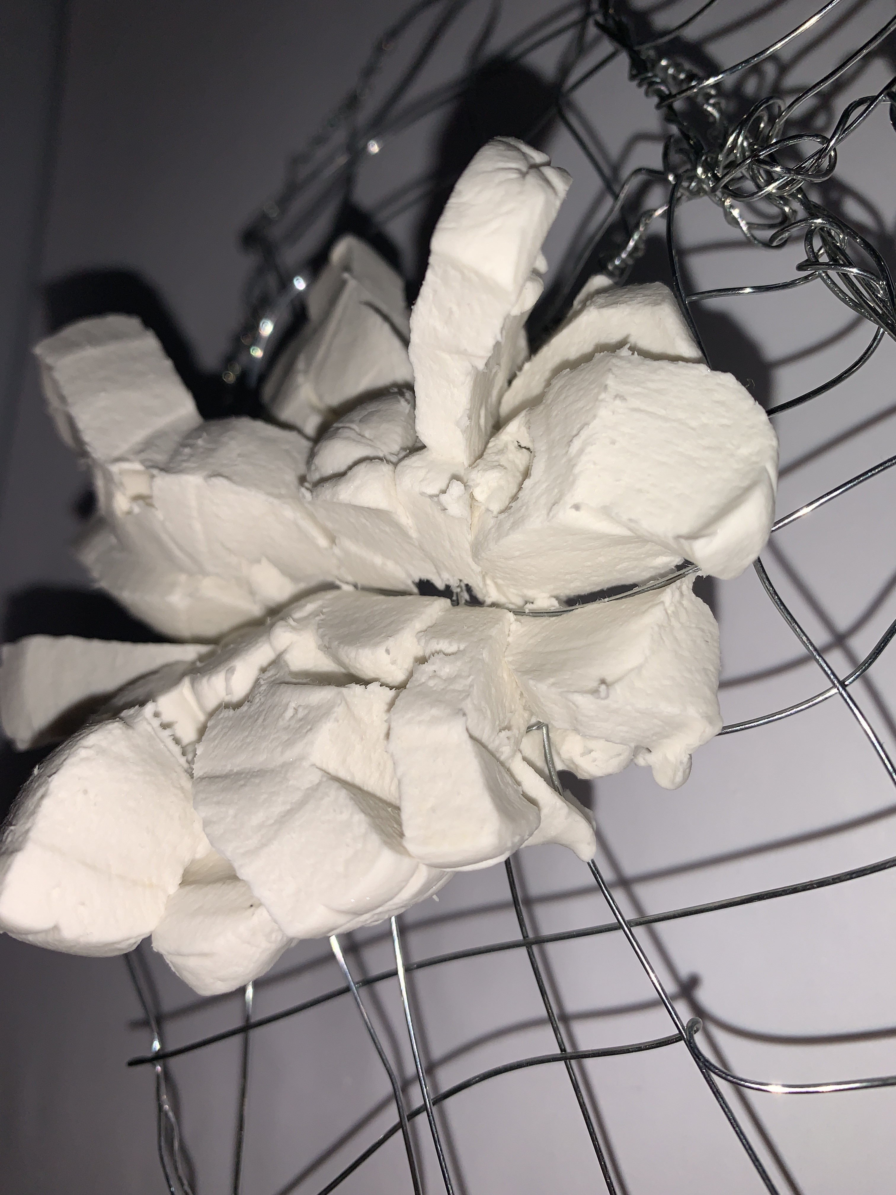
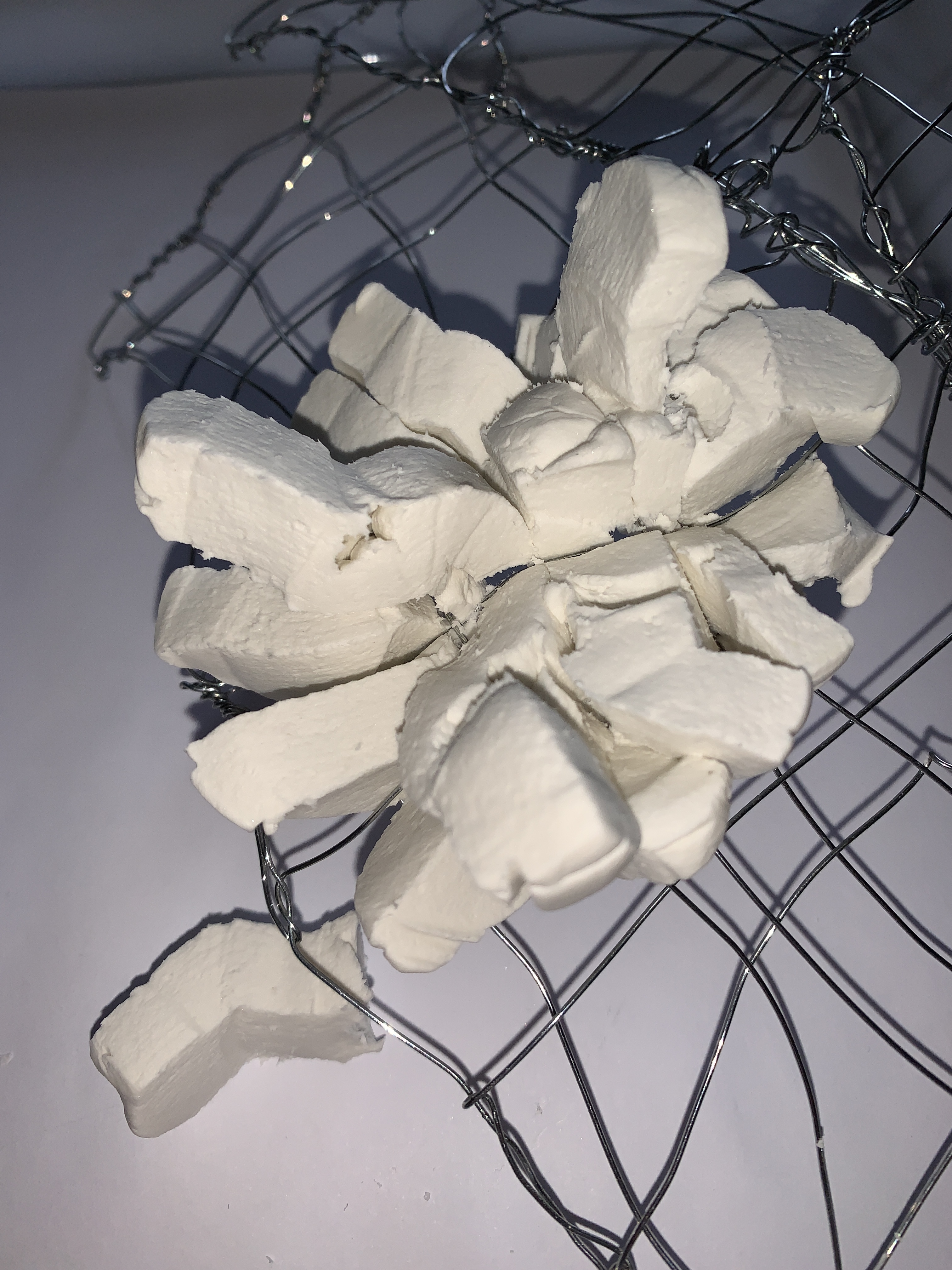
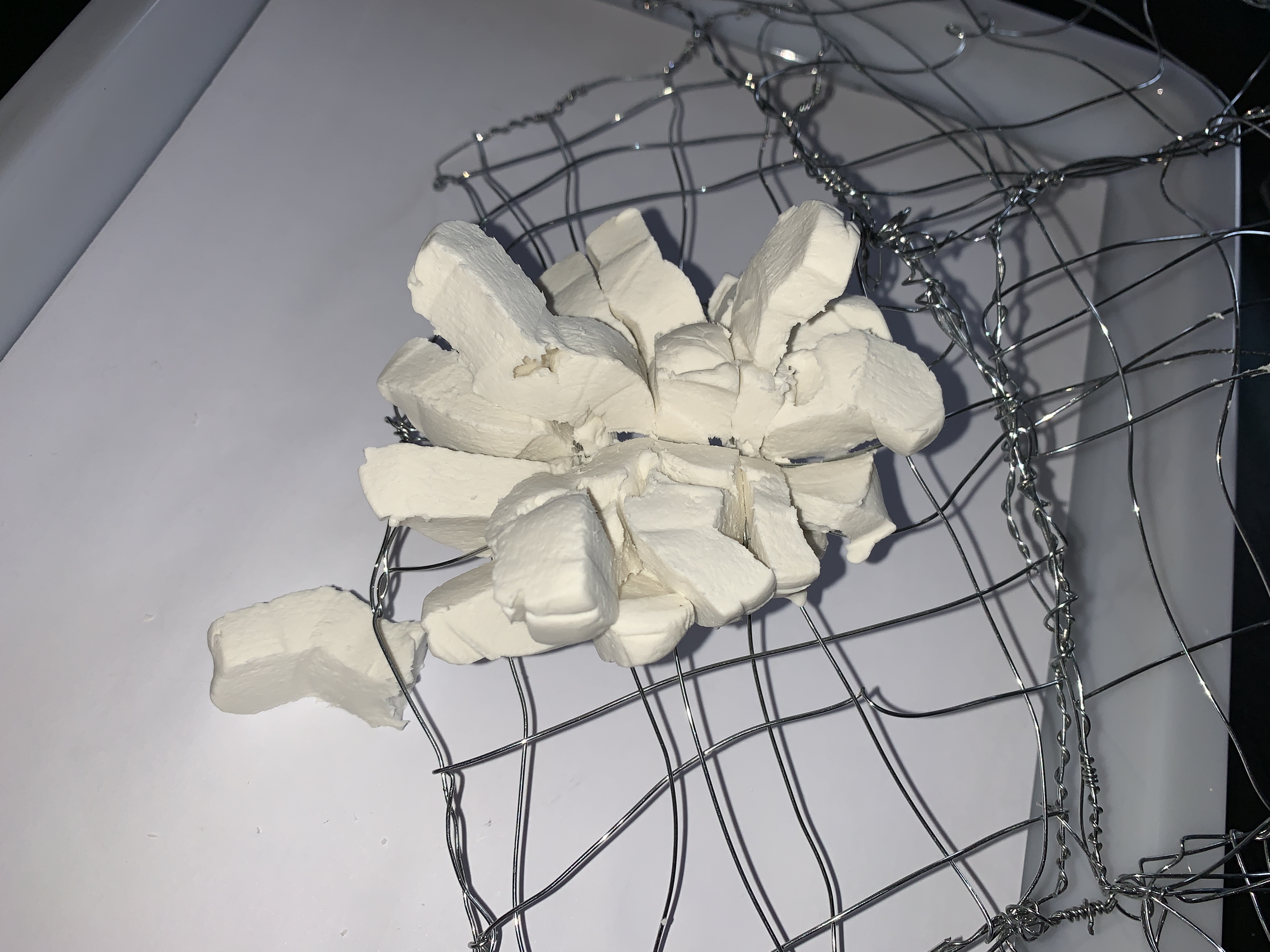
After a one to one i was encouraged to uses these images as a way of abstracting the form and making it less about the body and make it more abstract. So still thinking about feeling restricted and uncomfortable i played around with materials – soft , hard, flexible and stubborn to try and communicate the discomfort.
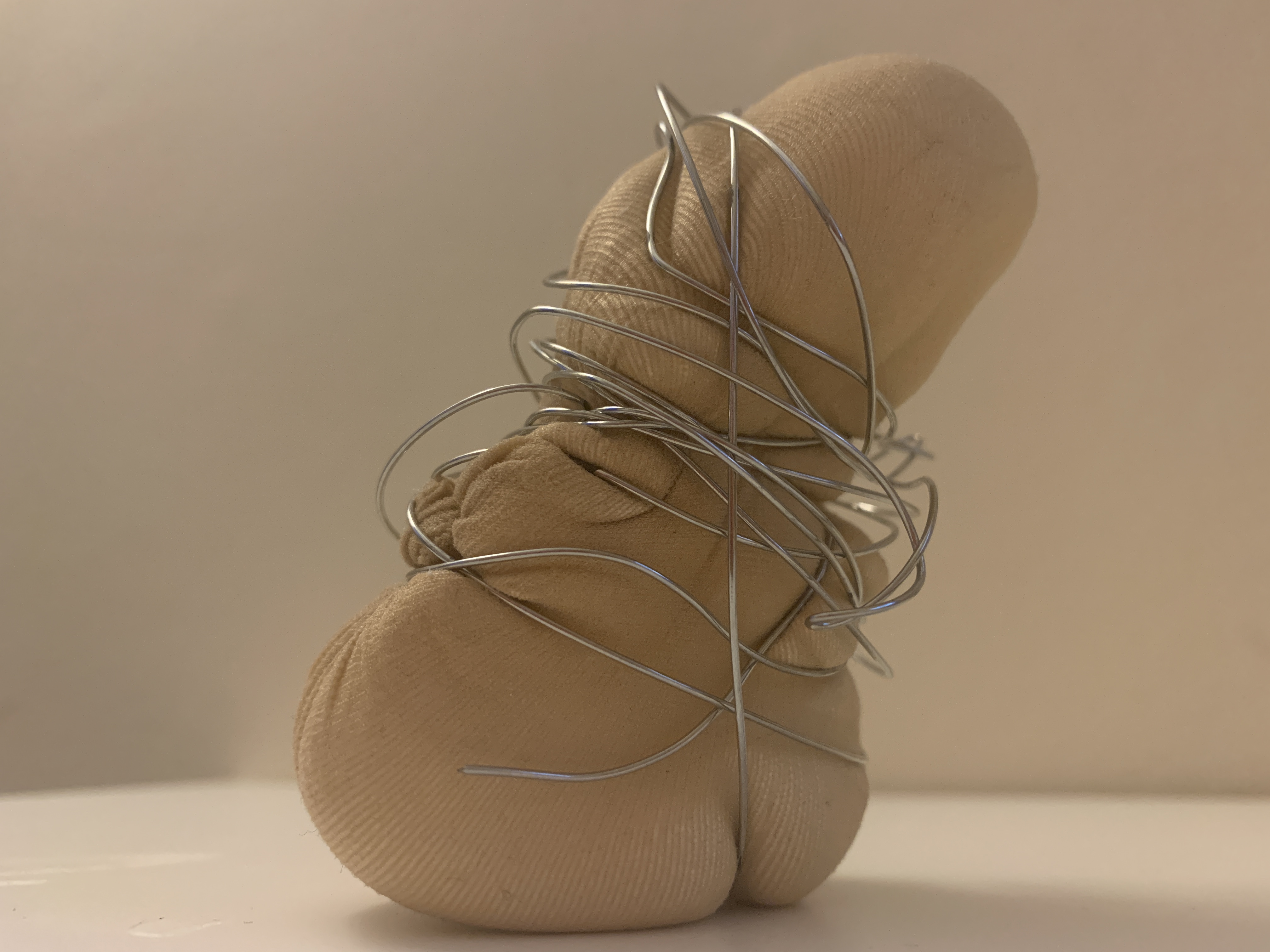
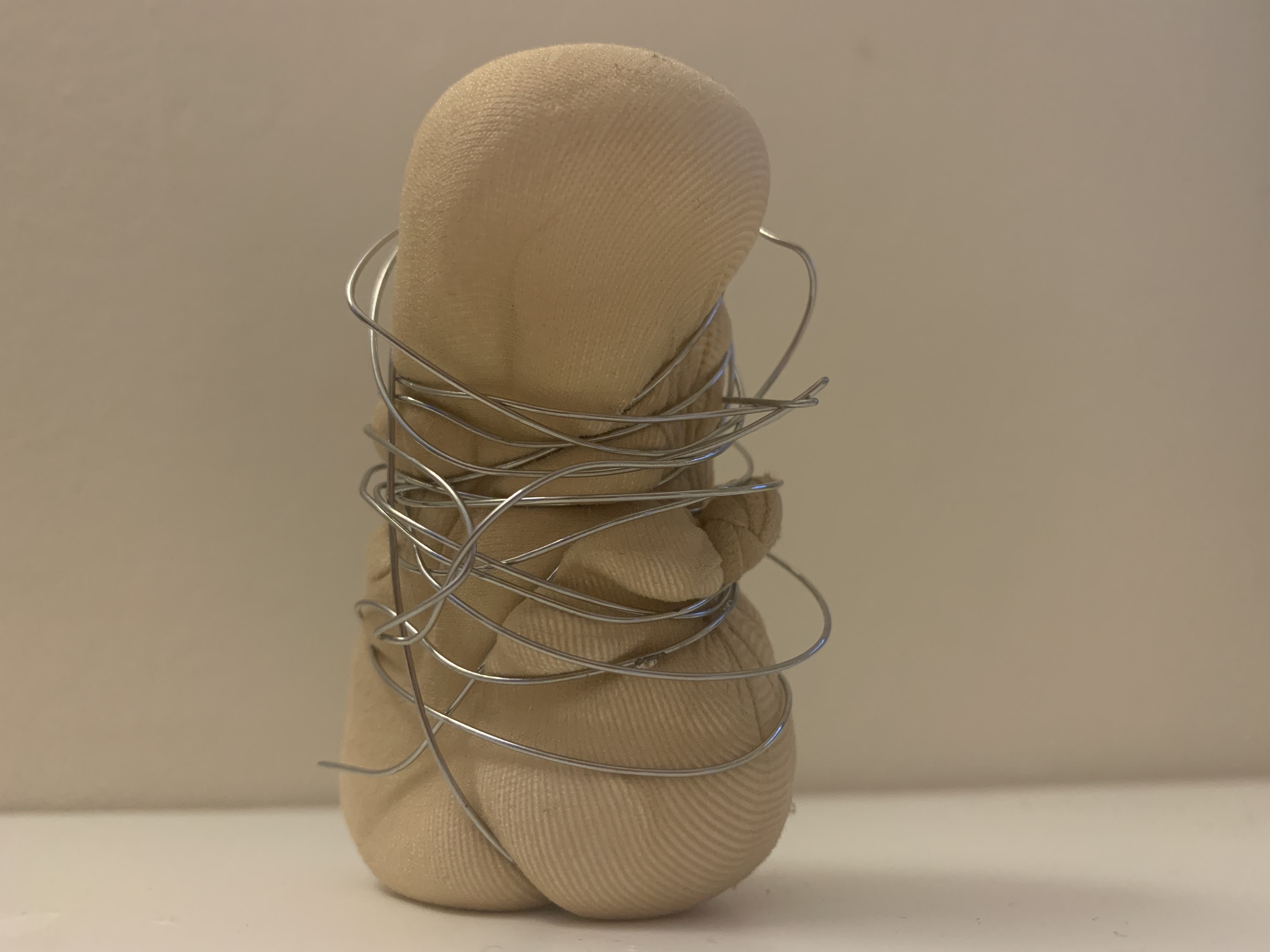
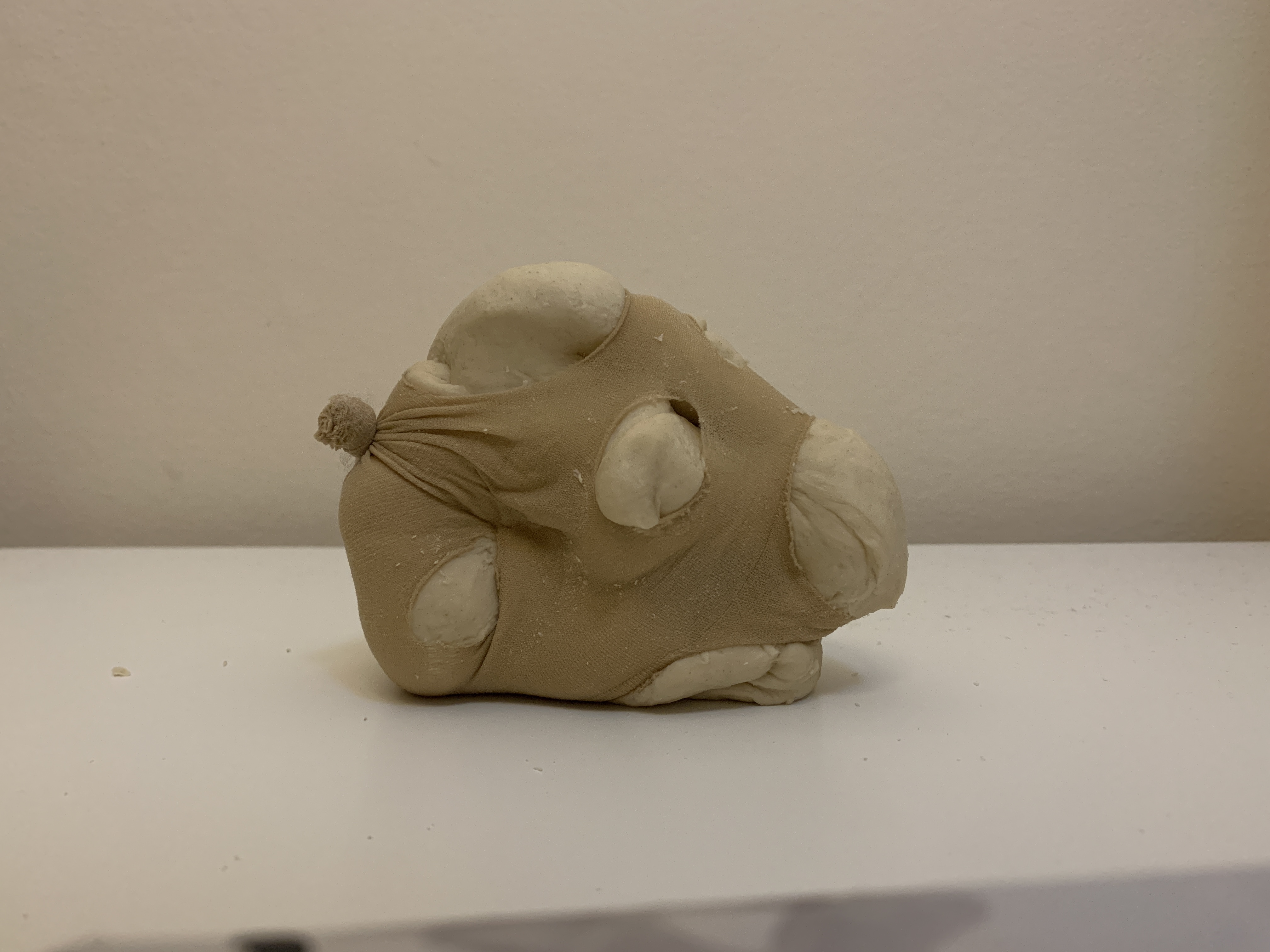
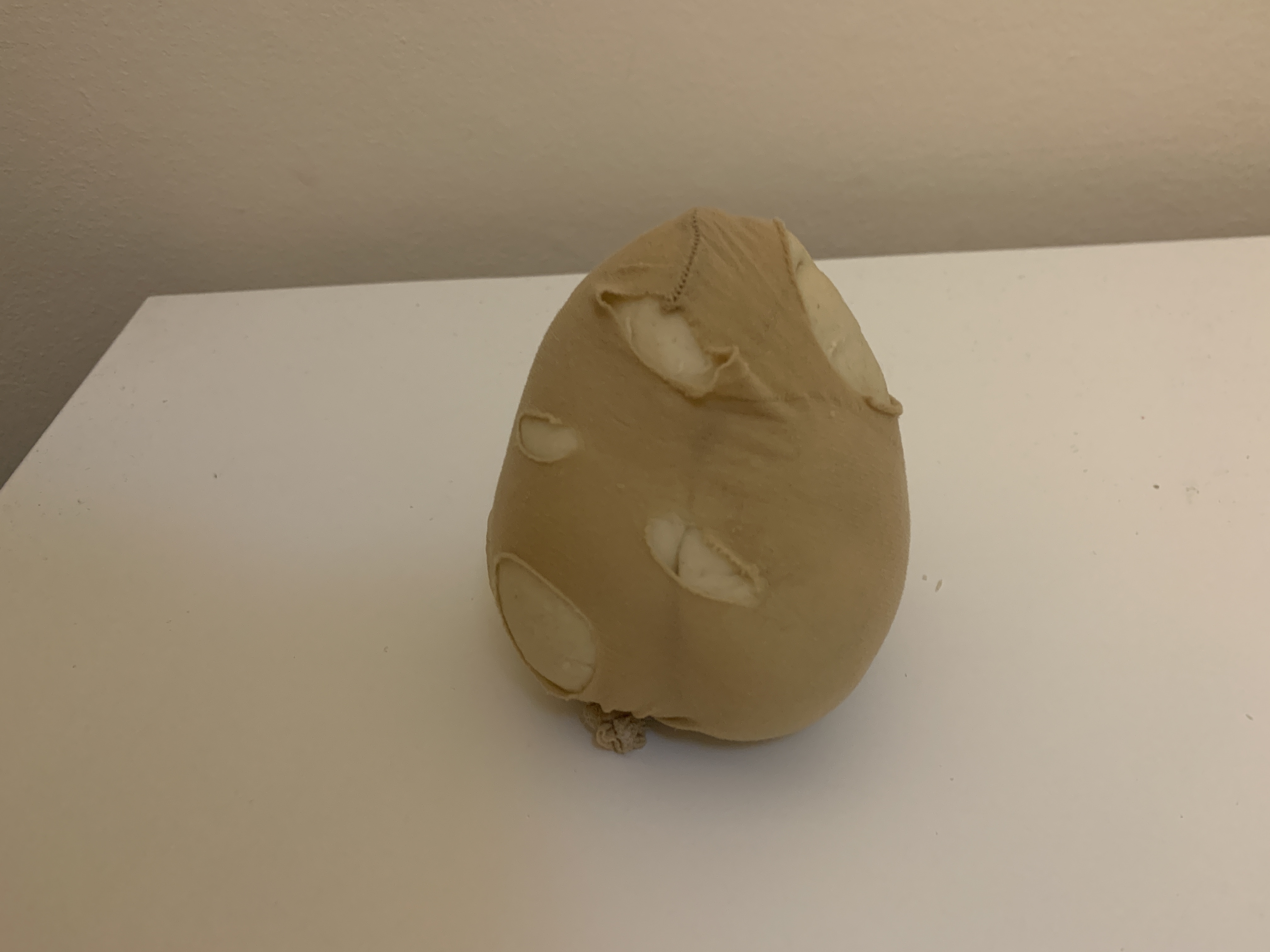
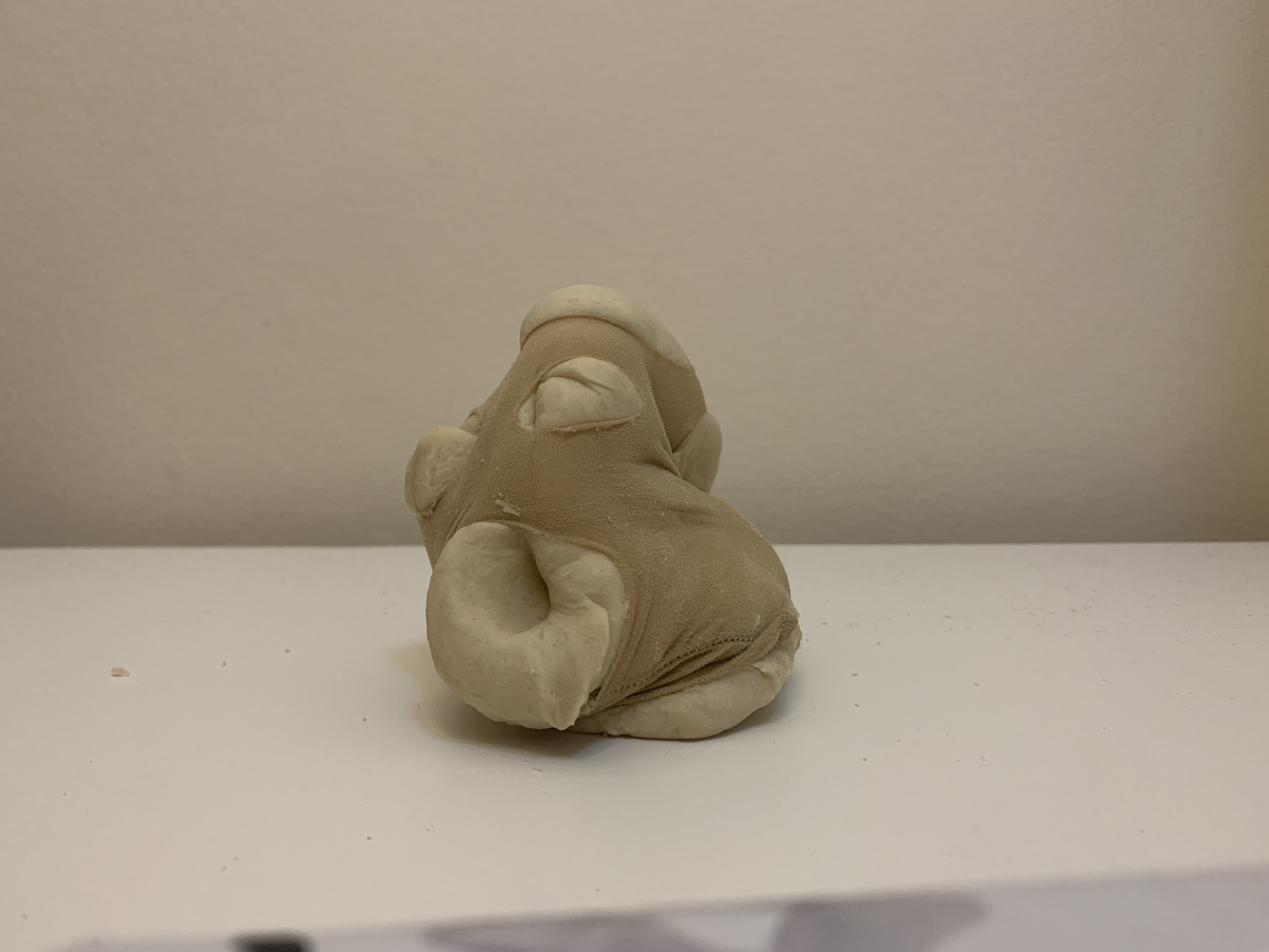
This also led me to think about the properties of these materials and i really enjoyed working on a small scale in 3D. These little clay models almost resembled a form without feeling to specific.
These images also show a type of fragility that comes with soft materials – this is reflective of the fragility I think we all feel when being restricted by the covid rules and fragility of my own body and mental health.
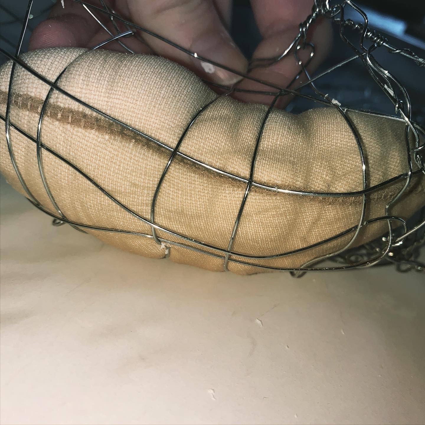
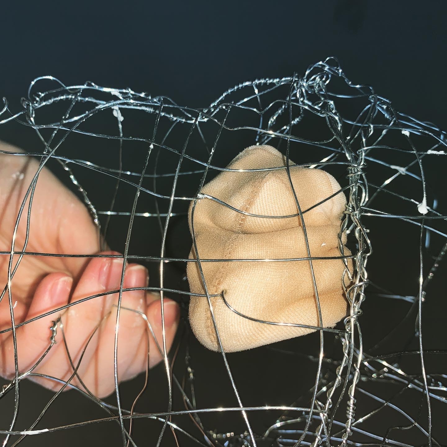
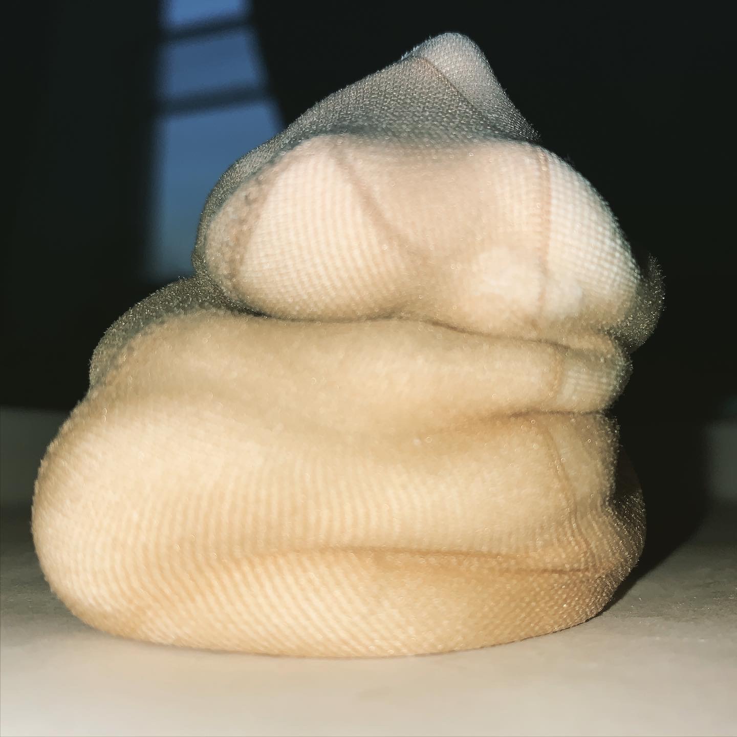
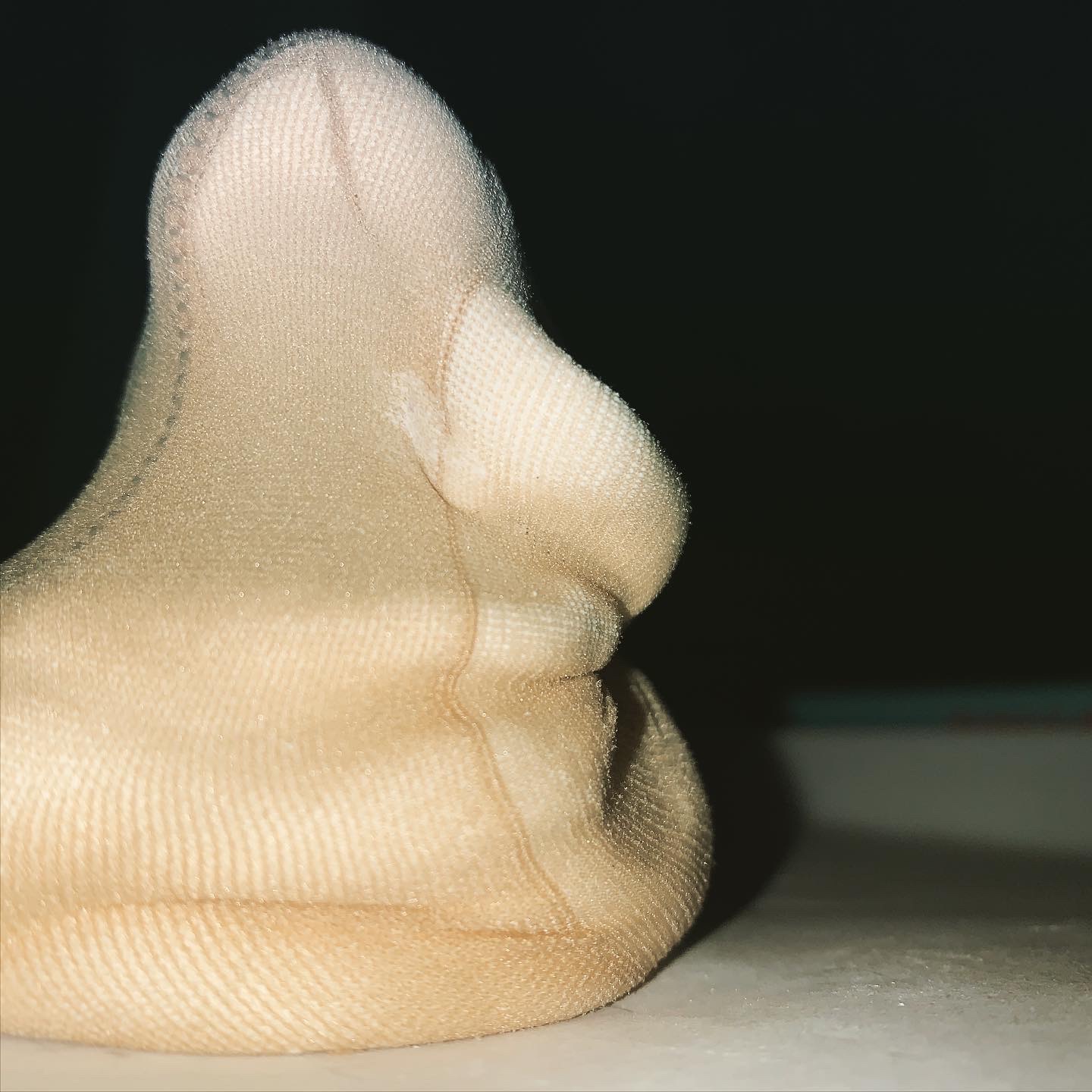
Material forms
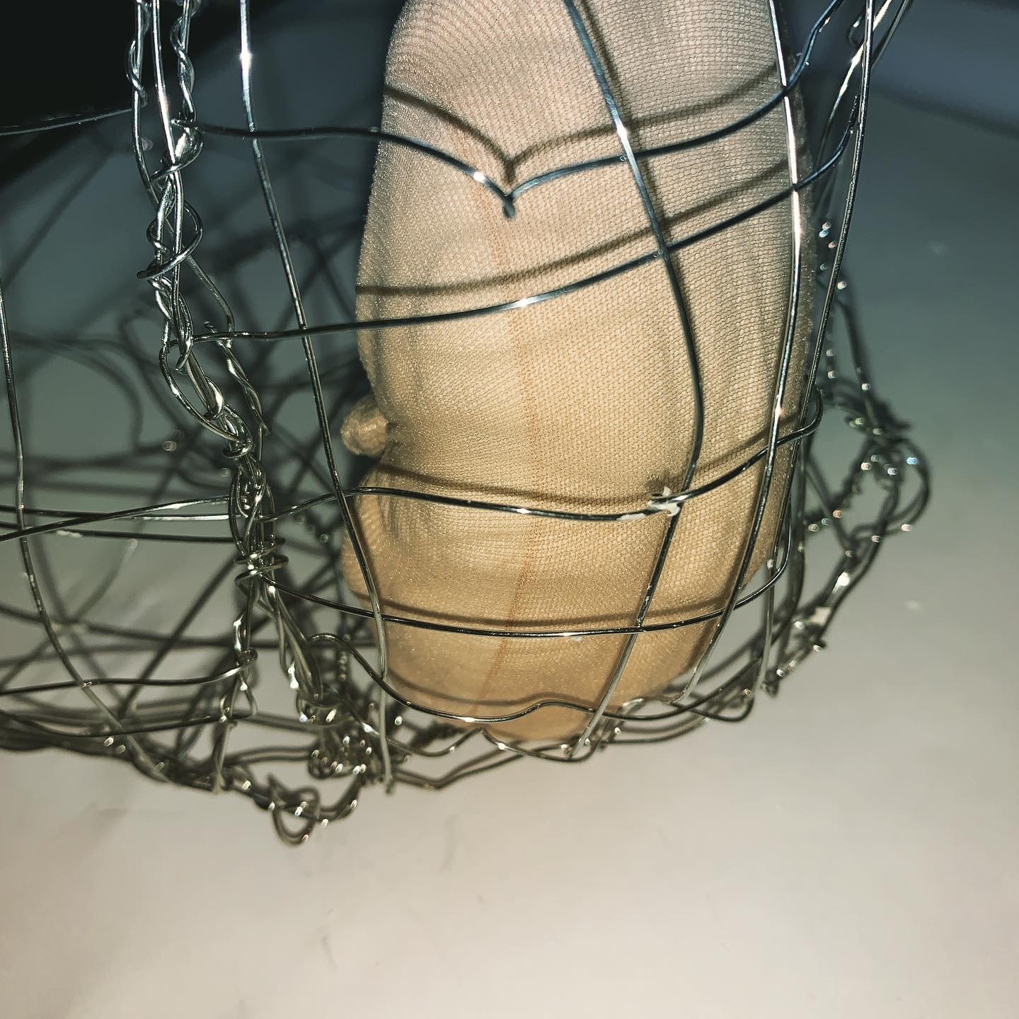
upping the scale and bringing in more materials and elements i played around with trying to almost hold up the soft materials. Manipulating them to fit in spaces and twisting them to fit a specific shape or line i wanted it to follow. I also made a dough like material that resembled my flesh and in someways how i felt. lazy and slouched over all the time. I felt like i too was holding myself up when i just wanted to be flat (like the dough).
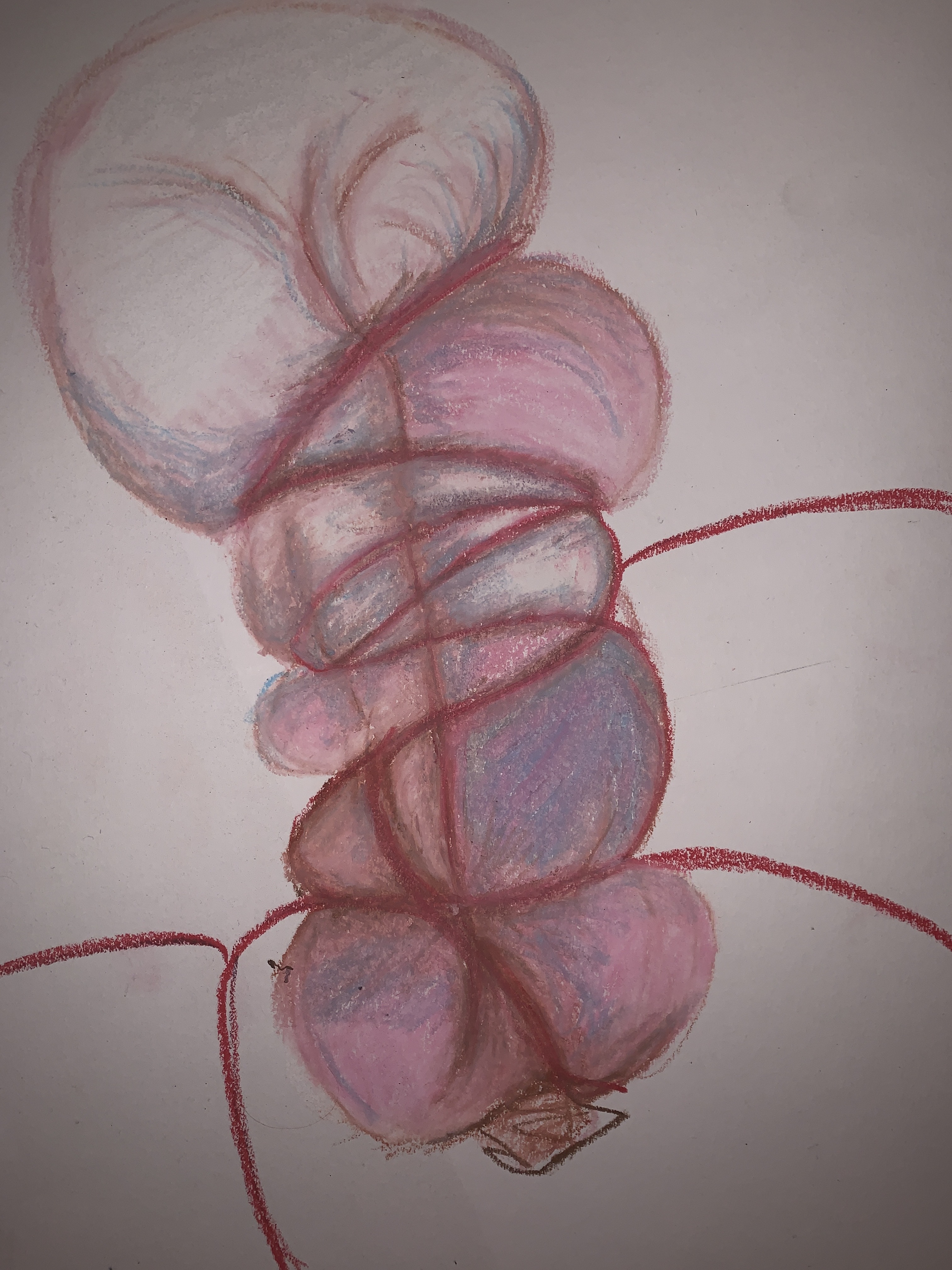
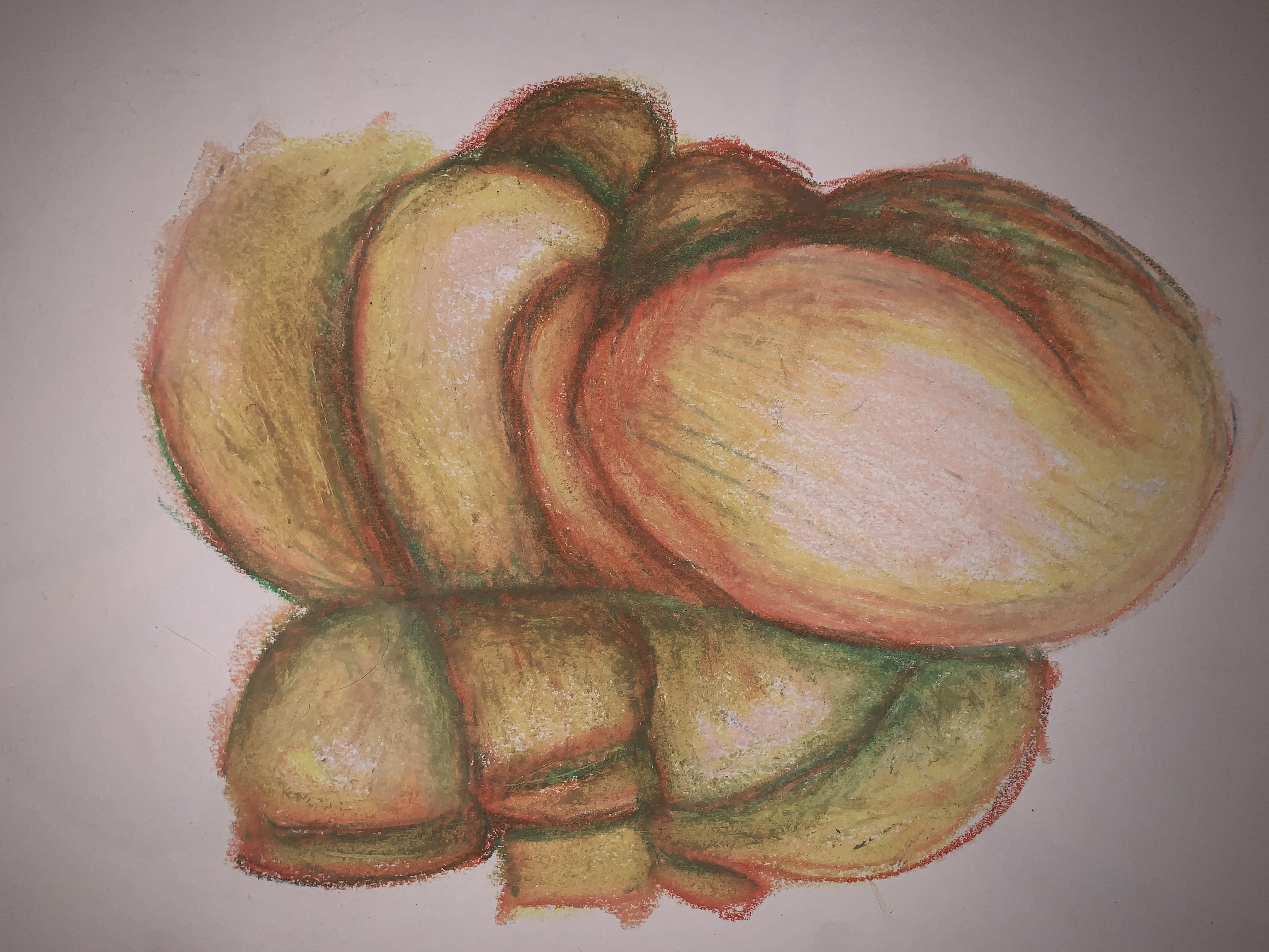
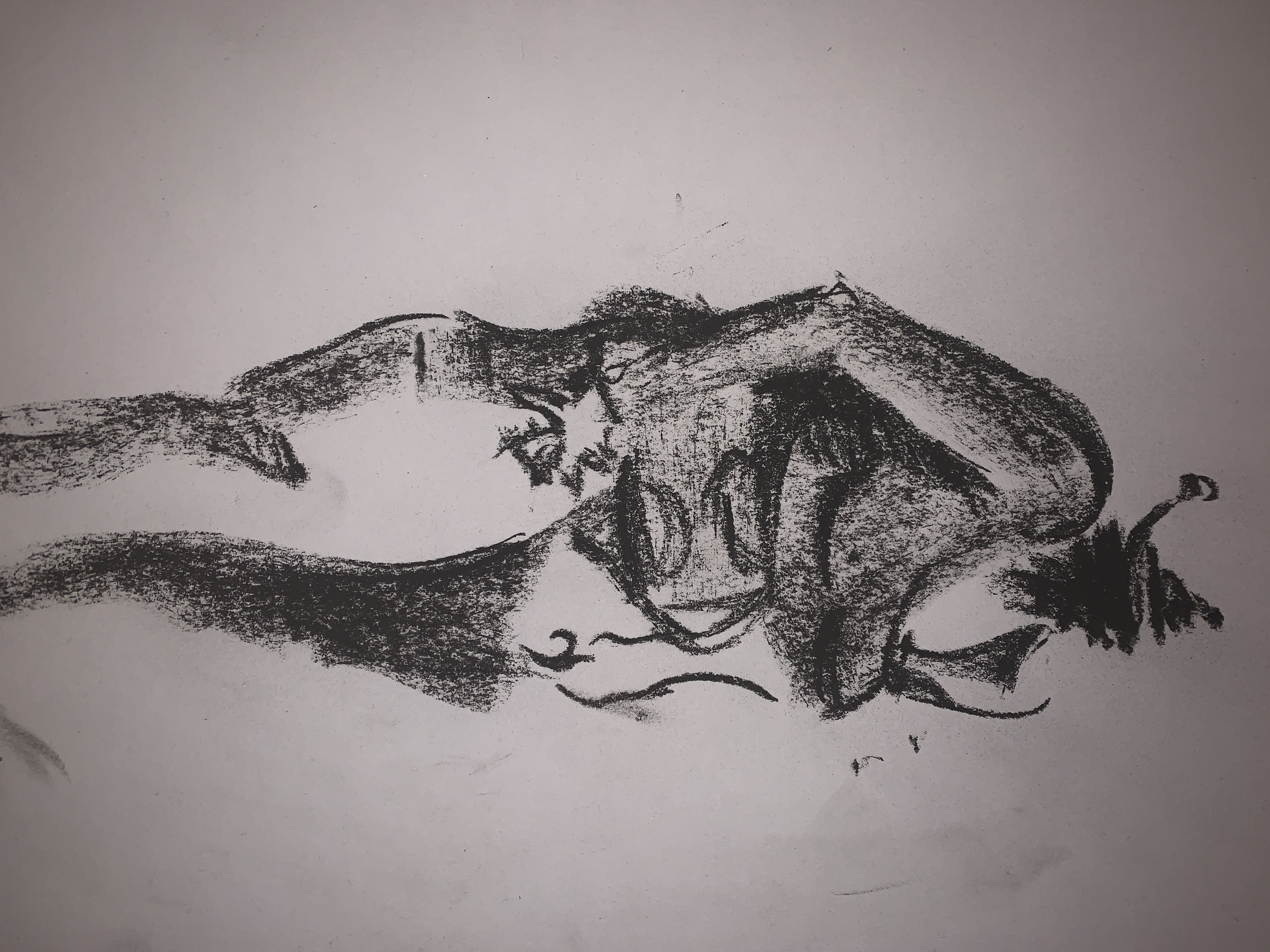
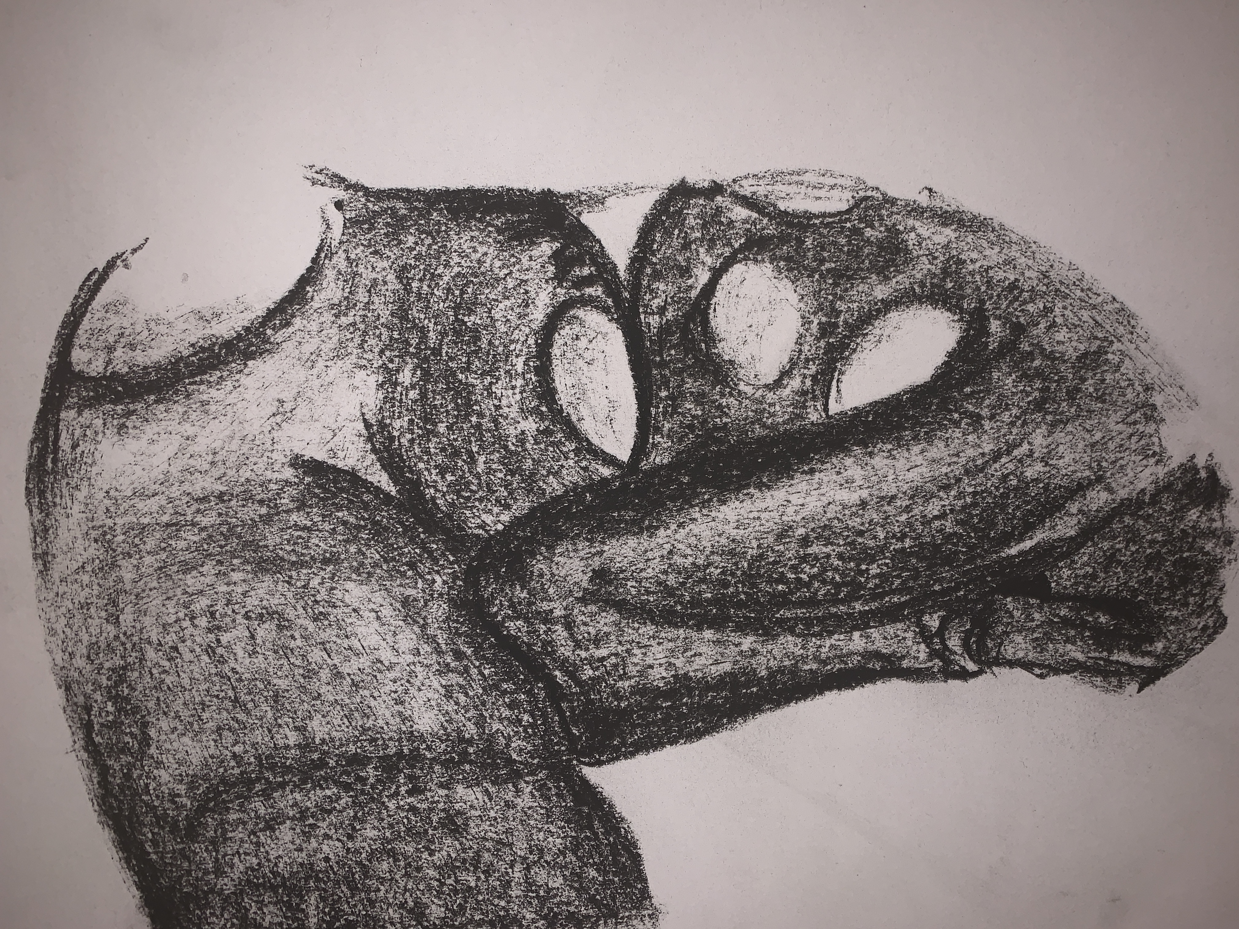
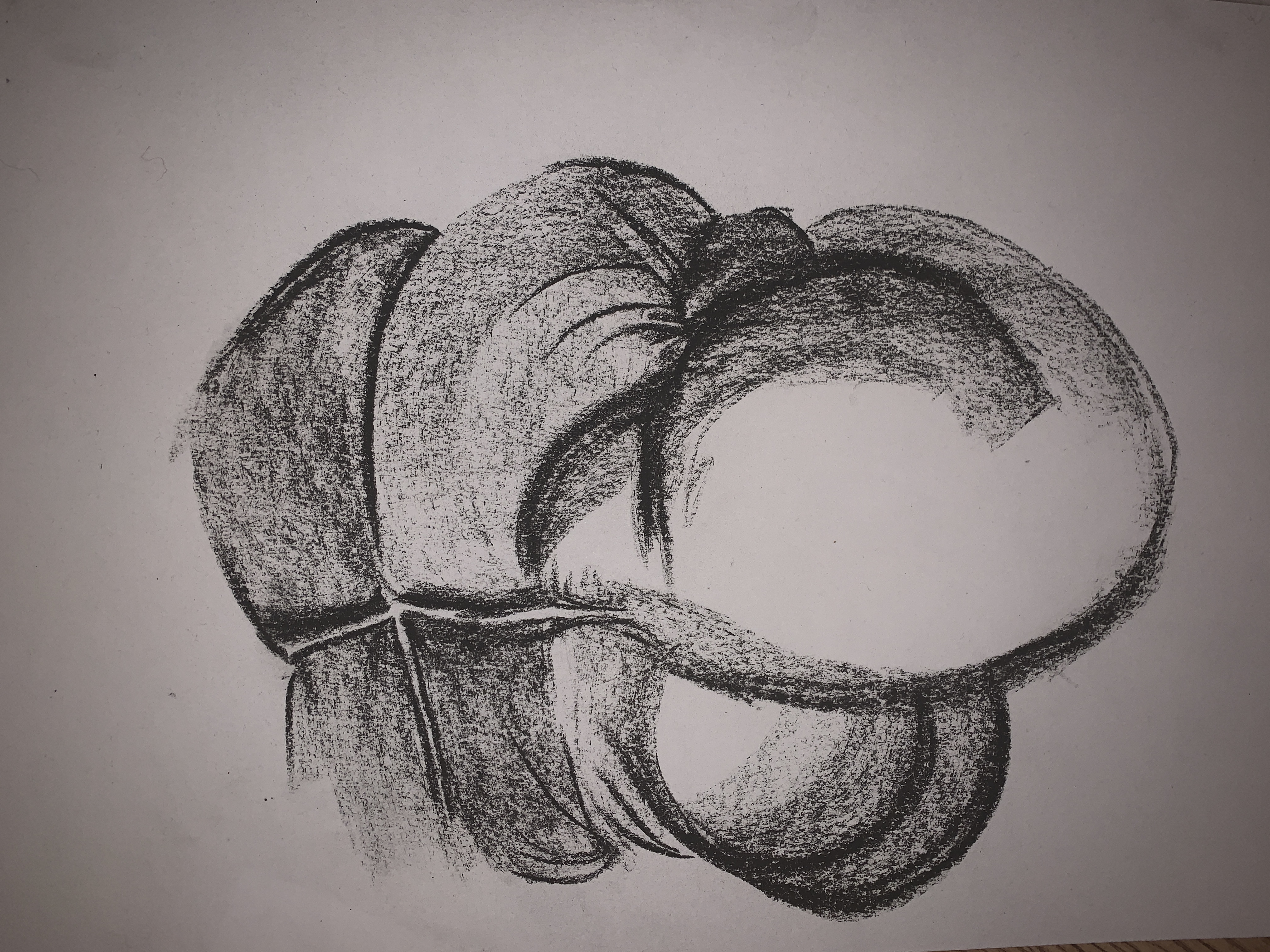
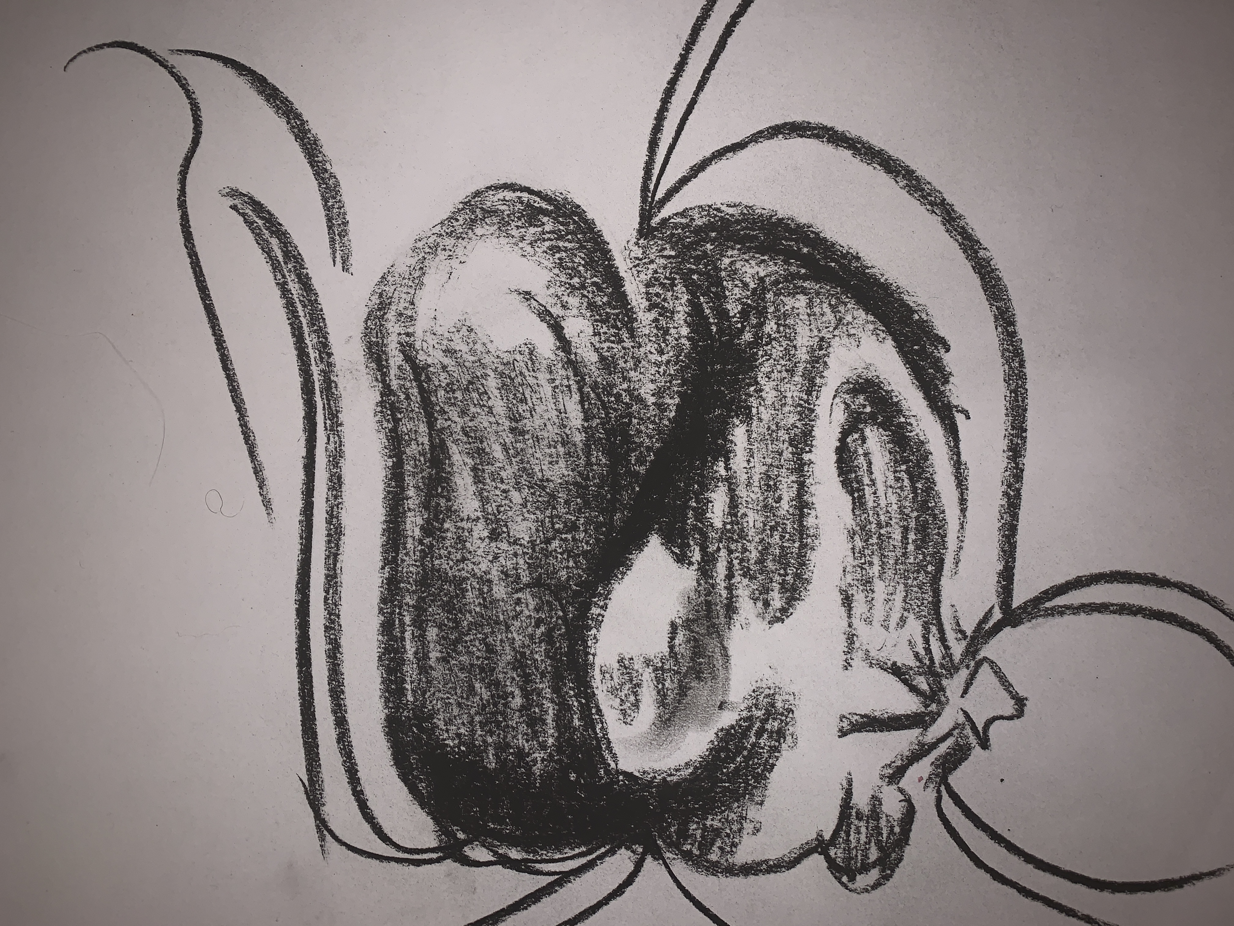
Again i think these 3d forms and sculptures iv made create interesting lines and carry this feeling of disscomfort within them. They also provide a lot of interesting shapes and lines to draw an sketch from.
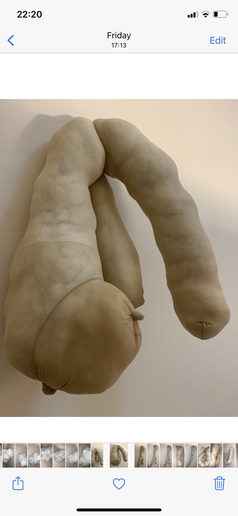
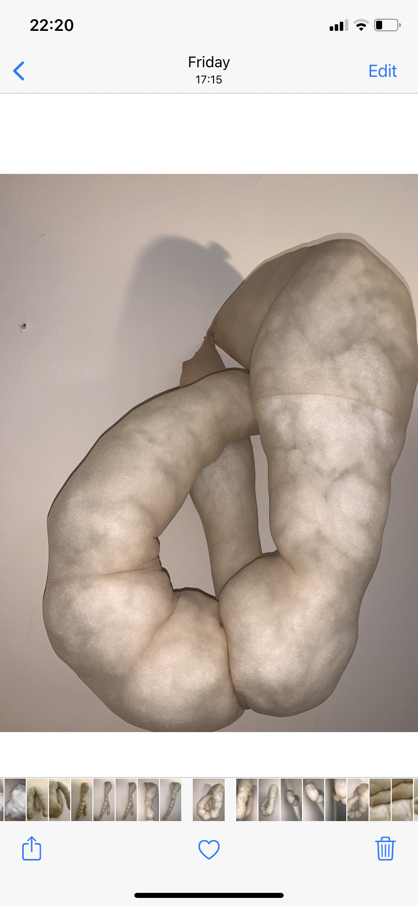
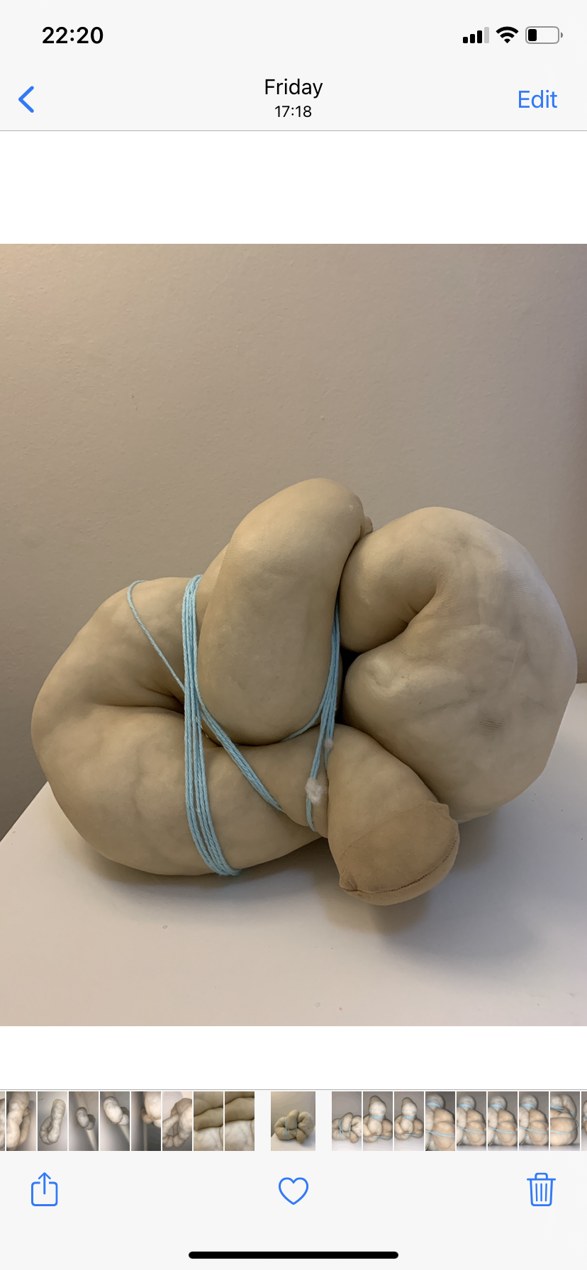
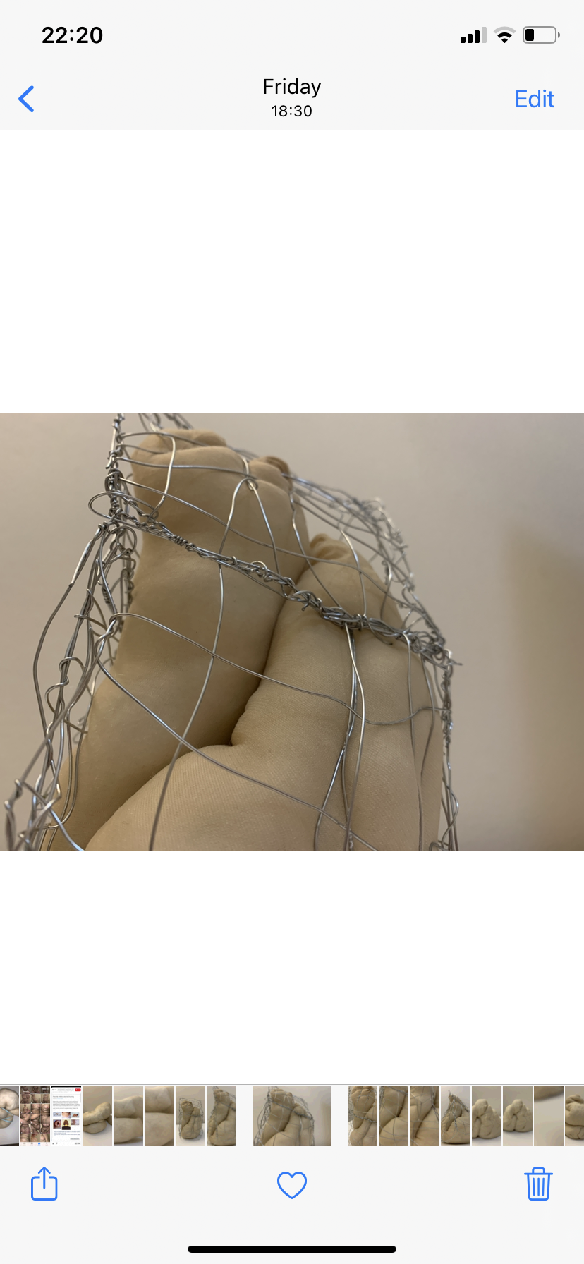
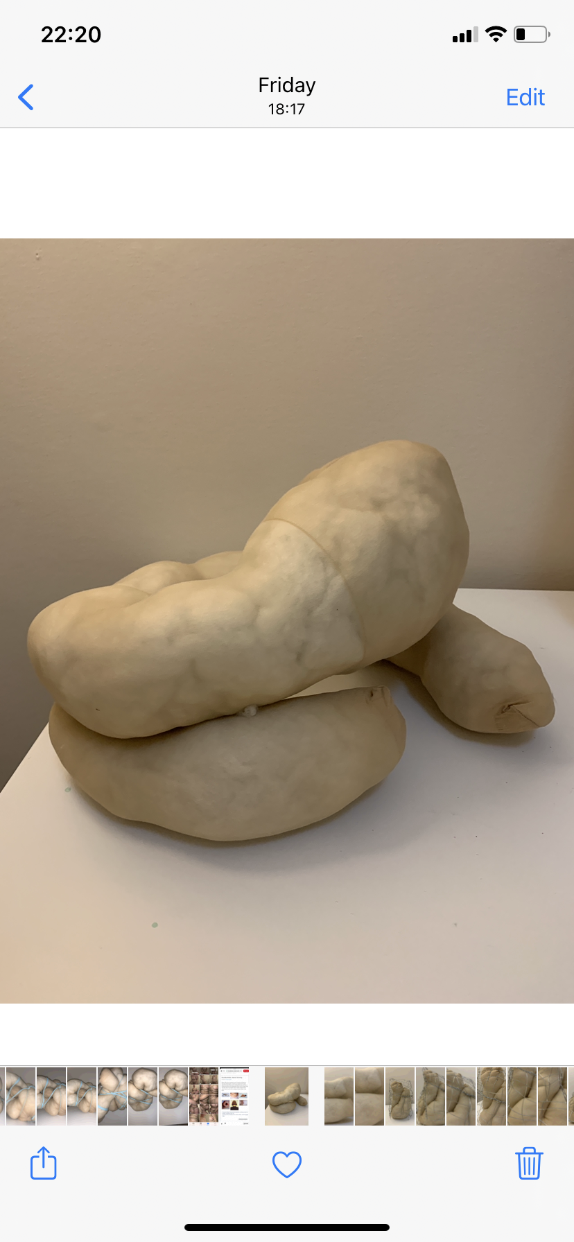
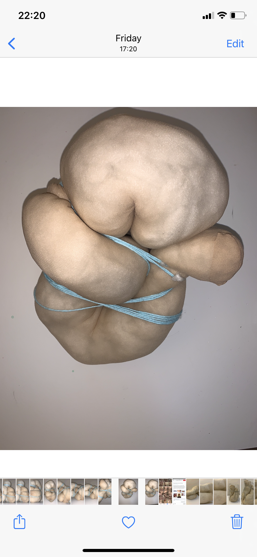
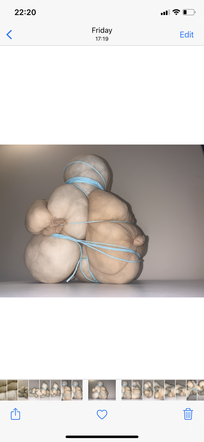
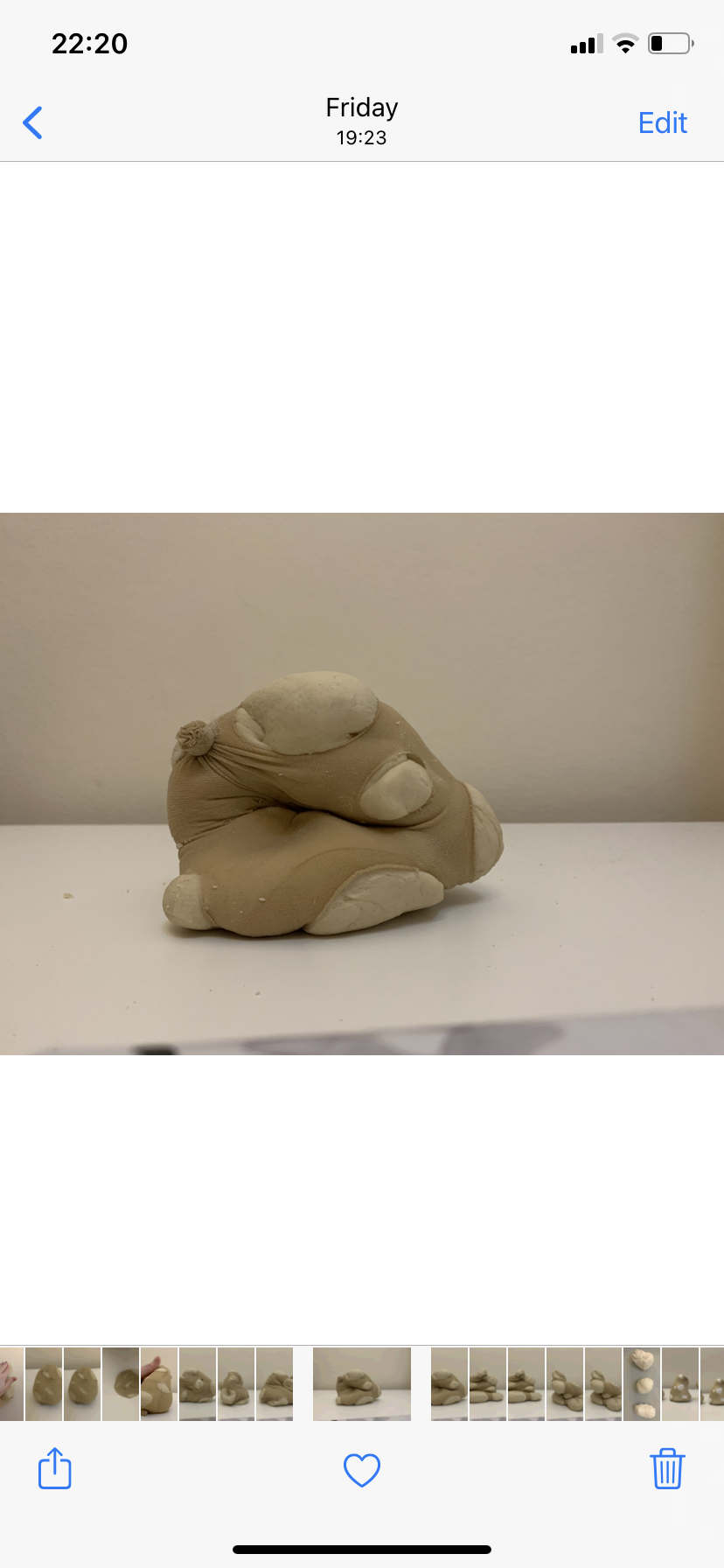
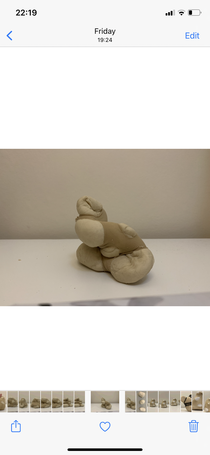
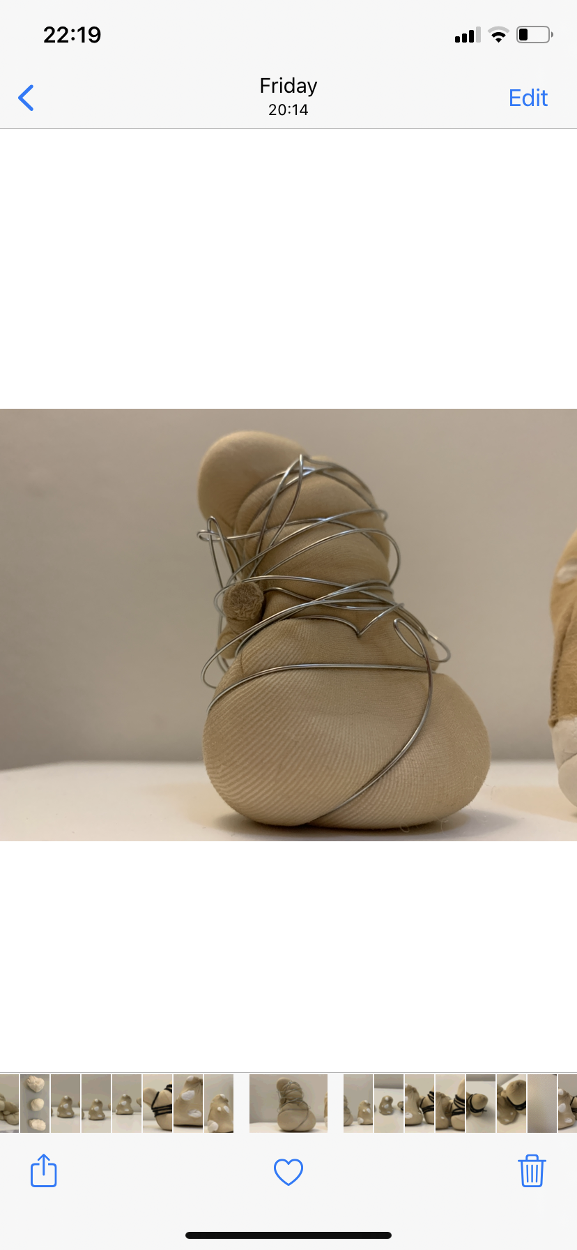
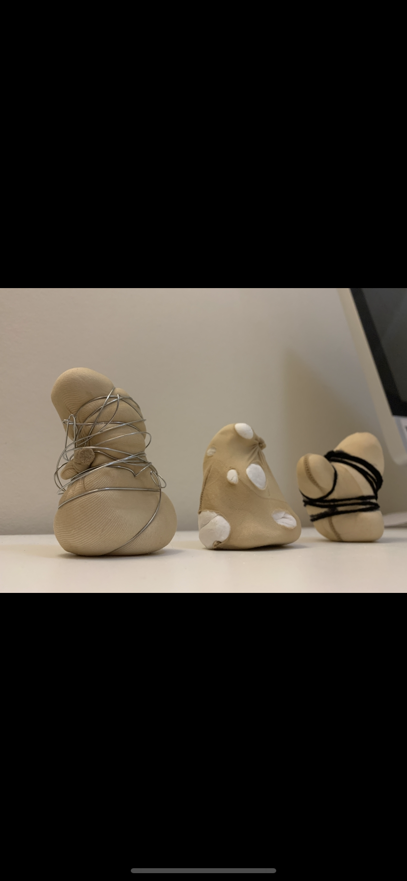
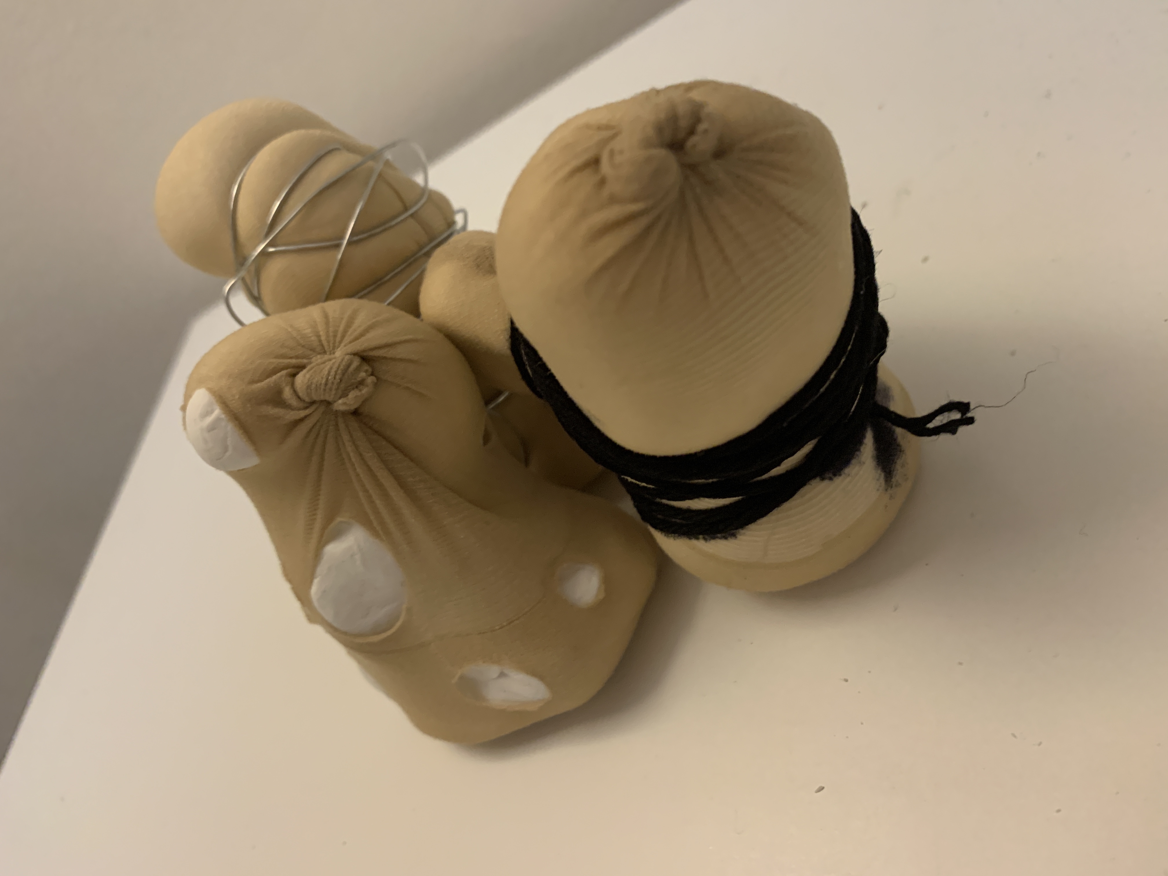
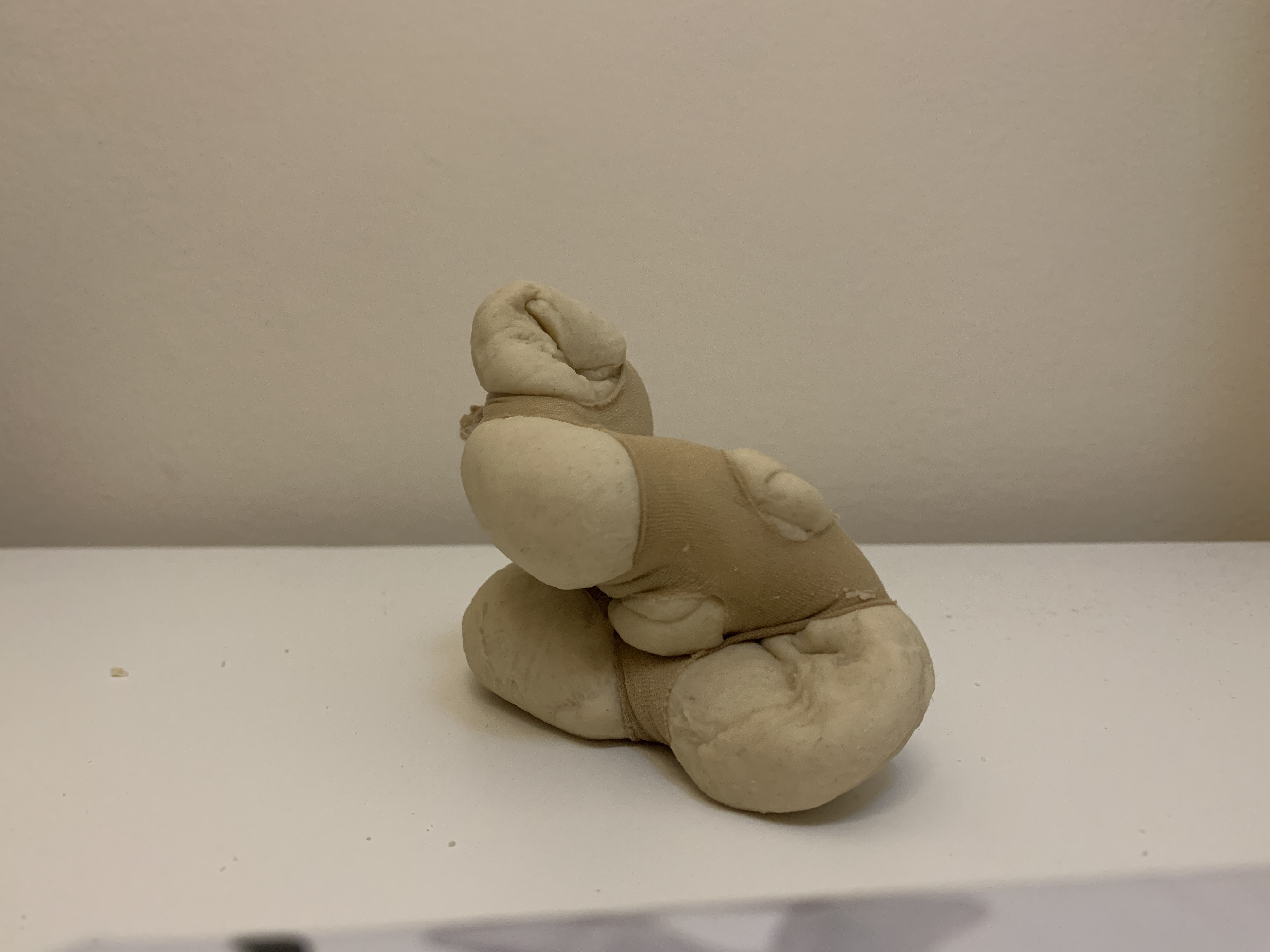
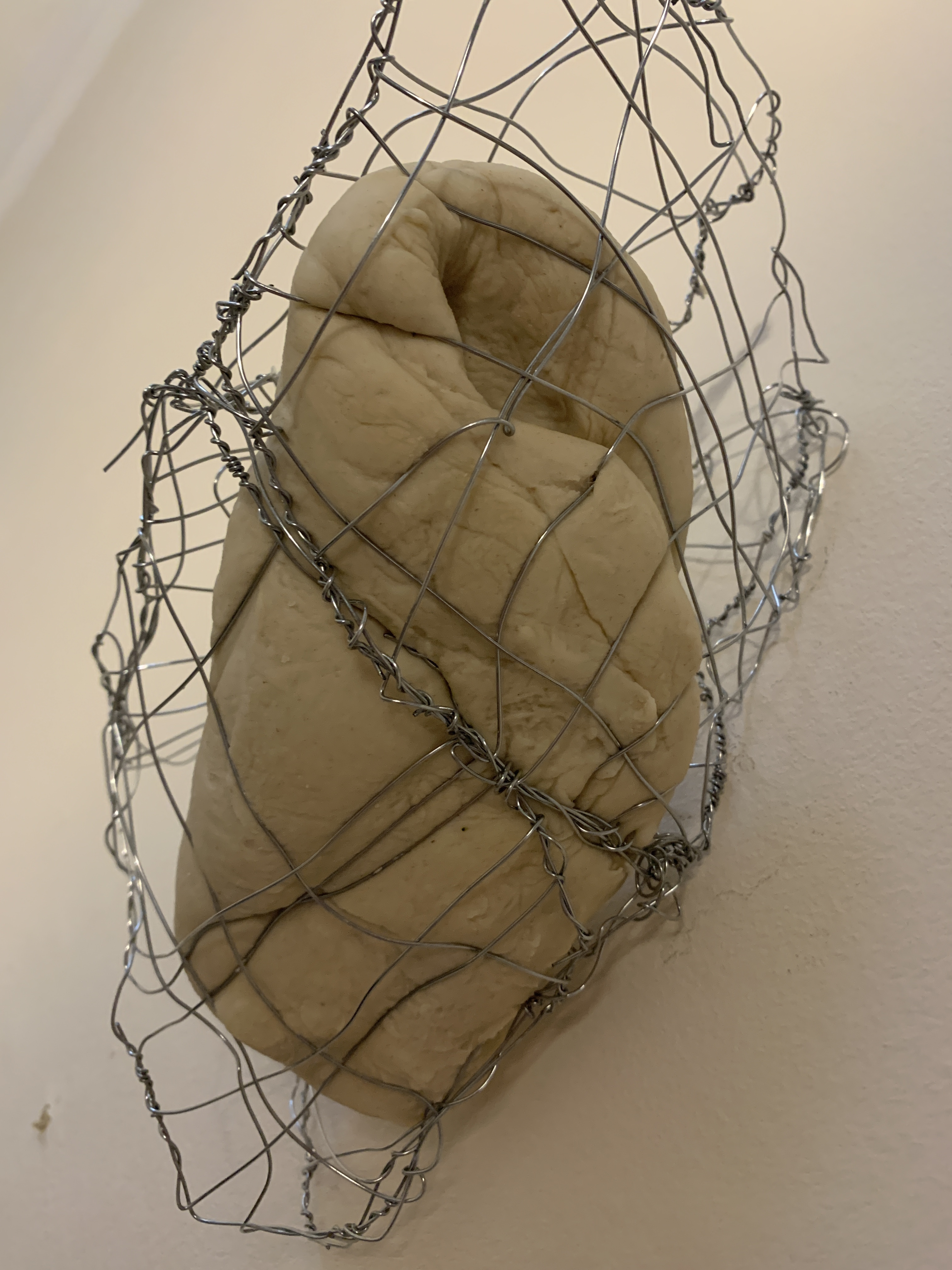
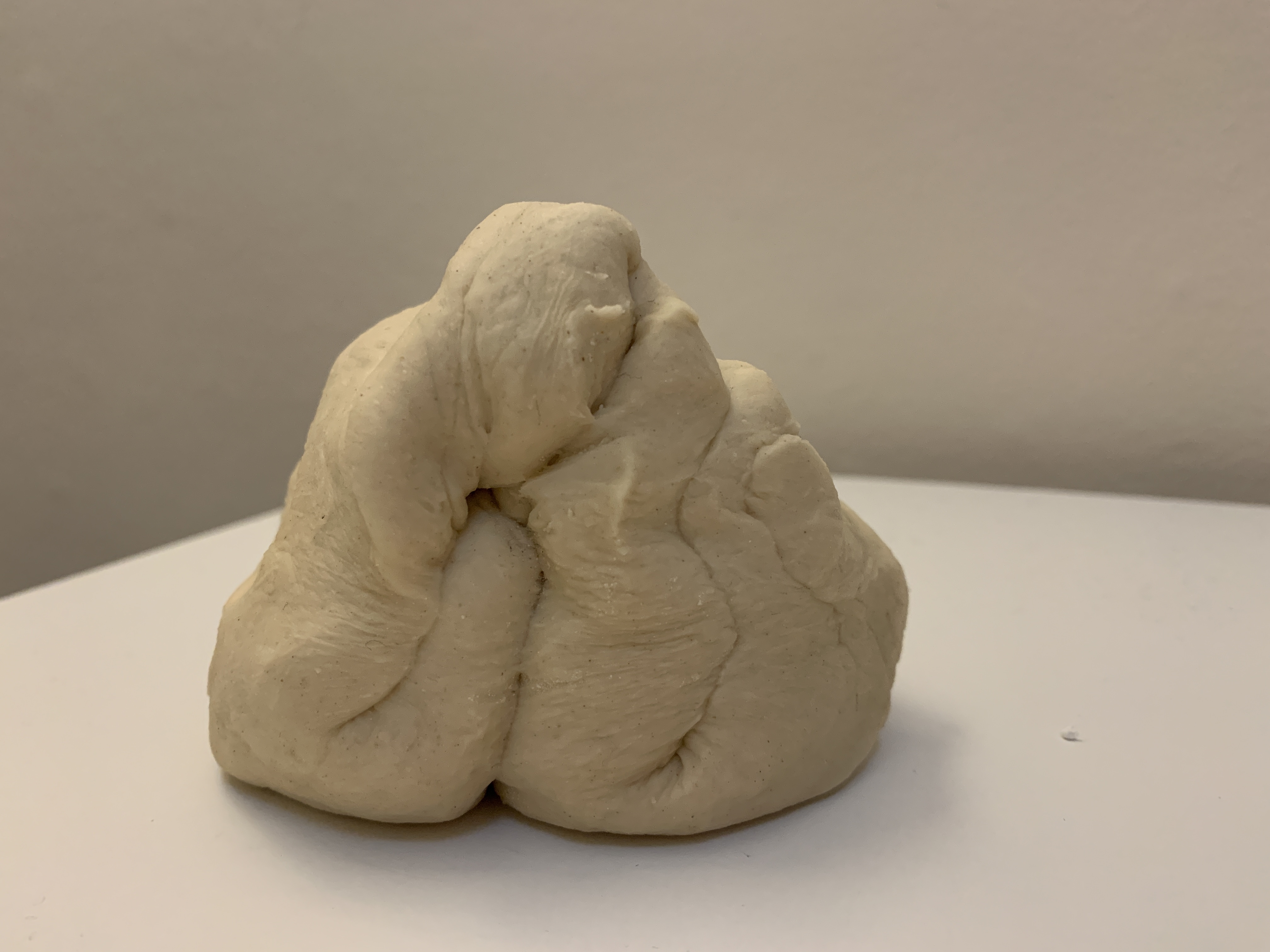
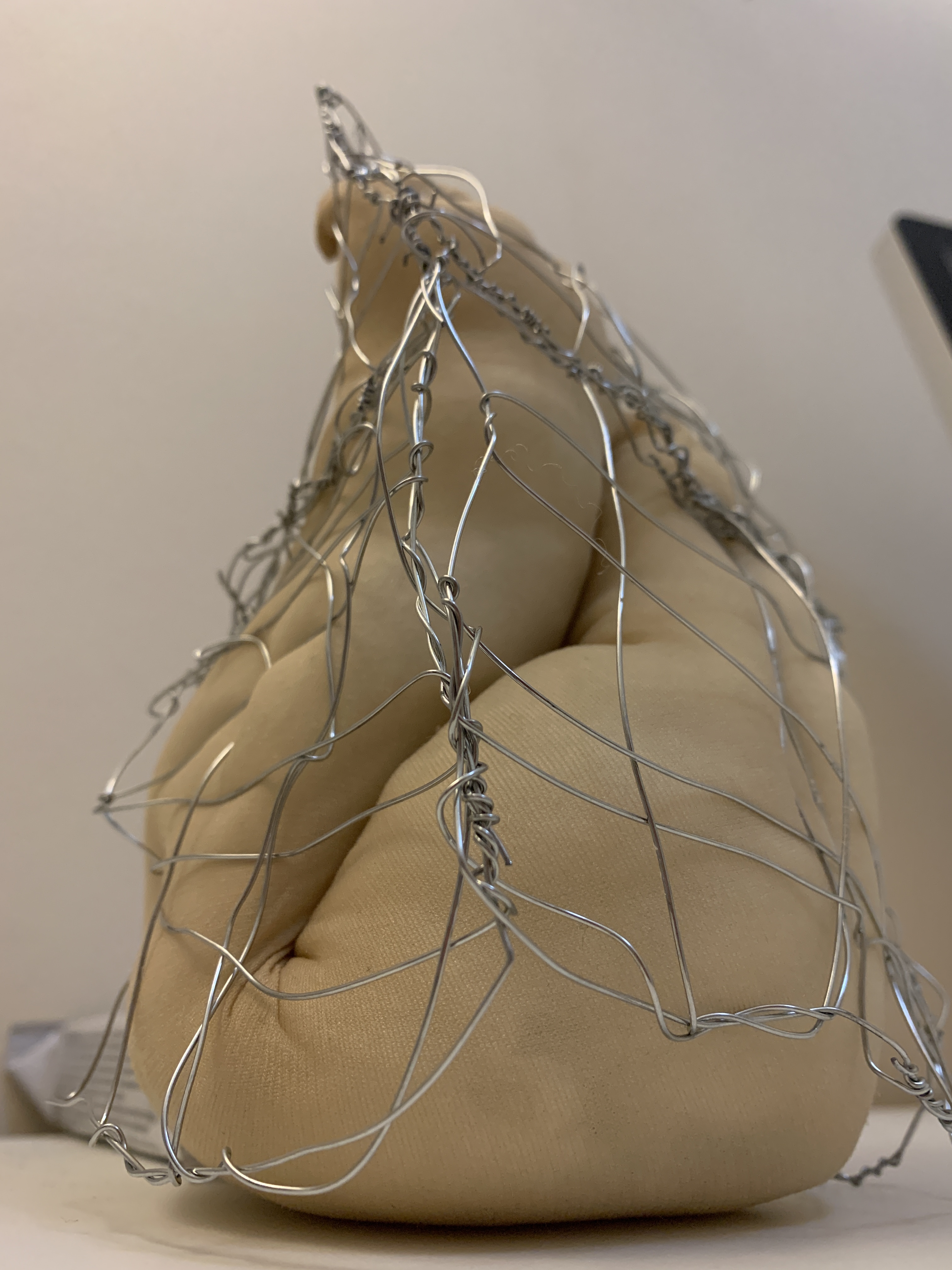
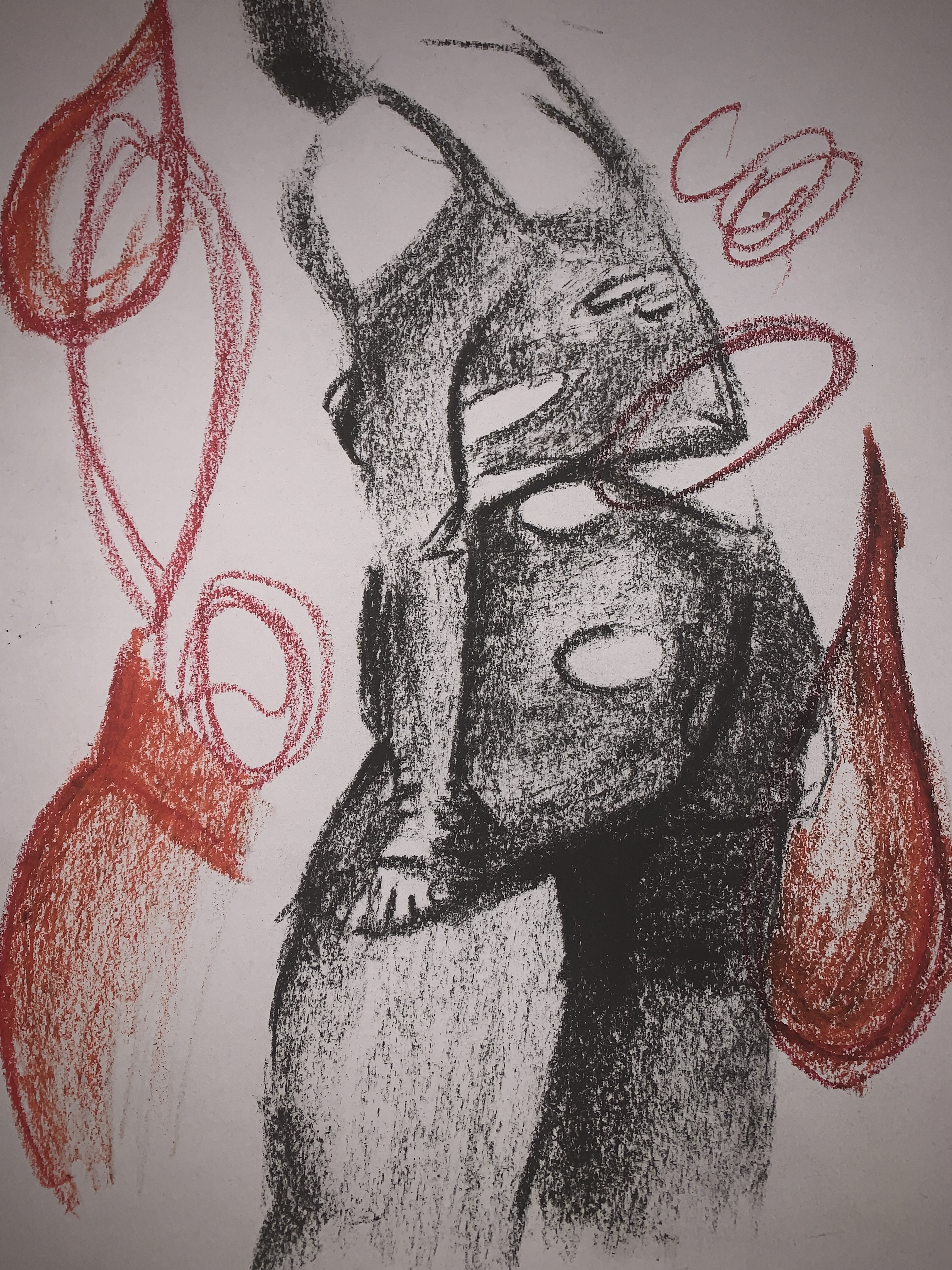
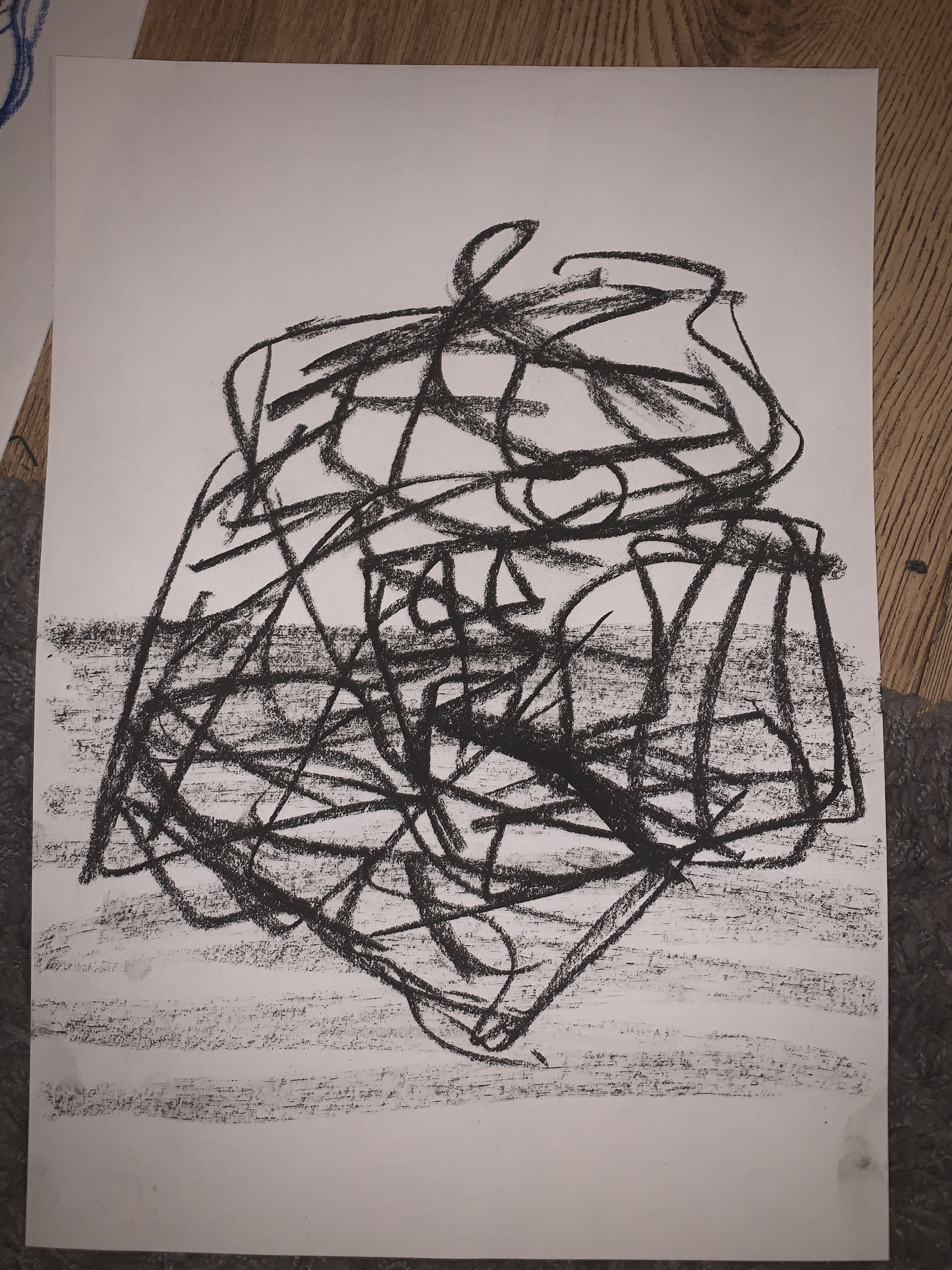
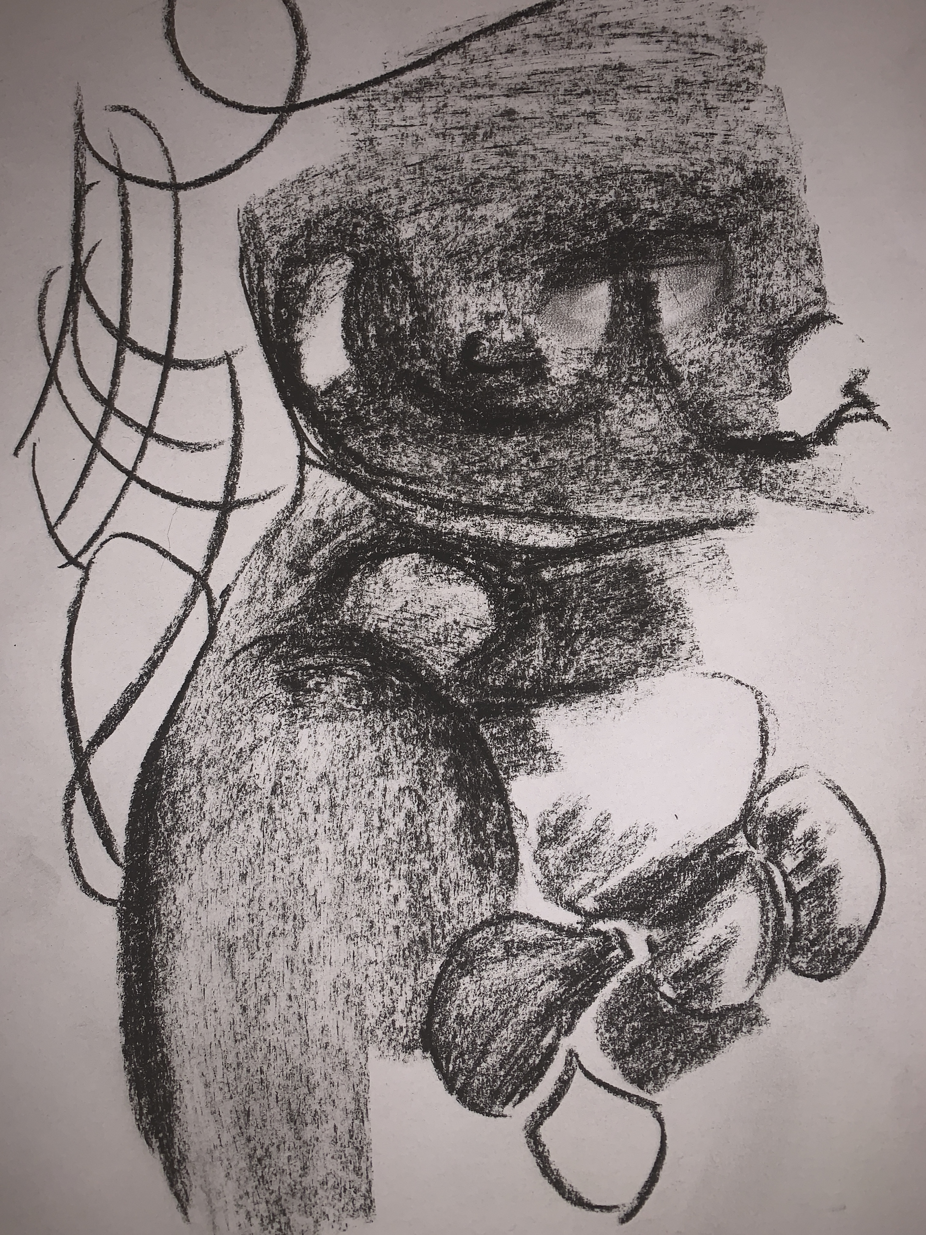
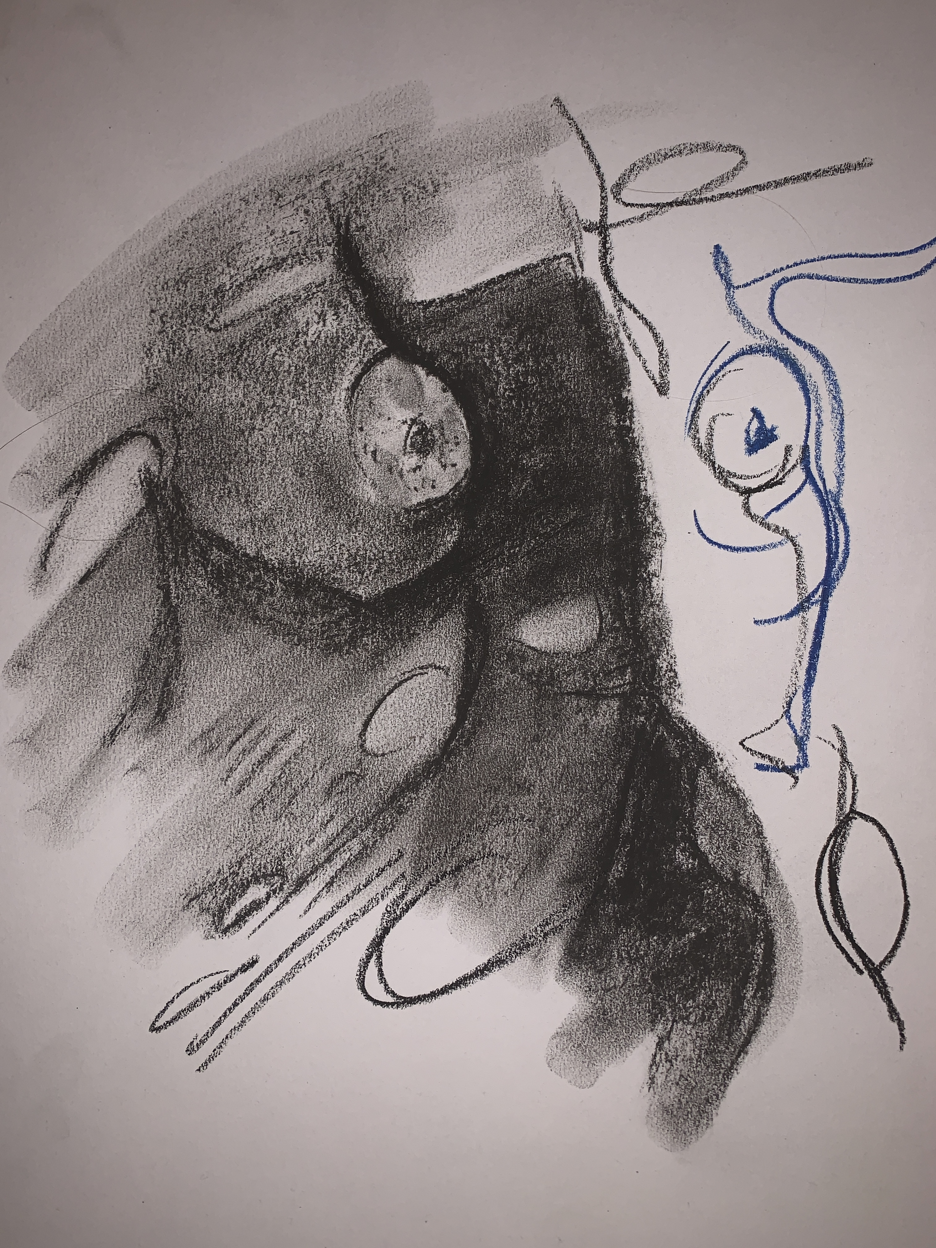
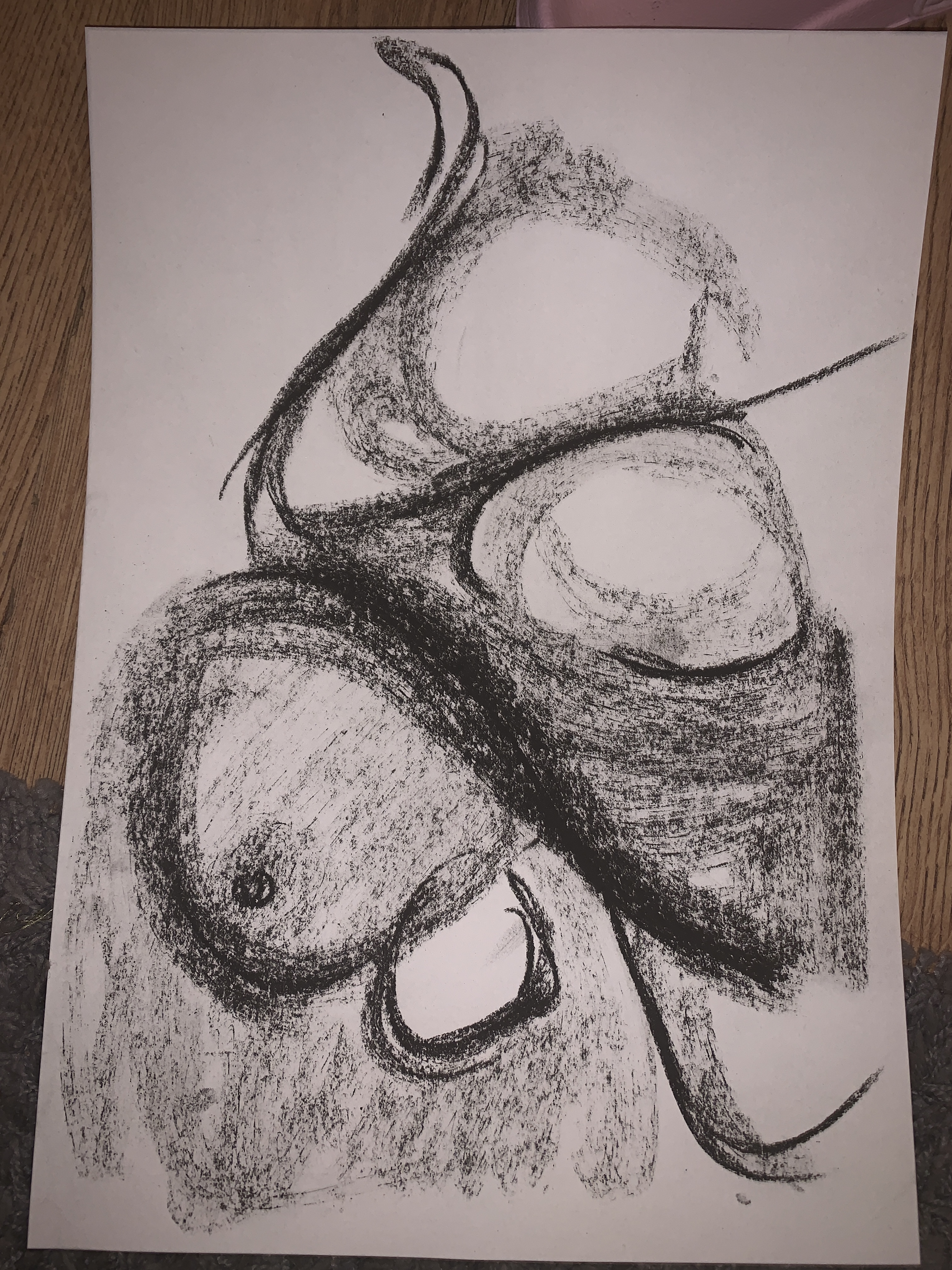
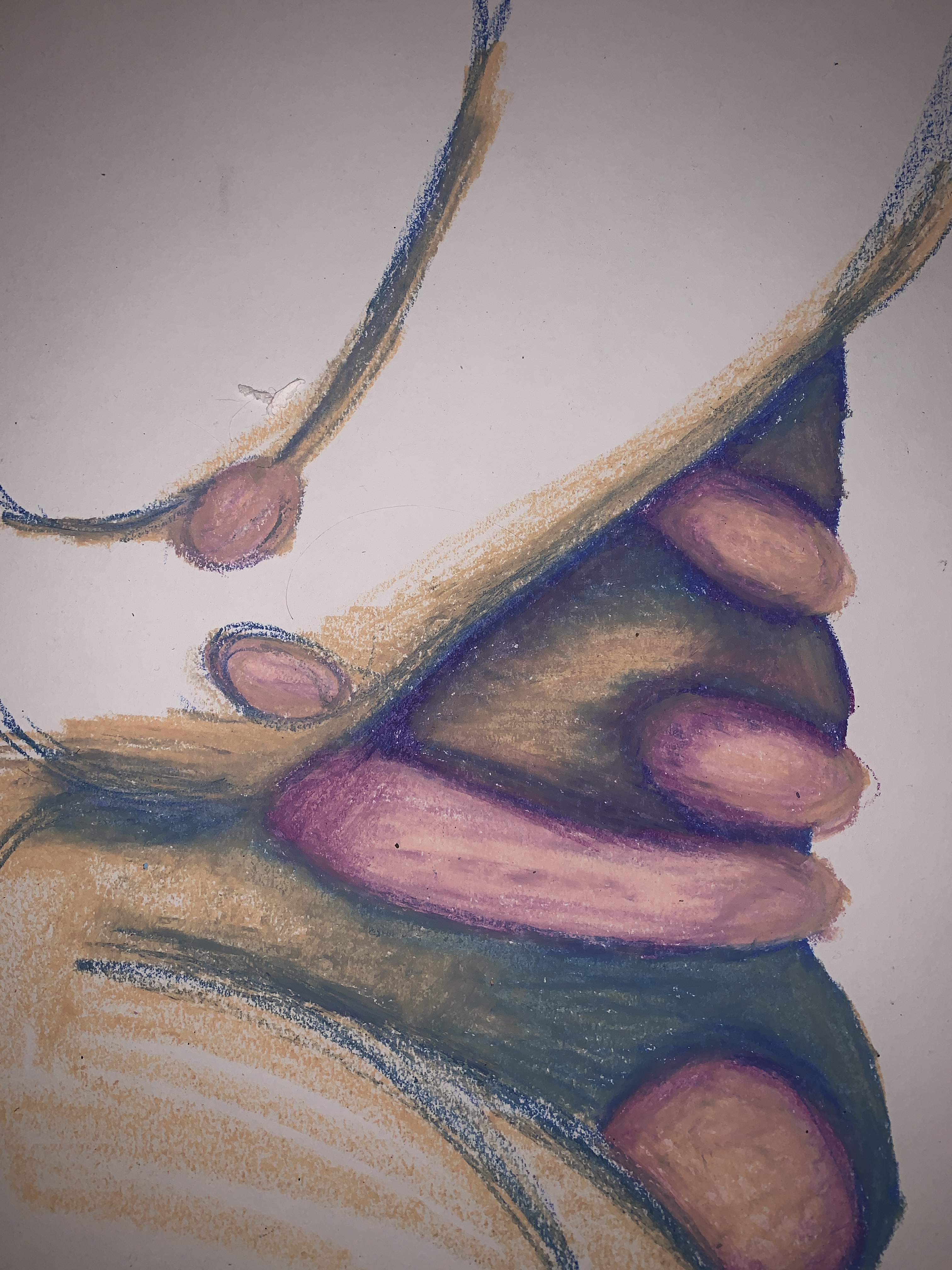
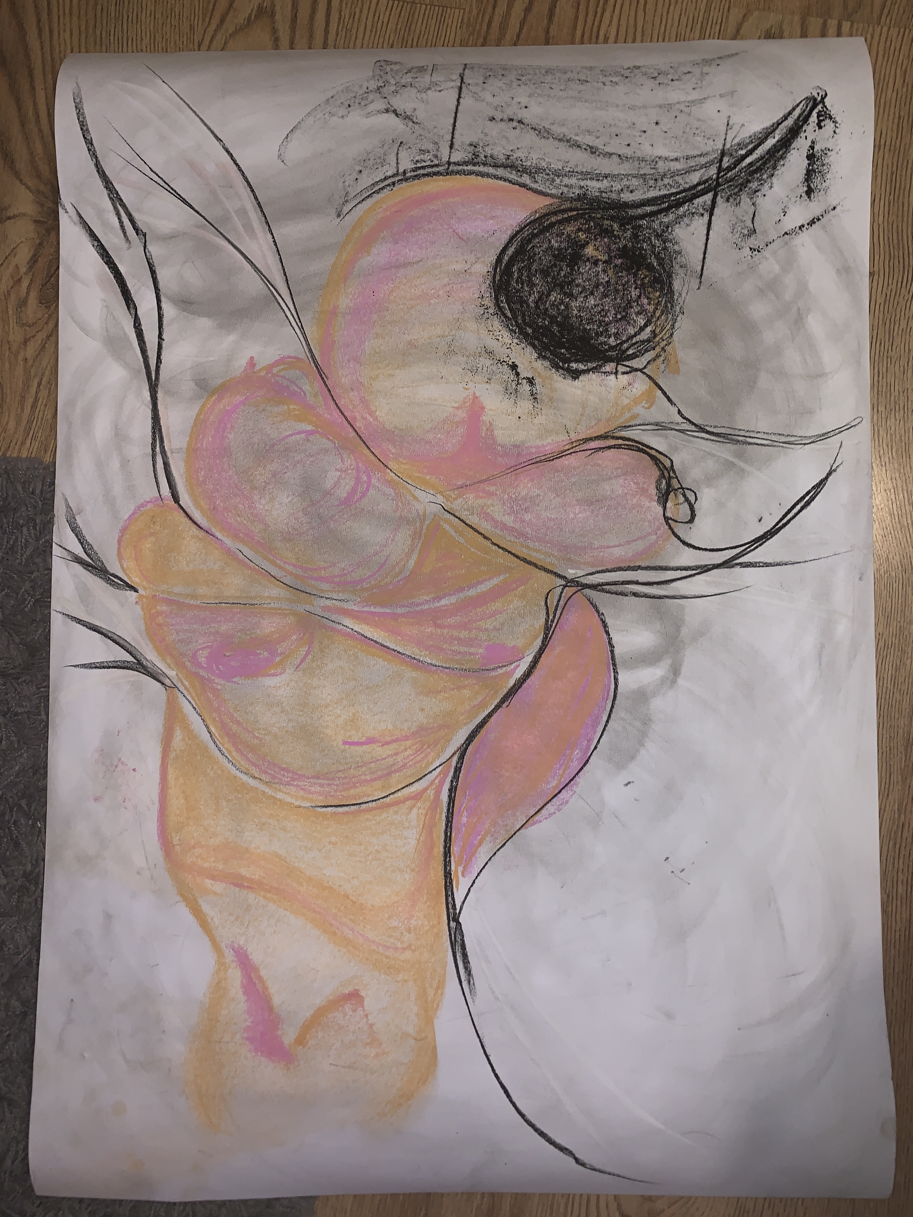
Sketches and drawings made in response to all the 3d work produced over the past 2 weeks.
Artist Research
I decided to make a post about all the artists i have looked at thought the WAWWA project to give some context to my work outside of my sketchbook.
Sarah Lucas

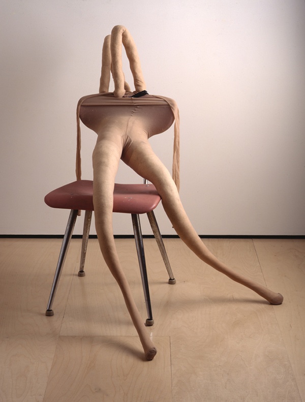


Lucas is part of the generation of YBA’s who emerged during the 1990s. Her work centres around themes of feminism, sexuality, gender and identity. In the early 90s she began using furniture as a substitute for the human body, usually with phallic imagery attached. The artist attaches sexual and humorous connotations to every day objects and materials. I like the artists use of materials and how she creates these different forms with sexual undertones.
Her work also included repeated images and symbols relating to the female body and the female experience. This has influenced how i view myself when creating work. Weather thats taking images of myself or making 2D work that represents the female form. As well as this i have used similar materials in my own practice with the intention of creating something that eludes to a human form without being too specific.
Phyllida Barlow

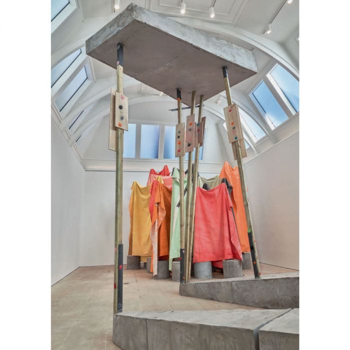

Phyllida Barlow continues to be a big influence o my work as you can probably tell. Her creative process of moving between 2D and 3D work is something I routinely do in my own practice. Her use of colour and materials again influences my work as her sculptural work relies on the space it occupies to communicate scale. I took this into consideration when making 3D models and taking images trying to image them filling a room and how they my be perceived depending on the environment they are placed in.
I also focused a lot on how Barlow creates the illusion of wight and pressure despite the material she is working with, something incredibly light and hollow (fabric) she manages to manipulate in order to appear overwhelming and heavy. I have tried to implement this in my own way of working due to my lack of access to materials an space. So making something appear a-lot heavier and larger than it is has become a new skill for me.
The artists work always achieves this illusion of physical pressure and gravity regardless of material or location.
Bruce Neuman
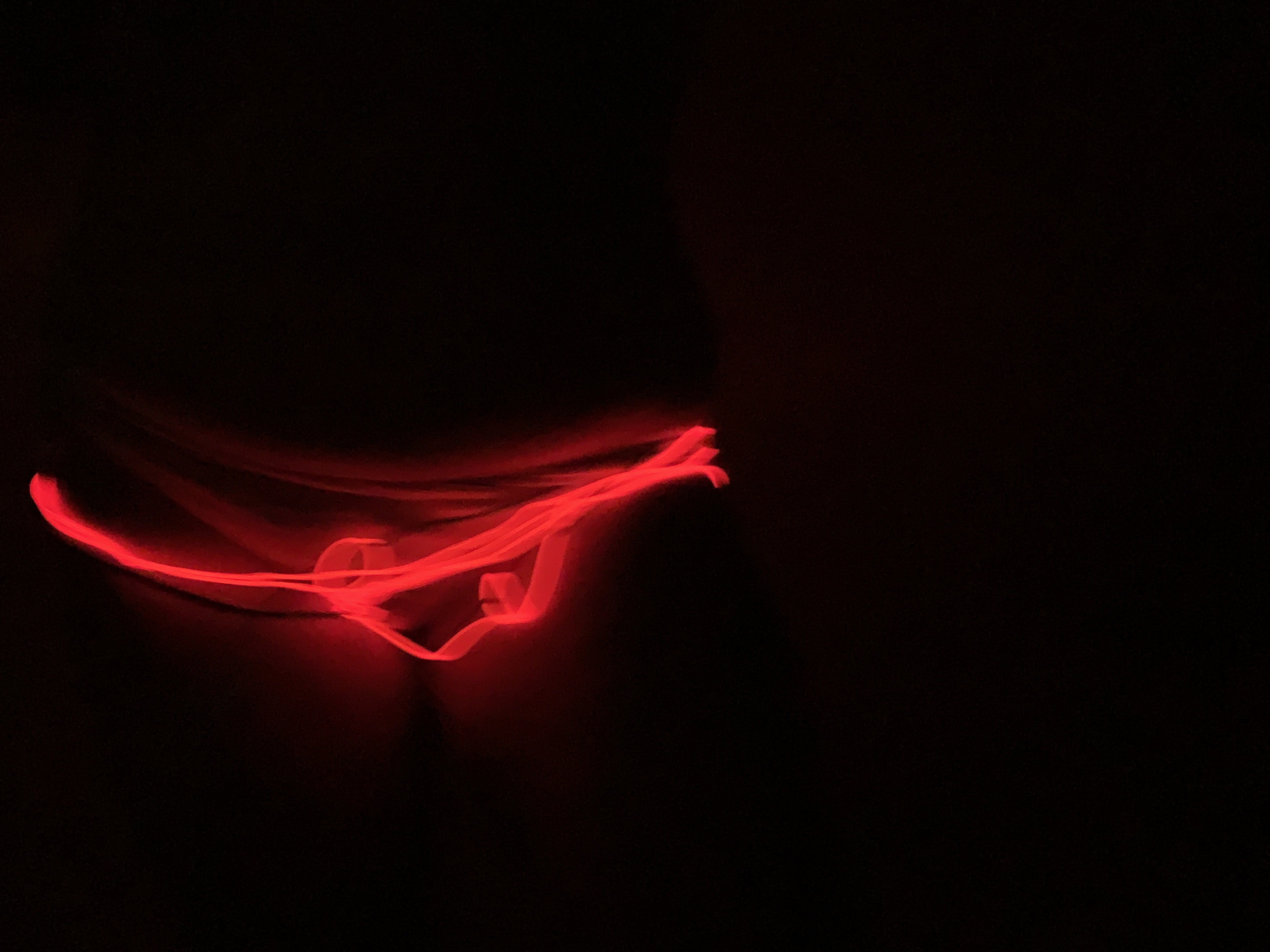
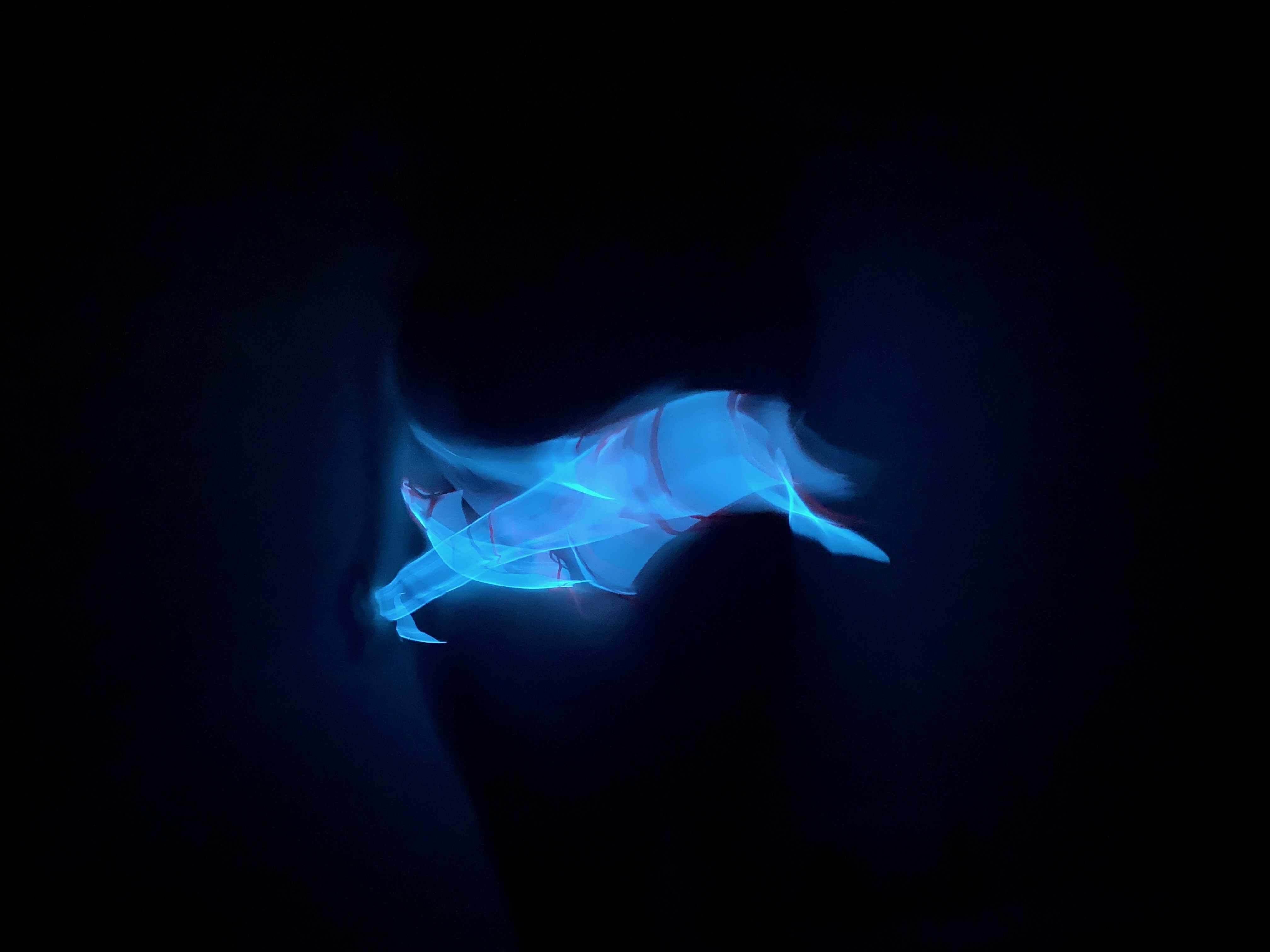
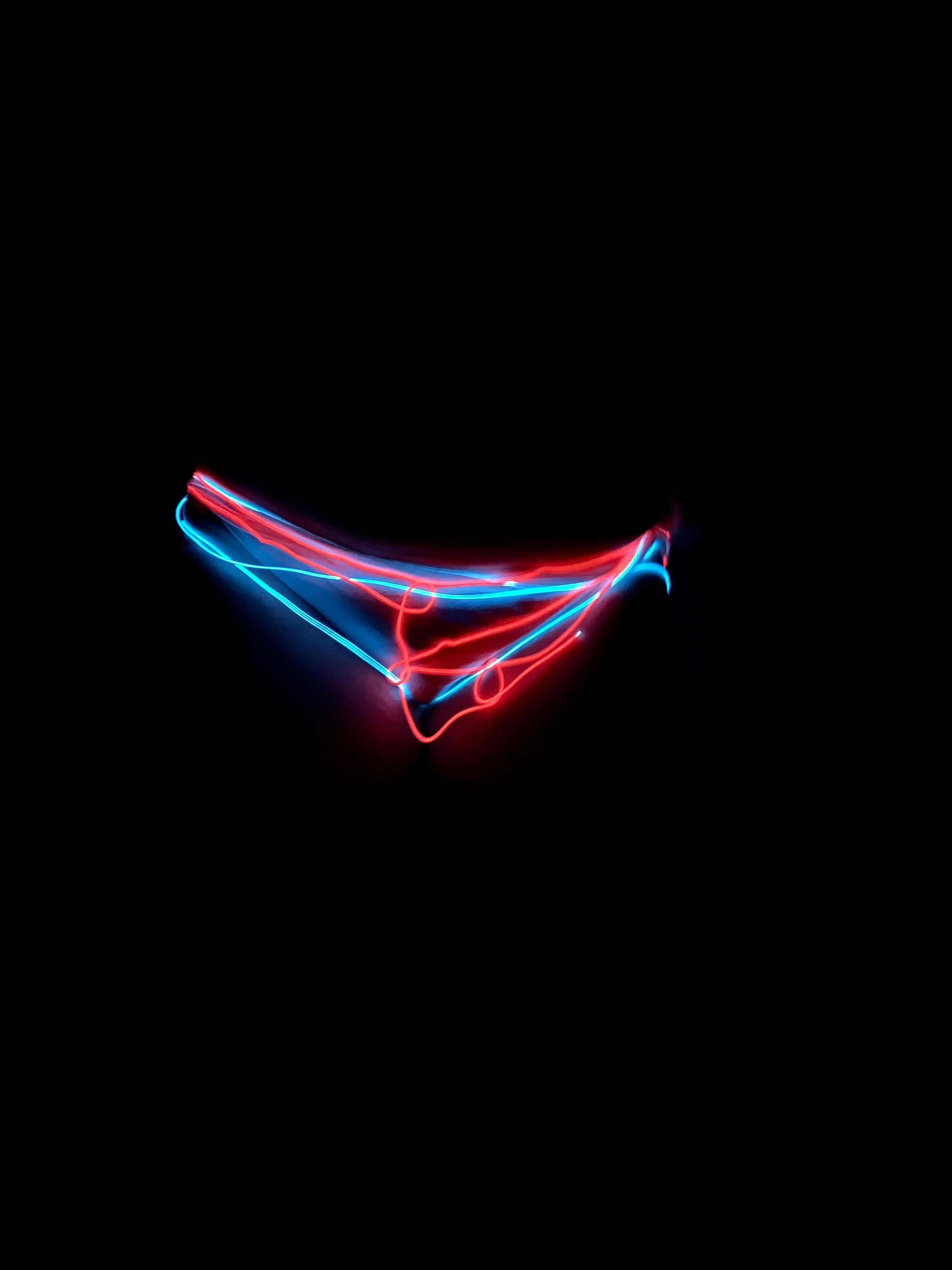
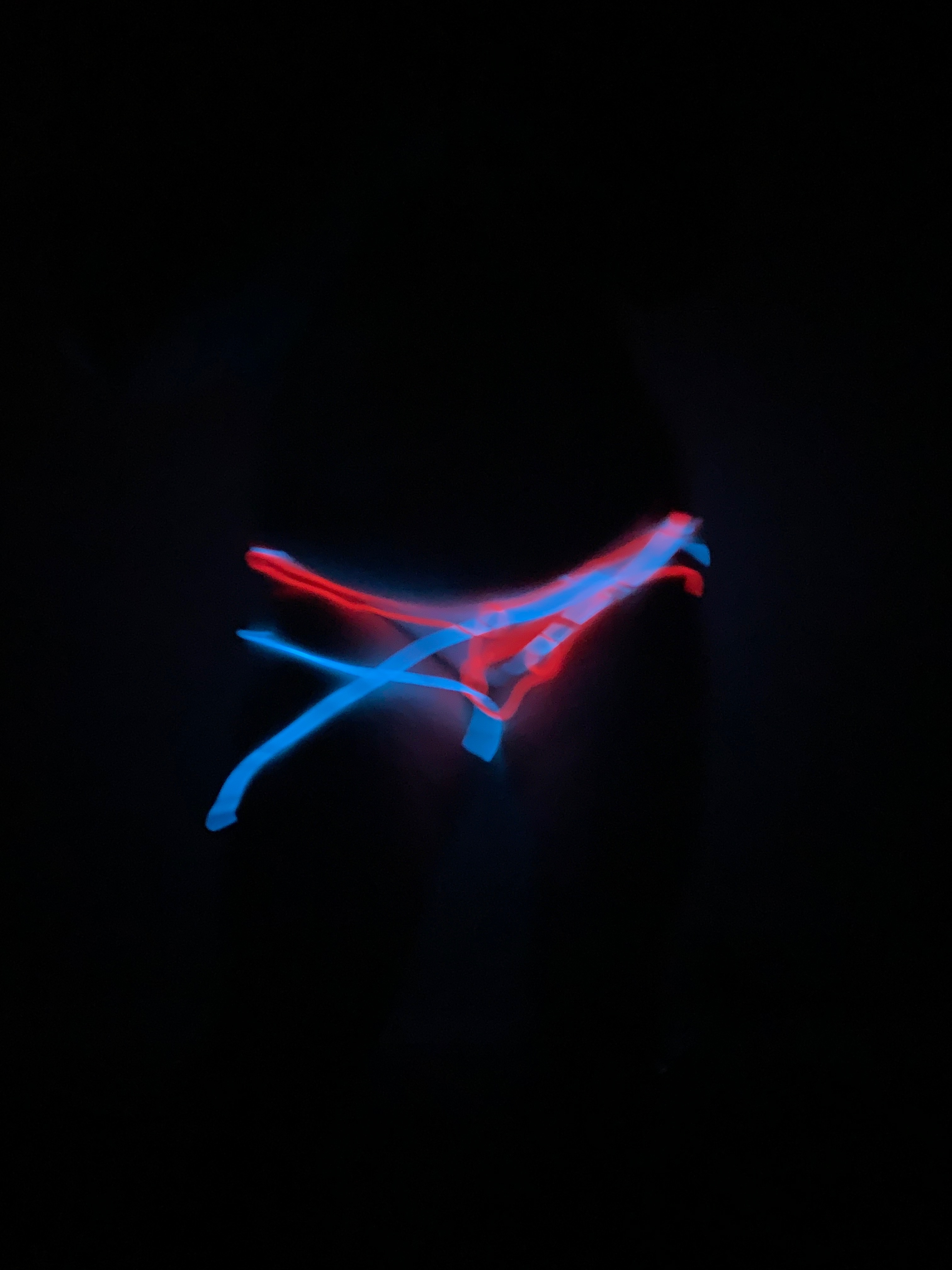
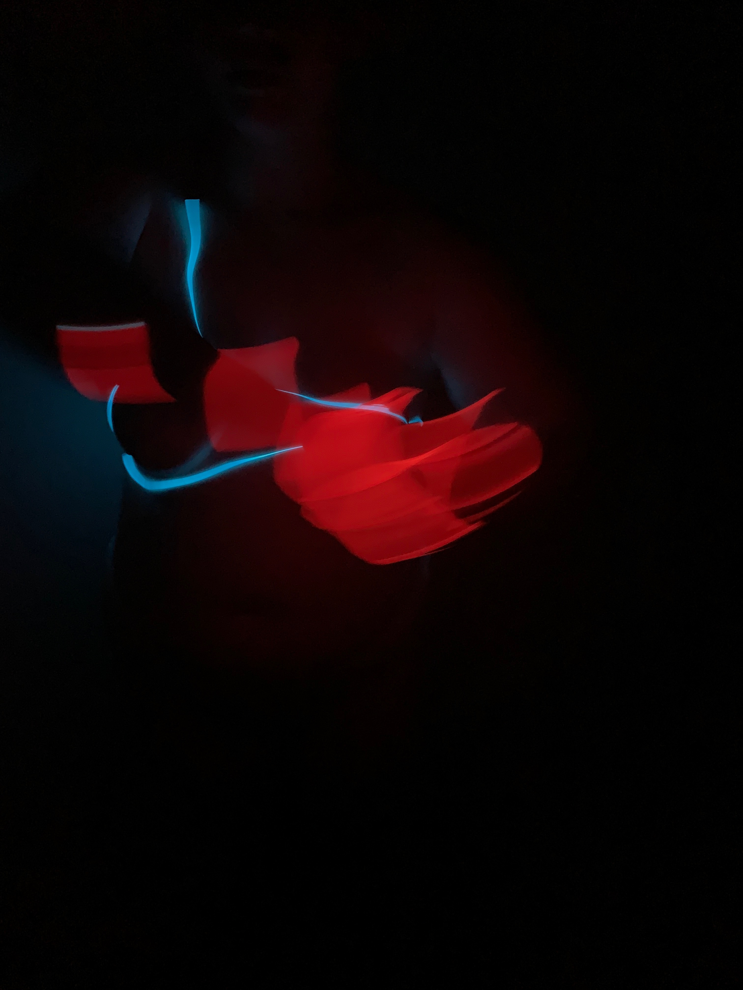
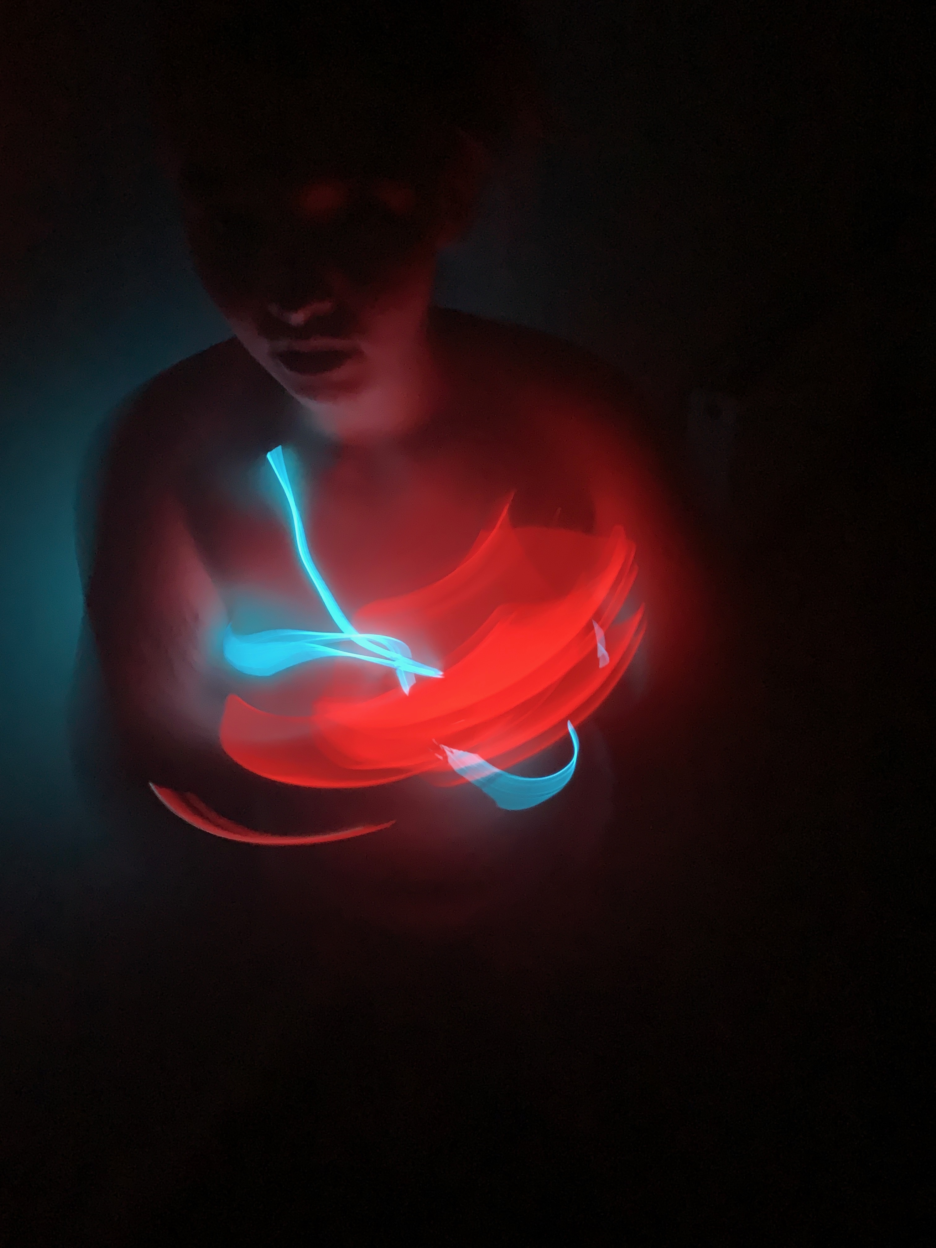
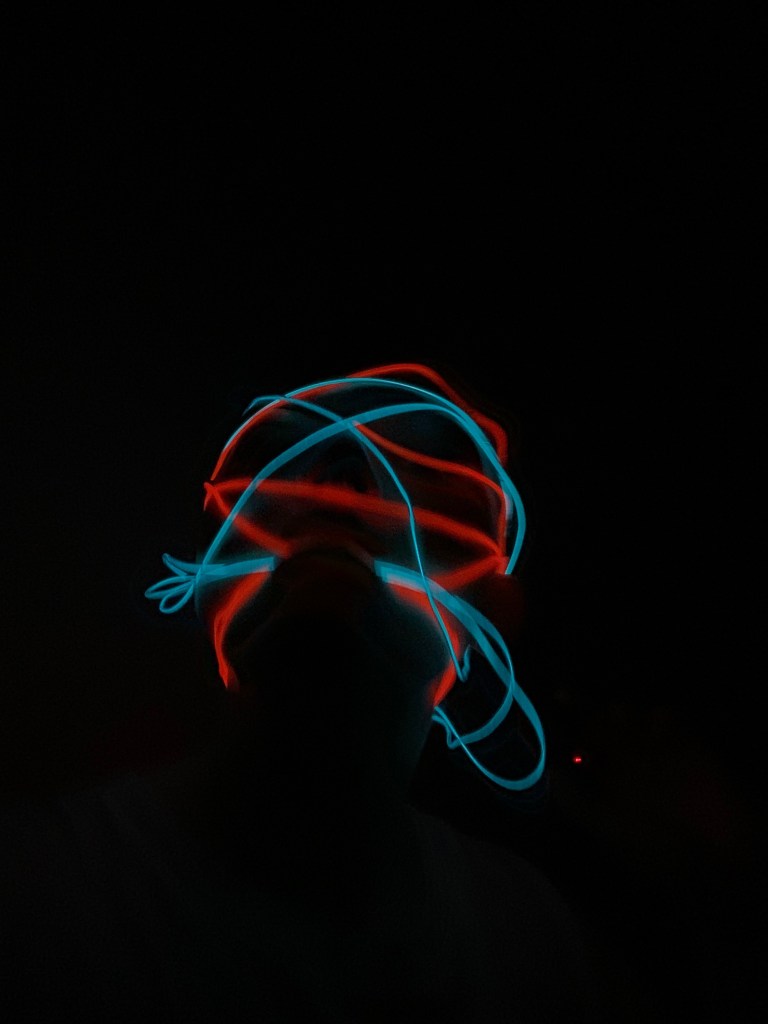
Again another artist that who’s work continues to influence my own. His work discusses complex themes around the human body, language and space. Specially in this project I researched and focused on his figurative neon light works. These works of his discuss and bring up issues around sex, humour, death and love, as well as politically led events such as racism, war, and torture. Again a clear focus on the figure and underlying pressures people are put under in our day to day lives. Light and colour i think are elements of my work i’m always aware of, as well as communicating this presence of pressure. Its easy to draw connections to his work and my own when looking at the neon wire pants I made and the images that spawned from this.


Anna Sew Hoy

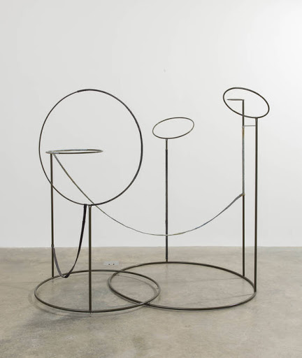
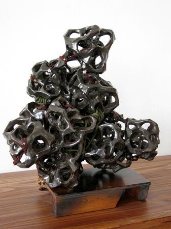

American artist known for Sew Hoy Known for her abstract sculptures and use of clay to create a sense of intimacy within installations and environments. I think my 3D and Photography work too holds this feeling of intimacy and venerability in different ways. The artist often begins with solid blocks of clay and then adds fabrics, such as jean material or velvet flocking, metal elements, wood, rubber, and mirrors to create pieces that are both industrial and organic. Again the use of contrast between soft and hard materials is something i’m interested in exploring in my work and this artist dose it so successfully. She almost creates a safe space that at the same time feels so open and exposed.
“One thing that inspires this work is jamming together opposites and making them exist in the same space. I don’t know if they coexist or if they’re fighting the whole time. Fighting the whole time is good, too. In Blood Moon Breastplate (2019), it’s the textures—the frayed, rough edges of those jean seams, as against the light-sucking dry velvet, as against that super glossy patent leather. I get a lot of energy out of finding things to pile on top of each other, and I want them to be questioning each other while they’re together on the same piece. I suppose one brings the other into focus: the leather scrunchie is a foil for the rust-red velvet and vice versa.”
Ernesto Neto

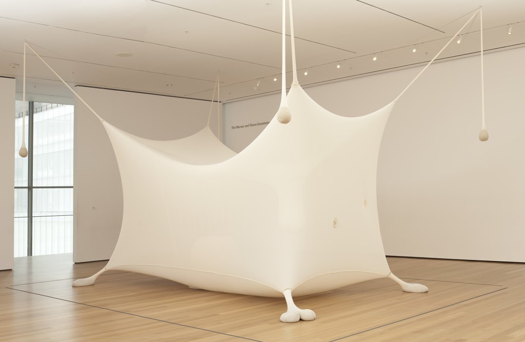
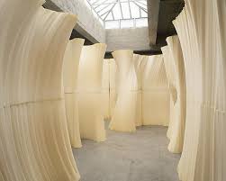
Neto is a Brazilian Conceptual artist whose installations allow the audience to touch, see, smell, and feel his artworks for a truly sensory experience.
“For me, mind and body are one thing, always together,” “I believe in the sensual body, and it is through the movement of such body-minds that we connect the things in this world, in life—the way we touch, the way we feel, the way we think and the way we deal.”
His work explores the boundaries of physical and social space through interactive, tactile, and biomorphic structures. Again this artists use and understanding of weight and hight and pressure are all things i’m really interested in. Done expertly with the use of materials and lighting and how these forms and objects occupy the environment they are place in. The fact his work is so immersive in interactive i also find really interesting. His uses of scale and space really adds to the interactive element and if outside of the covid circumstances experimenting with audience interaction would have been something i really would have enjoyed in this project in particular. Although often considered minimalist, his works differ from those of artists working in this tradition through their interactive quality.
Rebecca Warren


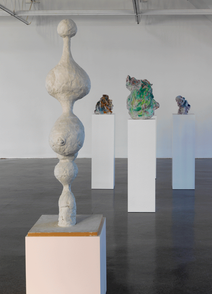
Warren is a sculptor who works in clay, bronze, and steel along side 2D collages and wall mounted assemblages of objects she has collected. Her ideas, influences and themes are filtered, distorted and often discarded as they find three-dimensional form. Her sculptures can be soft, yet also aggressive in their depiction of the female form. Her work takes influences from Willem de Kooning, Alberto Giacometti and cartoonist R. Crumb, individually and collectively Warren’s works form an entirely modern, complex and distinctive visual language. She was nominated for the Turner Prize in 2006 and the Vincent Award in 2008.
aThe shapes and forms in her work range from figuration to abstraction and from amorphous to more clearly recognisable, Her work has also been described as “cartoonish and eroticised”. In my work to i like to play abound and abstract forms reflecting the figure as well as making more abstract work, I like the artist understanding of her materials and the way in which she applies it to he artistic process. Allowing the ideas tpo become and exist more naturally and less forcefully with no clear image in mind. I d like to implement this more free and expressive way of working when it comes to 3D work and making models
WAWWA WEEK 6
The Body
I made some quick ink drawings just in responce to the images and sexual themes i was disscussing and exploring in my work last week. Though I don’t find these to be successful on there own it gave me some space and time to think about if this sexual element was somthing i wanted to continue with or if it had ran its course.
I think the colours red has came up repeatedly in the project as I feel it carries with it this feeling of urgency in as well as this kind of secretive, sexual nightly connotation when i pare it with the dark spaces I am creating (bedroom, darkroom and cutoff spaces)


Feeling Trapped
Following my crit it was picked up on about my use of wire and caged shapes i had exploed right at the beginning of the project. So i decided to play around with it a bit more and use my scanner to see what type of images i could come up with. They hold this feeling of being pushed and uncomfortable.
I Think they work well together as a set of images as well as individually n their own. The contrast of my soft pale flesh and this hard metal work really well in the sense that they have been put together unwillingly and forcefully.
I think if one of the images were to be scaled up to the side of a wall it would amplify the feeling of pressure and urgency for escape.


Using 4 peaces of string the same length as the edges of the paper I was using i played around with mark making to kind of represent the patterns or moments I has making while working in my room (between the four walls). I think they are successful 2D works in the sense of shape and movement and it was a was a good exercise to just play around with materials without having the overthink conceptually or be too concerned with the outcome.
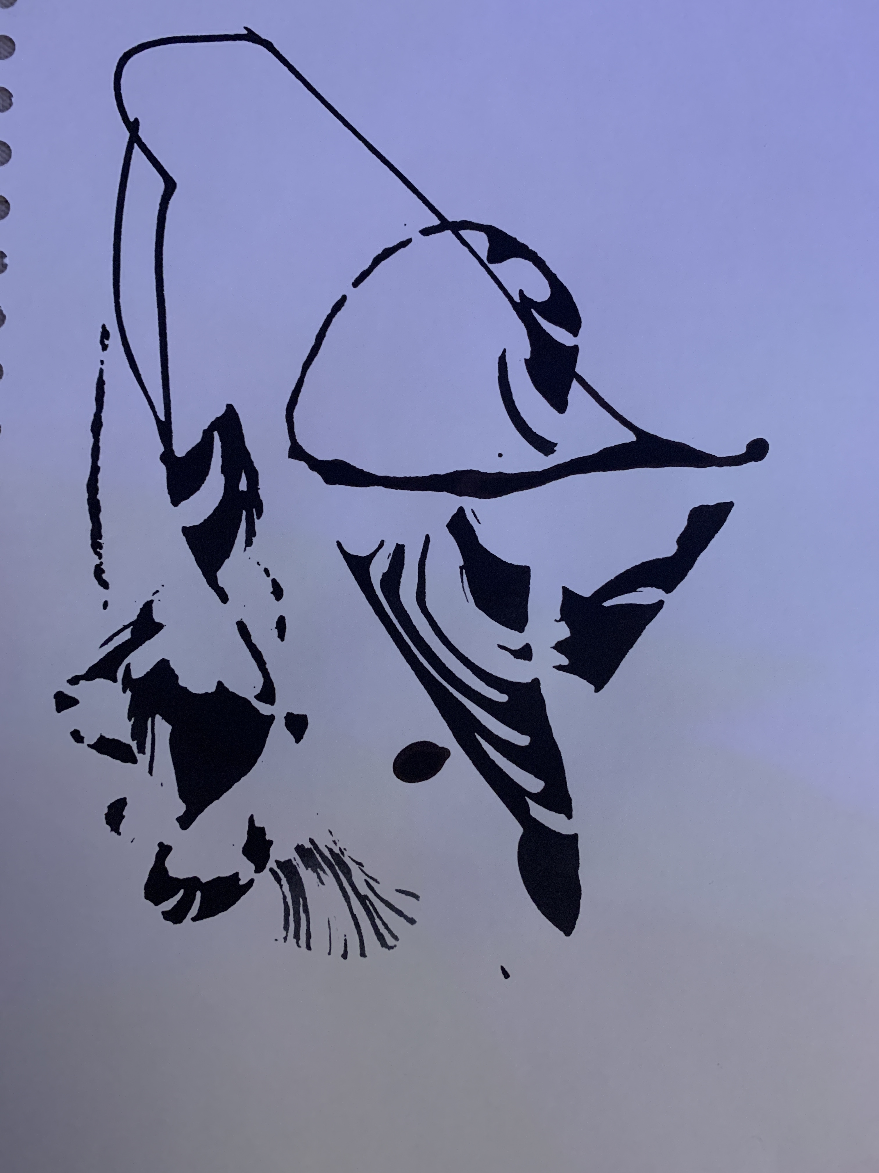
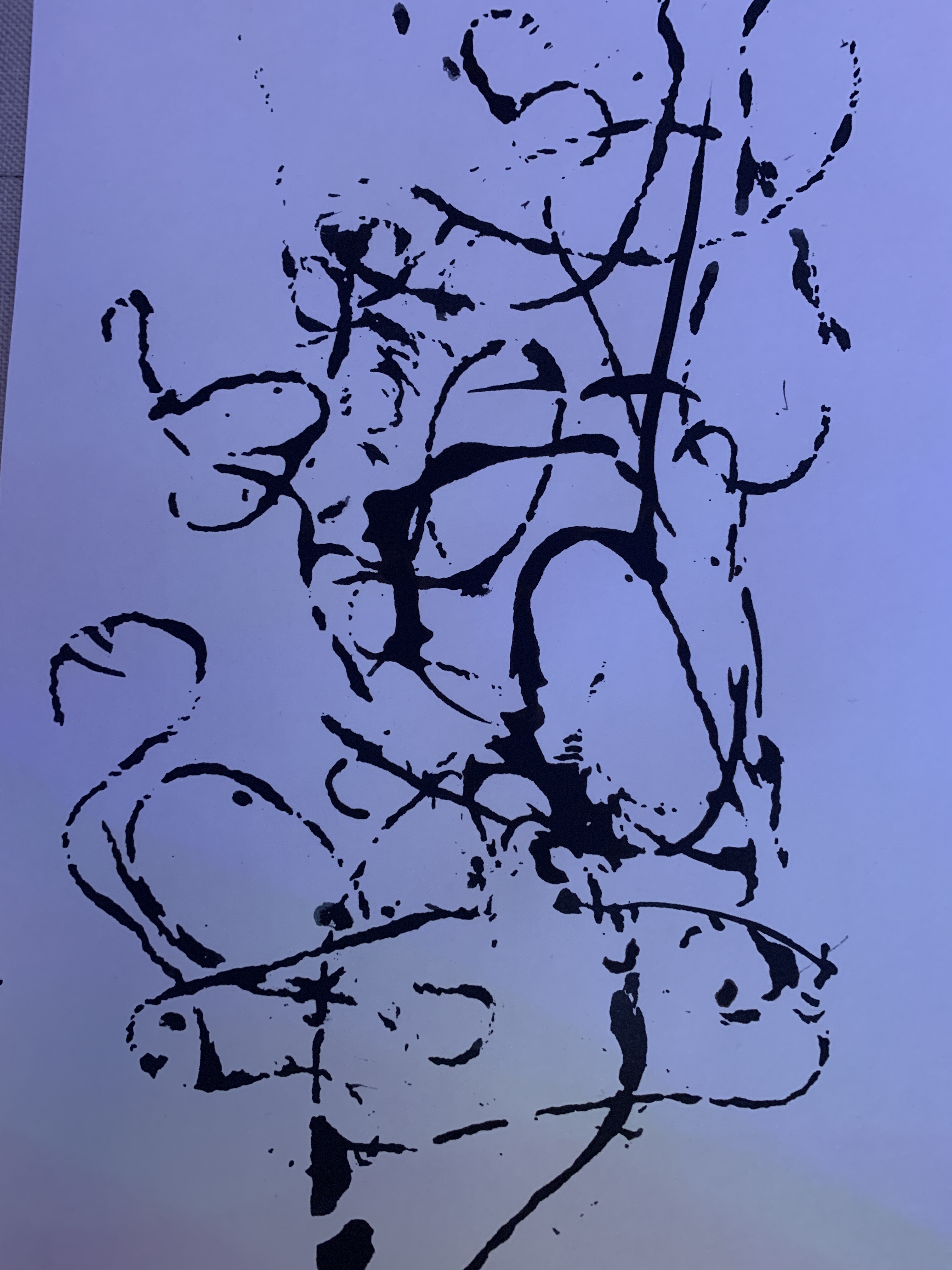
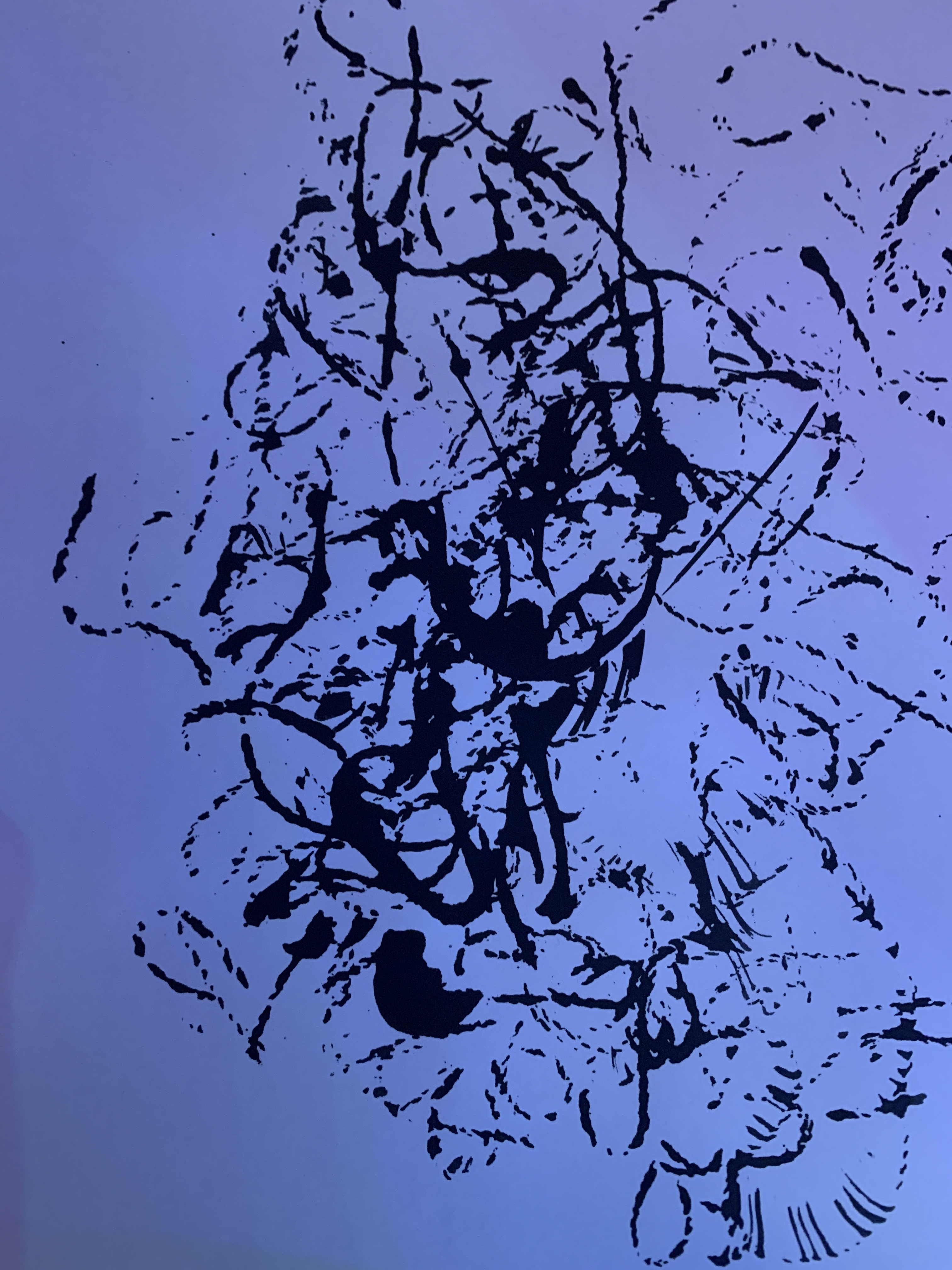
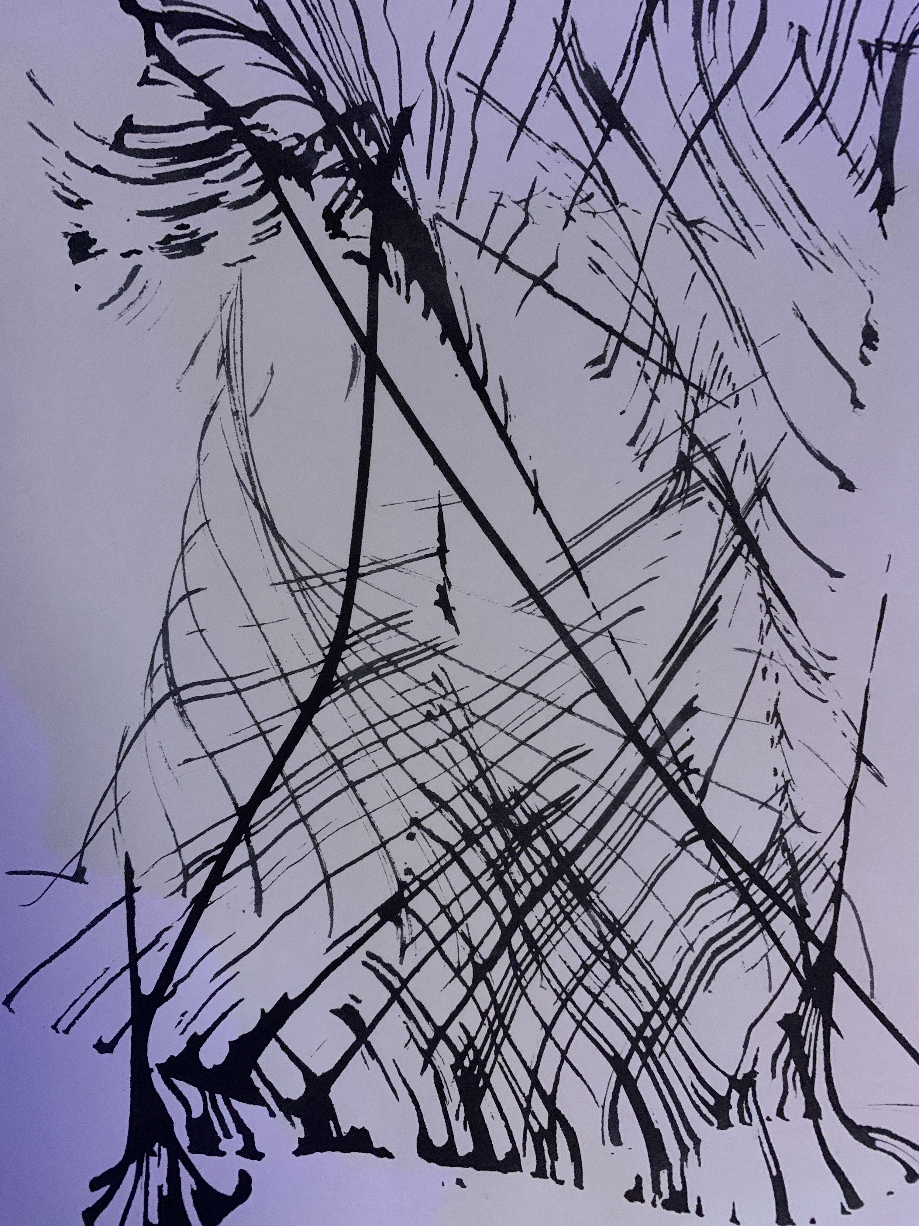
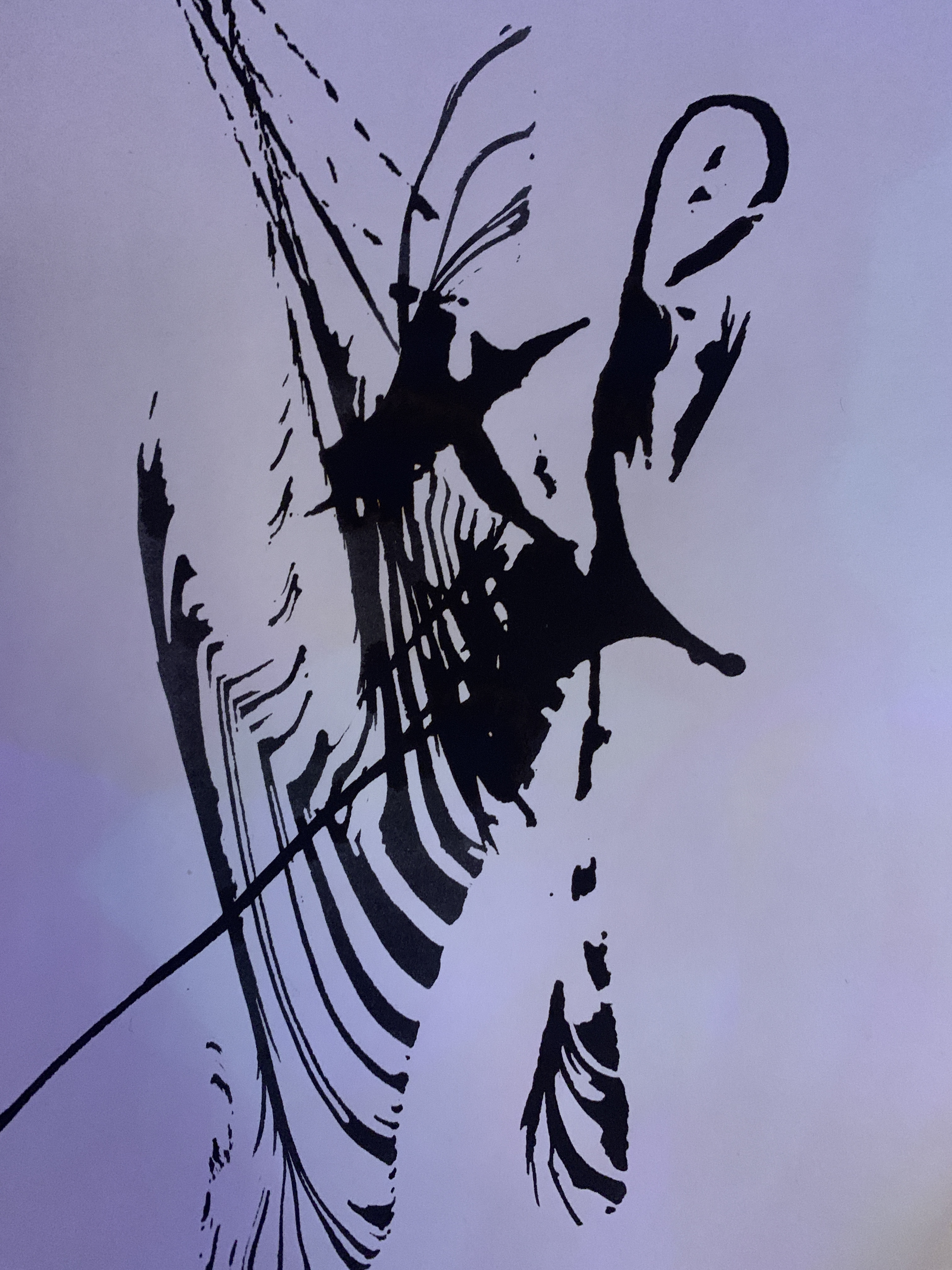
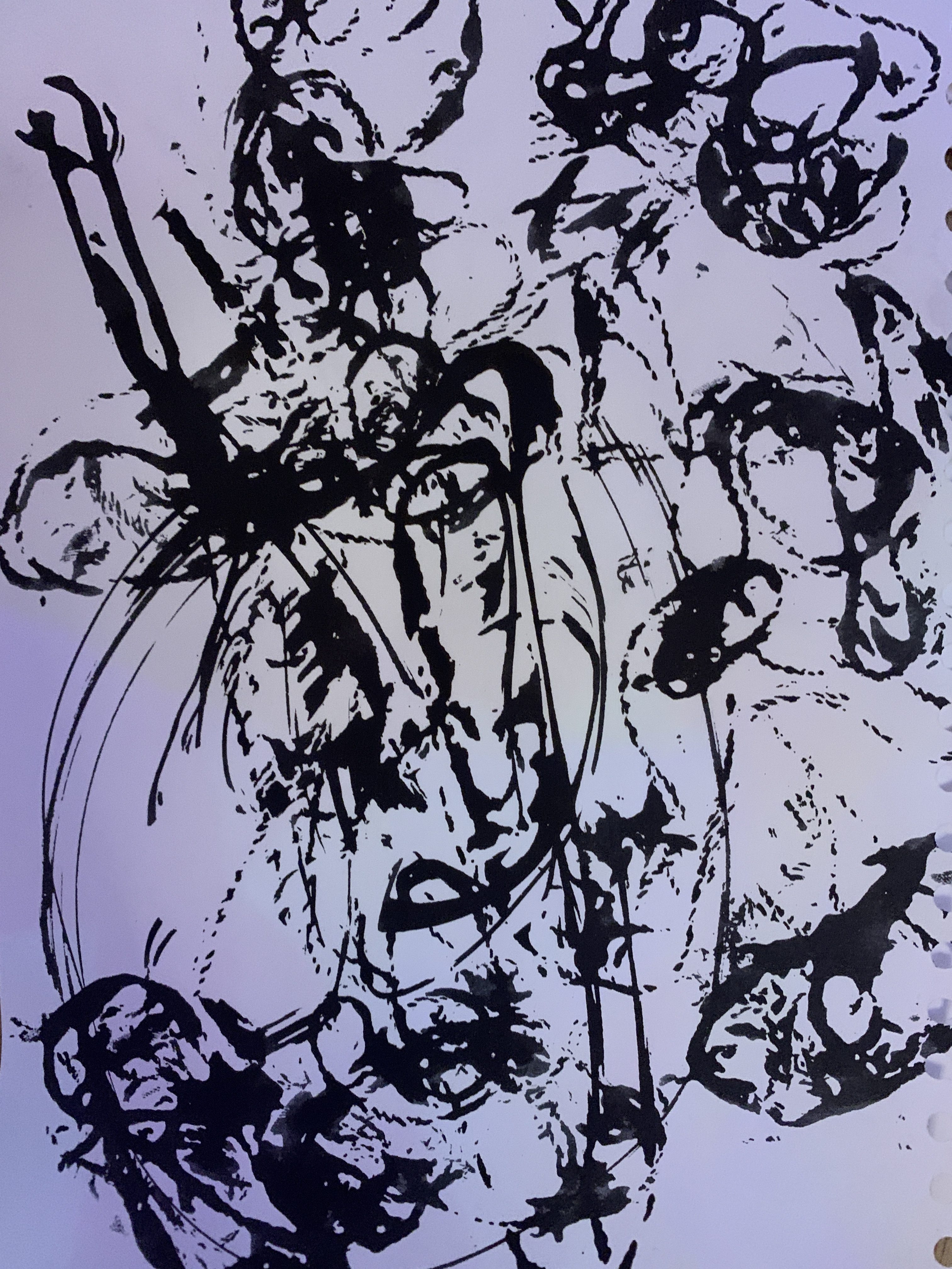
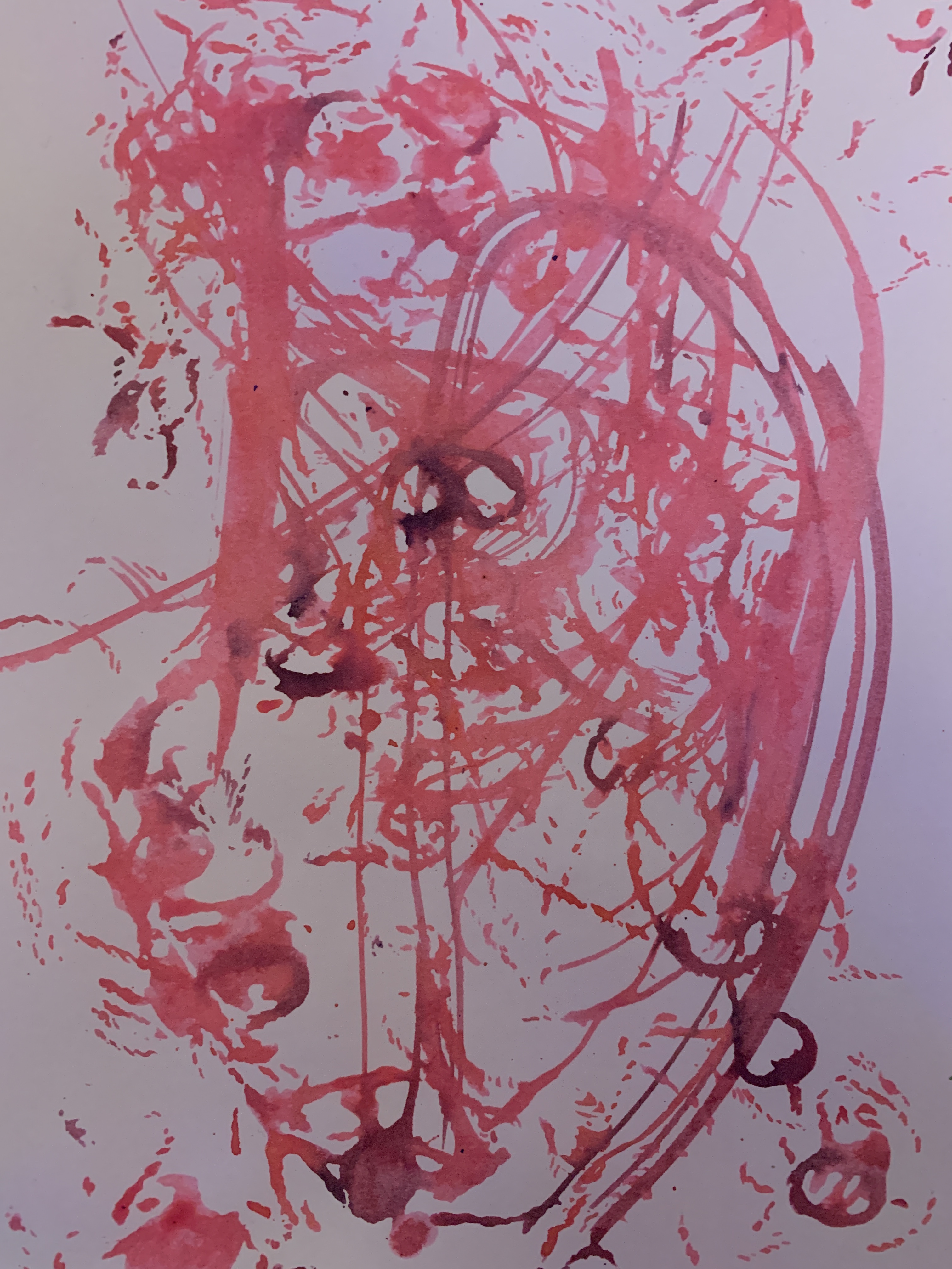
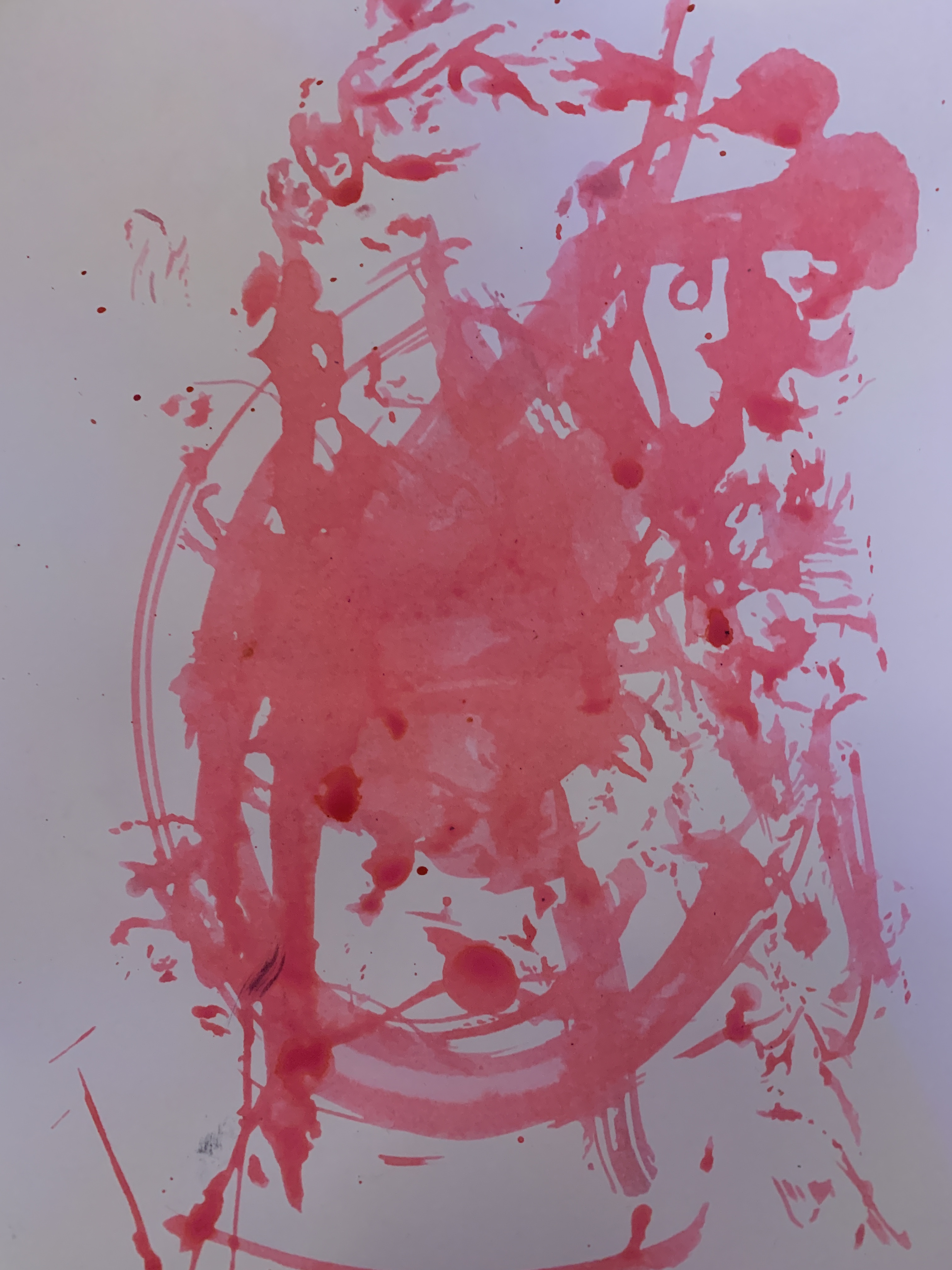
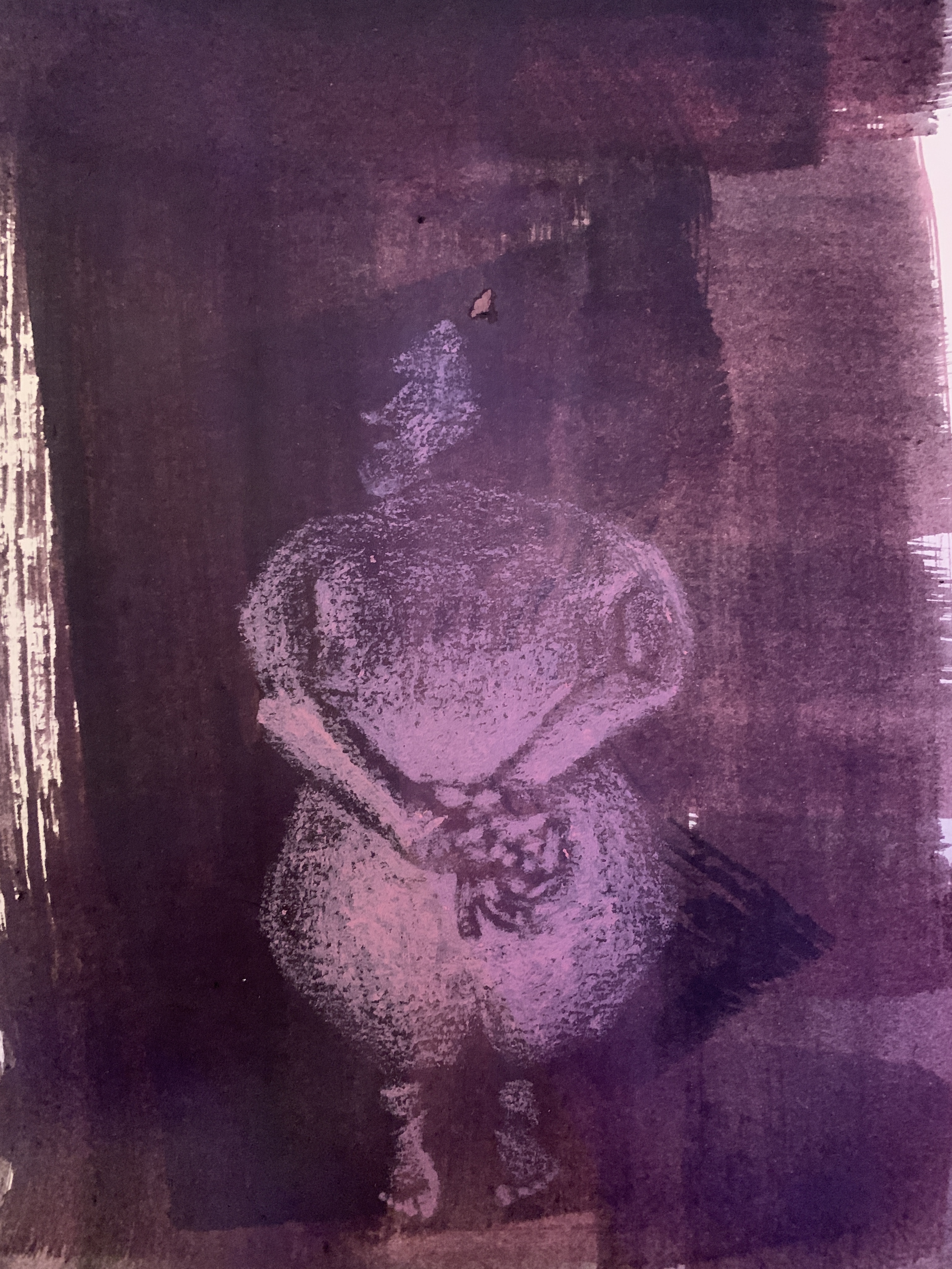
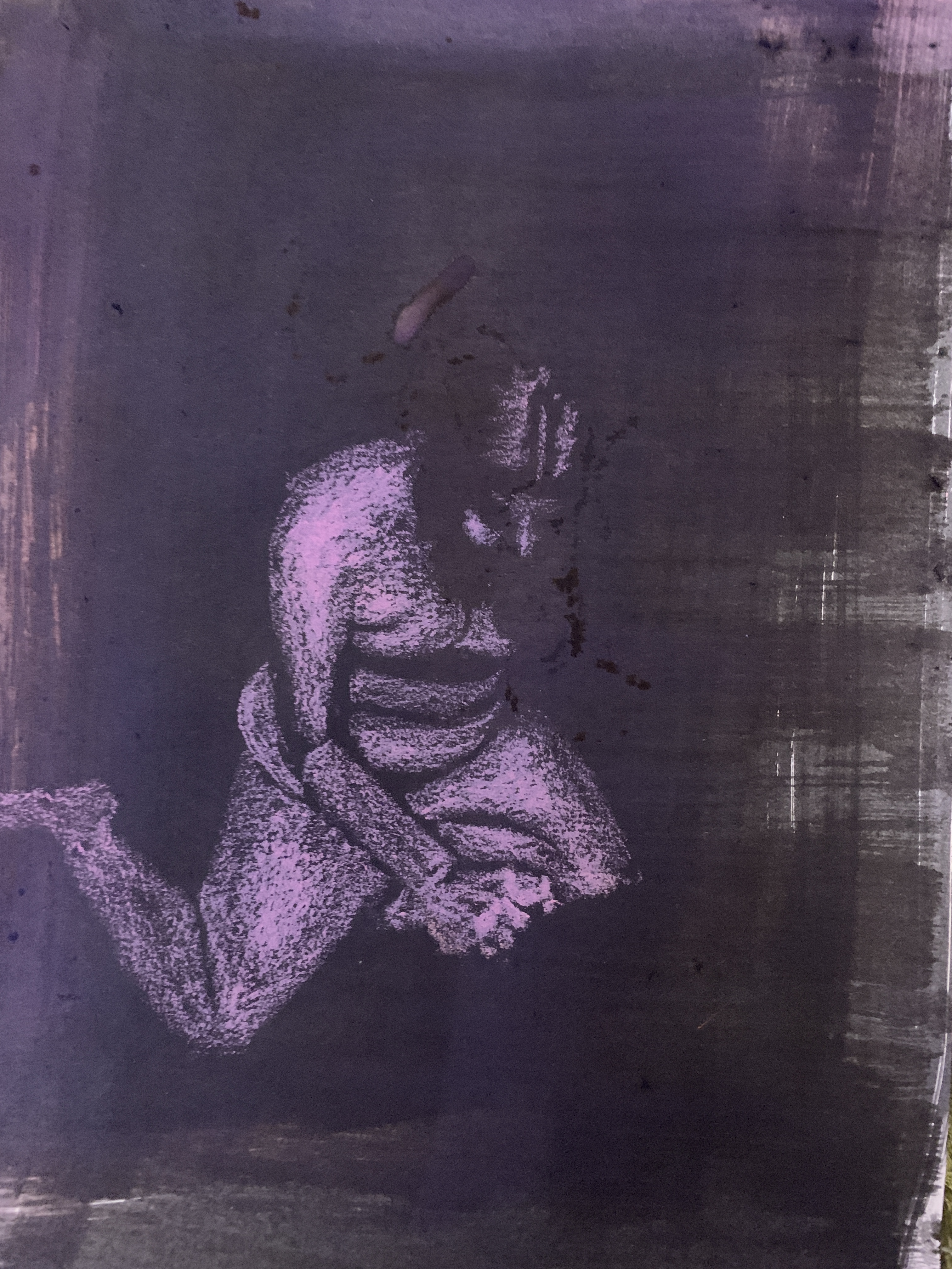
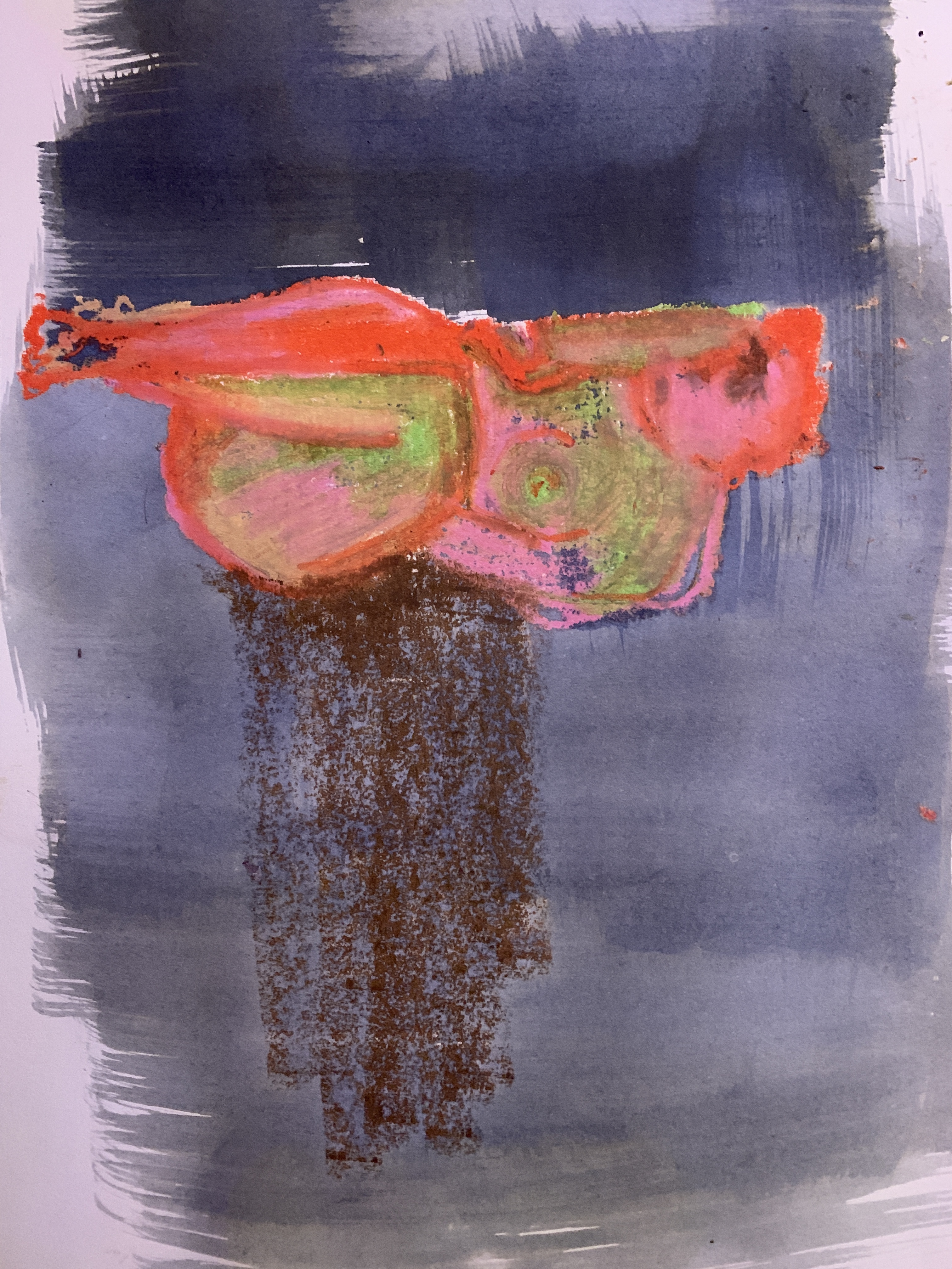
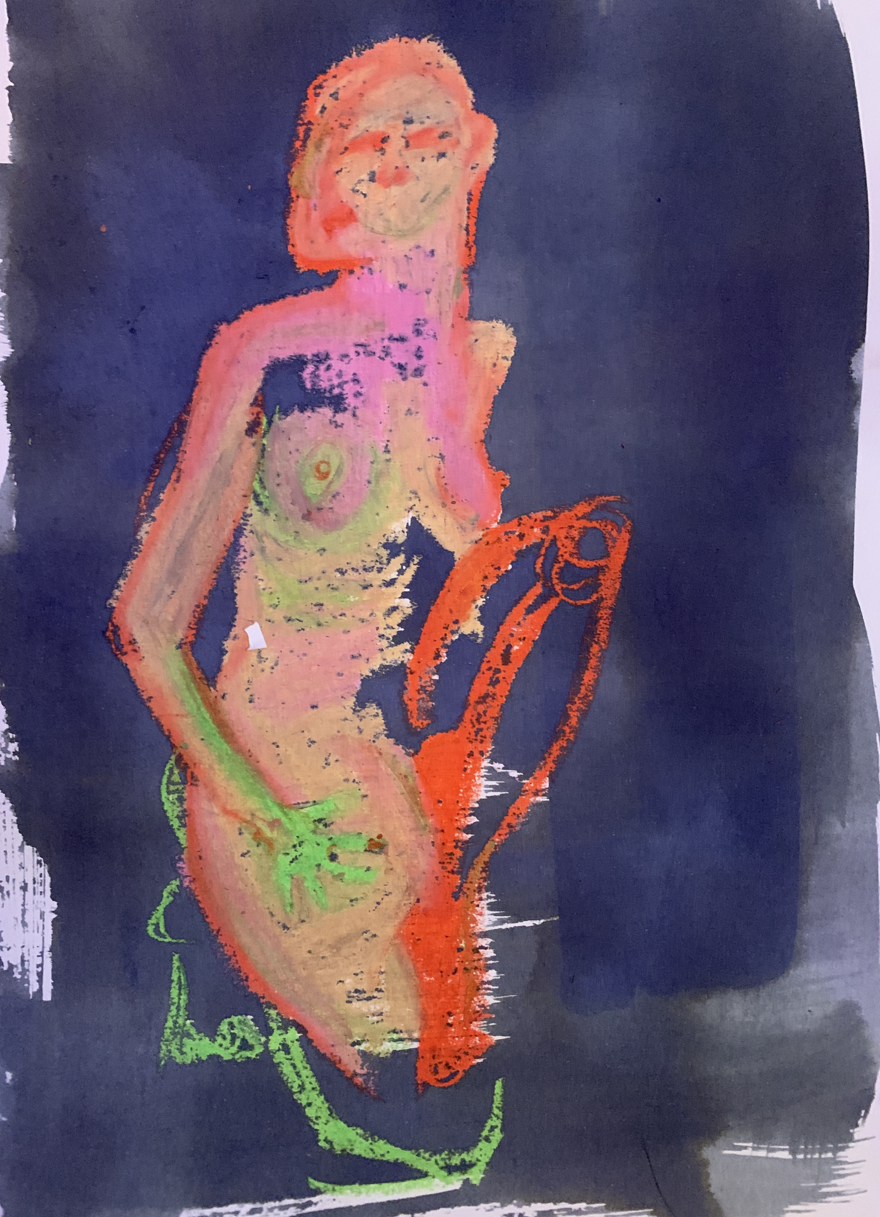
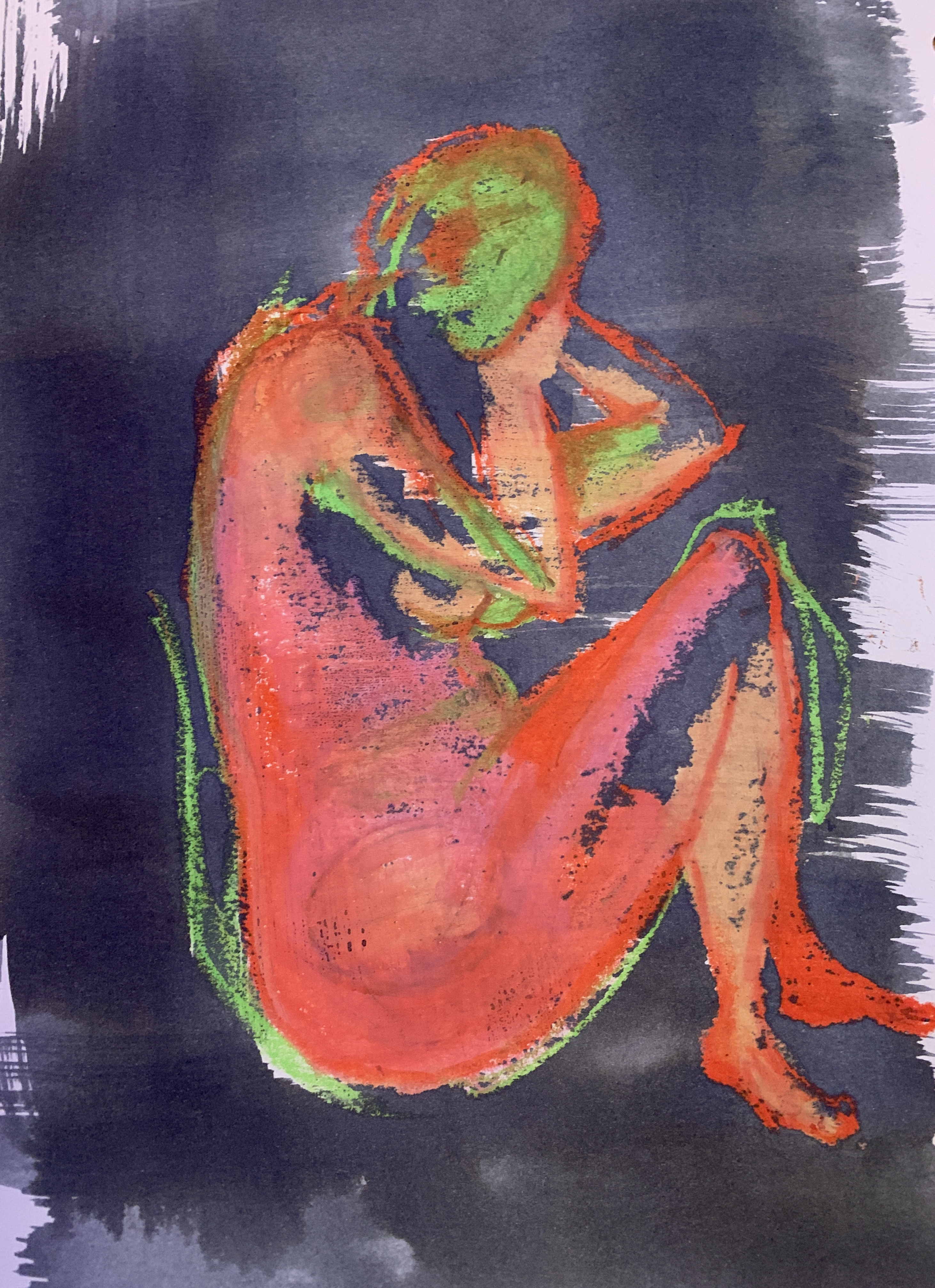
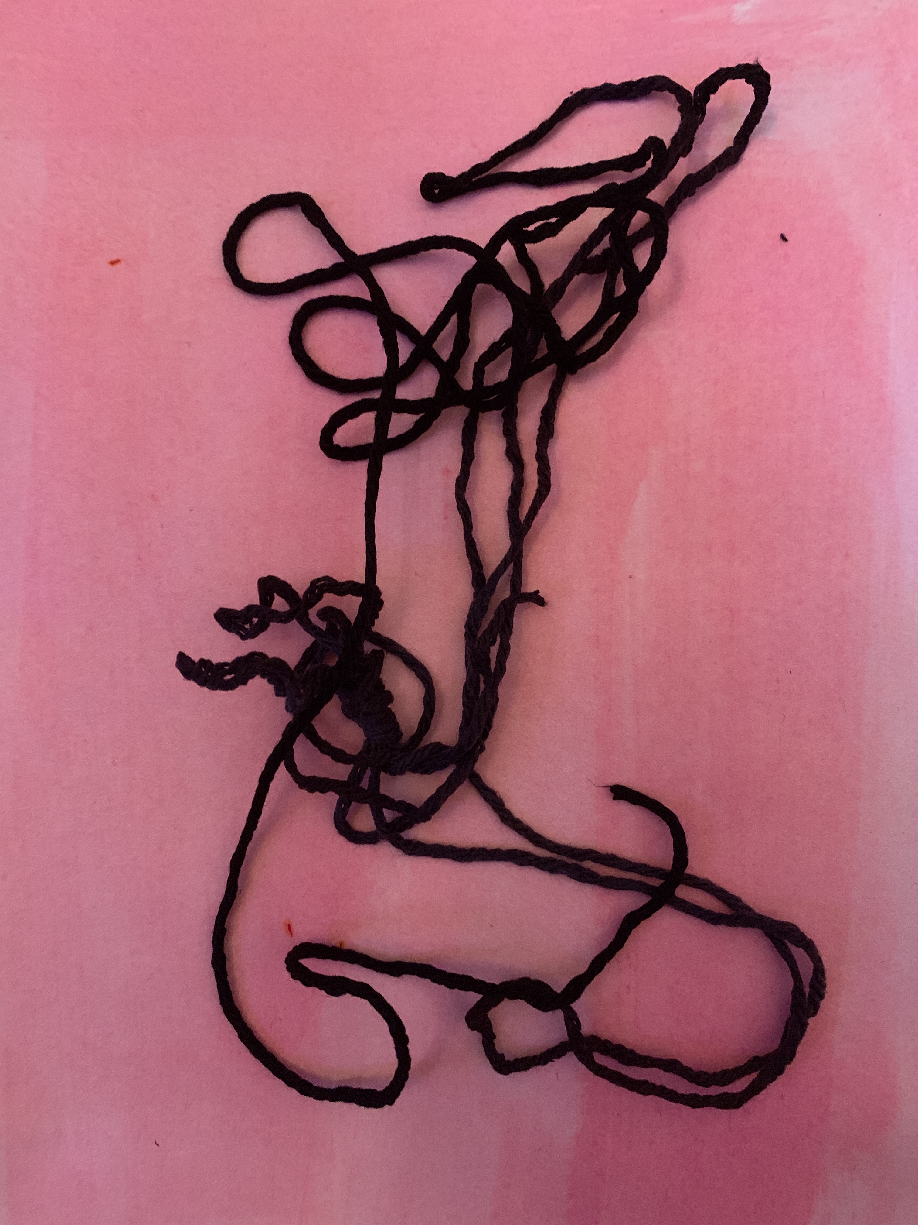
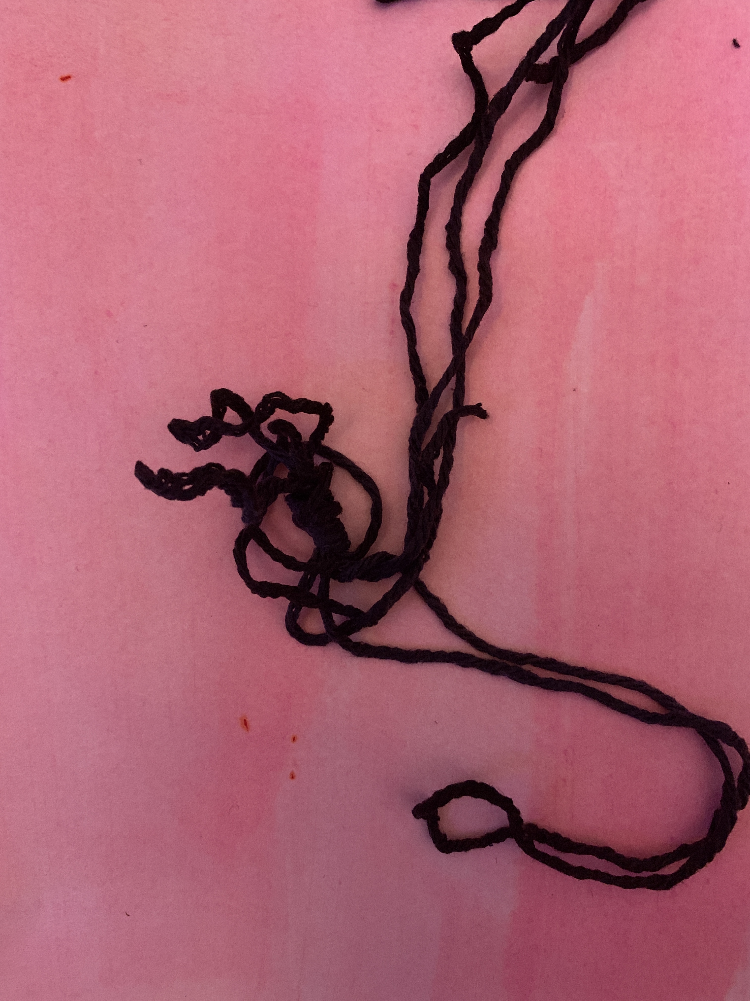
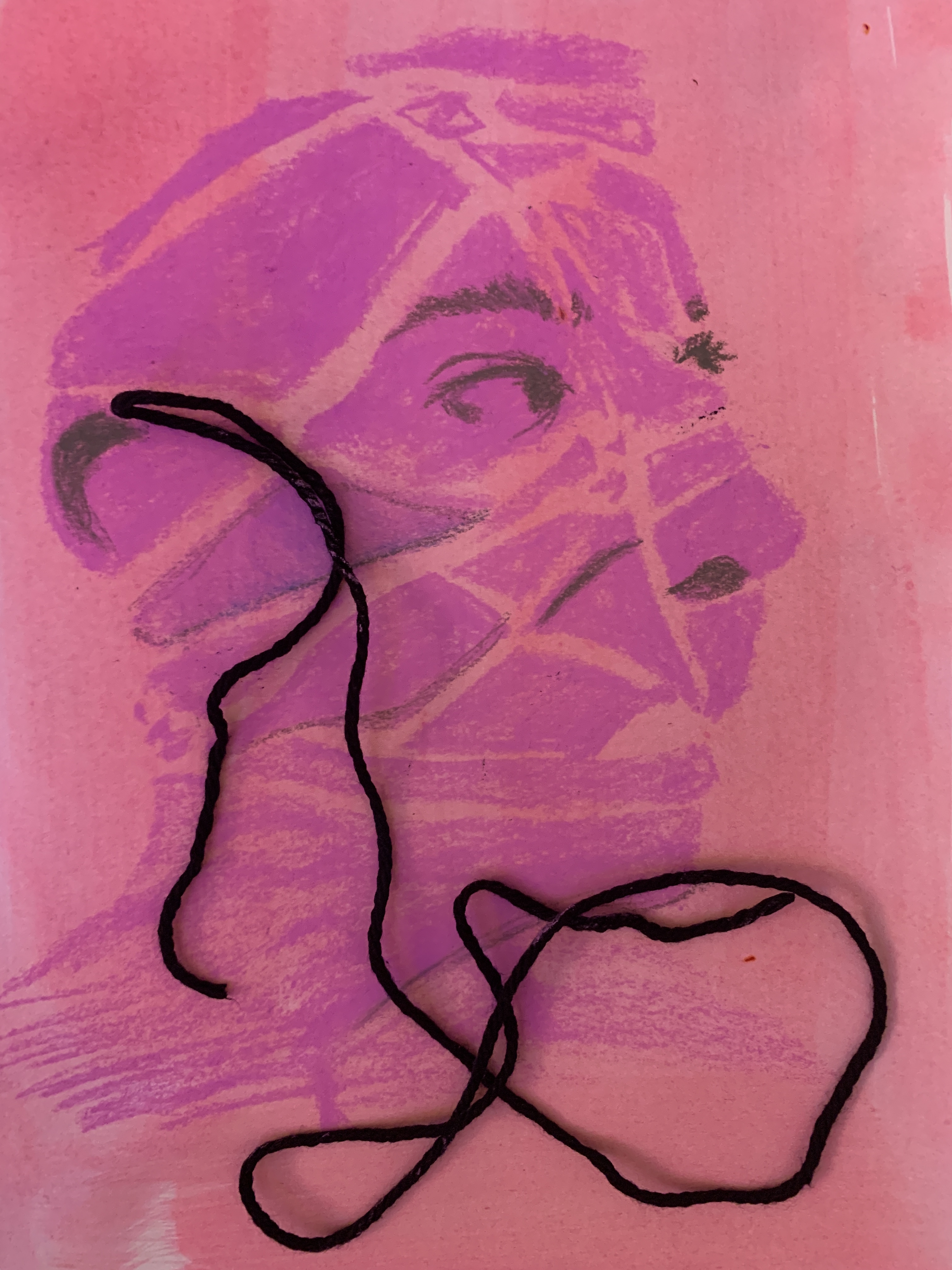
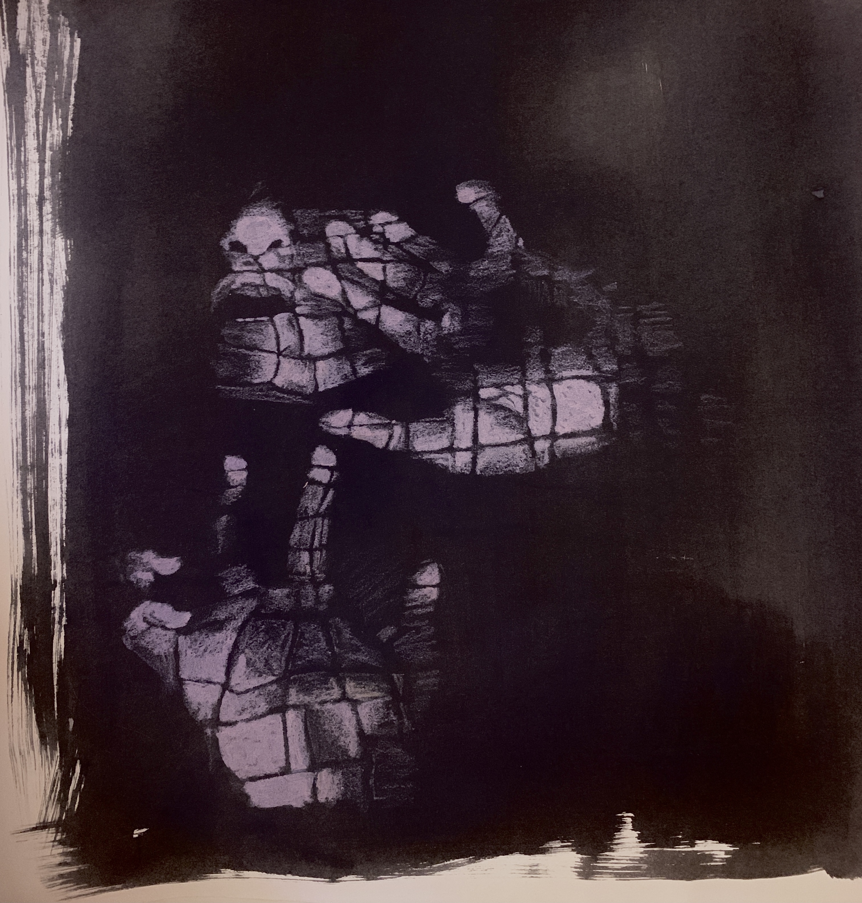
These are works looking at the photographs I have taken in the past 2 weeks with a specific focus on the colour pink.
WAWWA WEEK 5
Sexual Communication Changes
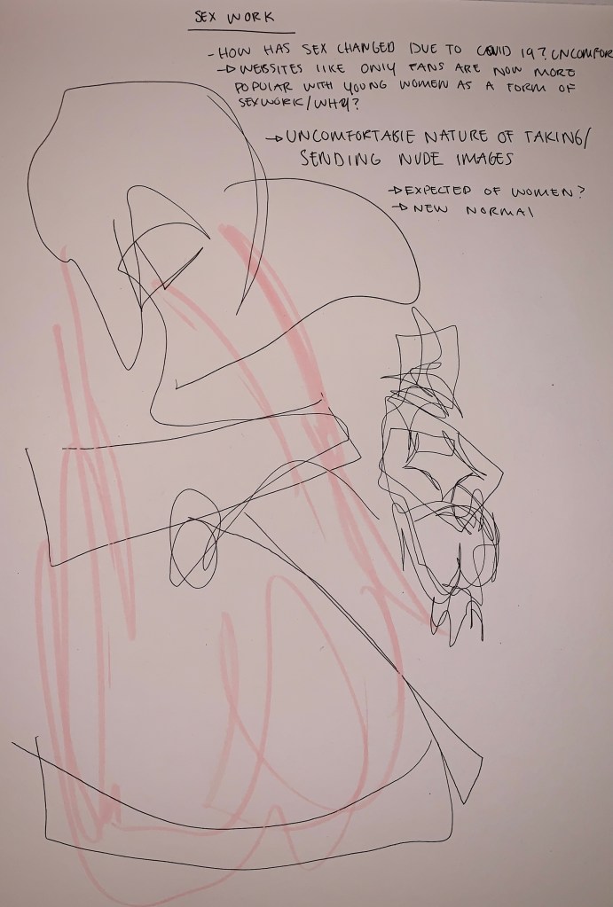
Going forward with the project i really wanted to push myself out of my comfort zone and explore the underlying sexual tones of my work. For the following images i wanted to ephasise the uncorftablity and restictive nature when taking/sending nude images to a sexual partner. As my people are now sending exploitive images/videos due to the current circumstances. It is almost expected and common place for young woman to take these sorts of images as i cant think of one person in my life that hasn’t sent a nude. I have also been reading a-lot about how sex work has changed for young women now making money from these images with sites like Only Fans.
I took a material and object i hated (a plastic pillow that normally sits on my bed) cut it into strips and sewing them together before wrapping them round my body. The uncomfortable nature of the pillow i feel was communicated in the images below as is pulled and rapped restrictively round myself.
Sex Work

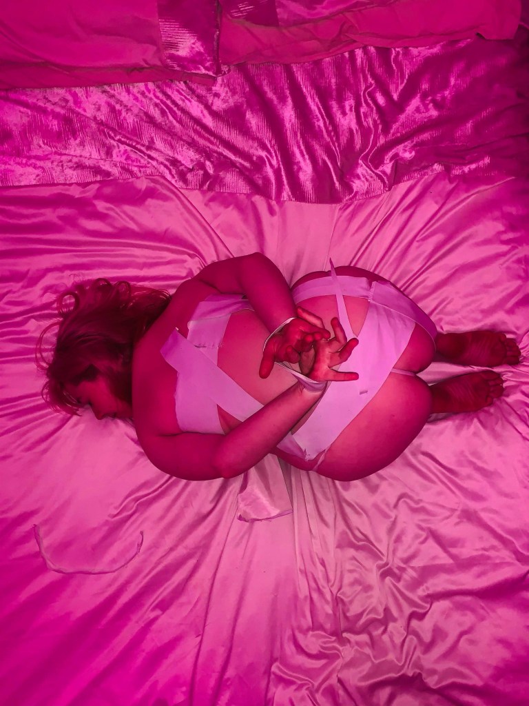
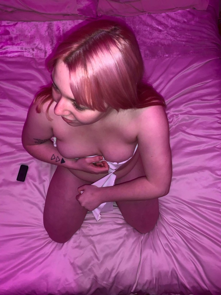


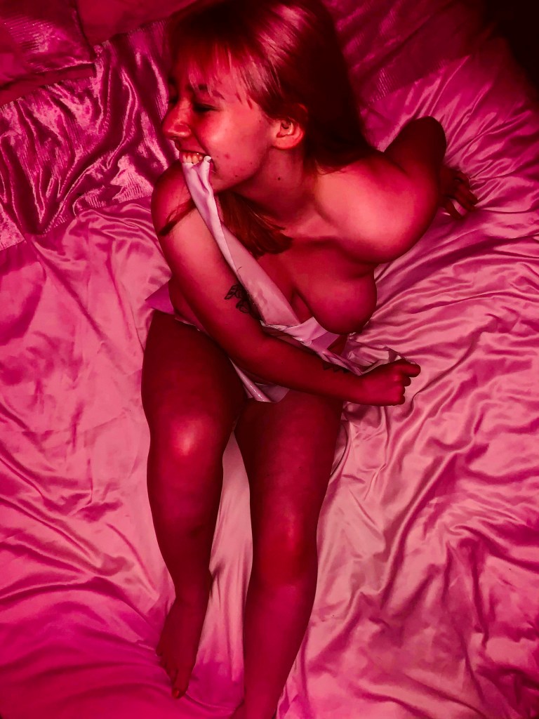

I also played round with where and how i wanted to lay/sit and the lighting the images were taken in. The pink light i feel echoed the kind of night time secrecy i feel is associated with sex. I especially like the over exposed pink images as they have this kind of venerability about them as its clear i’m not the one taking these images reflecting that i’m maybe not in control with the situation ; trusting someone to take them and not share them.
Government Sexual Guidelines


Reflecting on this week
I feel like has really pushed me out of comfort zone and feel like iv made good progress in the project so far. moving forward i maybe want to go back into doing 2d work is i feel it my be a brake from the researching and might let my ideas form more naturally through experimentation.
WAWWA Week 4
Restrictions on the body
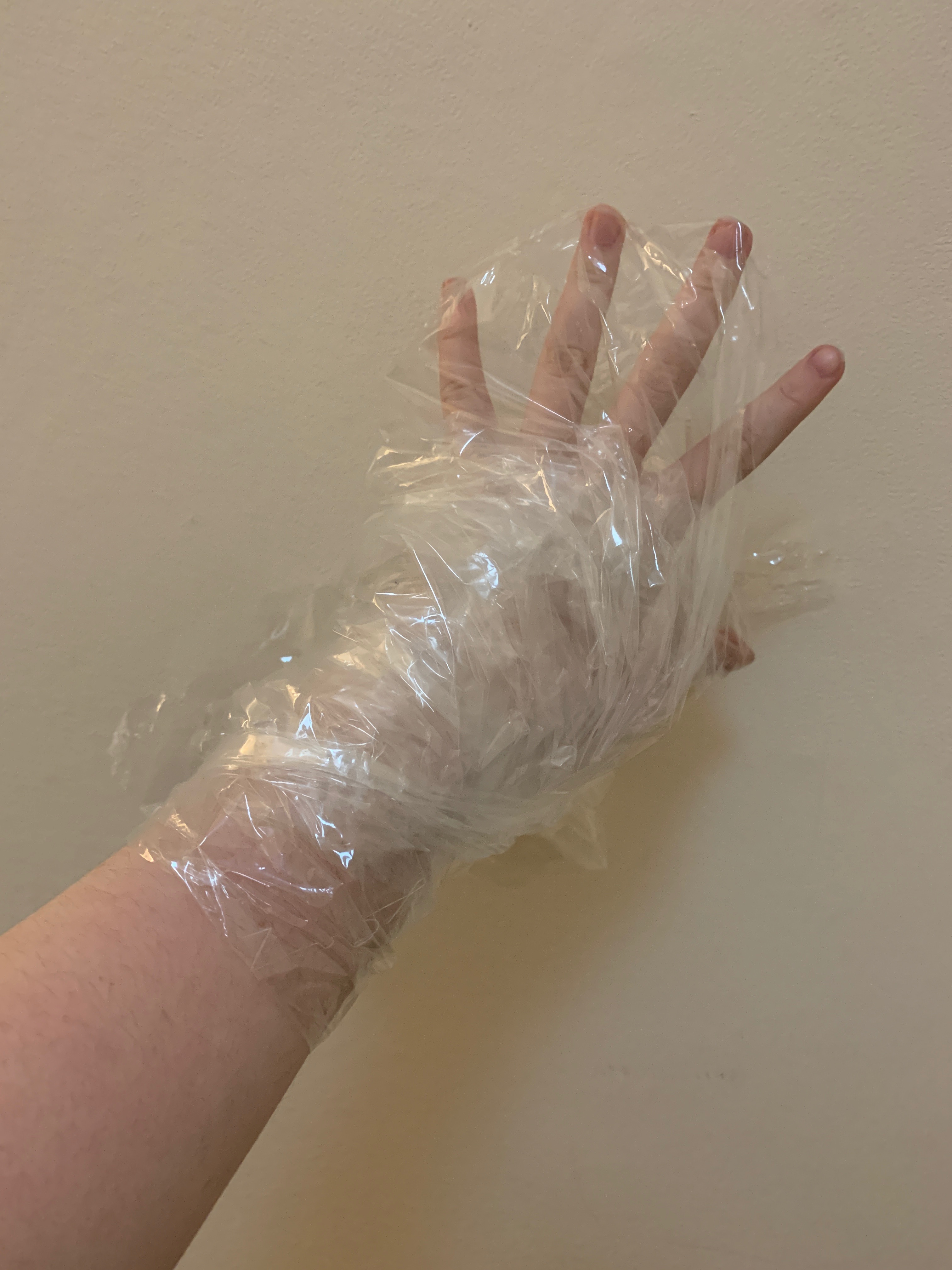
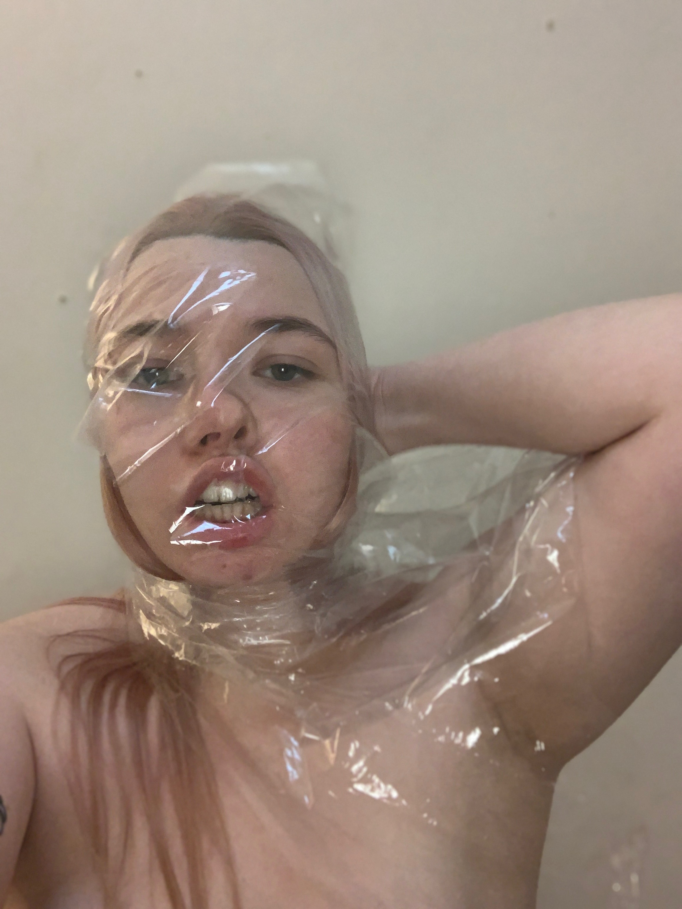
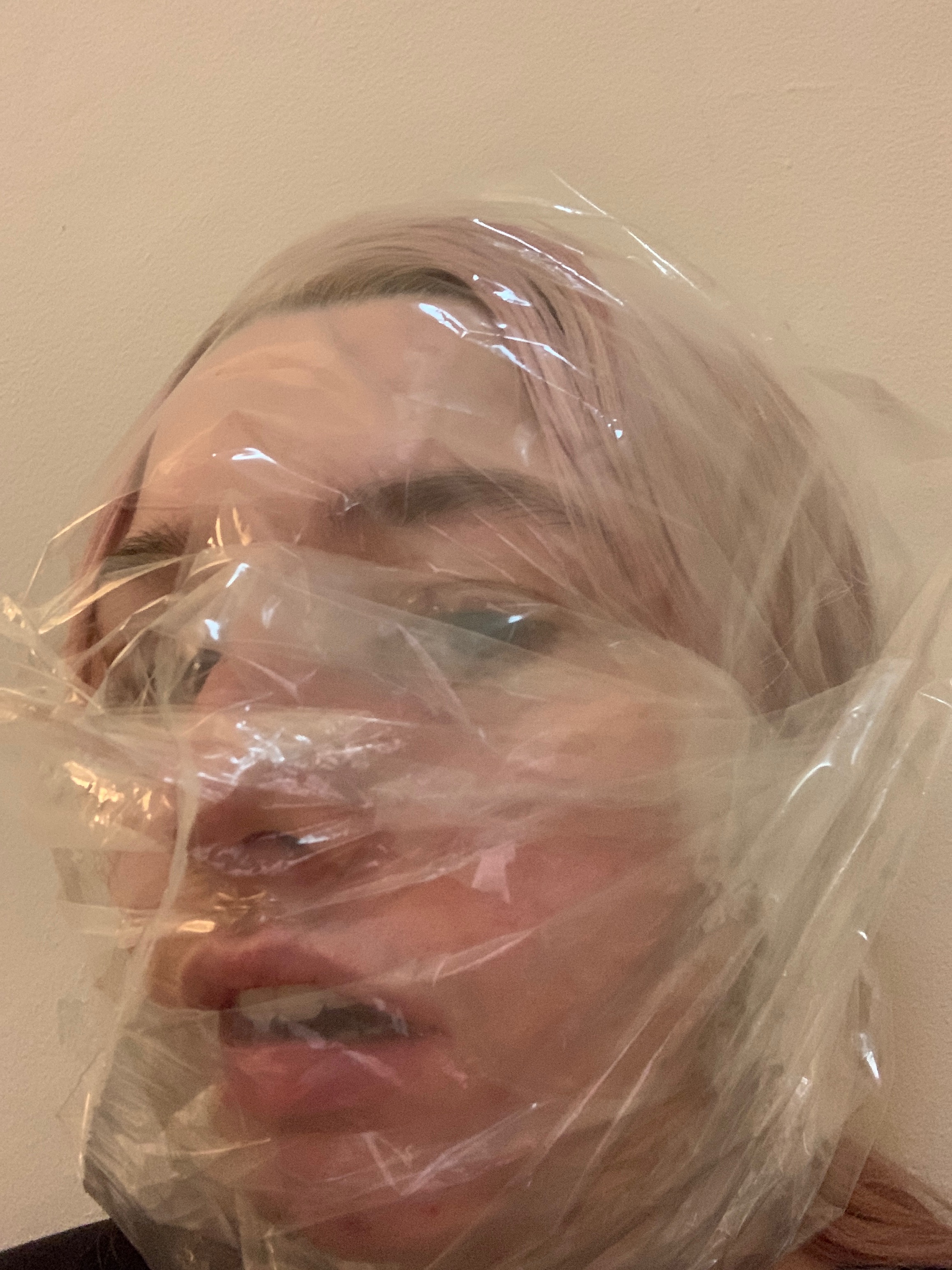
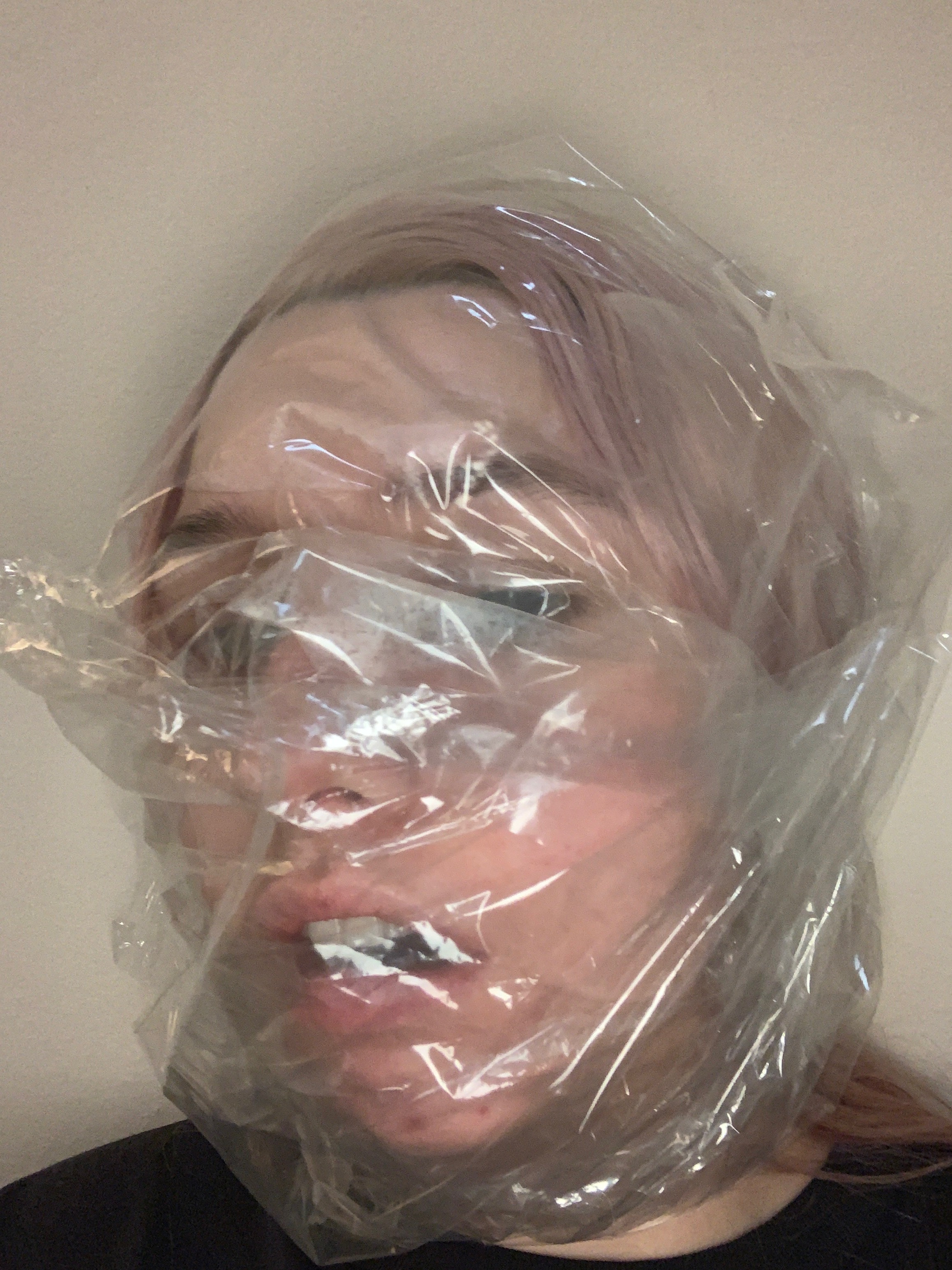
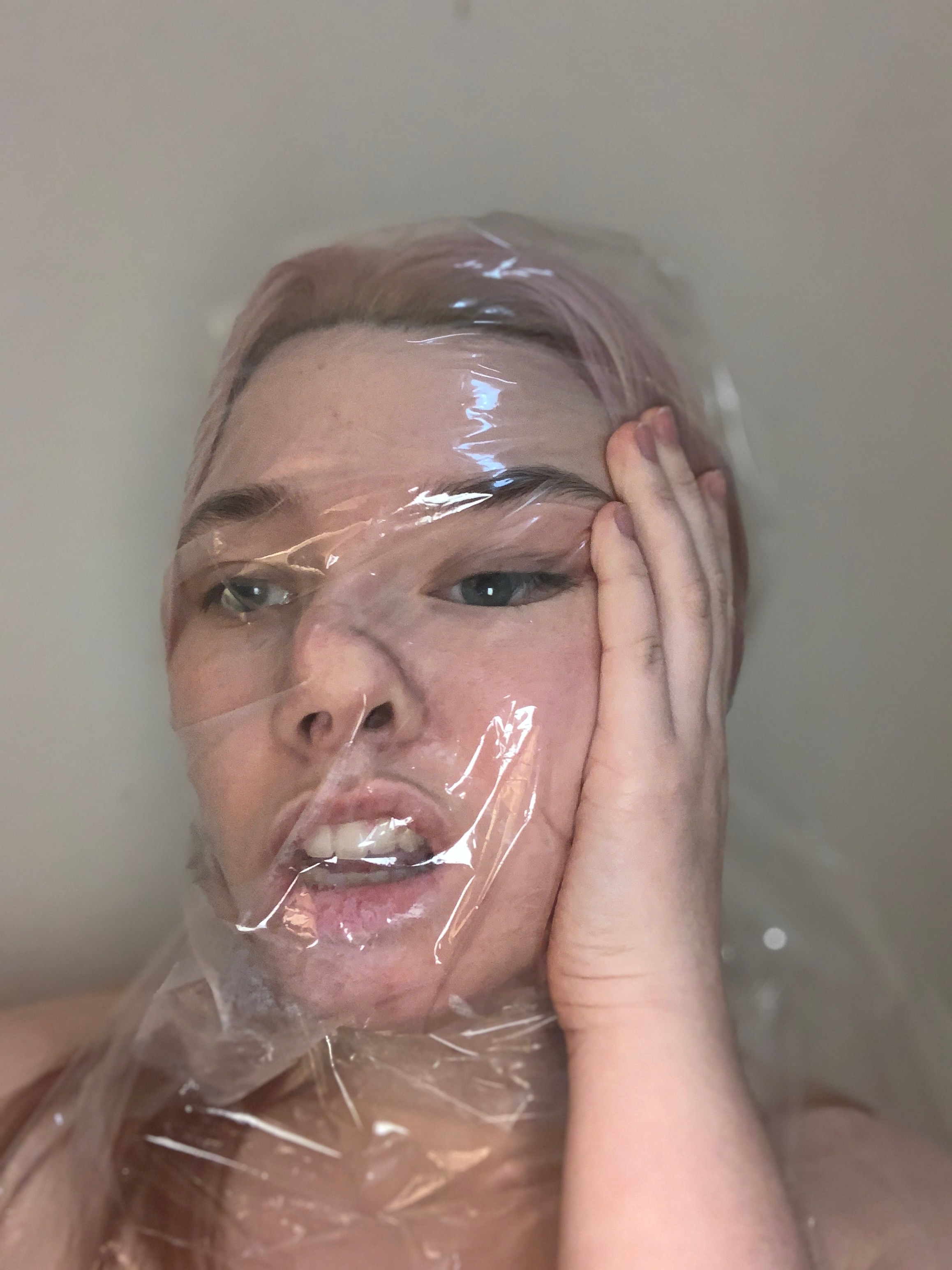
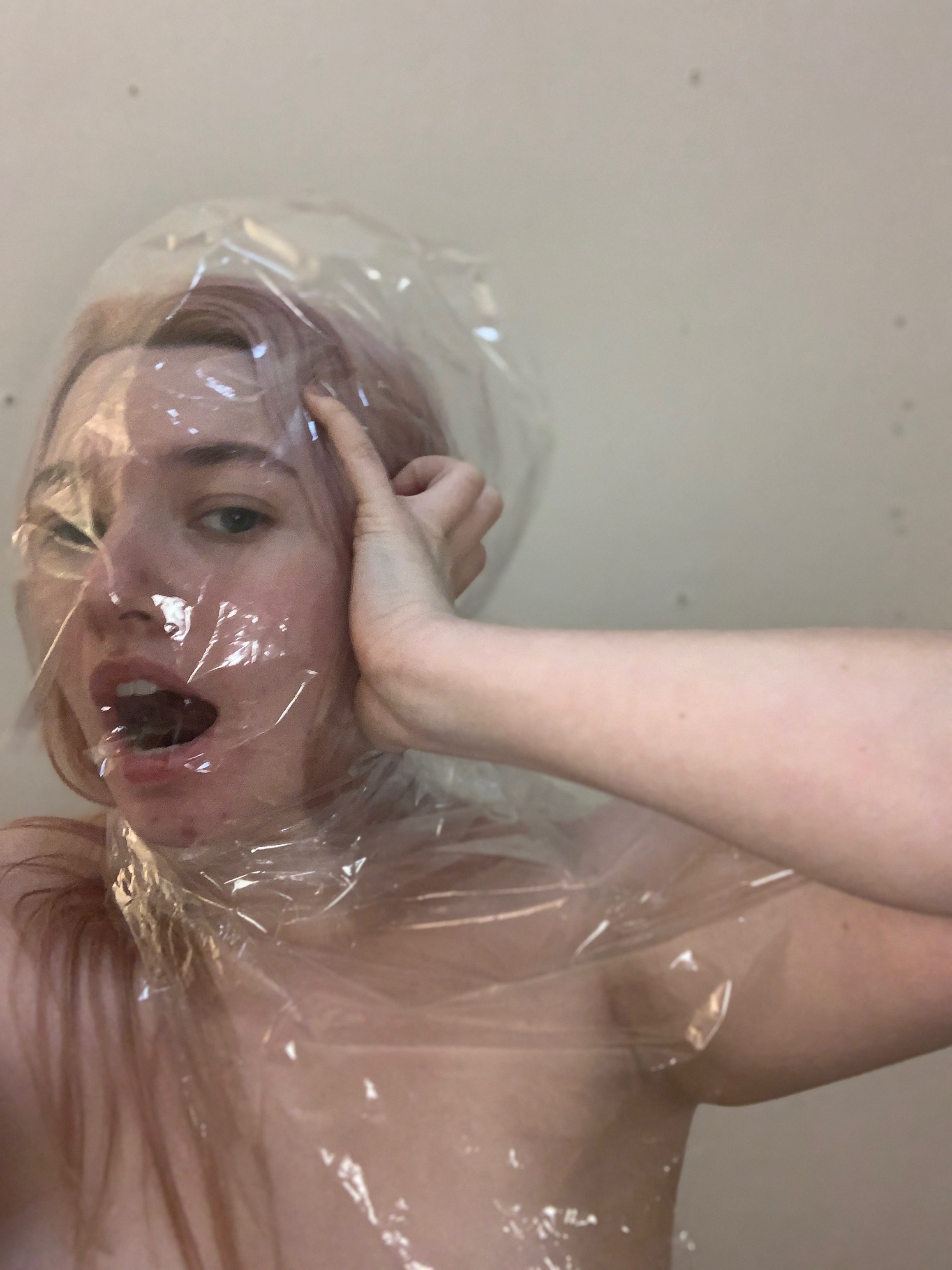
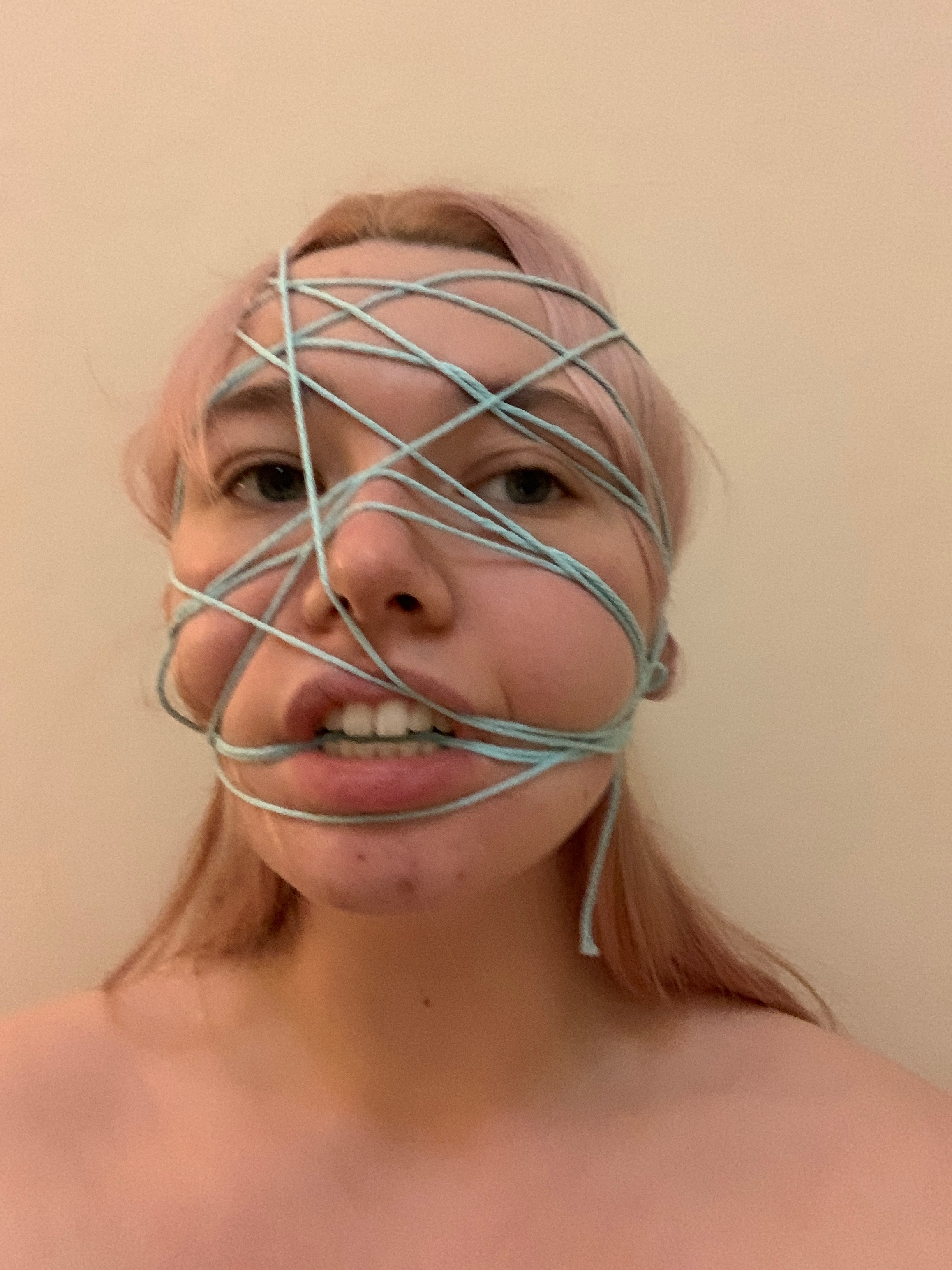
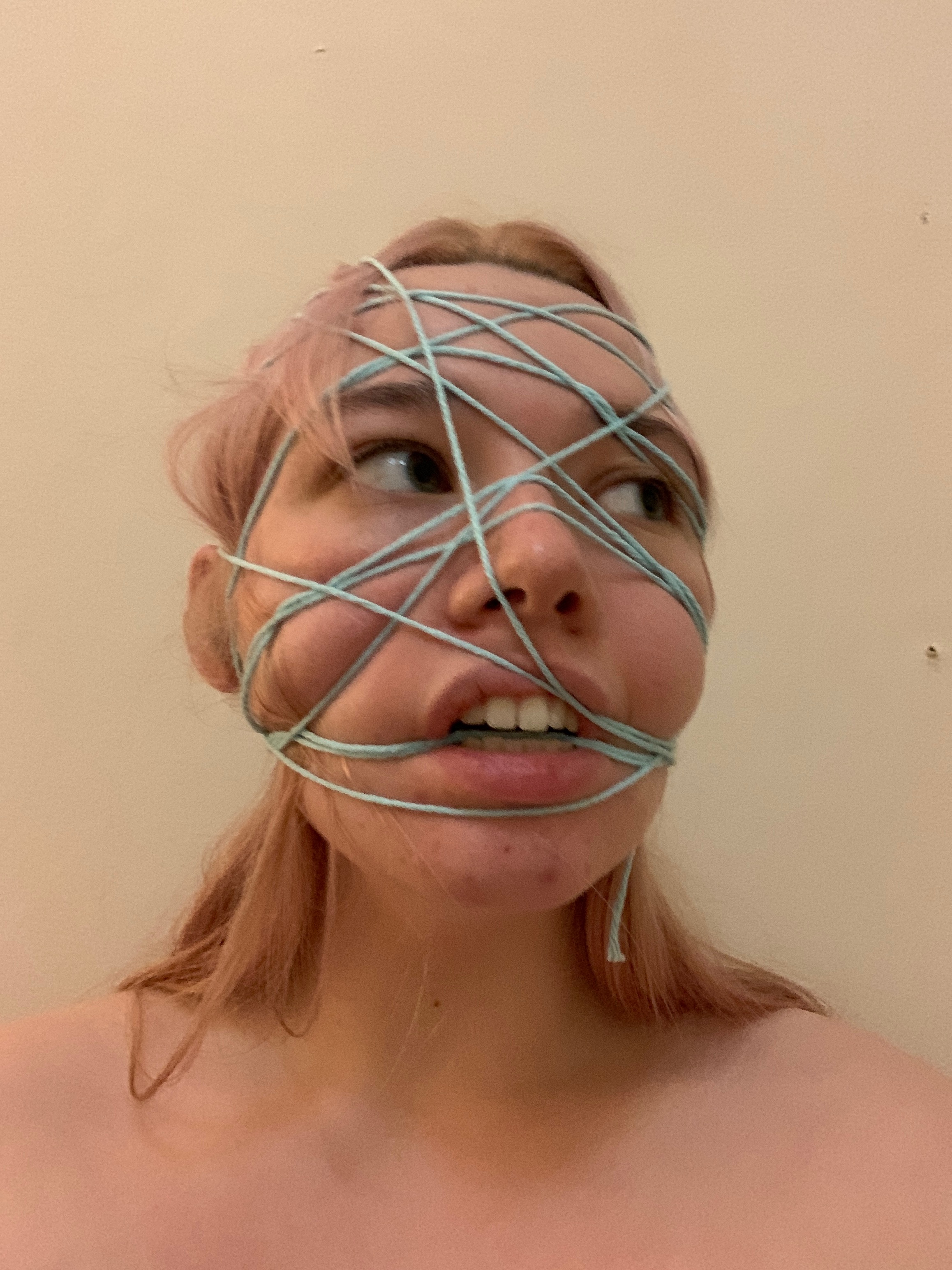
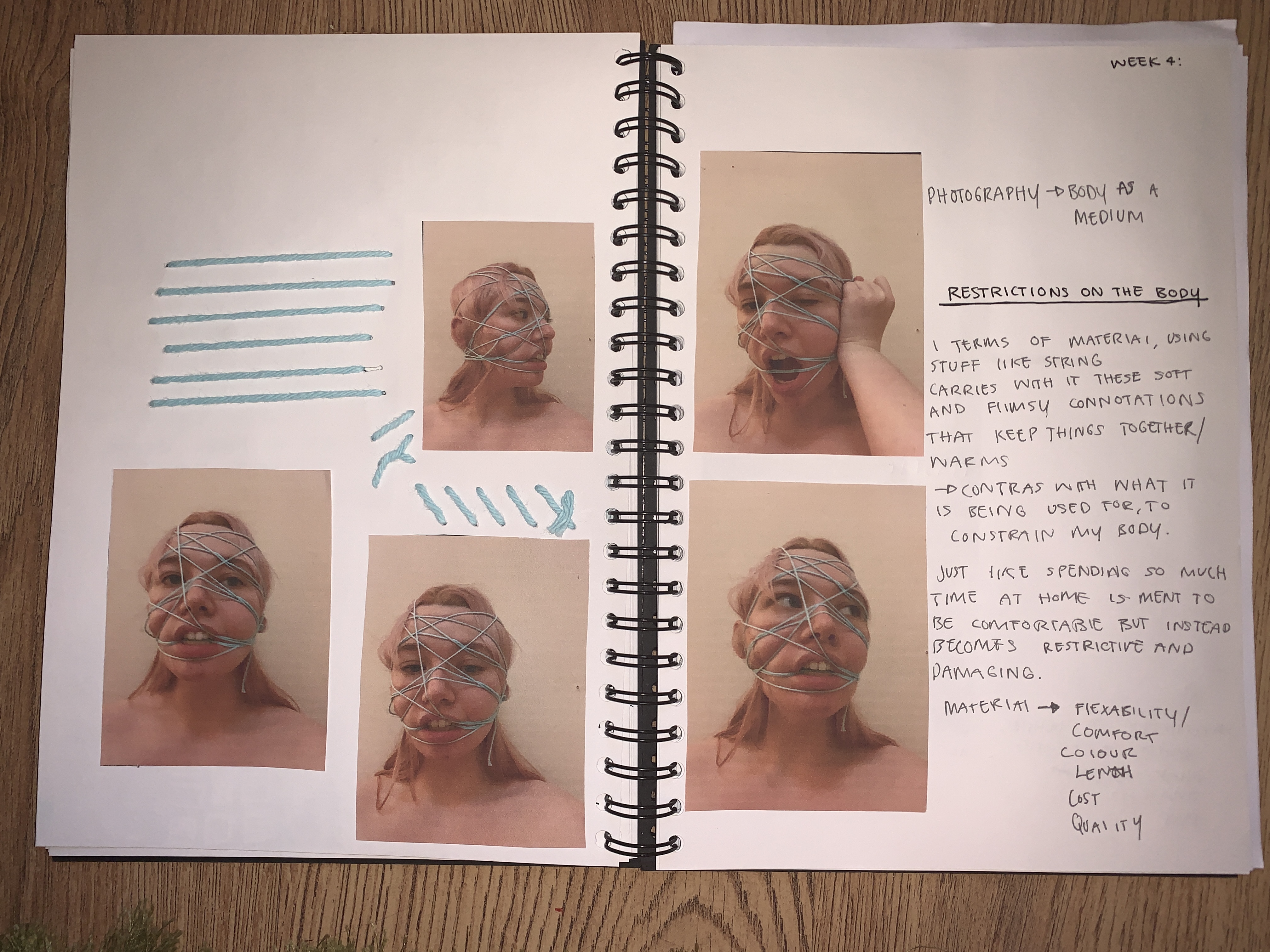
Moving forward with the project i wanted to play around with photography and using my body as a medium.
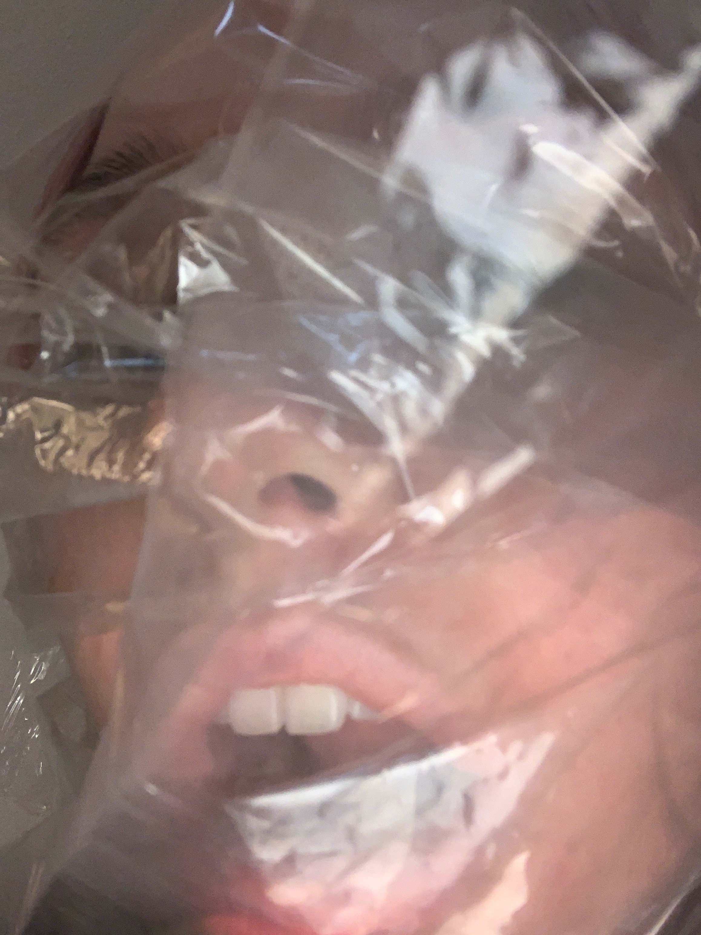
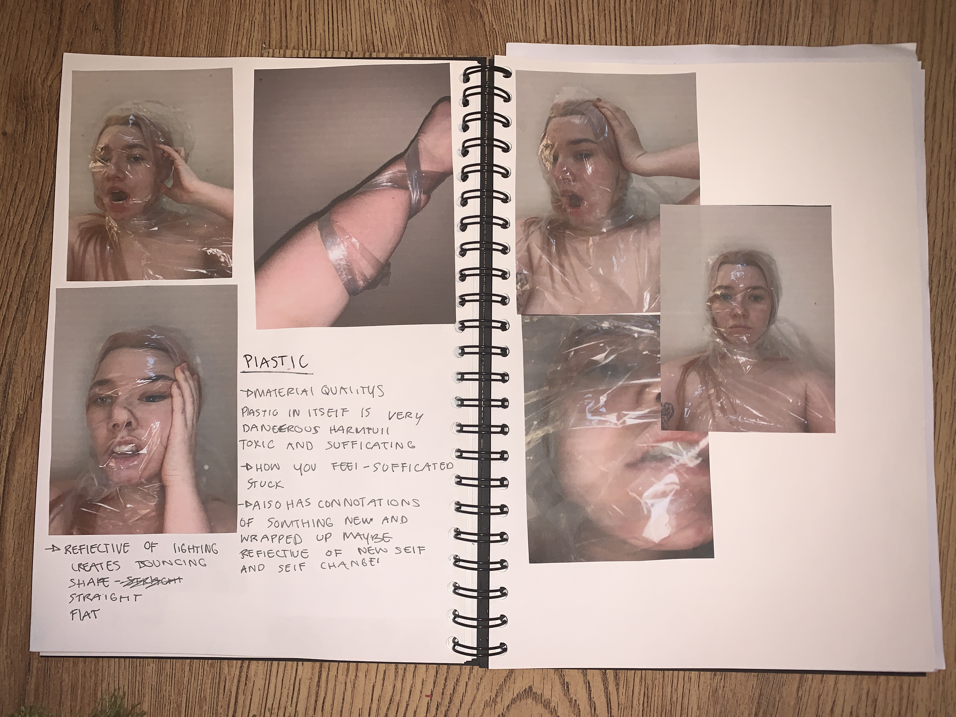
Thinking about restrictions in terms of material using plastic has this overwhelming and obvious connotations of suffocation and feeling confined. String carries with it these similar connotations as well as it also being quite soft and flimsy unlike plastic.
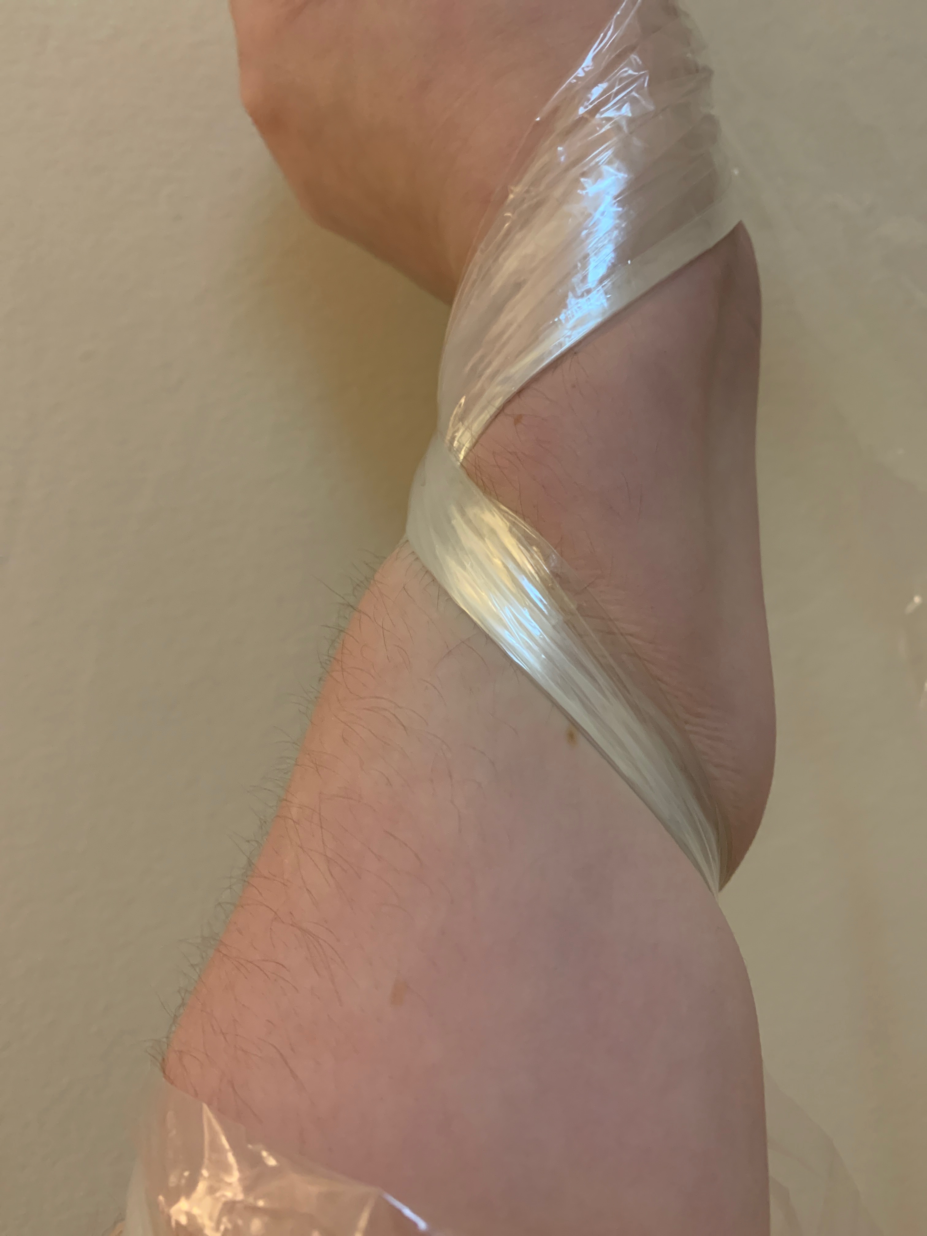
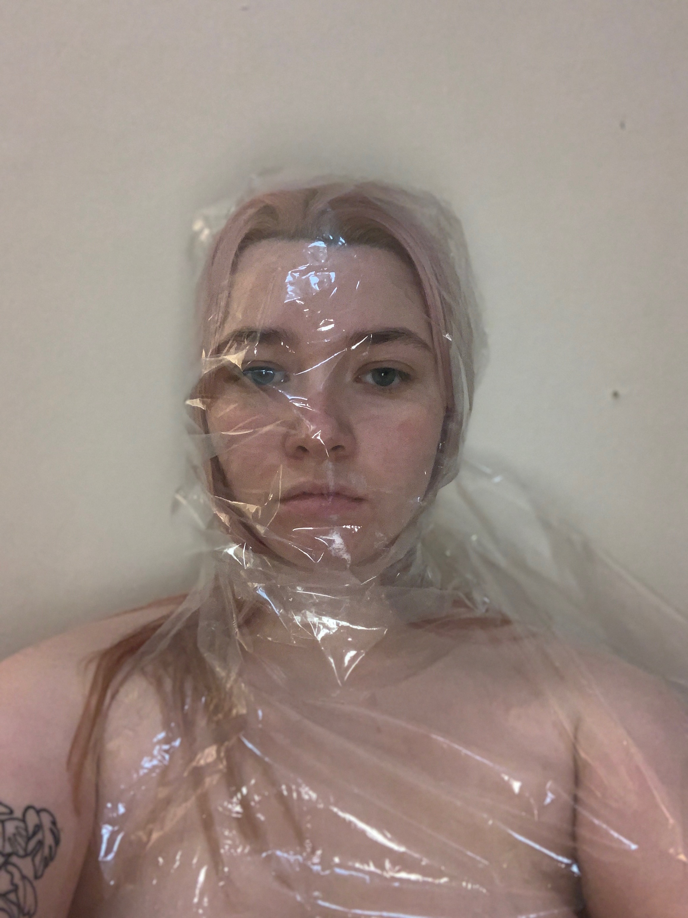
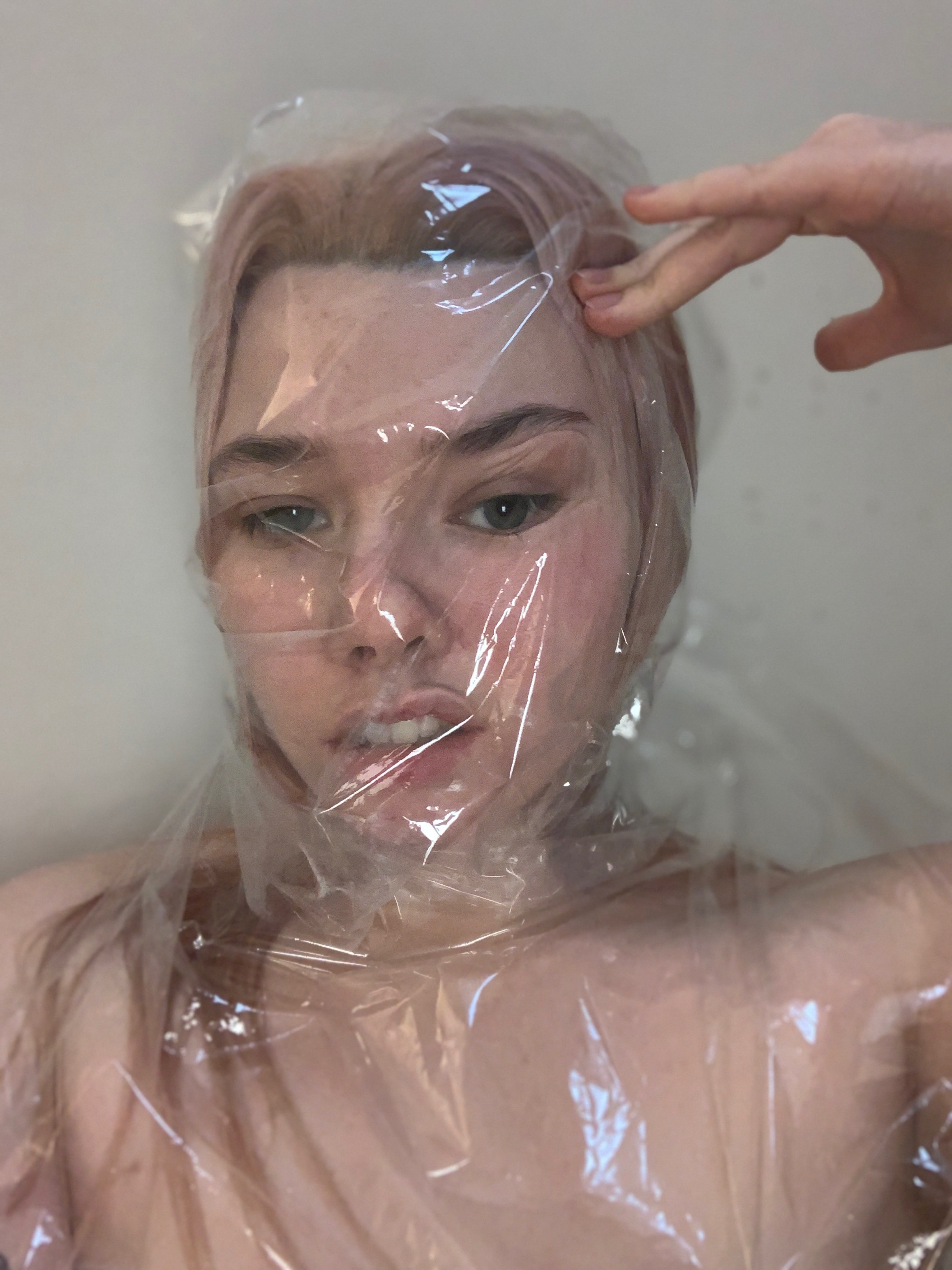
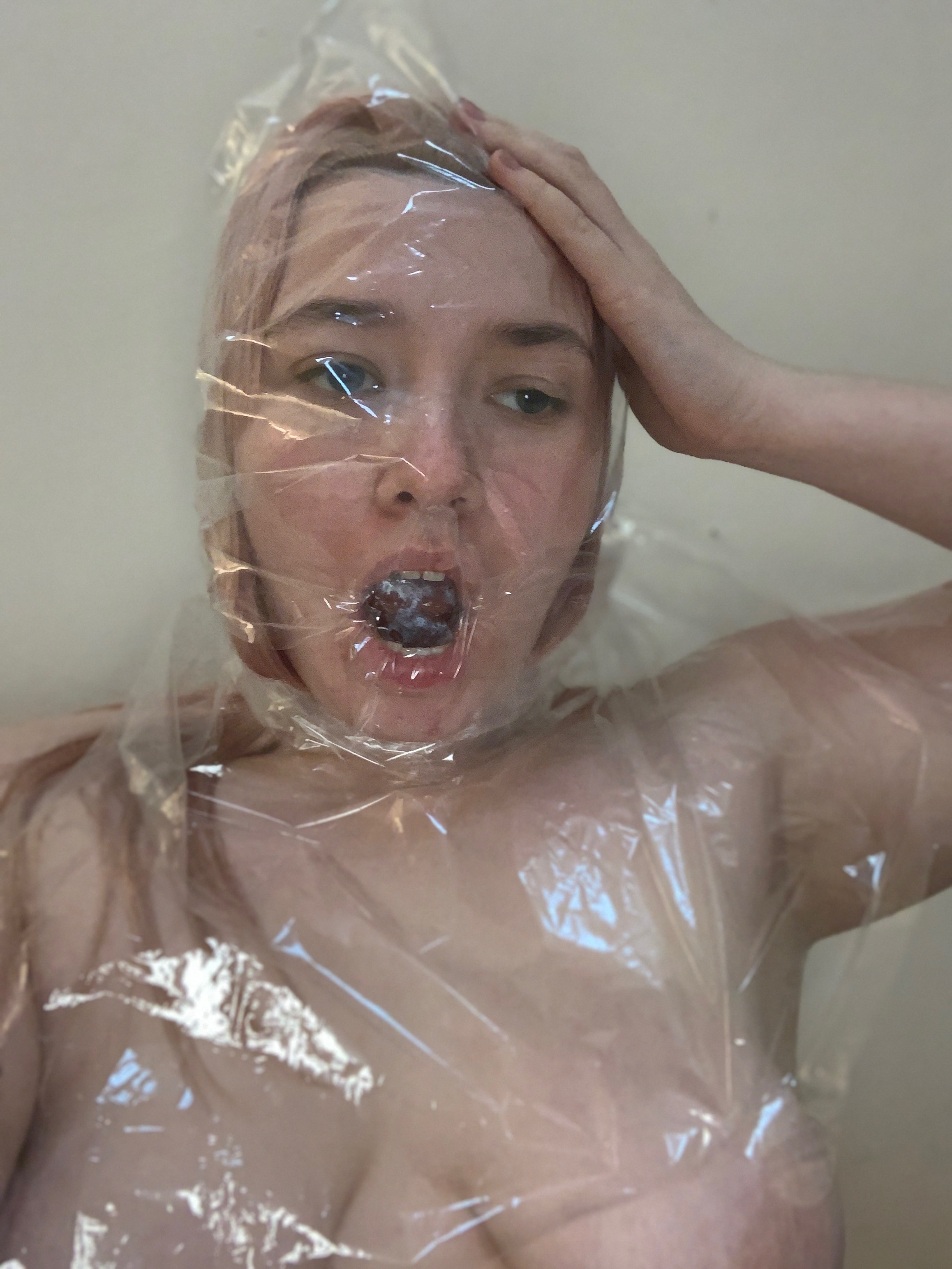
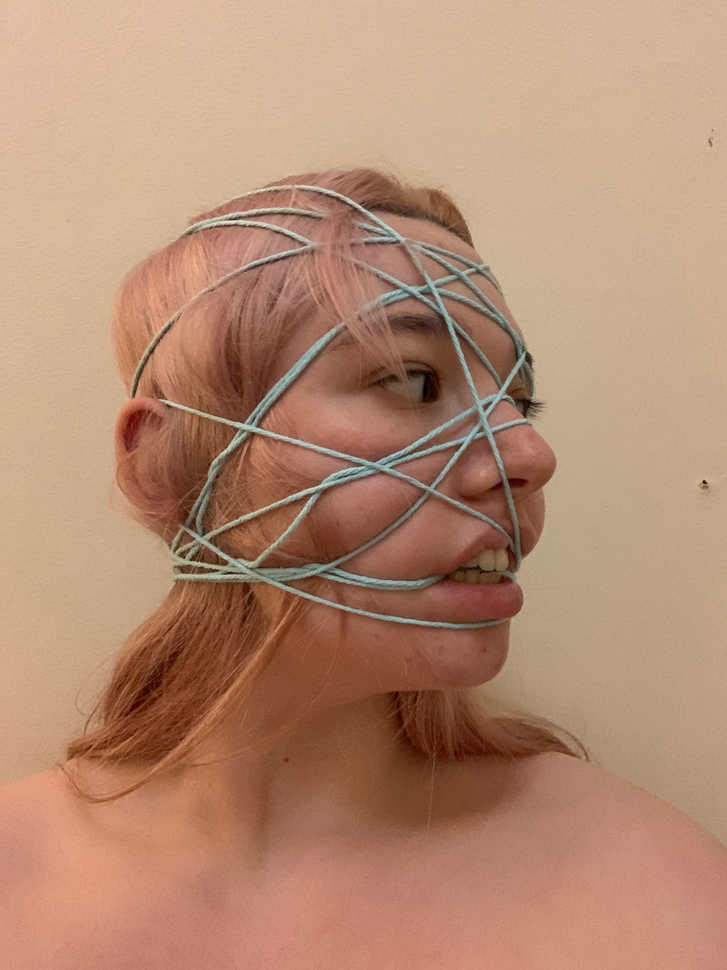
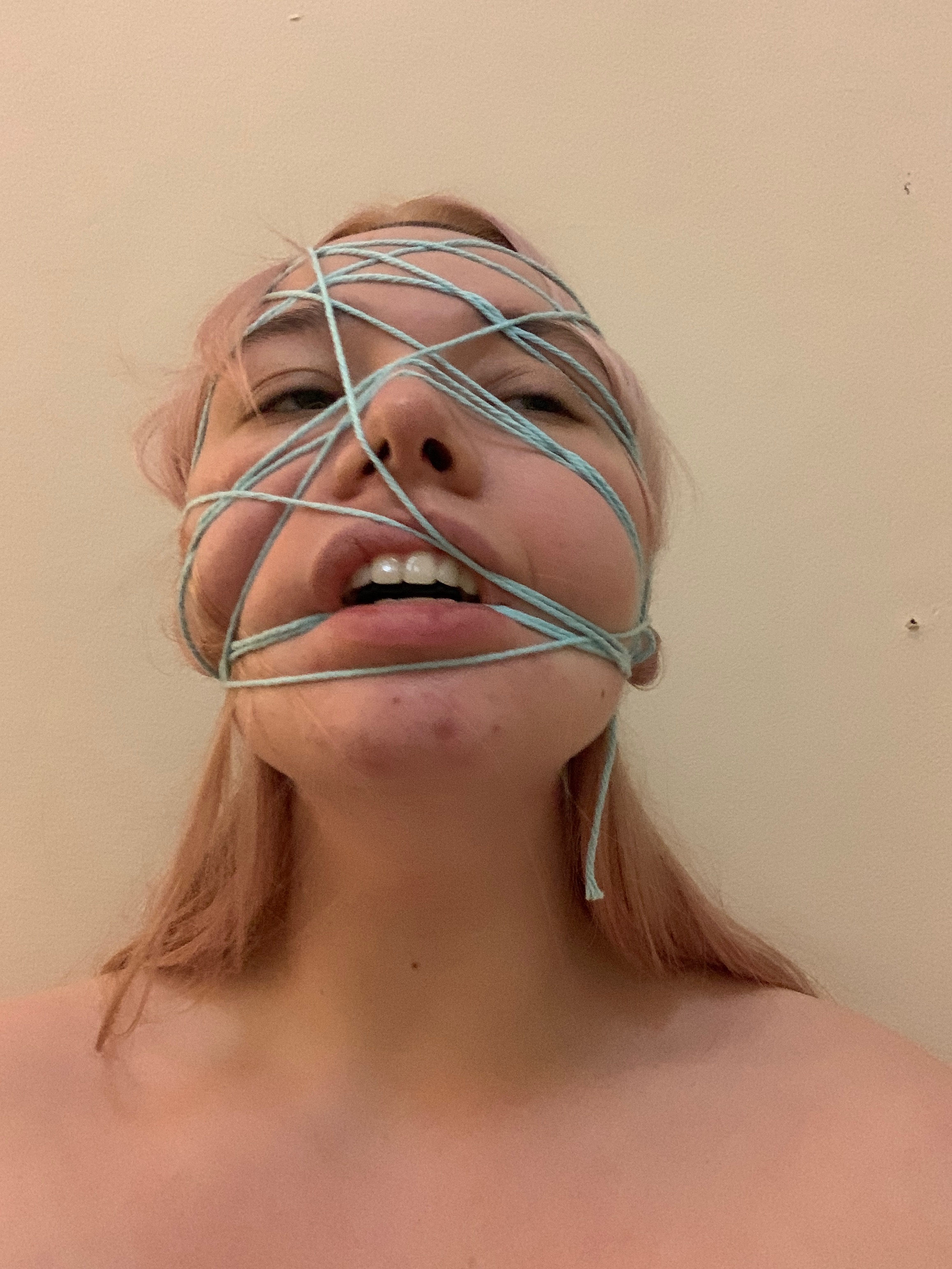
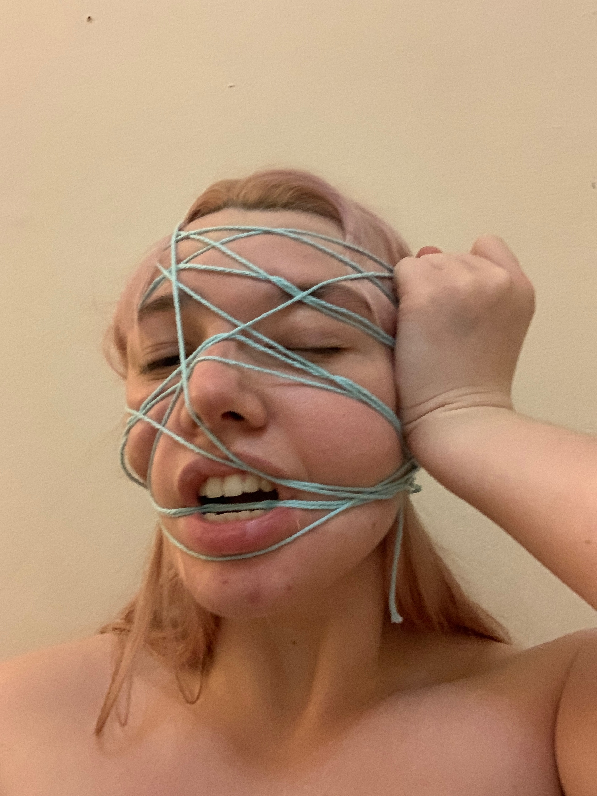
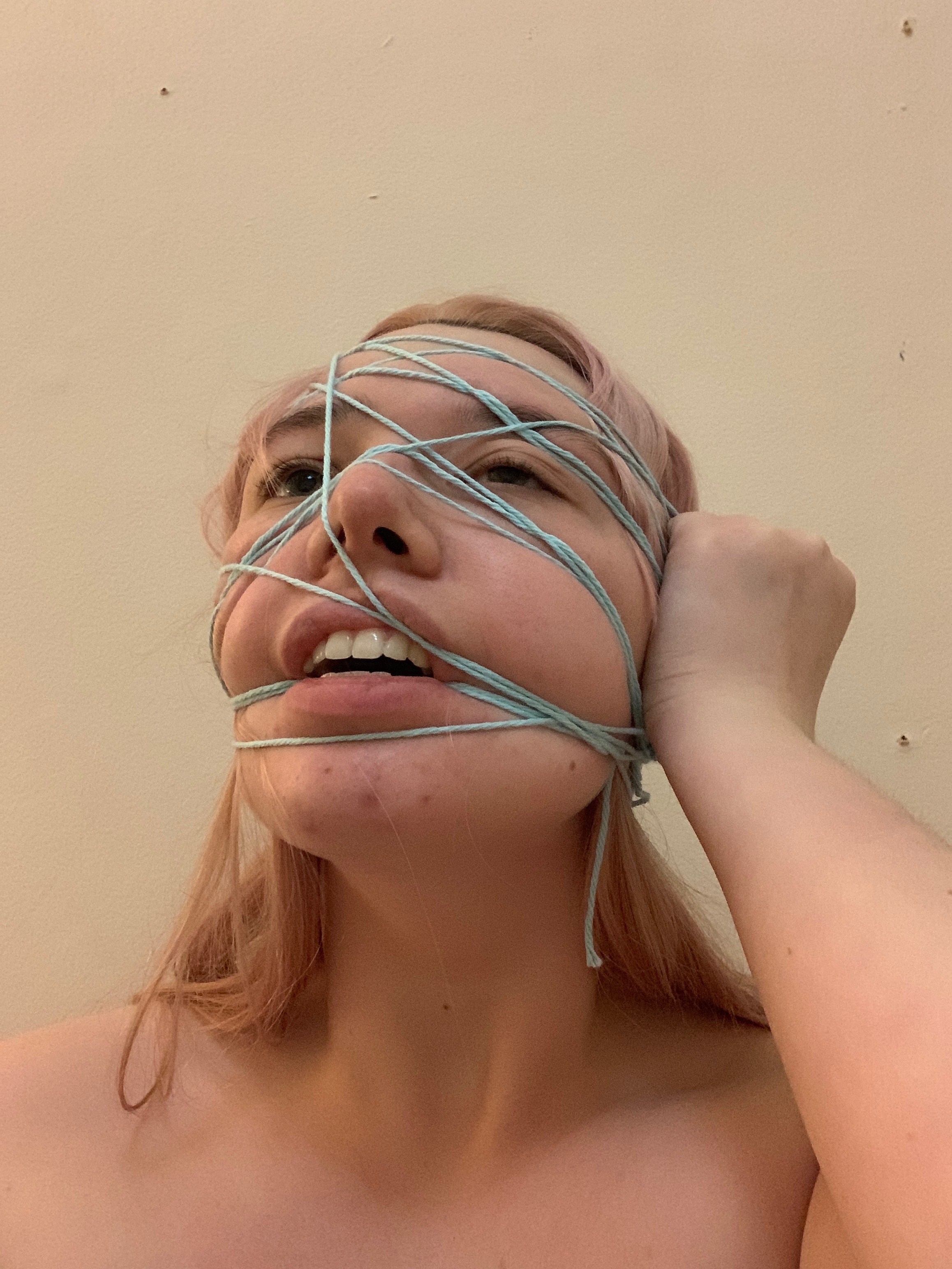
NEON
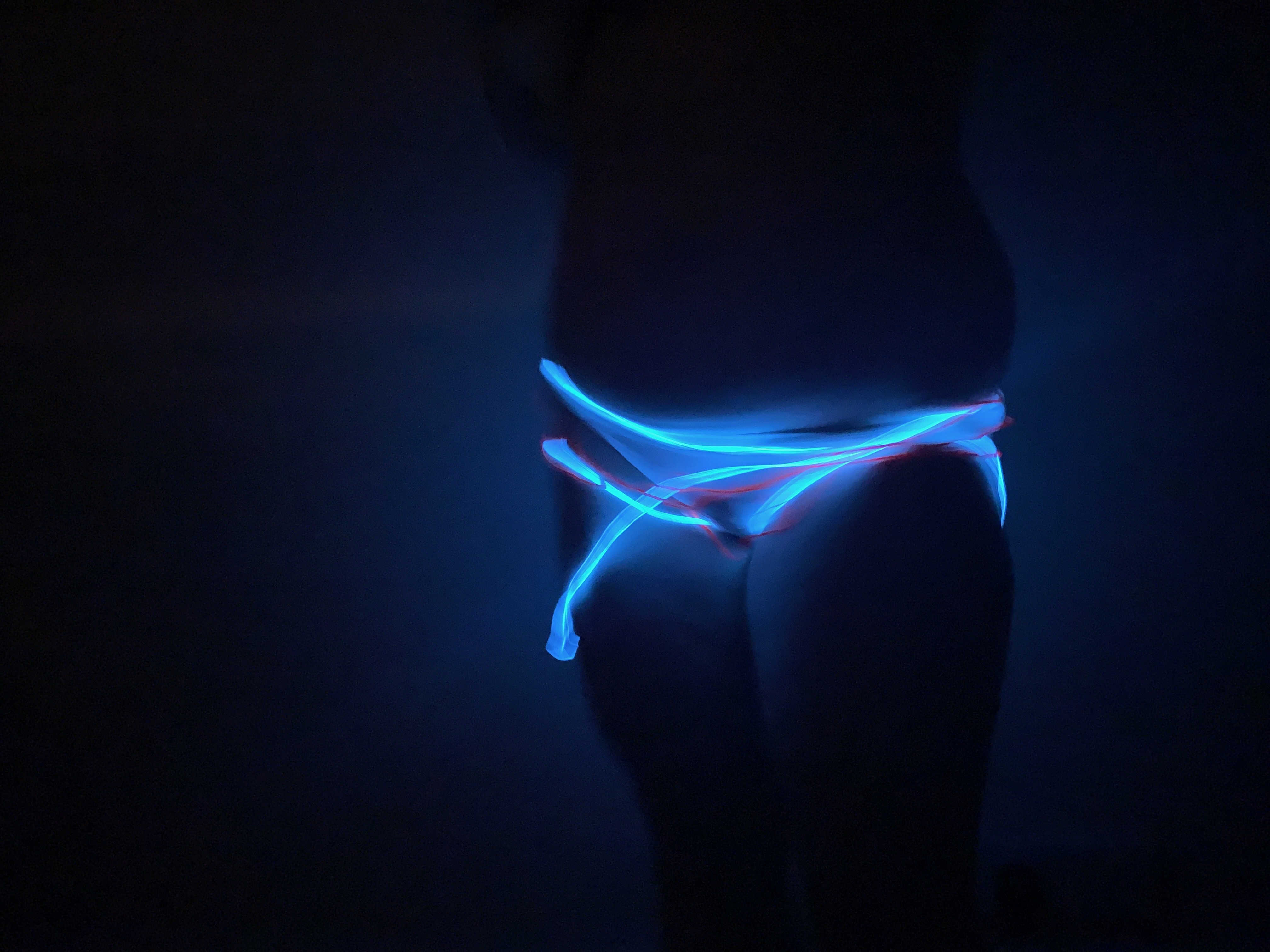
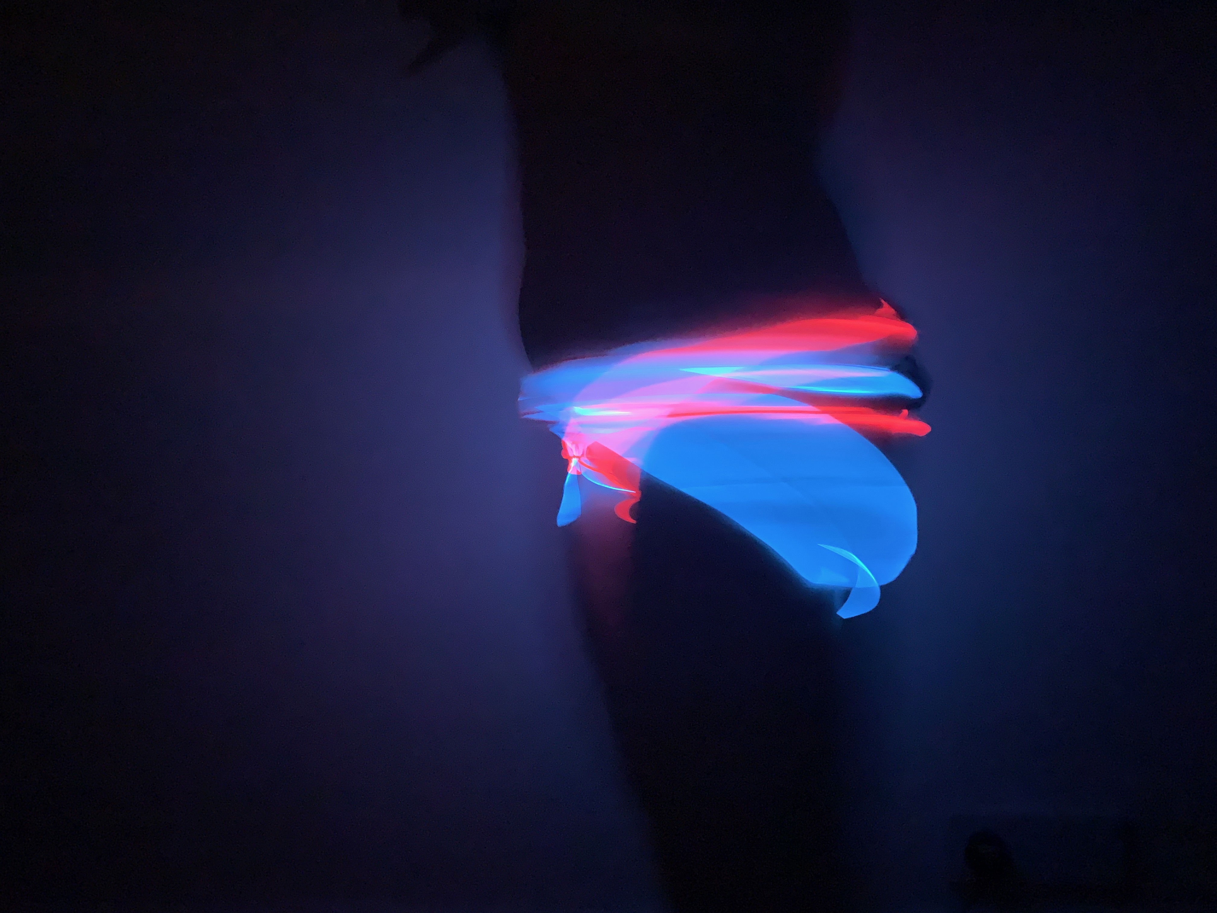
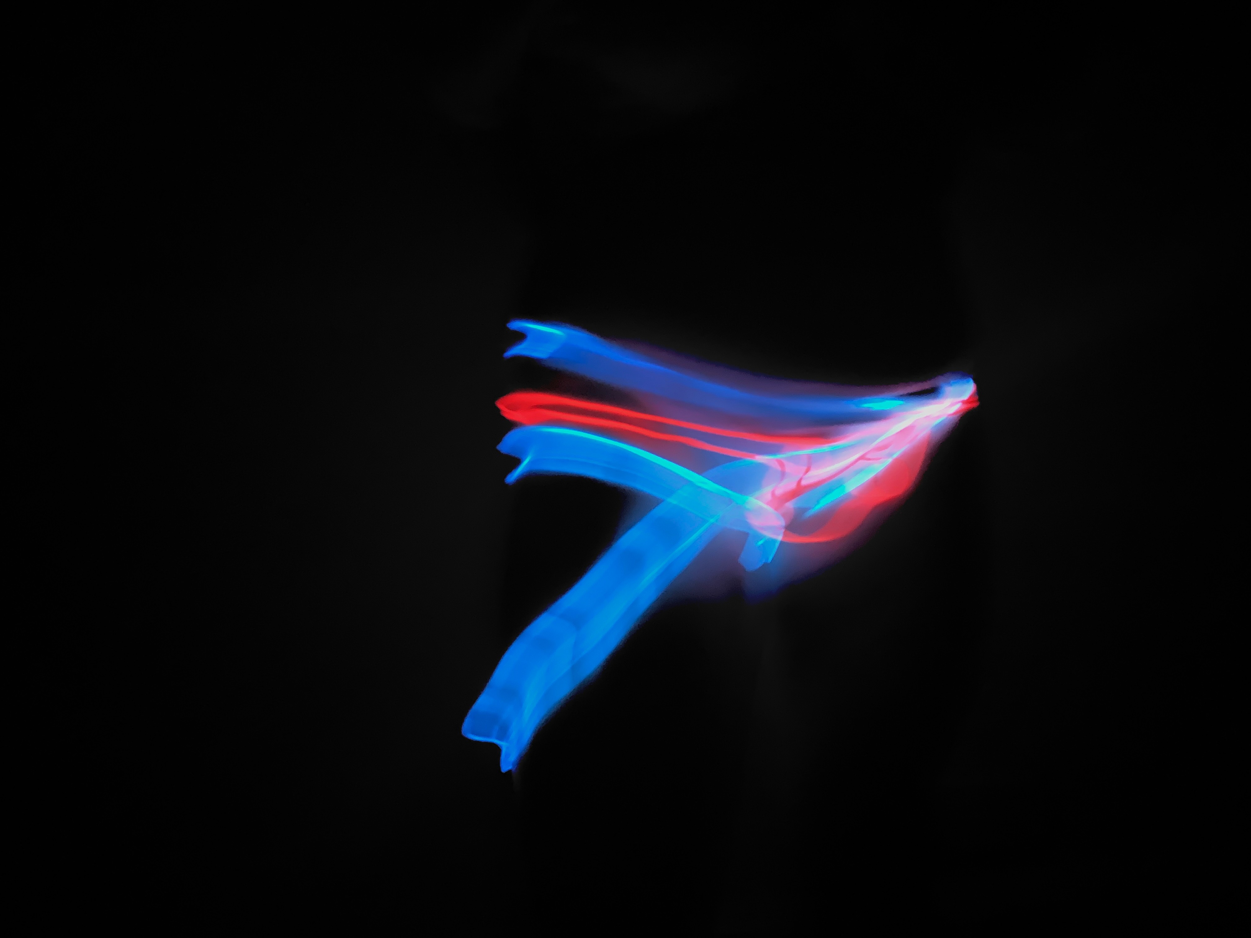
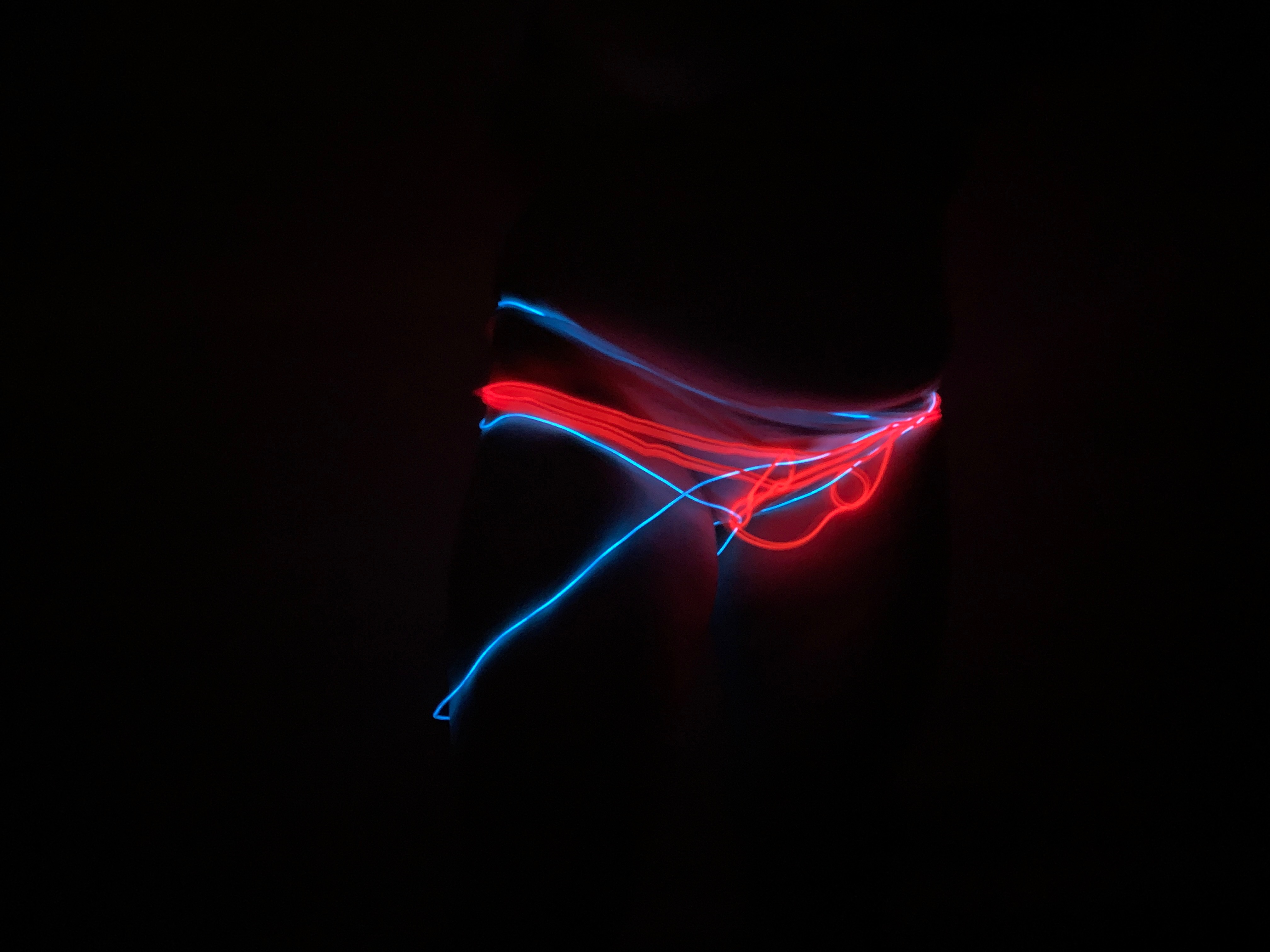
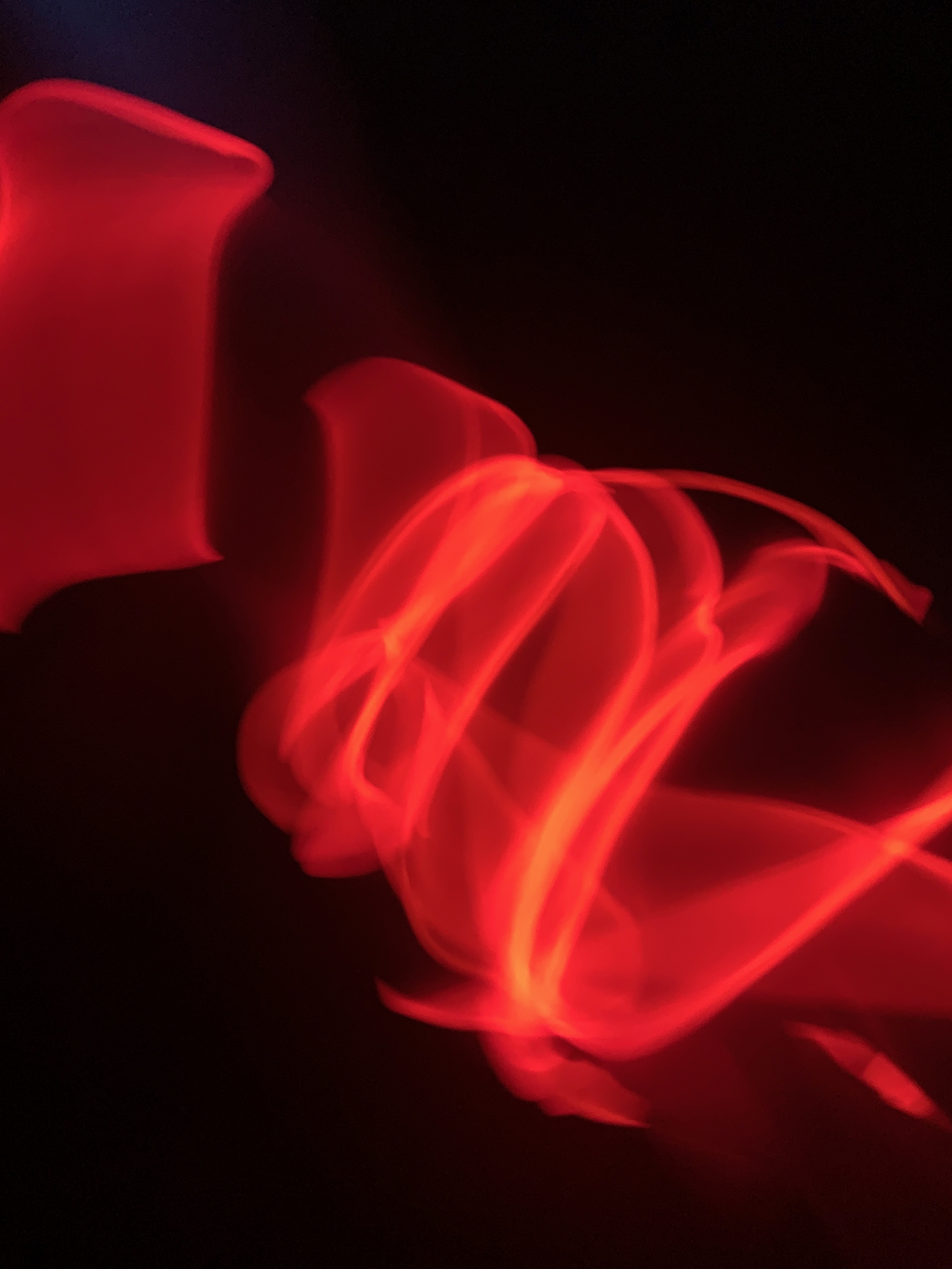
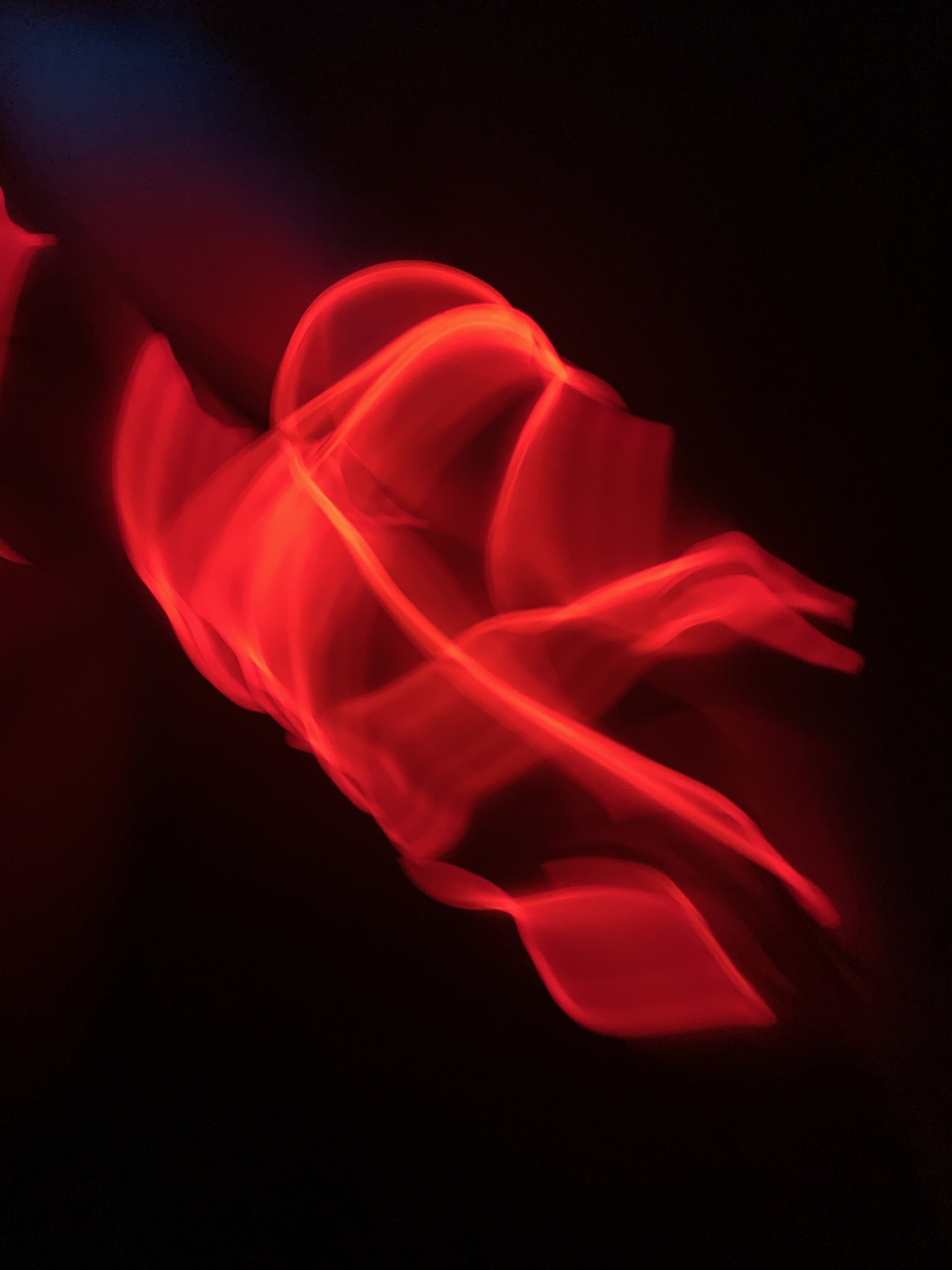
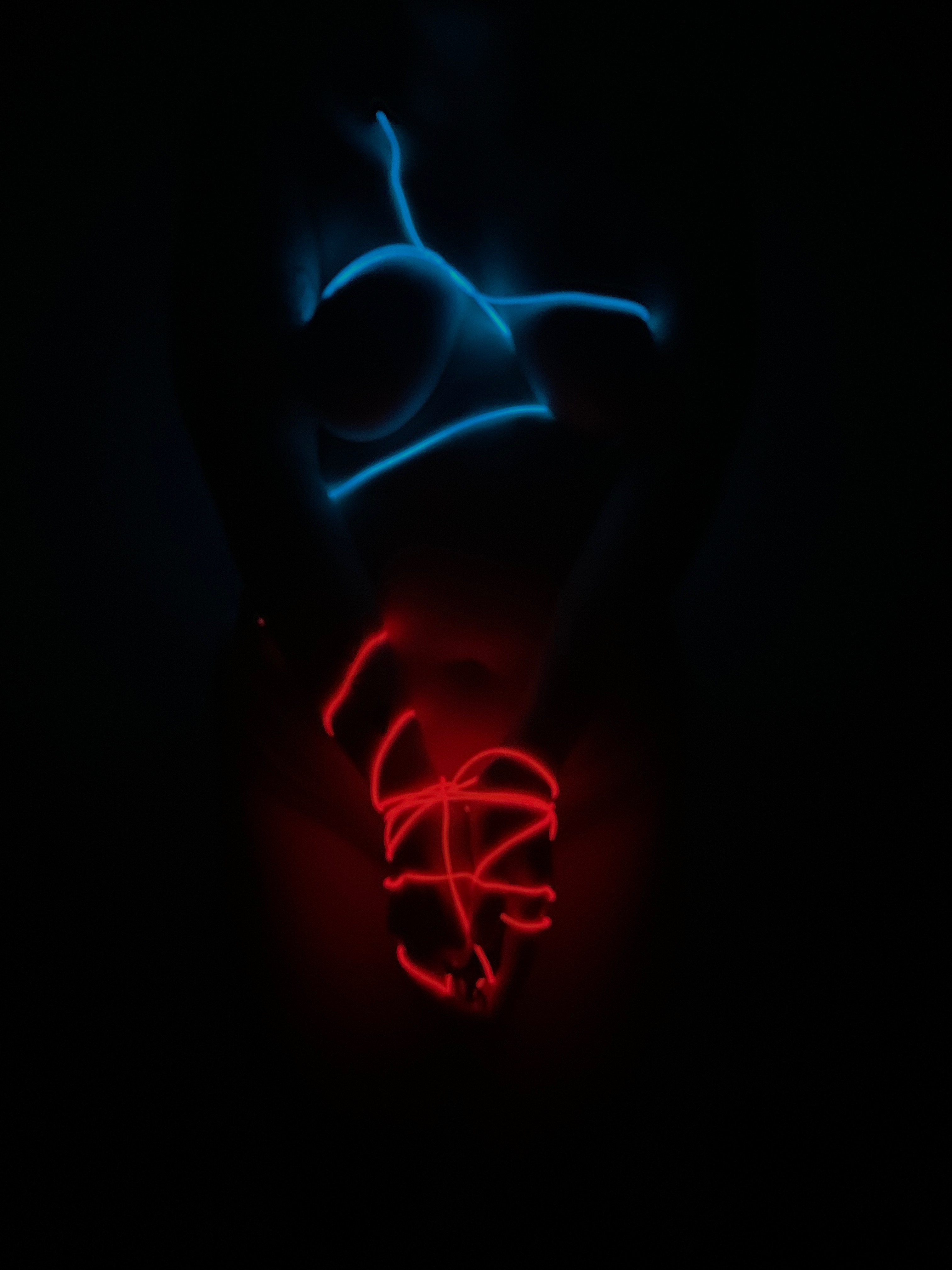
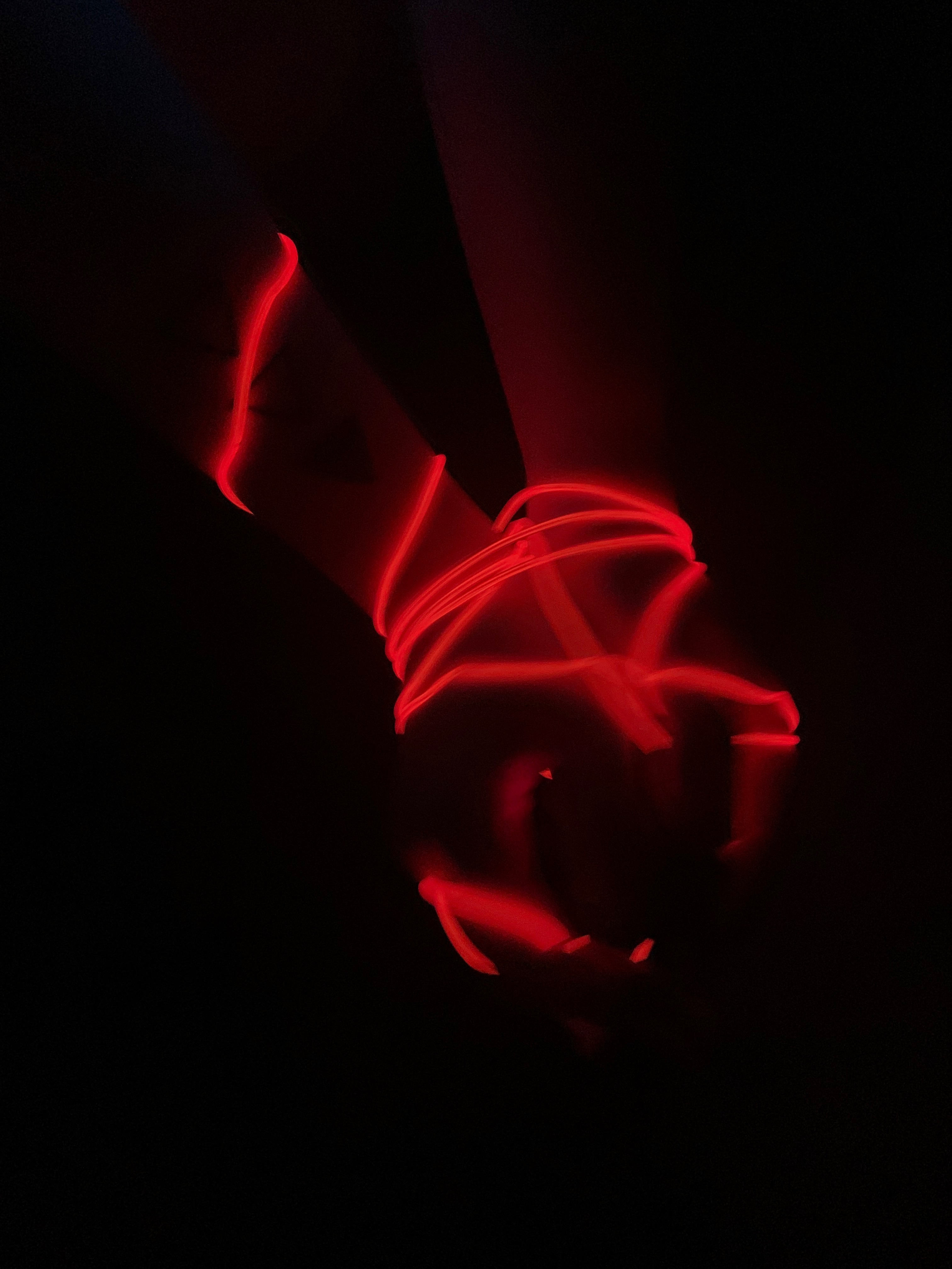
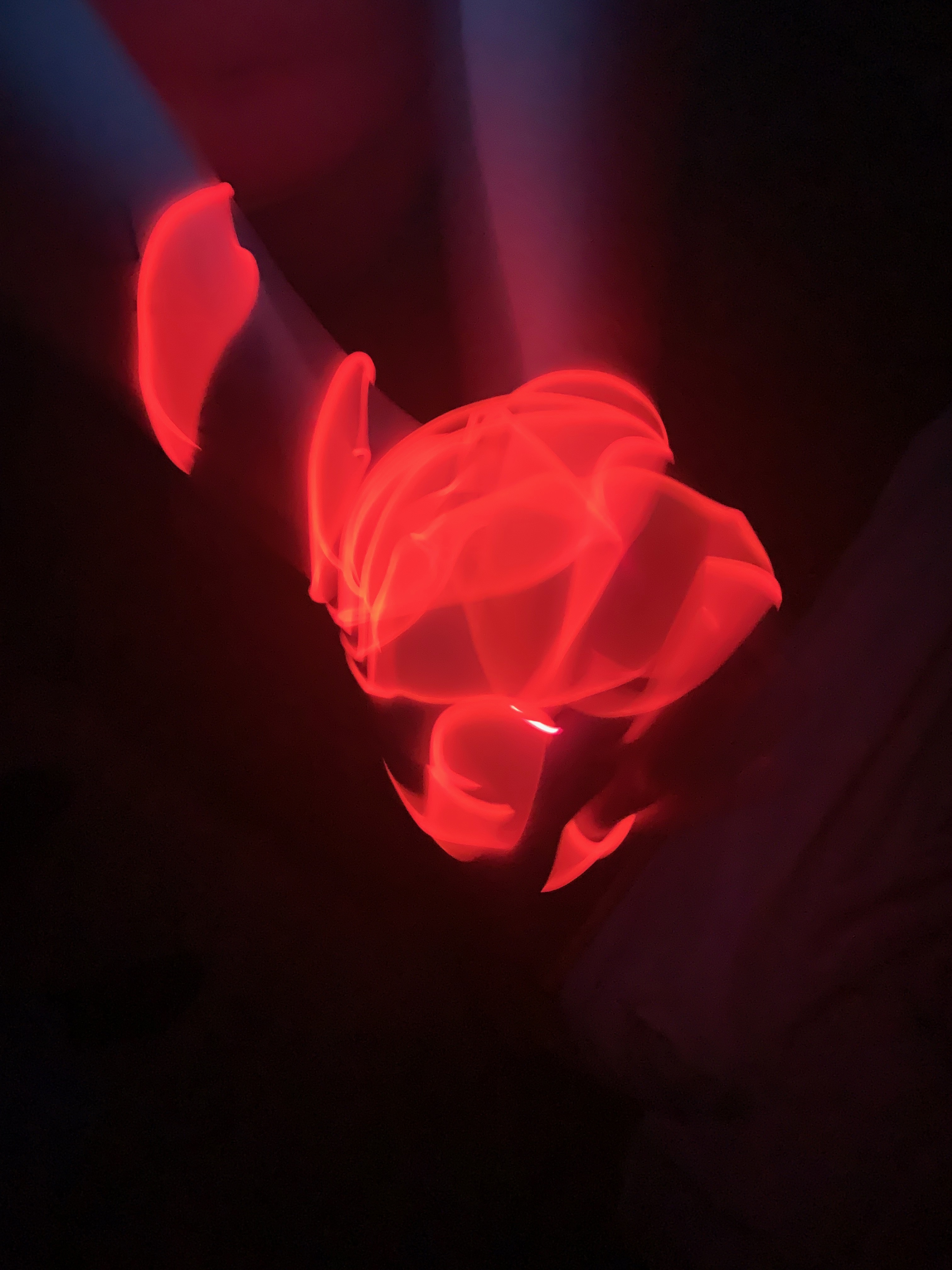
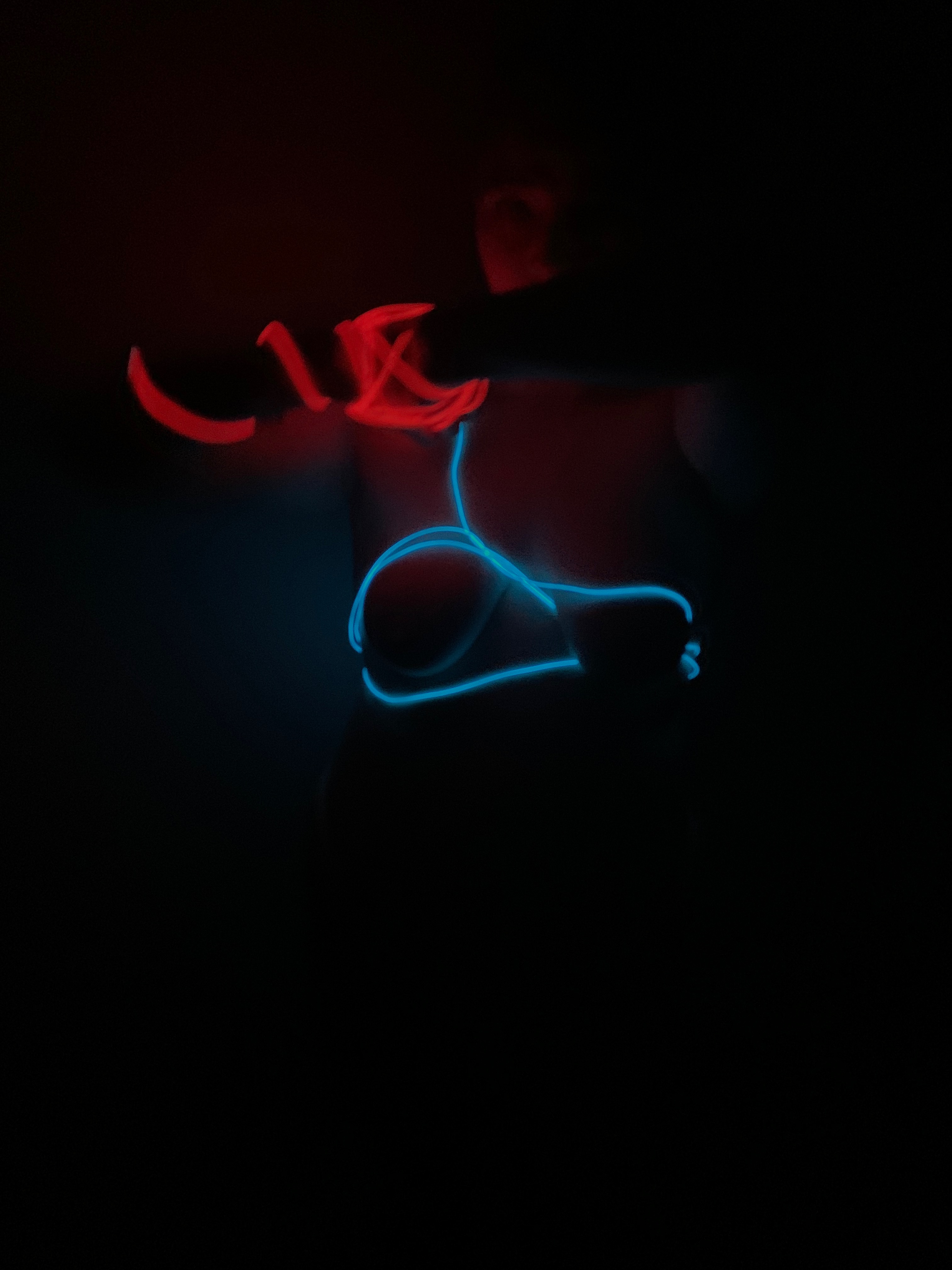
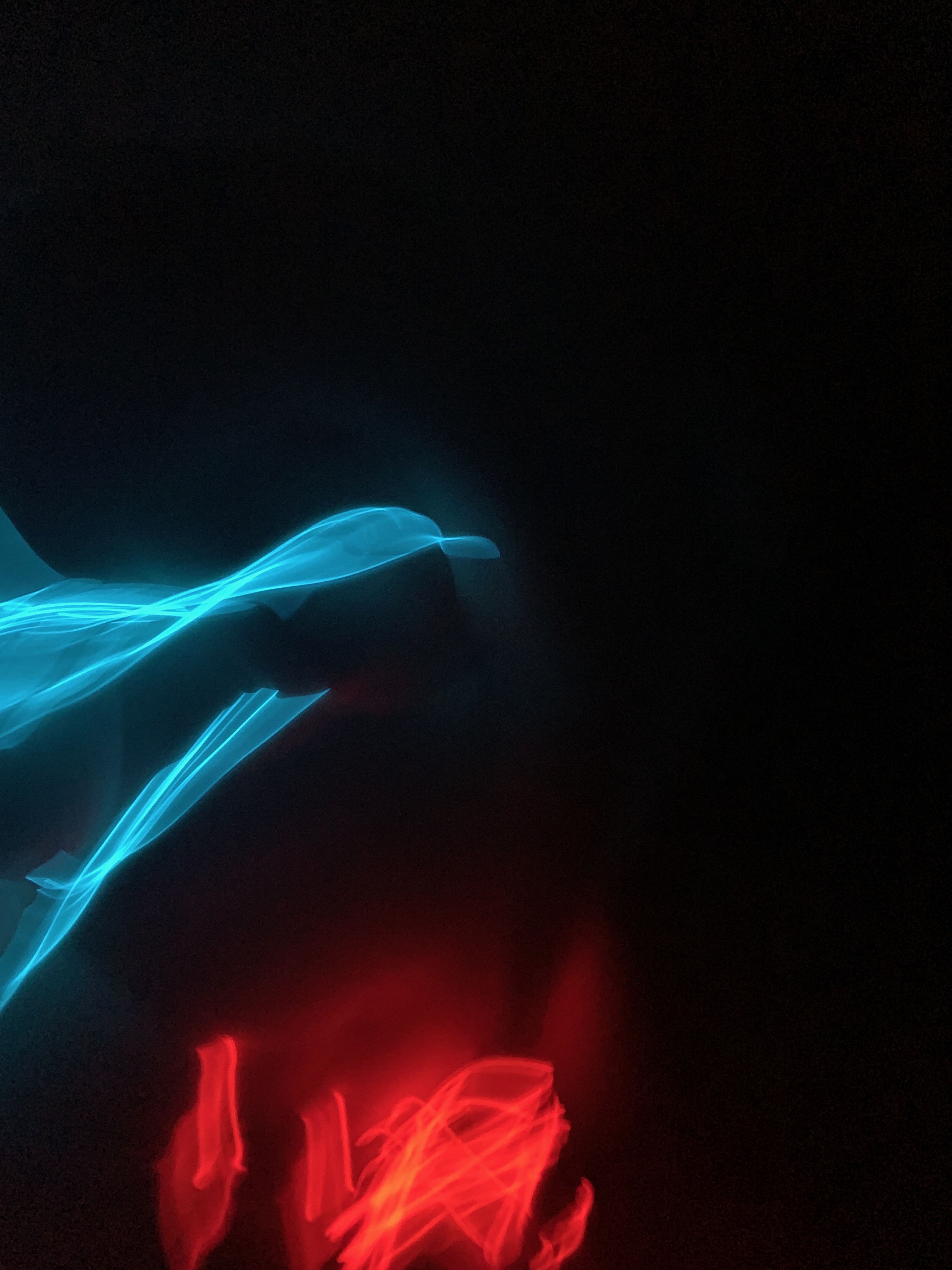
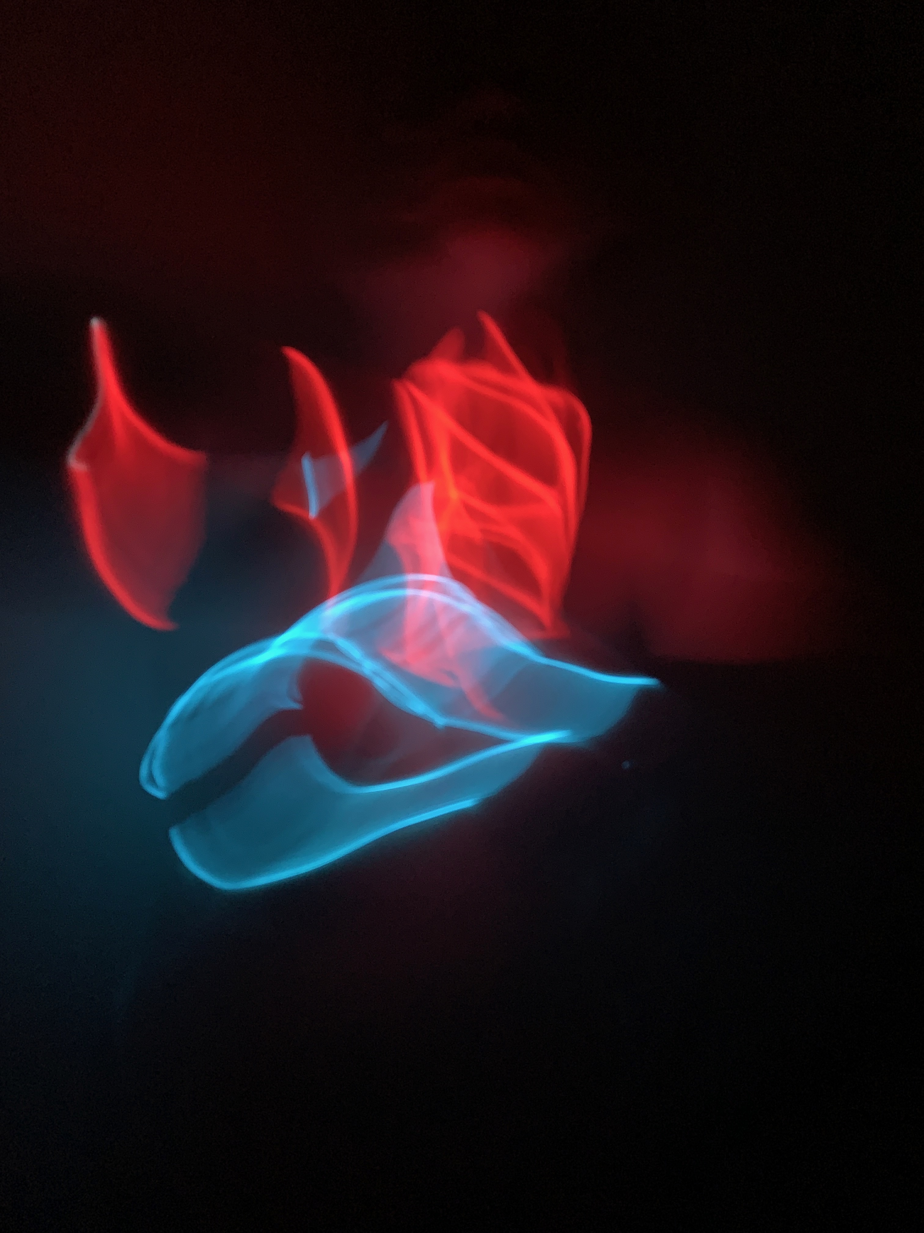
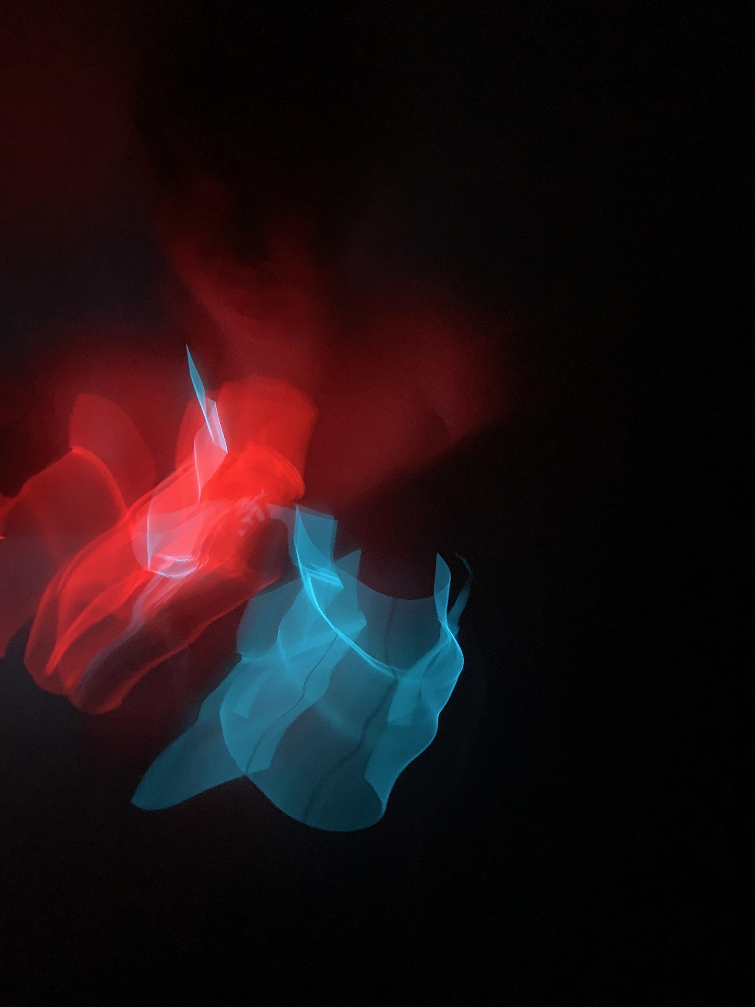
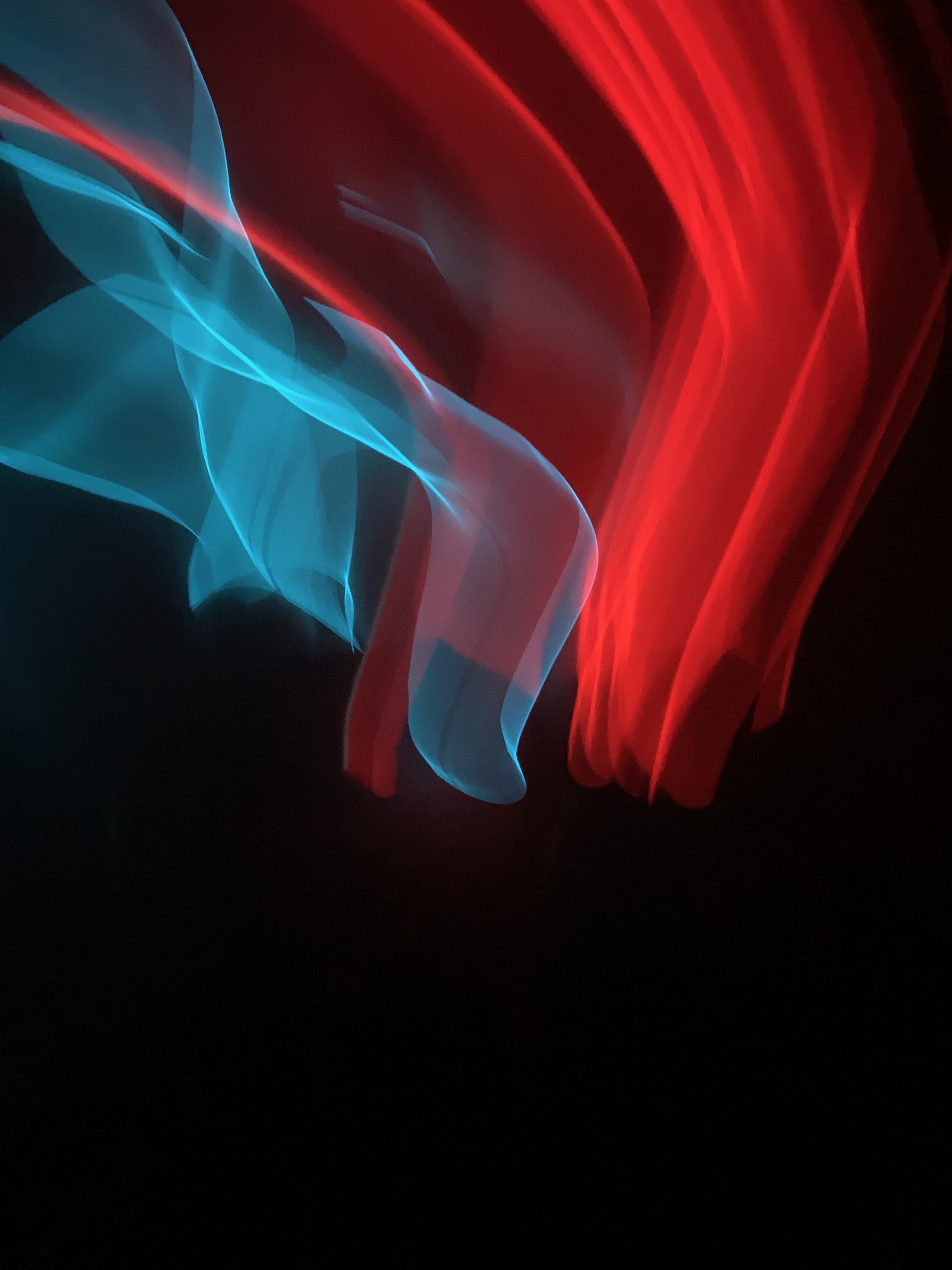
with inspiration from artists like Tracy Emin and Bruce Neuman i had wire from a prevoius project iwanted to play around with wraping it apround my body creating these amazing images.
My favouire images atre the ones where they resemble pants as i think they carry with them these sexual connotations about the restrictions. Focus on the sex and forbiddances of it because fo the current circumstances making it almost even more desirable and highlighting its absence.




Artist Research – Barlow, Delaunay and Hesse
Phyllida Barlow’s Drawings
While Barlow is best known for her sculptural work, her majority of these have been destroyed. This leaves behind her drawing archive as the only surviving record of her earlier sculptural practice. Her drawings show influences from Arte Povera, Pop Art and New British Sculpture amongst others.


Its easy to see and draw a connection between her primary working drawings and her resolved sculpture work. she draws all throughout her creative process, both to aid developing work and to visualise ideas which are later translated into three dimensions. The drawings are fluid and create a real feeling of space like stepping into another hazy colourful dimension. Primarily using pencil, pastel and charcoal using cross-hatching, scribbling or covering expanses of paper in washes of flat colour, her mark-making appears deliberate but at the same time free flowing and spontaneous.
Her bold use of vibrant colour as a means of expression is the thing I find the most interesting as I think colour is a big part of my own practice. Looking at her work and moving forward with this drawing project I want to carefully start including colour in the form of pencils and pastels. I want to create drawings that feel like a small vibrant space that could be visited while still being abstract enough that it can be interpreted in different ways.
Sonia Delaunay’s Drwaing’s
Delaunay’s work pioneered the movement simultanism. This movement revolved around the idea of colours looking different depending on the colours at surrounded them. In her own words “Colour is the skin of the world.” “One who knows how to appreciate colour relationships, the influence of one colour on another, their contrasts and dissonances, is promised an infinitely diverse imagery.”

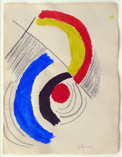

She was a multi-disciplinary abstract artist and key figure in the Parisian avant-garde alongside her husband, Robert Delaunay. While she is now known for her large abstract and wildly colourful painting i am most drawn to her smaller drawings and colour studies. These show such movement and again appear almost otherworldly. While the colours are mostly contrasting when arranged and placed in her thoughtful swirling compositions it feels totally harmonised. The contrast of the chaos and the calm i find the most interesting.
I think I am most drawn to her work as I also consider colour to now be a large part of my practice. After coming out of lockdown and everything that was going on I feel like I want to explore and incorporate it more in my work as I really feel like iv been lacking it. As well as this I have been living with someone who is colour blind and having them as an impact on my everyday life, having them see things completely different to me i think has inspired me to consider it more.
Eva Hesse
Hesse was a German-born American sculptor known for her pioneering work in materials such as latex, fiberglass, and plastics. Like Barlow she is most known for her sculptural work and use of materials in this field however i find her working drawings and sketches most interesting. She strongly establishes the type, feel and shape of the material in the drawings despite only using drawing materials with no text to label what is what. Also its easy to see how the materials will react and communicate with each other just how they overlap on the page.
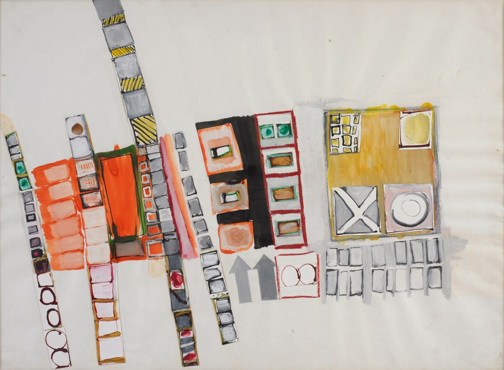


The abstract forms suggest figures and objects interacting and almost becoming one with each other. They speak of positive stories and spaces, something transports you into a new and imaginative space.
 CHARLEY MILLAR ART