ESW

DAY ONE

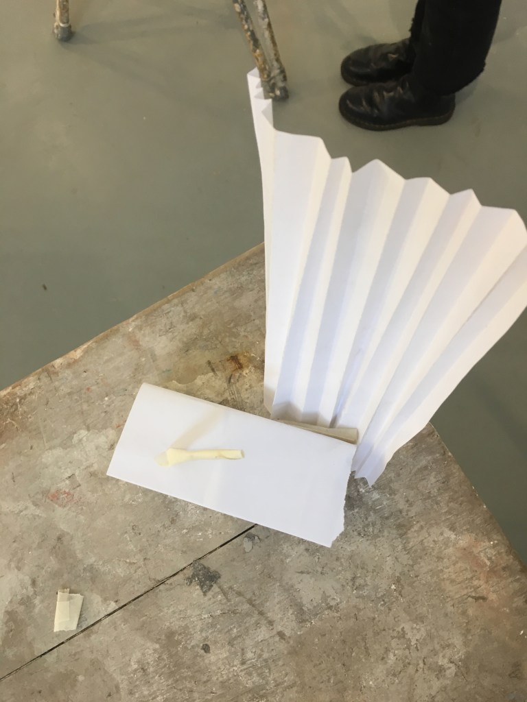
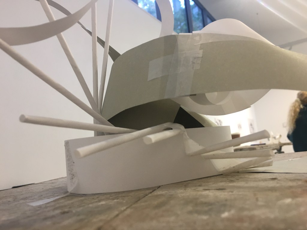
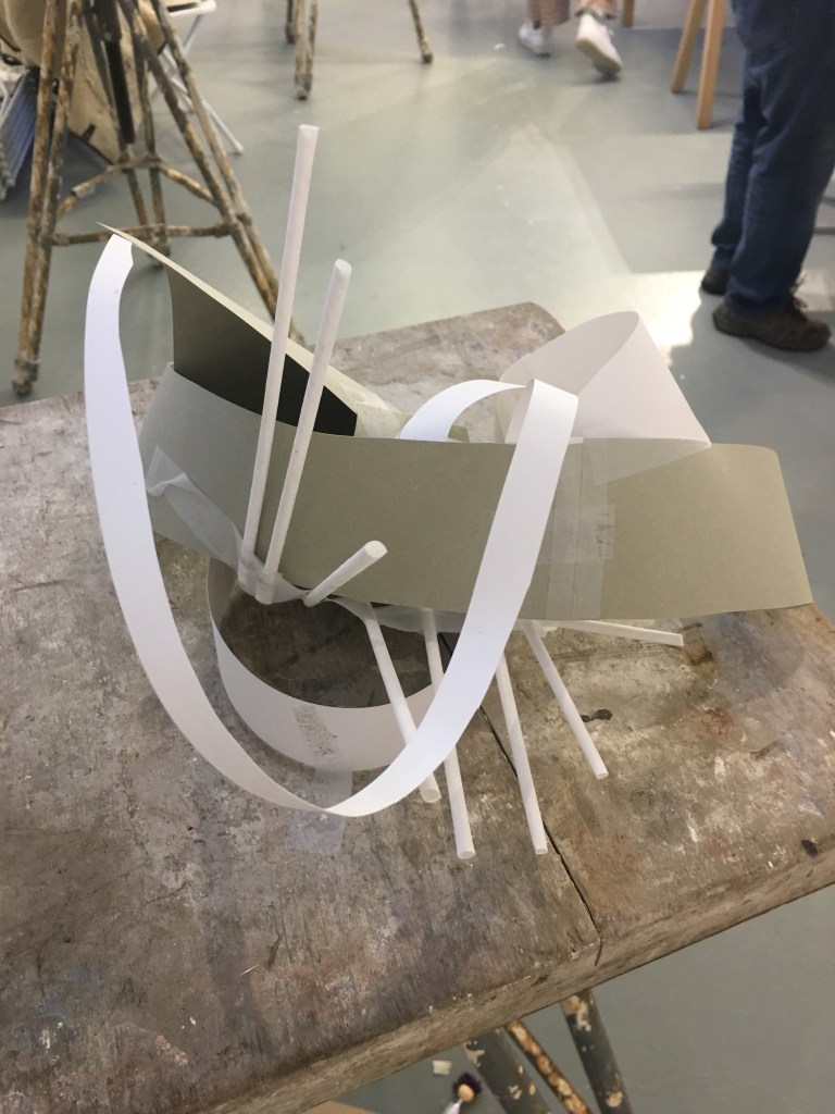
The inspiration for everything we made on day one of ESW came from a 15 minute walk at the very beginning of the day. We were asked to take in and consider shapes, patterns, textures, depth, scale etc. With all these elements considered I used the materials I was provided to create a 10 minute 3D response to what I had just seen. However found this challenging as we were only provided paper and tape. I tried mostly to show the angular and industrial elements of my surroundings as well as the differing levels and hight.
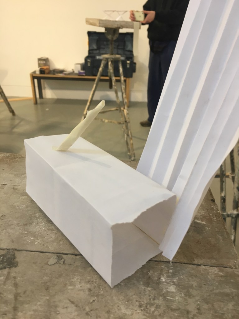
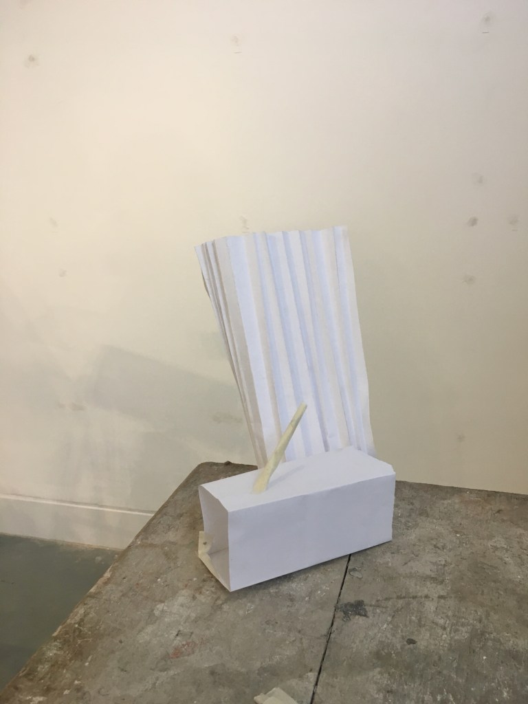
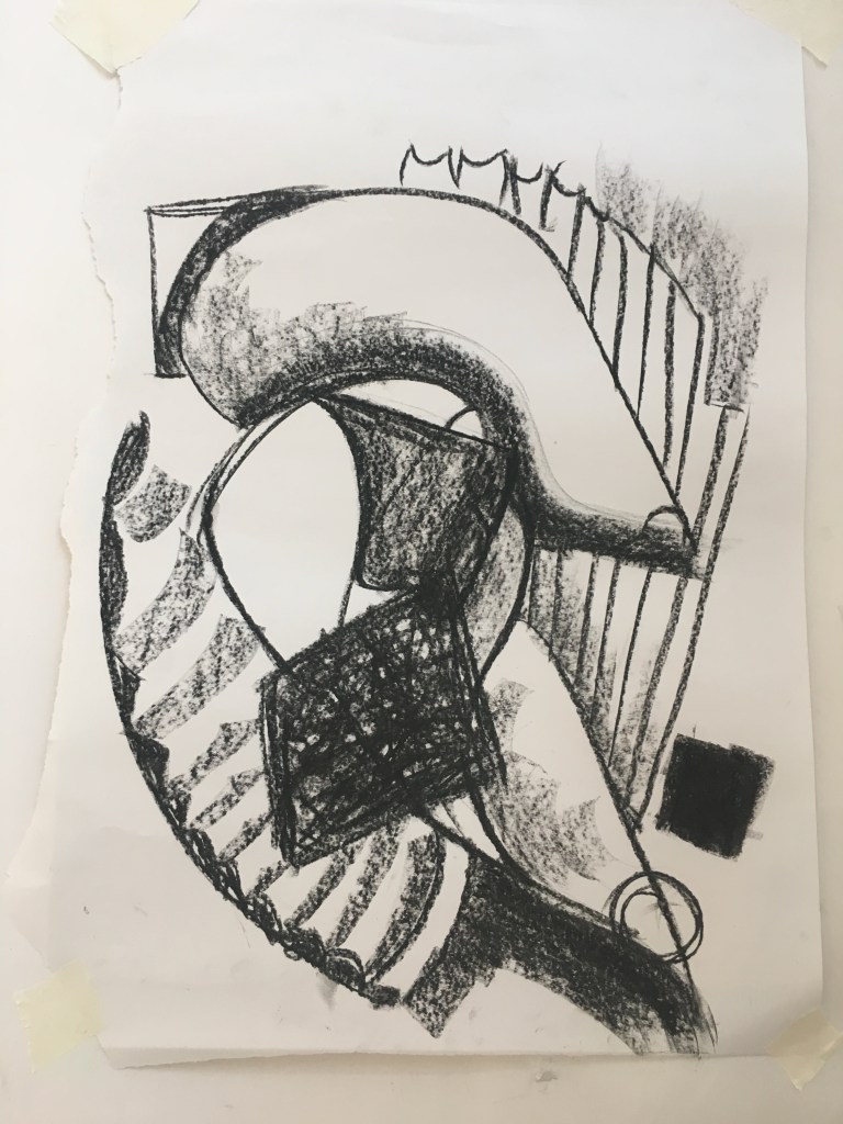
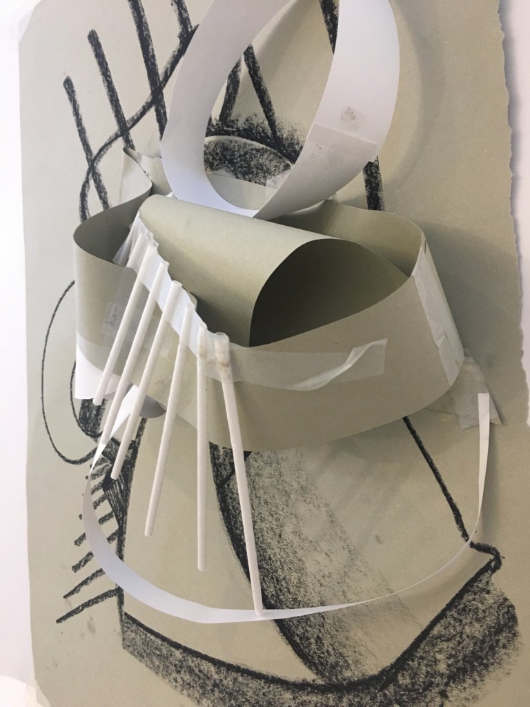
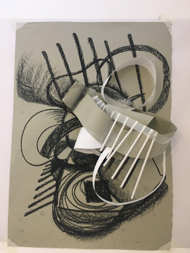
After reflecting and evaluating our timed paper sculpture we then were put through a series of translating 3D into 2D. Repeating this process created and produced a large variety of work.
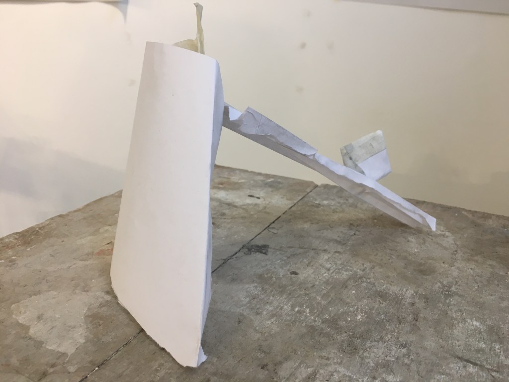
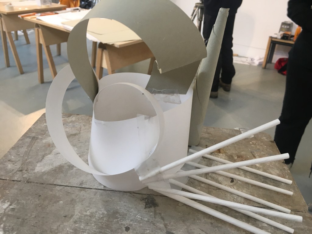
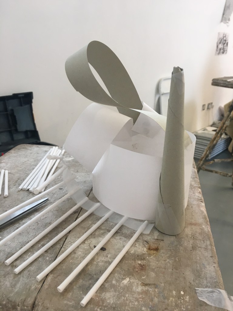
As the day progressed we were given more and more time with a larger range of materials. AS a result, the scale and complexity of the sculptures complicated and developed further. This creative cycle was quick and easy to do and I’m planning on implementing it on my own working practice when I feel stuck or I am unable to move forward with and idea.
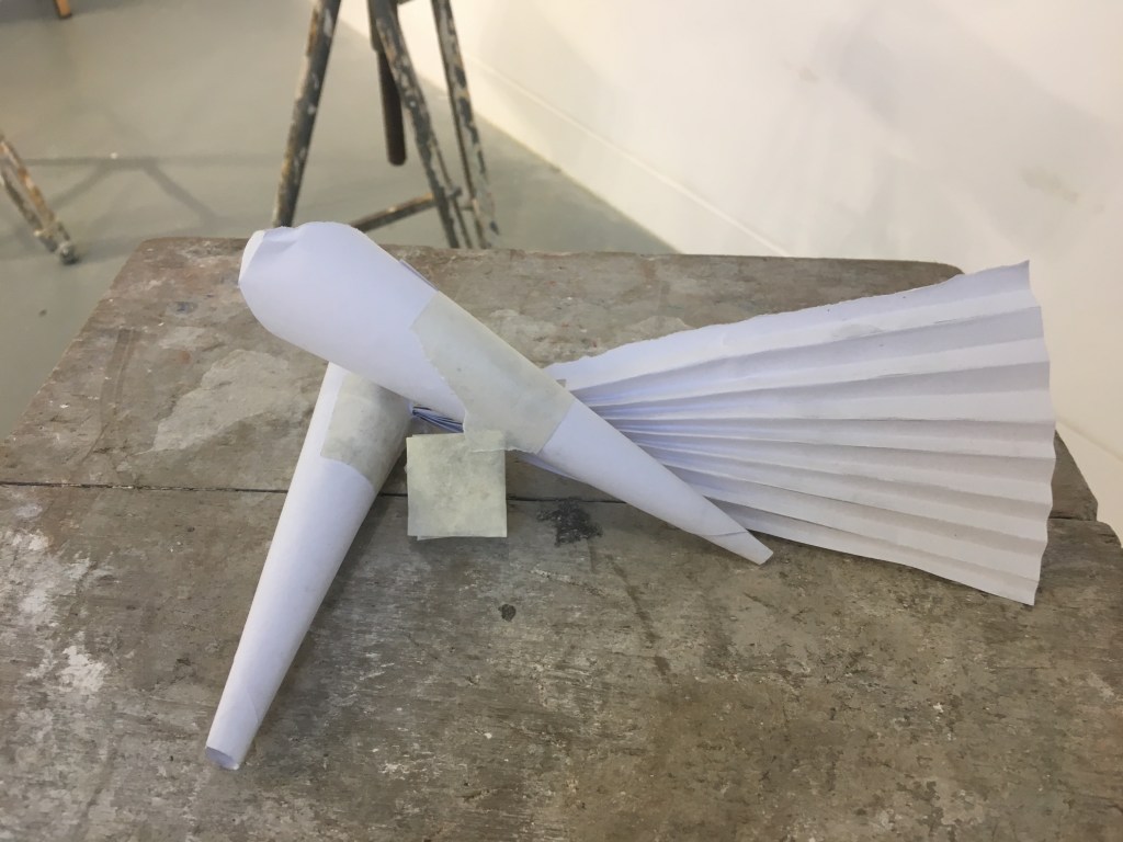
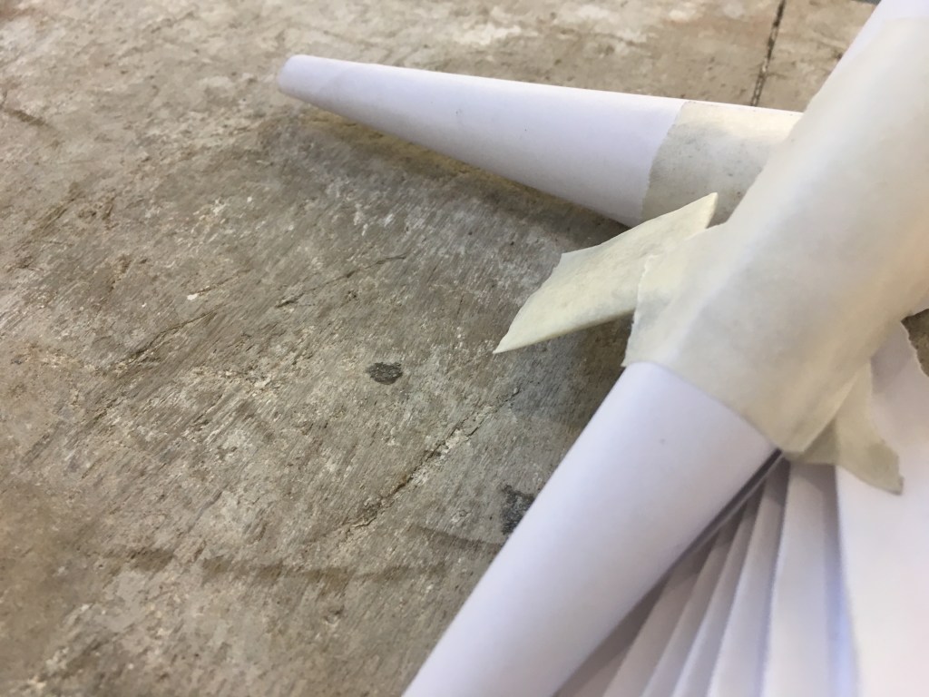
I was becoming more pleased with my sculptures astray developed and they became more complex holding a lot more movement and wight. It became important to consideration not only the space they occupy but the space they don’t. As well as how your eyes are led round the sculpture

Is it as interesting from all angles and dose it provoke you to move around it, be within it?

Combing 2D and 3D work further added texture and depth overall created an interesting piece of work from only paper, card, straws and tape. Also having learned not to be to precious when making work and constantly evaluating and reflecting on pervious work in order to move forward and improve the next stage.

DAY TWO
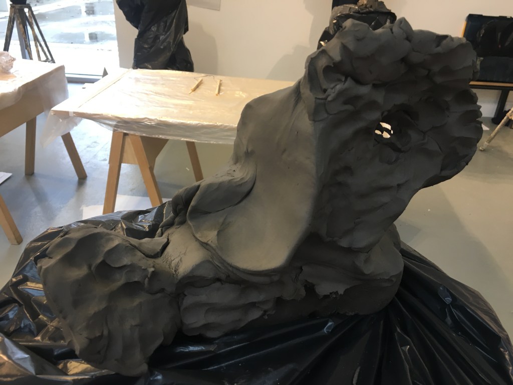
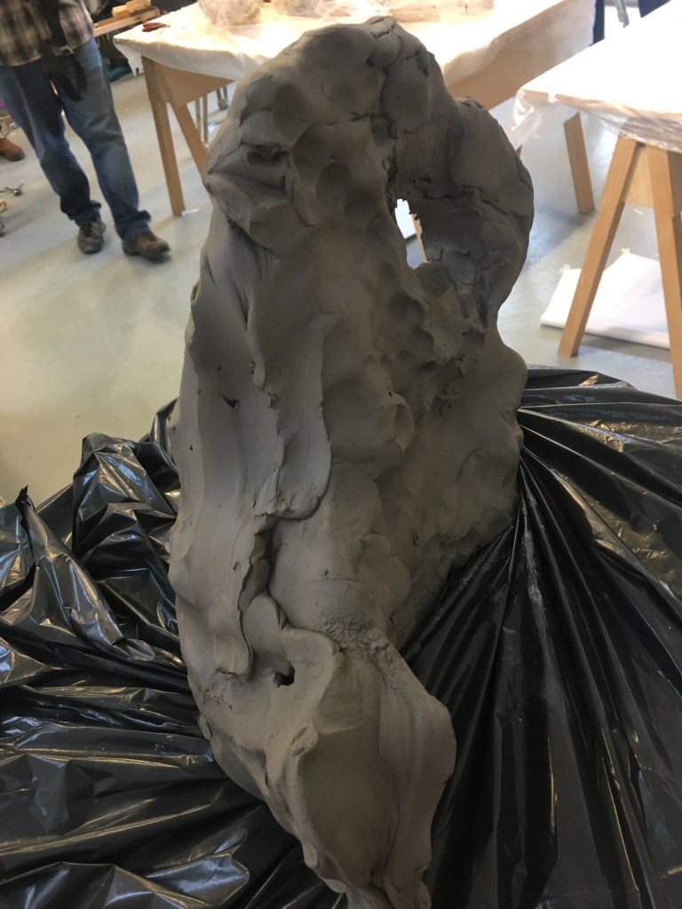
Experimenting using clay as a medium and form. First using our drawings from the previous day as inspiration for our clay sculptures as well as only being able to use our fists to move and mould the clay. Doing so allowed the general idea shape and form to come trough rather than focusing on the fine details and having an already fixed idea of the finished product in mind. If we had just used our hands as normal the results would have been a lot narrower and restrictive.
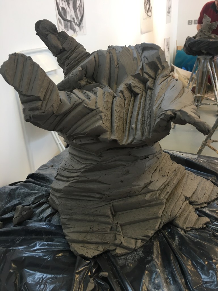
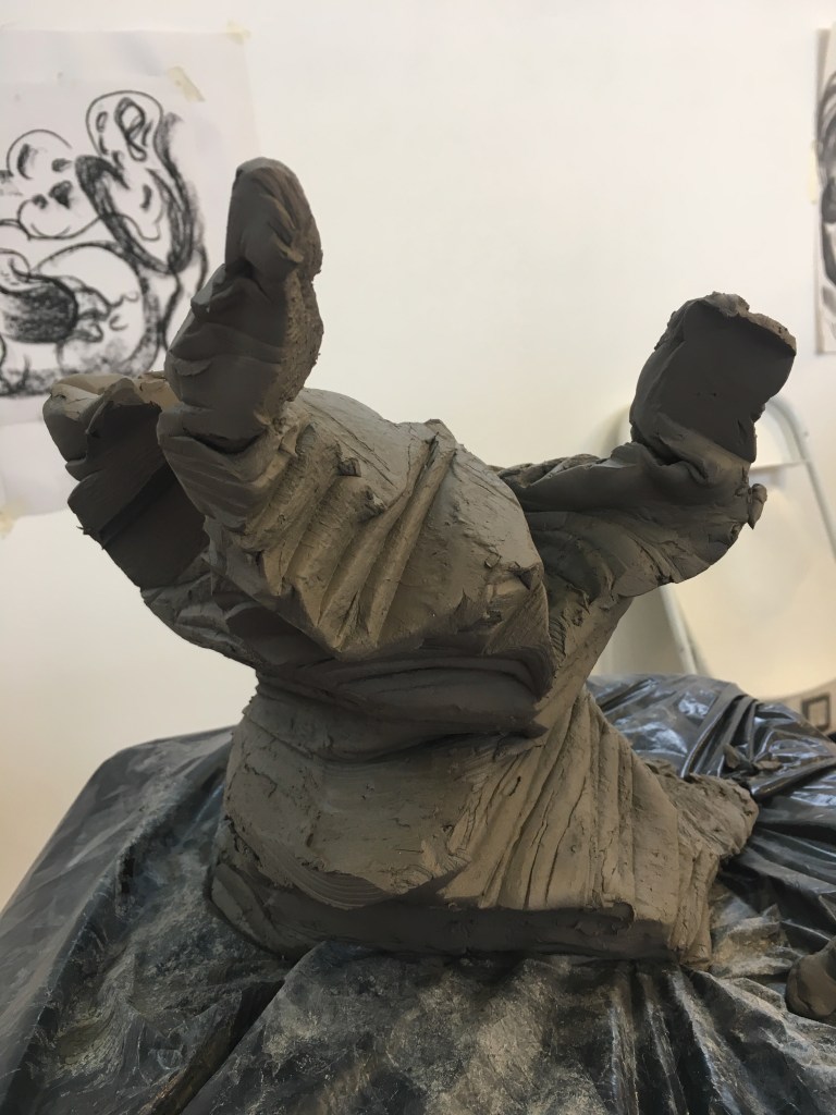
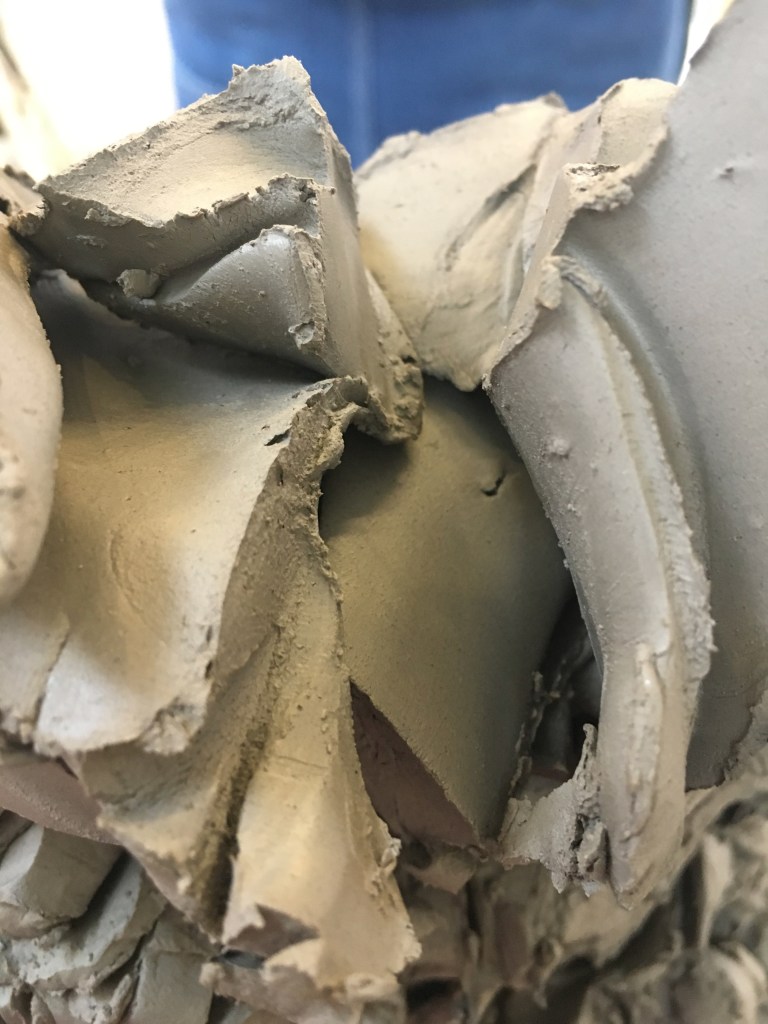
Next using wooden sticks as our tools this method was probably my favourite as I liked the voracity and twisted jagged effect it created on the clay it held a lot of movement and evoked you to take a closer look and move around the form.

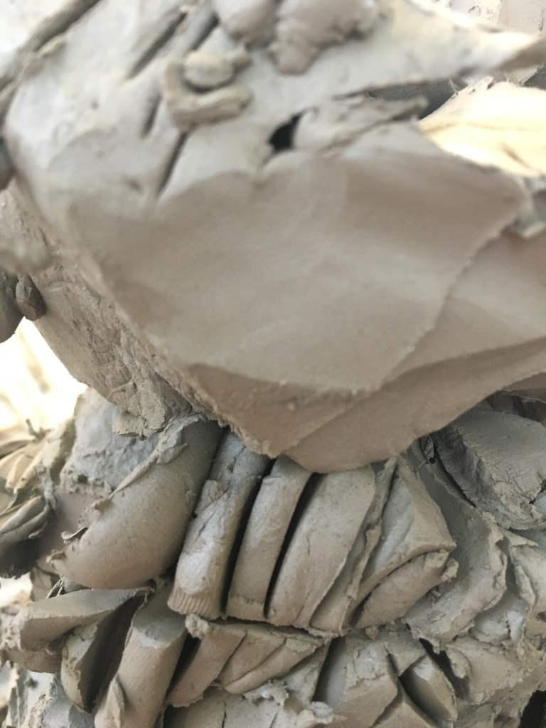
Finally, manipulating the clay using only wire I found the most challenging to control but still managed to find interesting textures and patterns along the surface of the clay rather than in the shape and form of the clay more than anything else.

DAY THREE
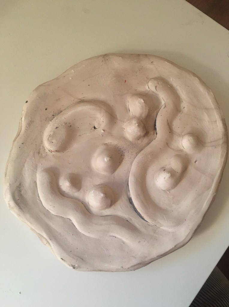
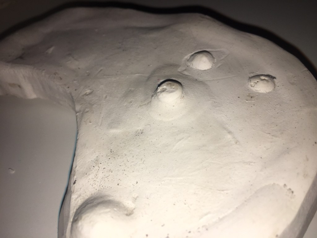
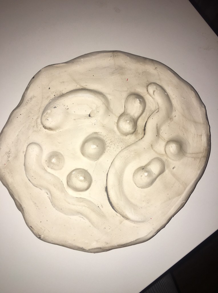
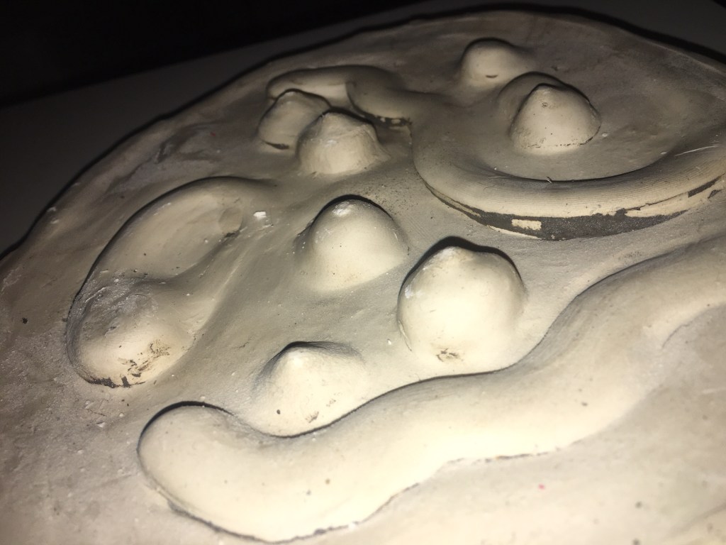
Using our drawing from the previous day to experiment using the plaster. I liked the finale results of the plaster and how it could be manipulated into forming lots of shaped however felt restricted once the plaster was set as it was difficult to change or connect to other materials and display. I felt the things I was creating also lacked movement and hight they felt very shallow and flat and only gaged interest within their fine details and texture. I think bringing colour to these would be beneficial and would add another level of interest.

DAY FIVE

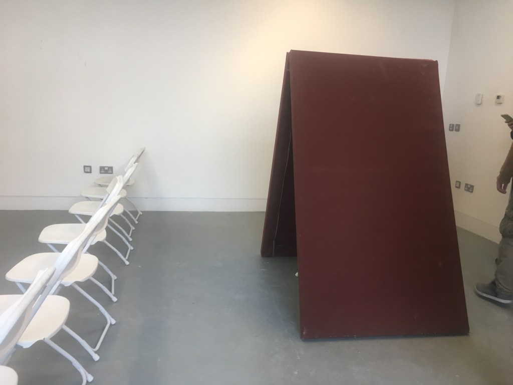
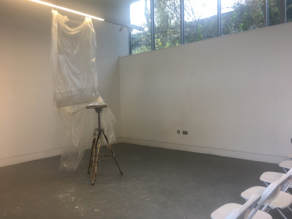
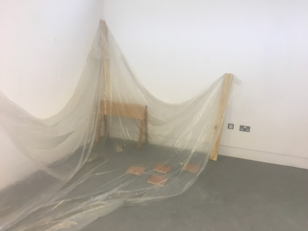
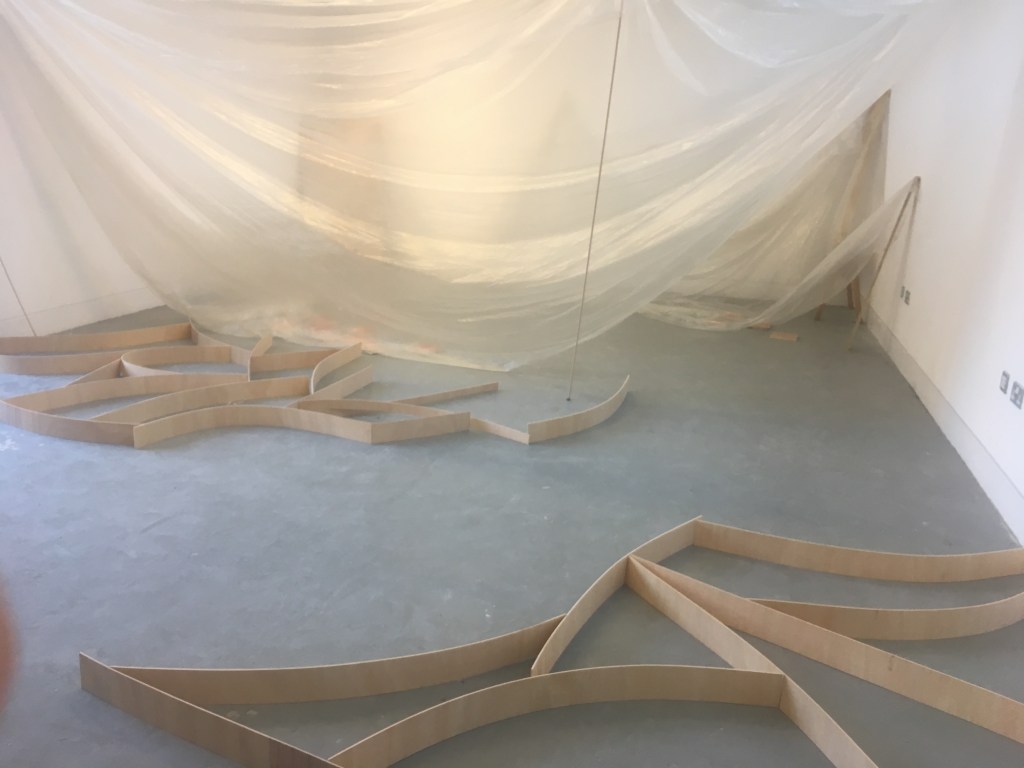
Creating installation art required us as a group to consider the space we were working in and how we wanted to occupy it/ what we wanted to say about the space. It was also important to consider materials and how our work interacted with the other groups.
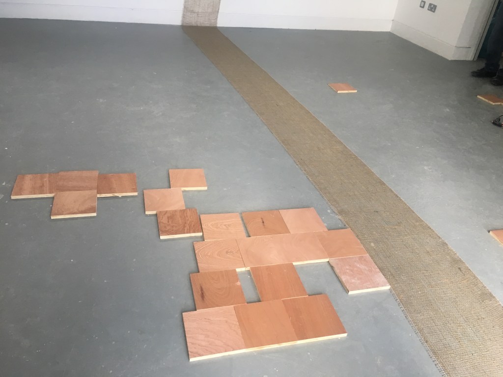
We also considered light as well as how our work made you move around the space and where you wanted to look/ignored. Through the day our installations became a much grander scale and combine lots of different elements and materials.
EVALUATION

The week as a whole showed me not only how to approach a material or a specific type of working but how you must consider the space your work occupies and the space it doesn’t and how you want people to engage with your work. Having a back and forth with 2d and 3d i also thing will be helpful in future projects when i find myself stuck or unable to progress with an idea.
Consumption Development

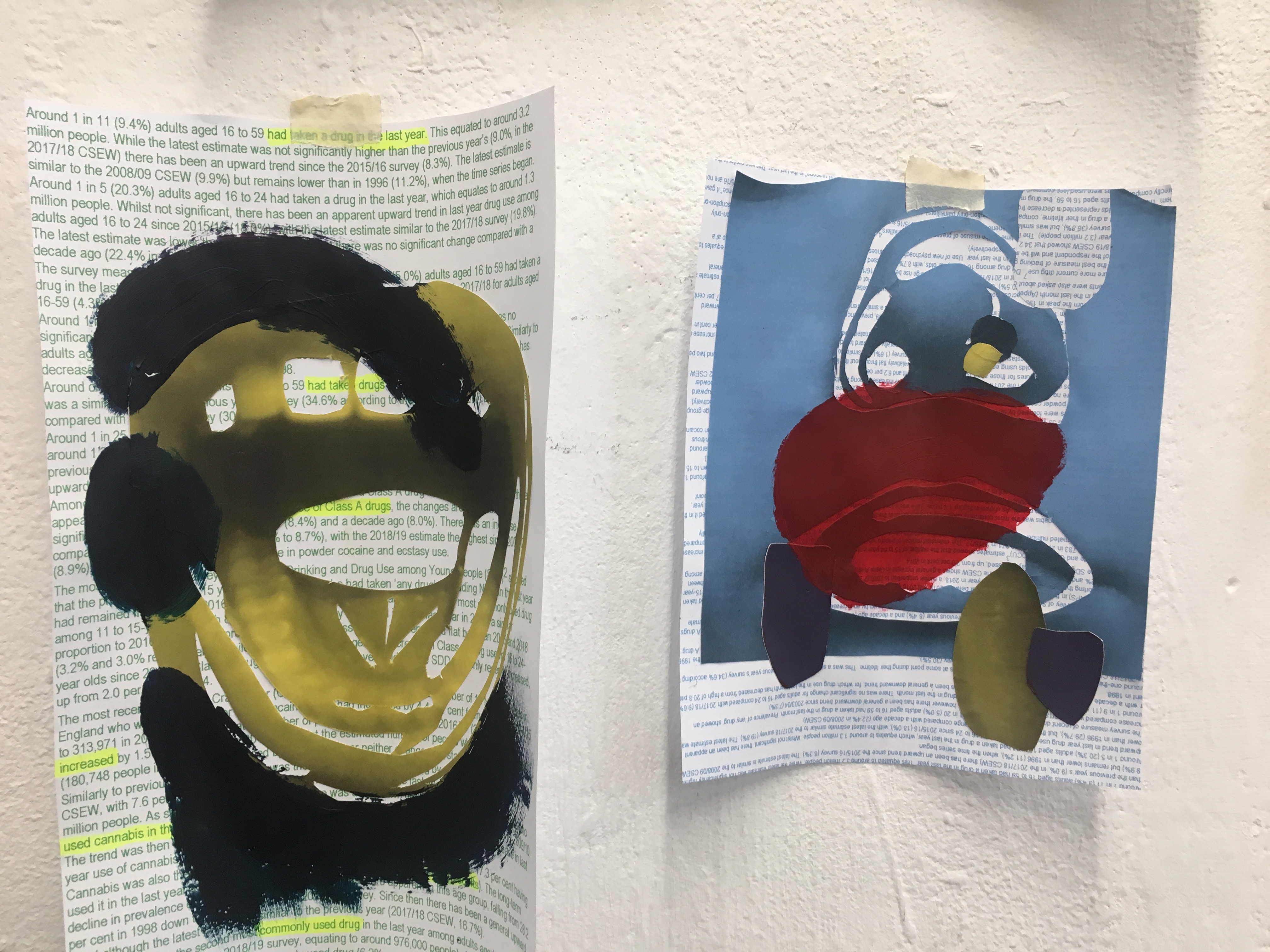
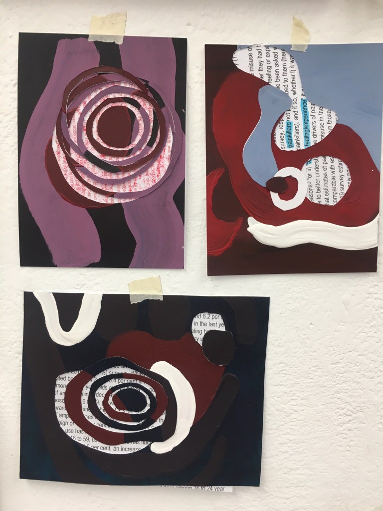
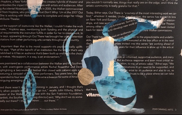
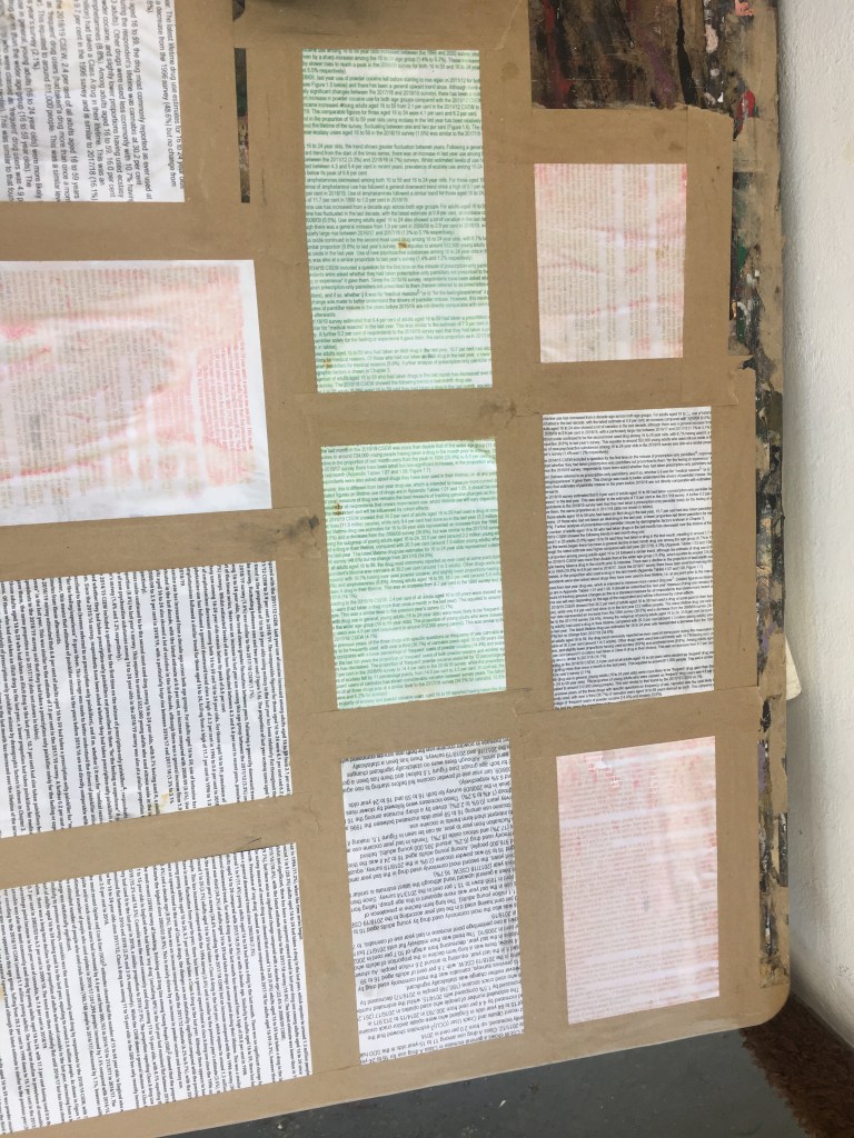
To further contextualise the work I was making I researched statistics surrounding drug and media consumption in the UK within the past 3 years. I printed out the statistics onto plain paper as well as existing prints before experimenting with them as a new layer to my work.
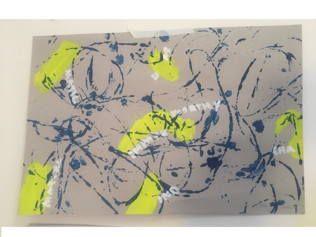
Using the statistics as prepared surfaces I was able to add another layer of meaning to my work, highlighting some of the words and statistics within the large overselling chunks of information

evaluation

Good use of research as well as a large variation of ideas. Simplifying and abstracting images works well as well as use of colour/pattern and layering collage/paint. The use of dark colours and imagery effectively conveys the ominous undertones and theme. Using the statistics added a depth of information to the work both literal and visually and was well integrated however the information could be made more obvious. The final presentation of work needs to be clearer on what is considered to be the more resoled and finalised work as on the wall it appears to erratic and difficult to navigate. Moving forward it would be interesting to experiment with digital and further explore movement and sound. Would also be interesting to scale up work in order for it to become more physically immersive and communicate the feeling of falling in/out of something (vortex).

2D practice

Project starting point

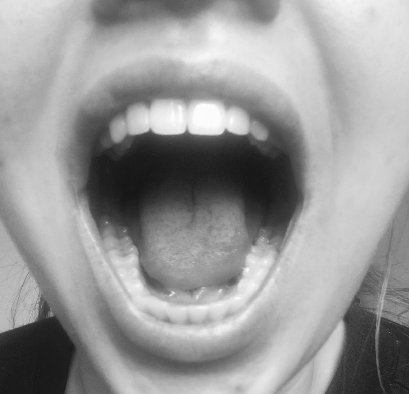
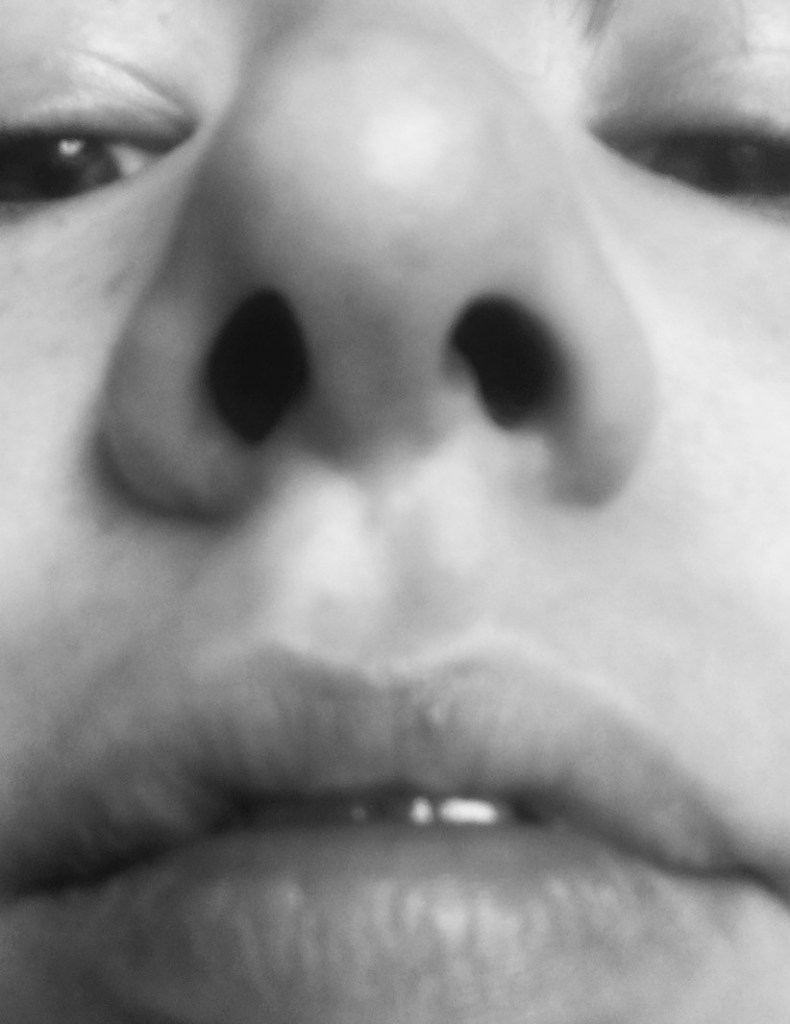
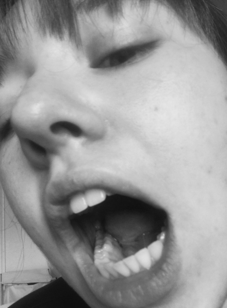
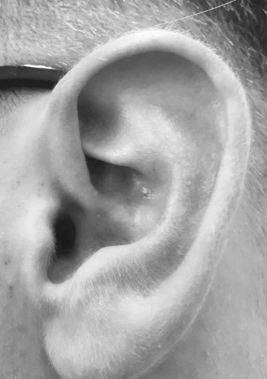
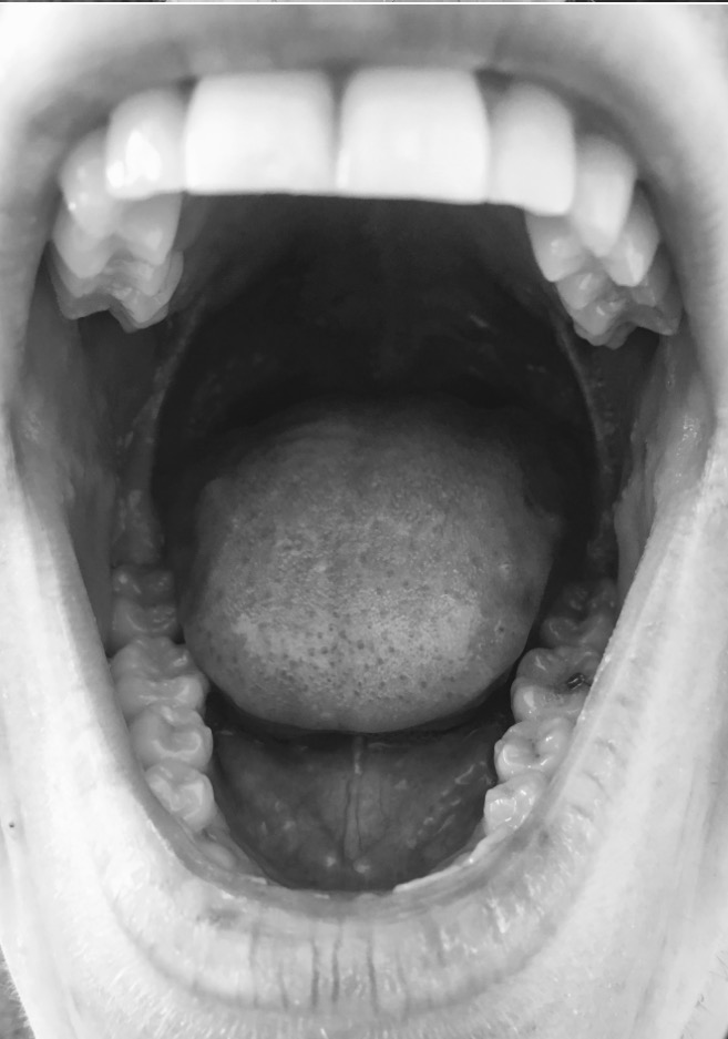
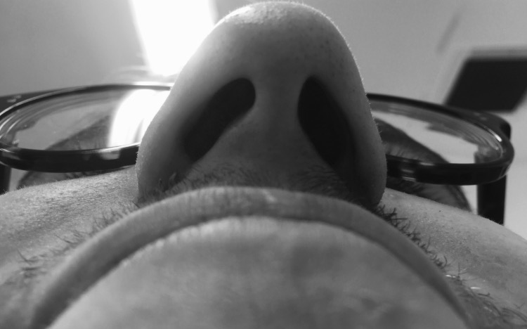
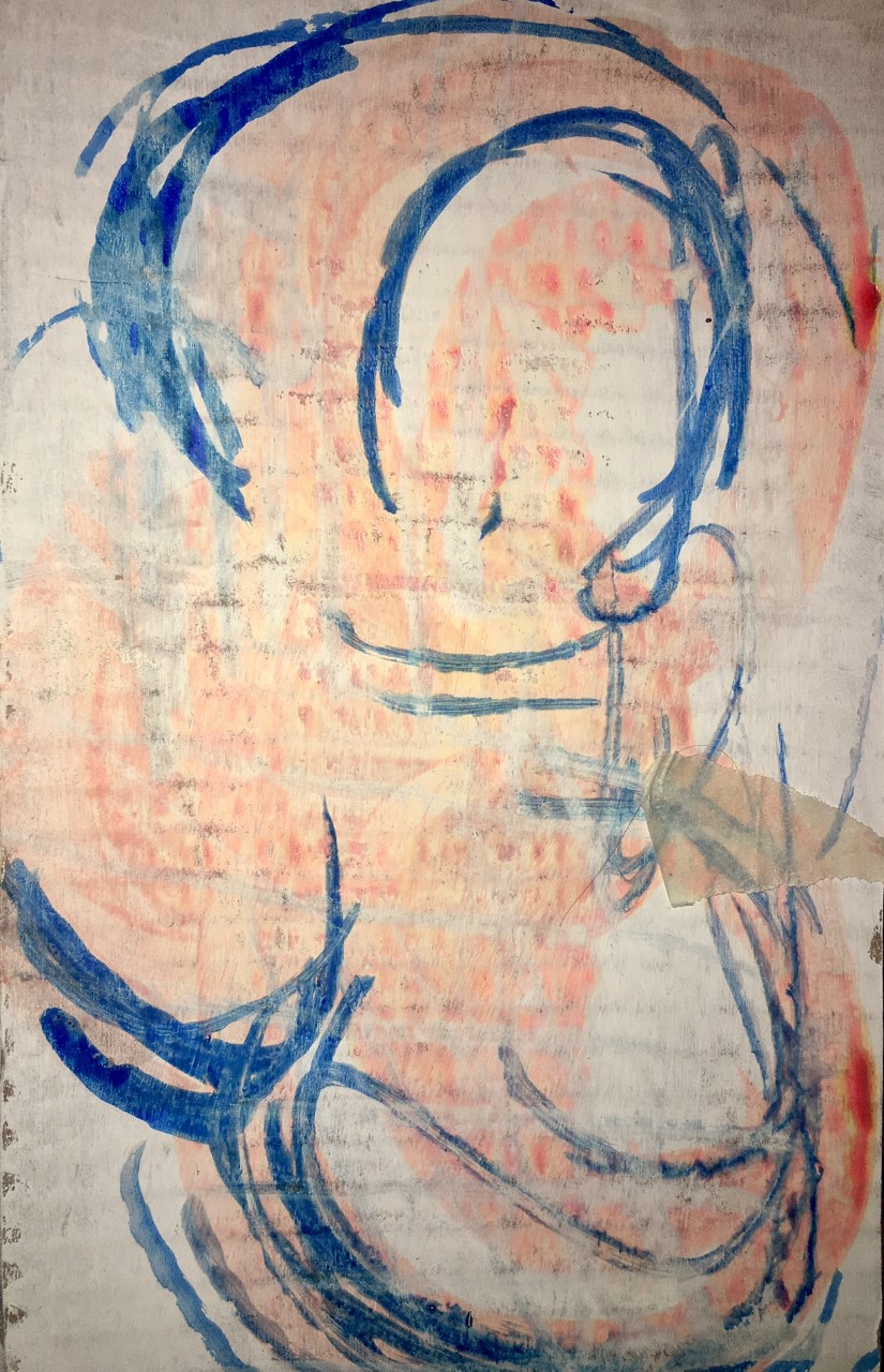
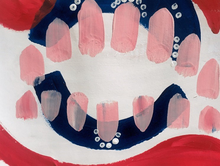
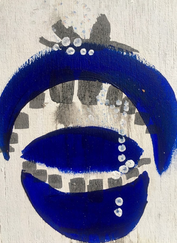
My initial idea and concept for the project surrounded consumption. specifically I wanted to focus on capturing the ways in which we consume as well as the different things we consume on a daily basis- media, food, drugs, information. I thought the best starting point when exploring consumption would be to focus on the senses taste, smell, hearing, sight, touch.

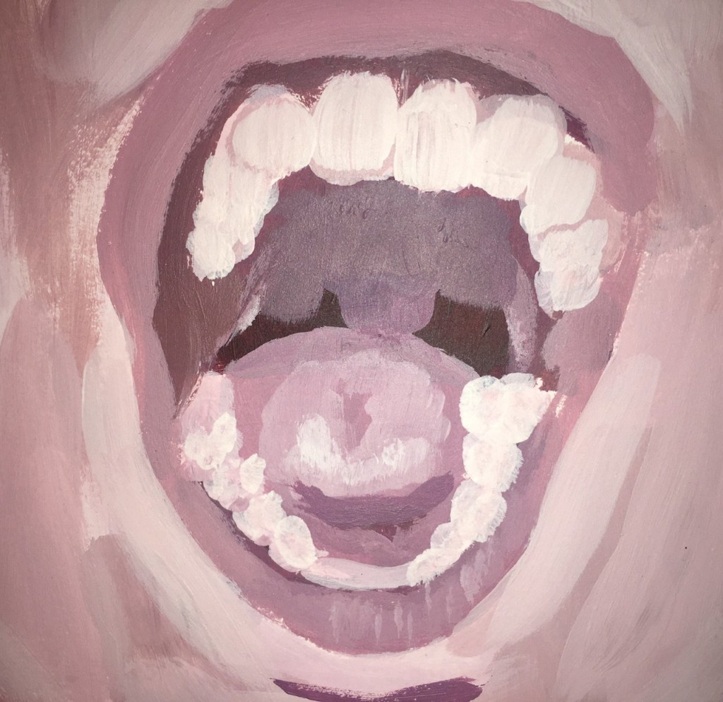
Having the senses as a visual starting point I gathered reference images to refer to before I started experimenting with different media and techniques. First taking images of myself before collecting a range of images from other people- ears, mouth, nose, eyes.

Wet Media Experiments

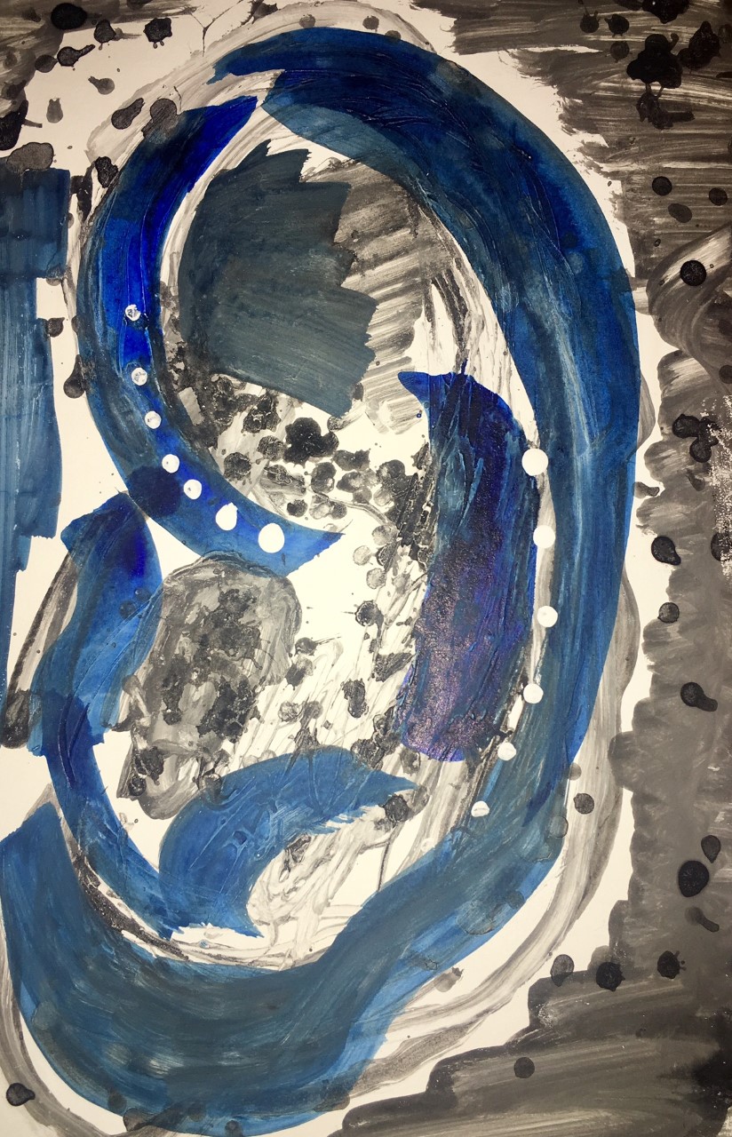
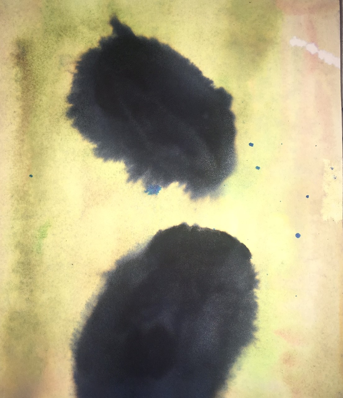
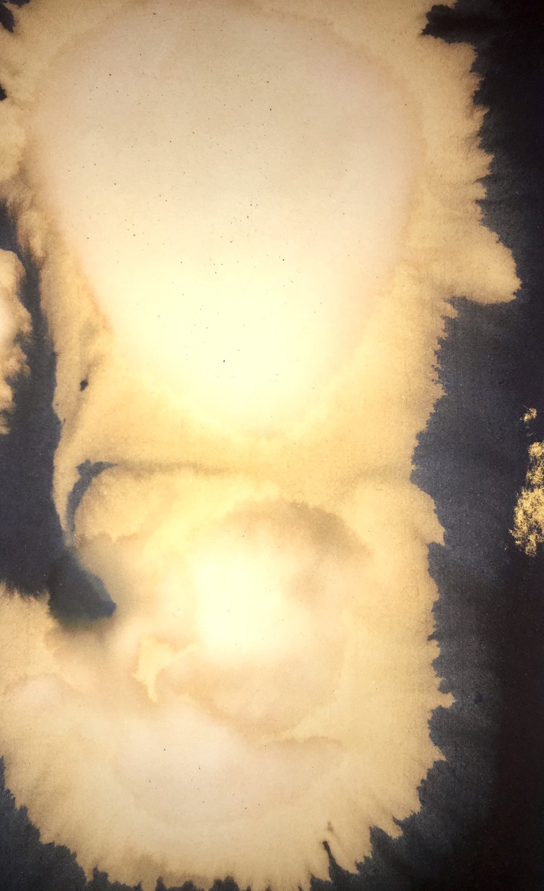
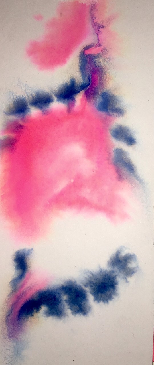
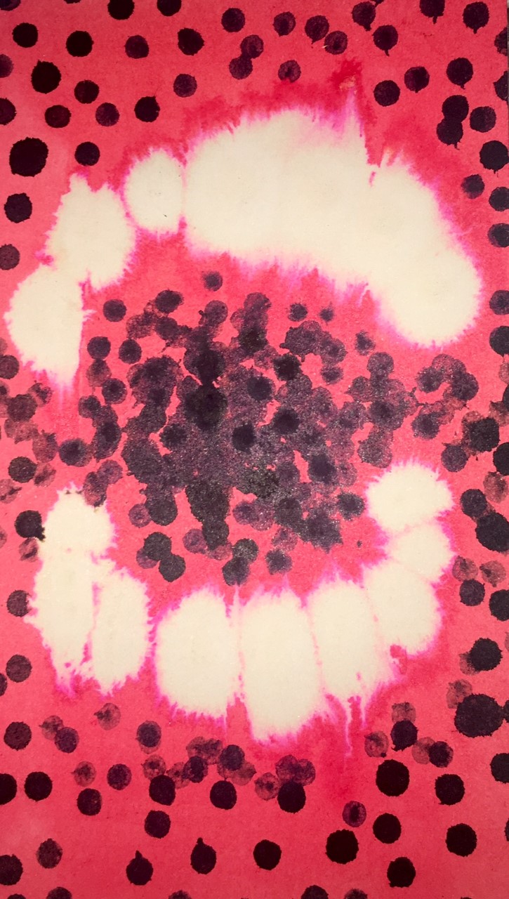
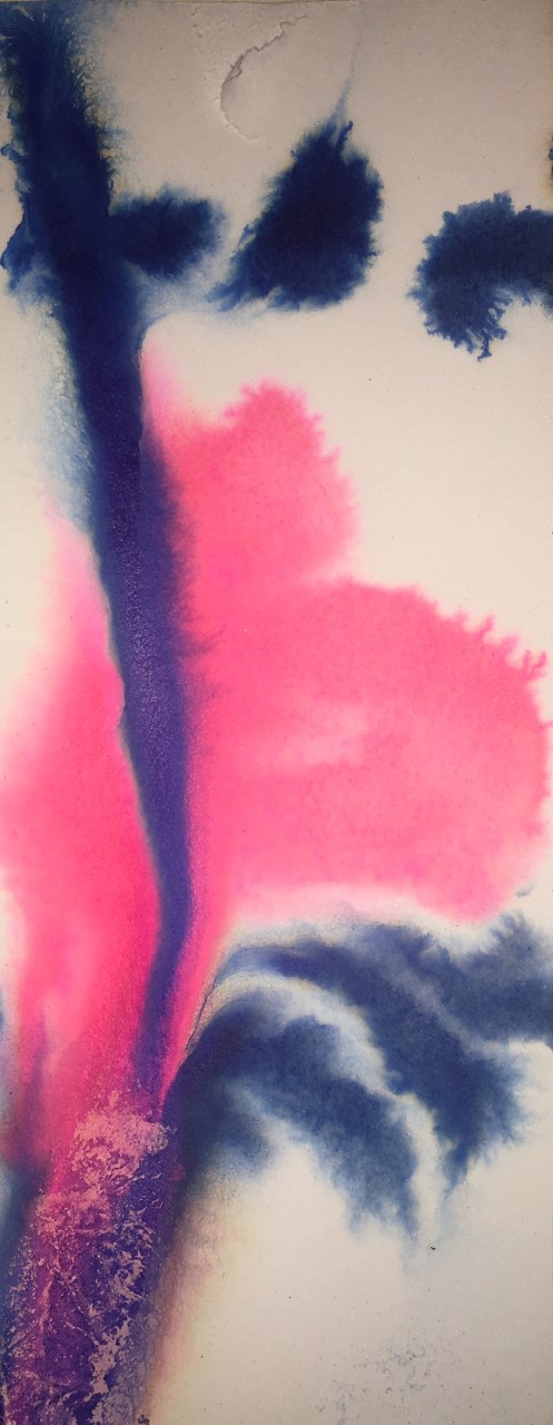
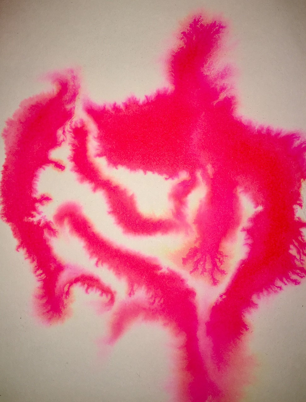
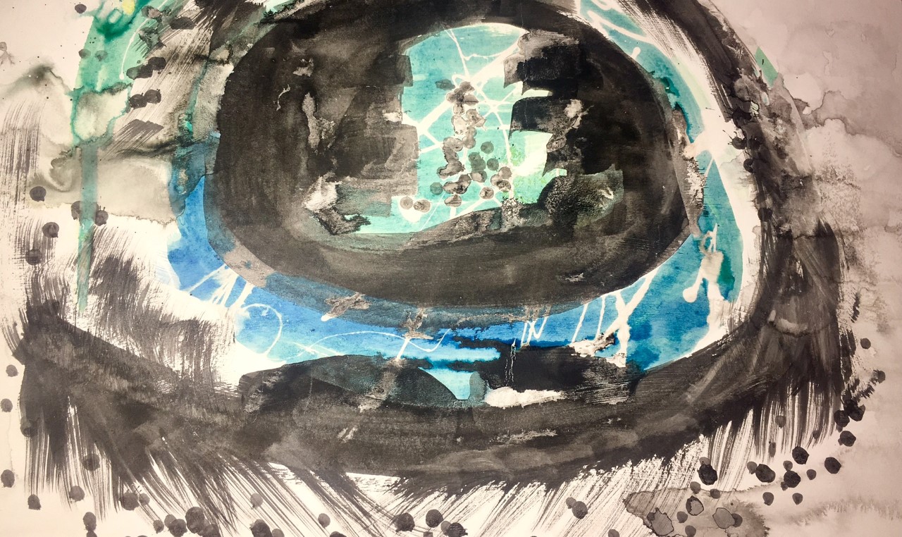
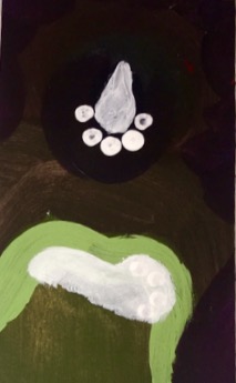
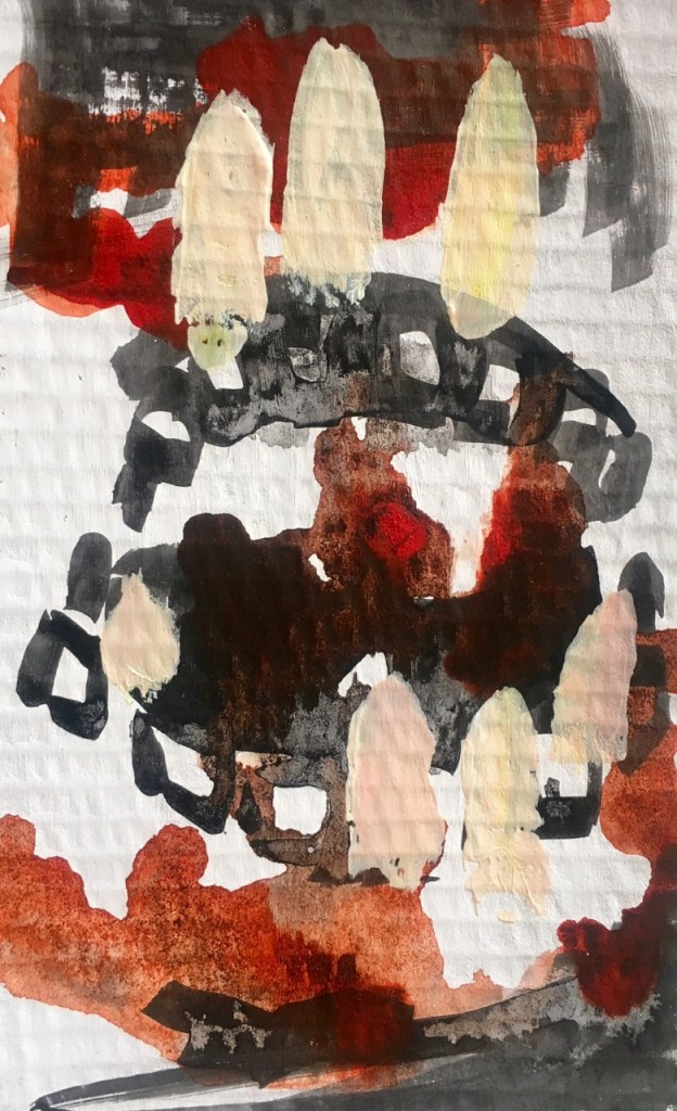
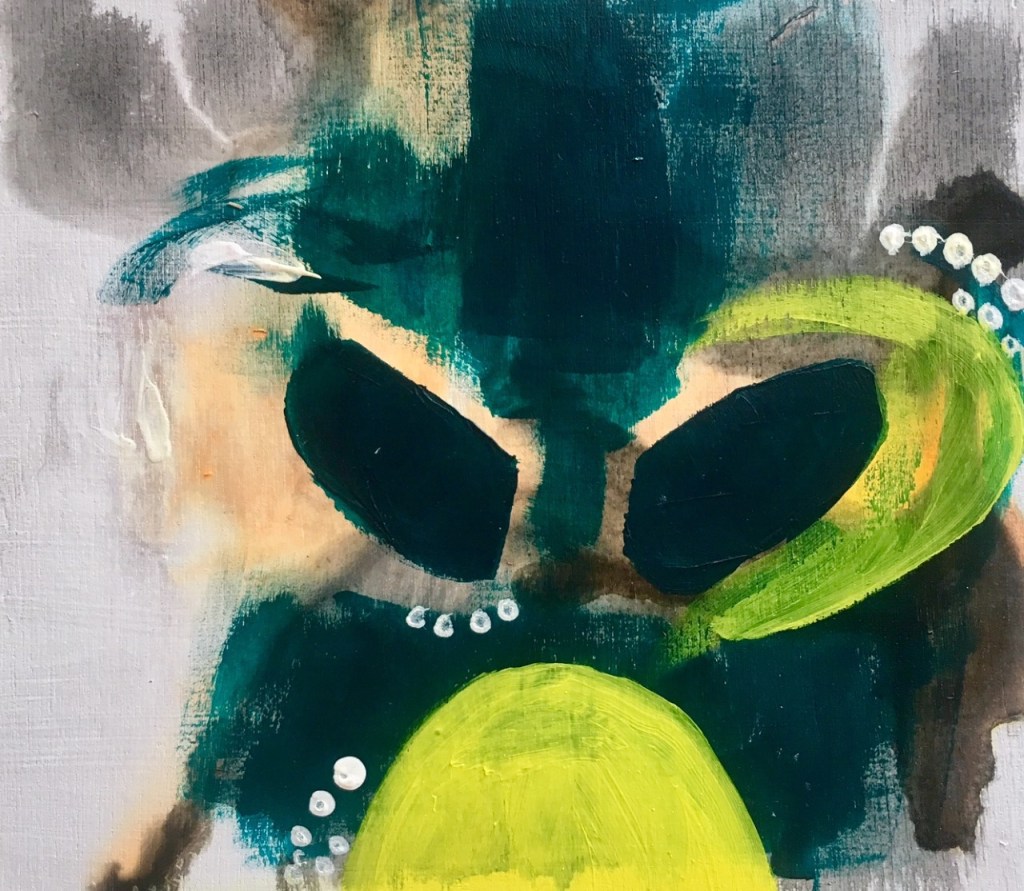
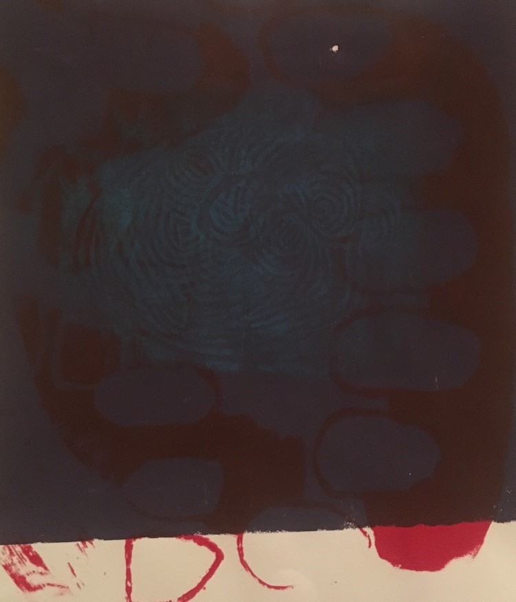
The first set of media experiments I think lacked the shapes and images I wanted to communicate however I liked how unpredictable using the ink was and the movement it could create.

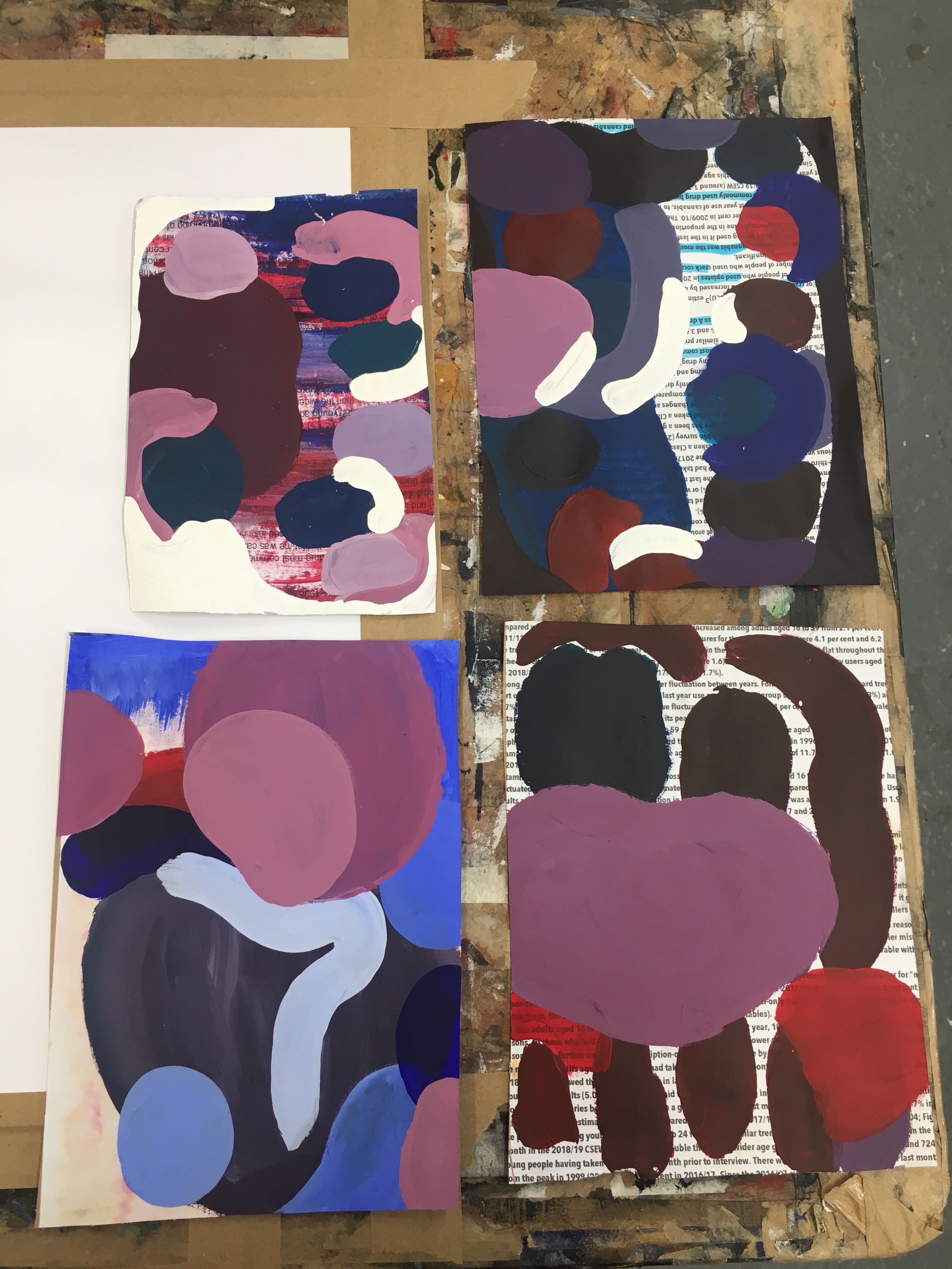
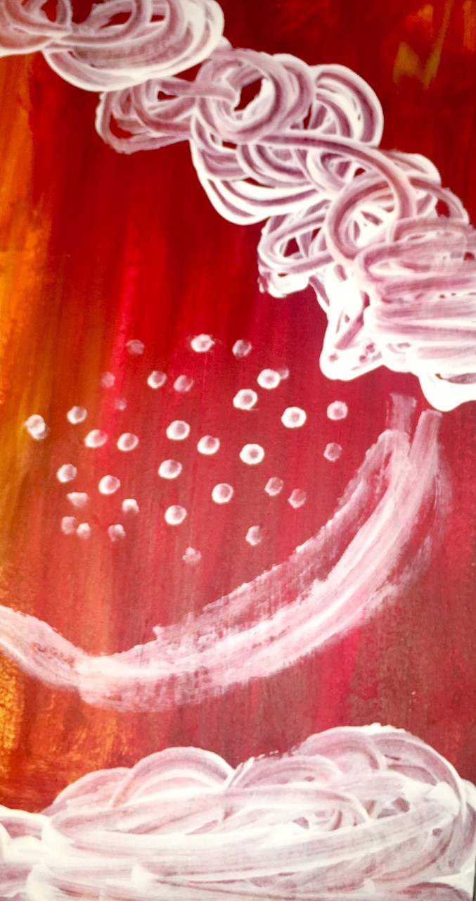
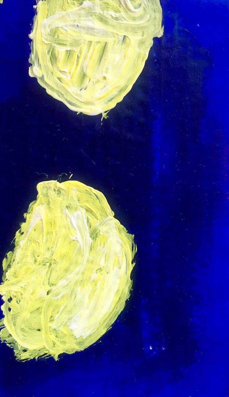
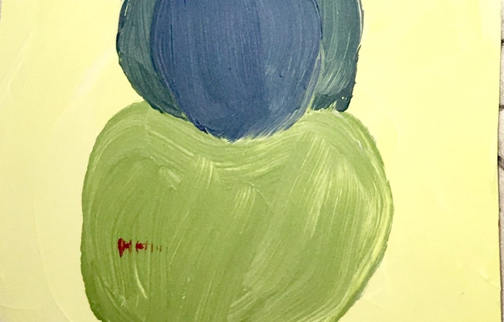
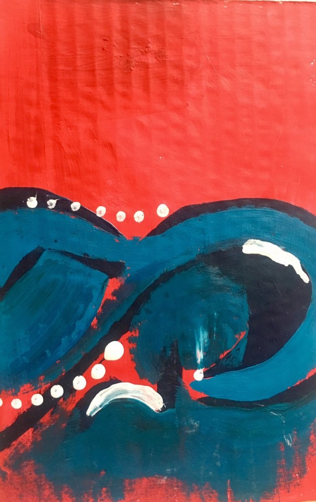
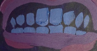
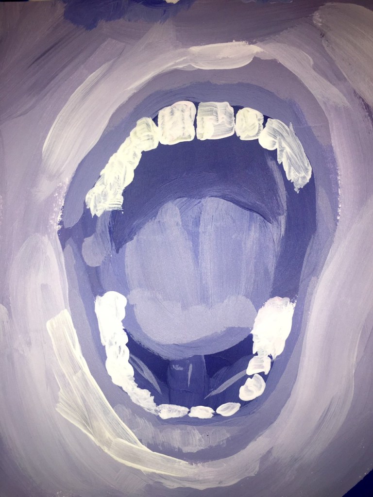
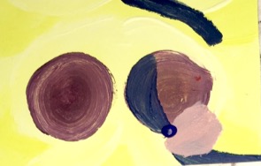
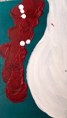
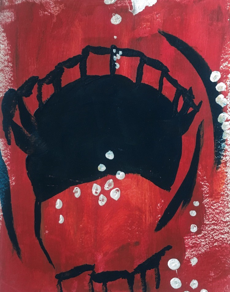
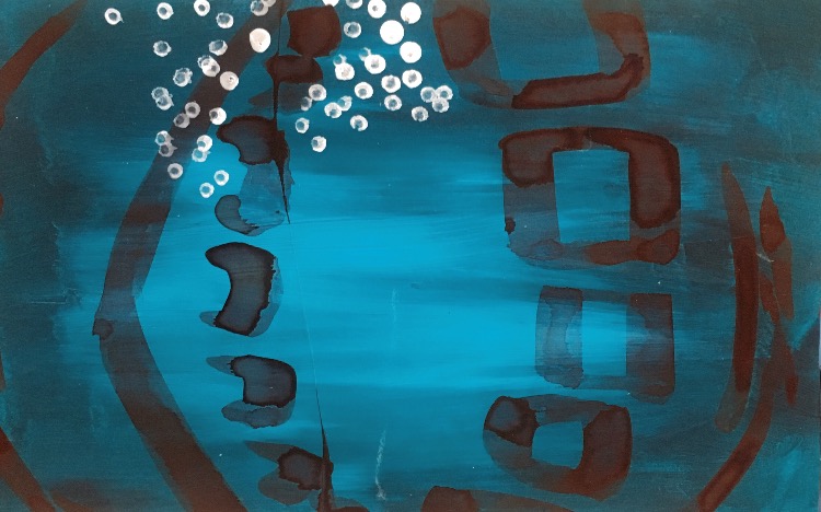
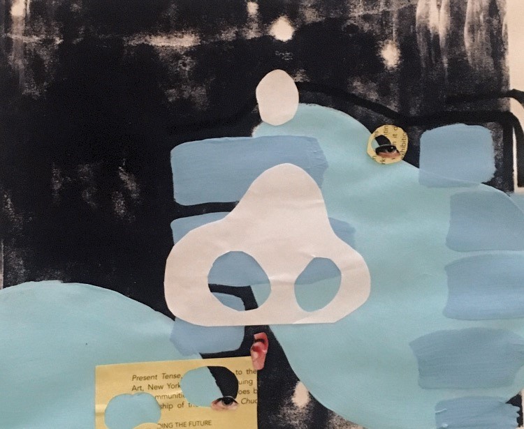
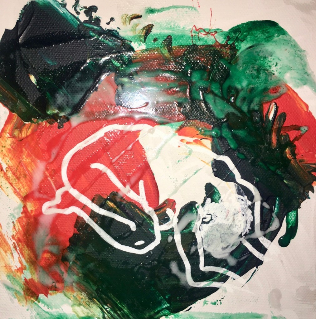
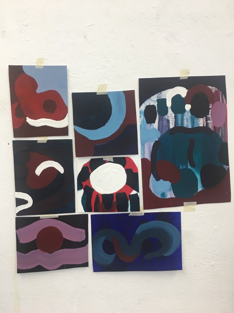
When I started using acrylic it was easier to communicate the shapes and images I wanted using mostly blocked coloured shapes. However I felt these images lacked depth and became very flat, this was enhanced by the similar colours I was using within each of the experiments.

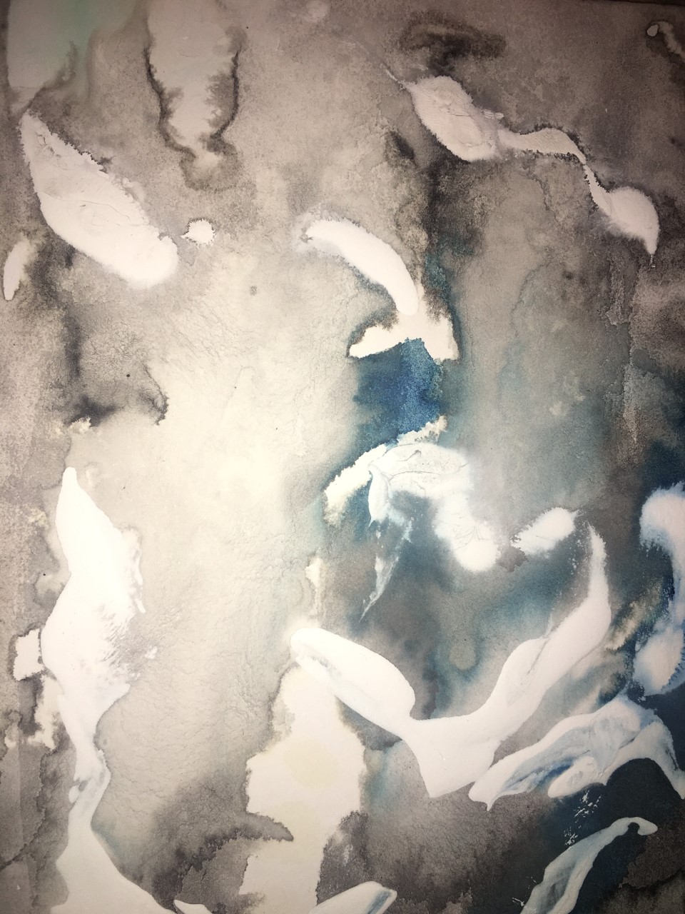
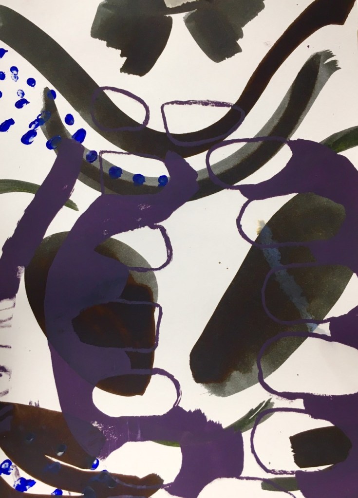
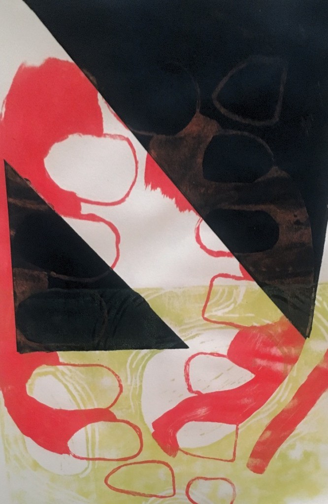
Braking up and spacing out the shapes allowed it to become more abstract and subjective. Layering the different colours and textures within the congestion added depth to the simplistic shapes.

PRINT

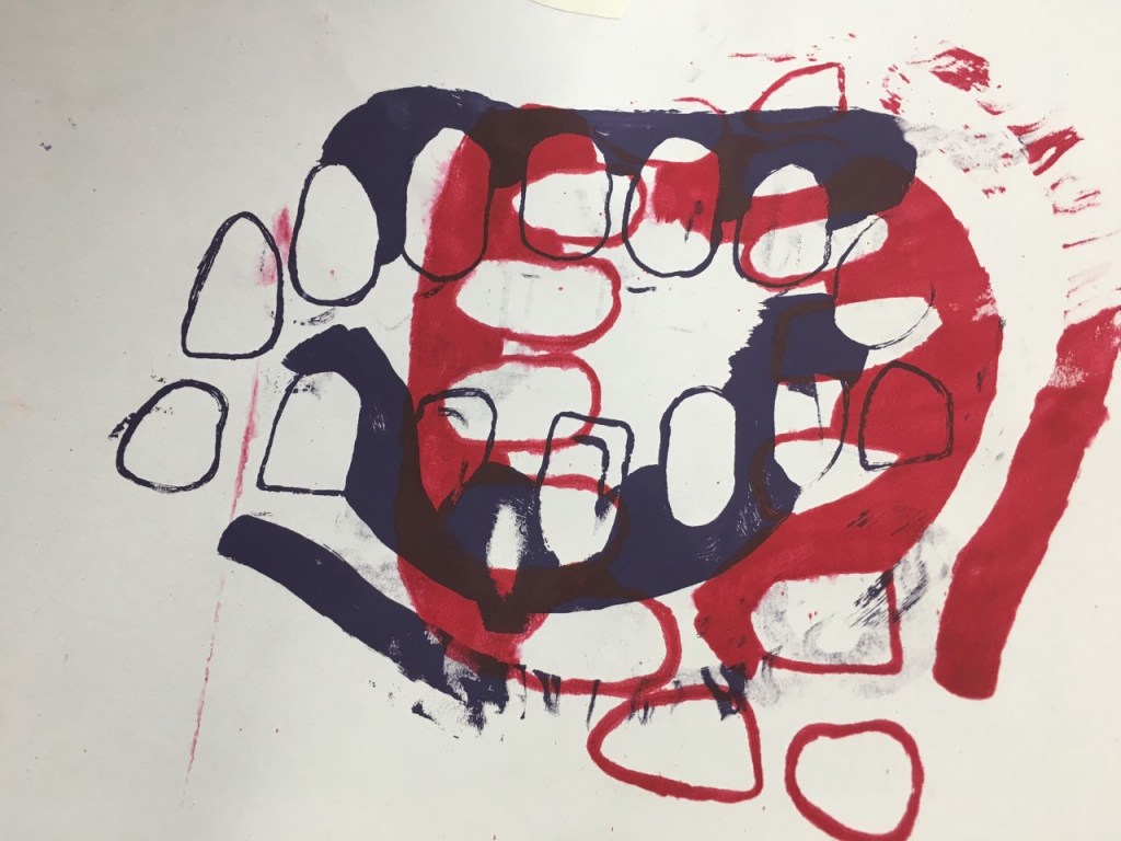
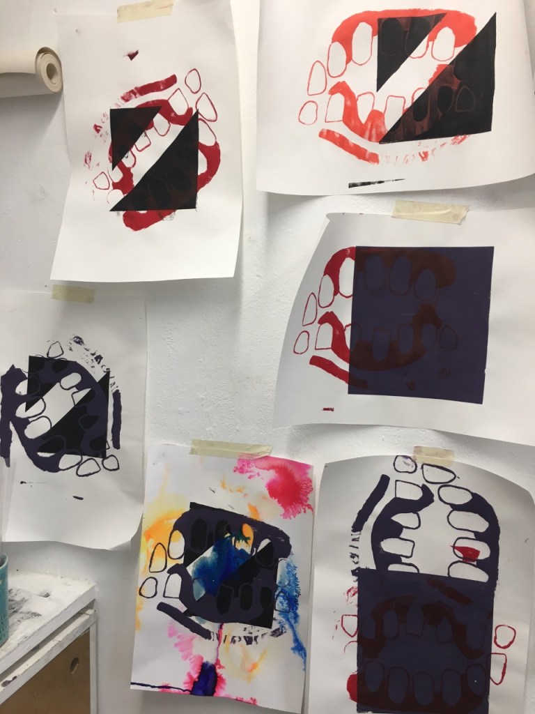
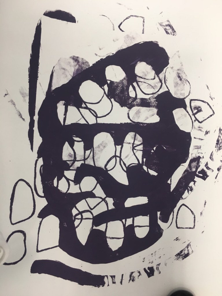
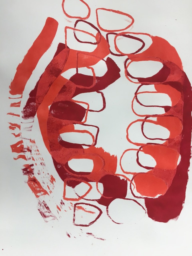
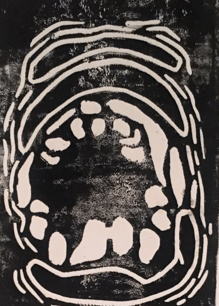
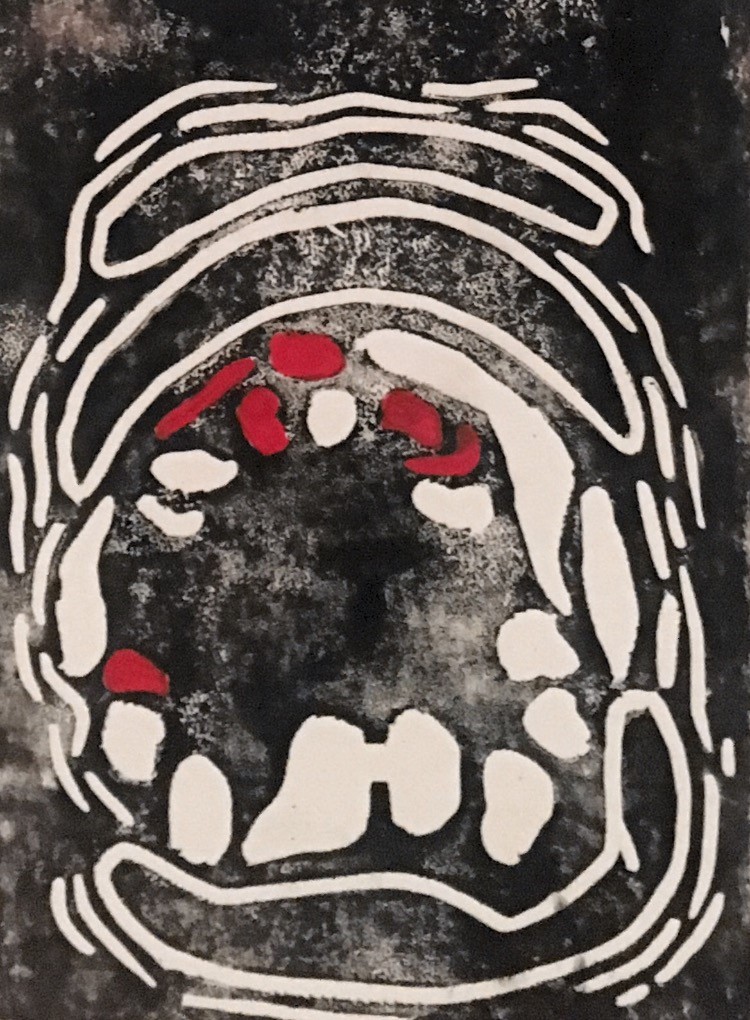
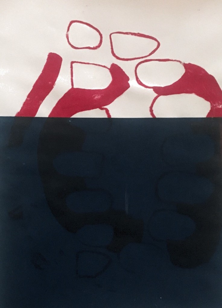
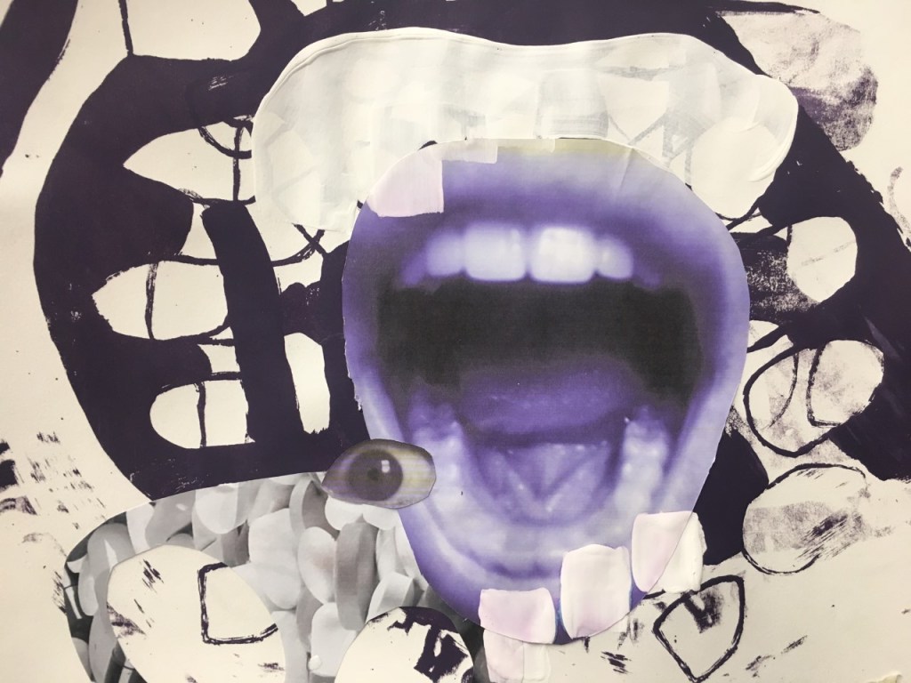
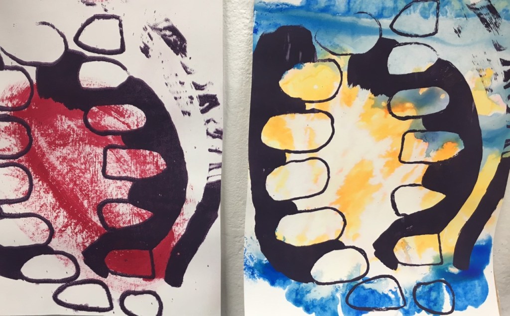
For screen printing I decided to use the image of the open mouth as inspiration as I felt it was the easiest to pick out and identify especially if I was going to be layering different prints and colours.

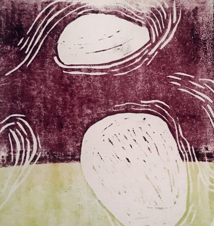
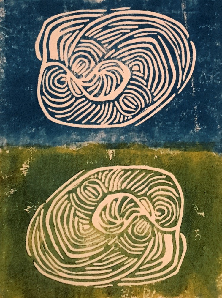
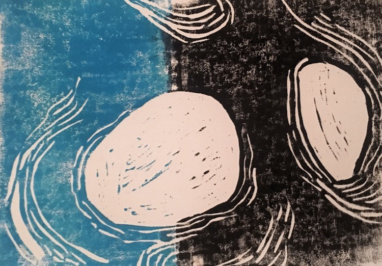
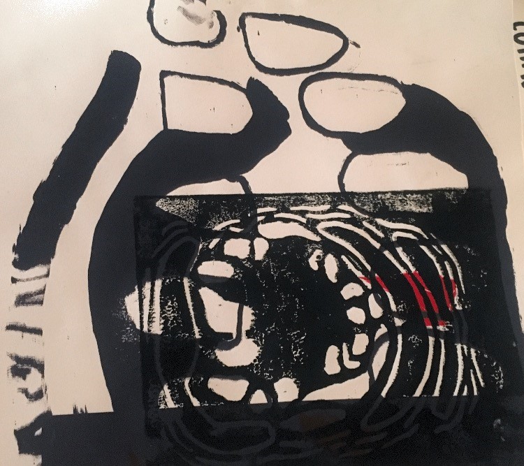
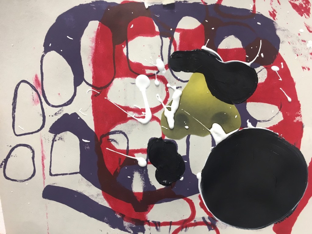
when experimenting with the lino printing I felt the more successful ones we’re the ones where I split up the print using 2 block colours. When I tried to layer these prints onto of the previous screen prints the composition became too muddled and complicated the shapes.

Collage

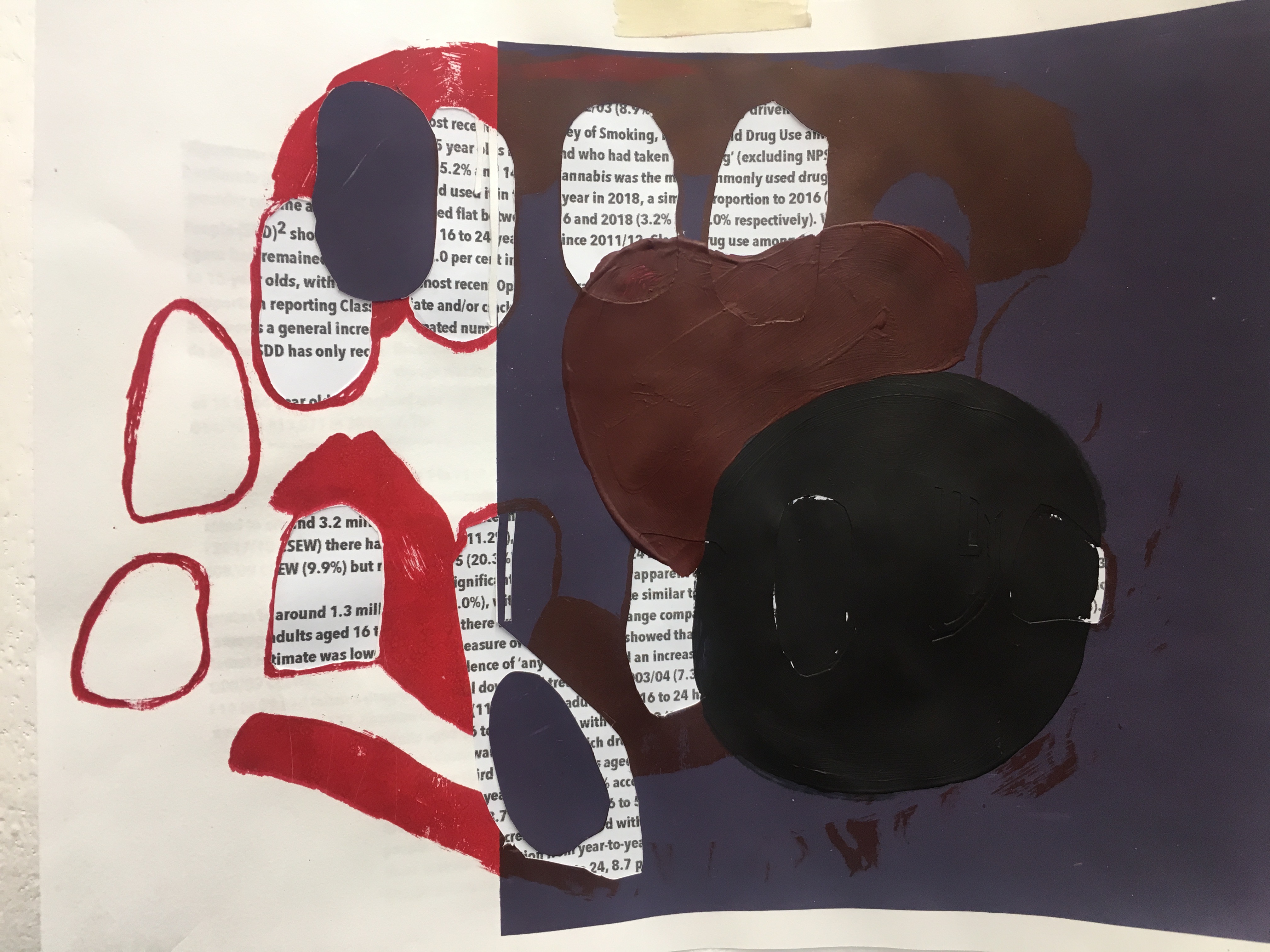
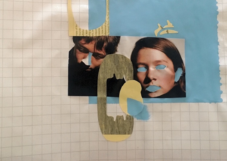
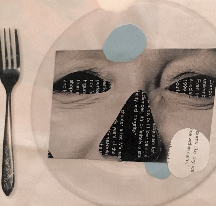
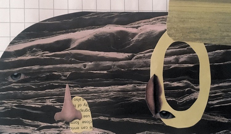
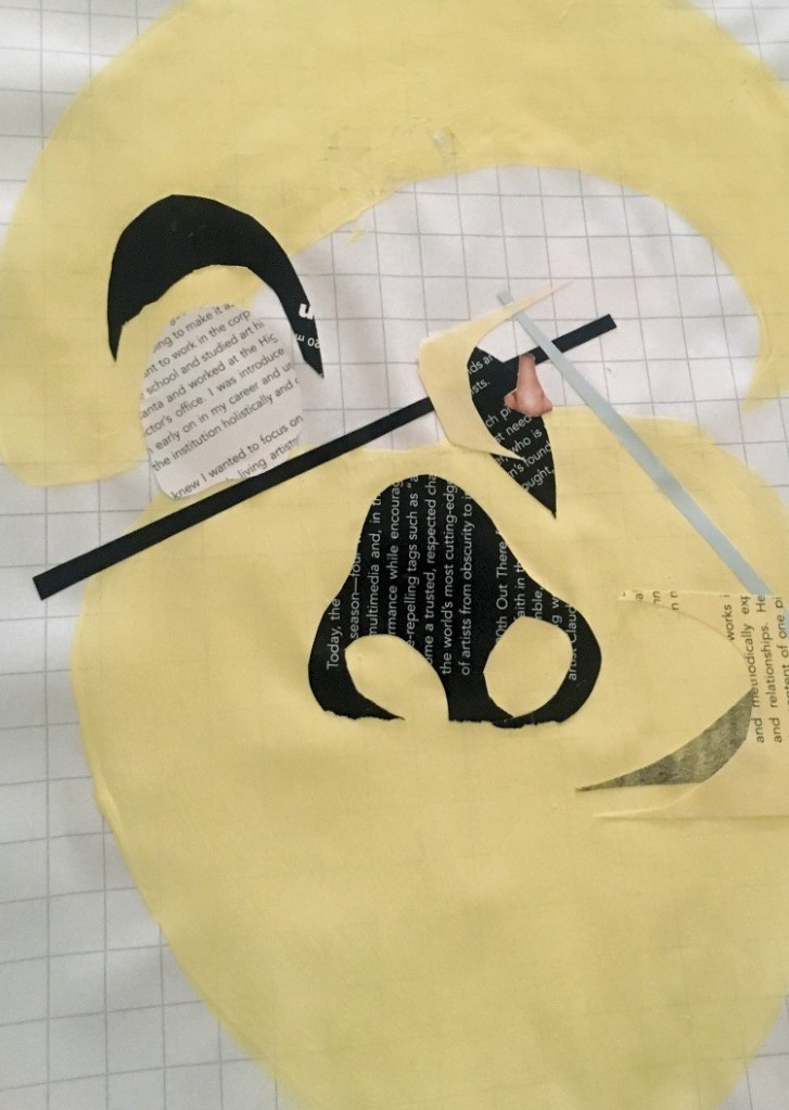
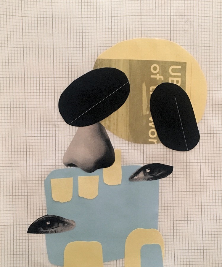
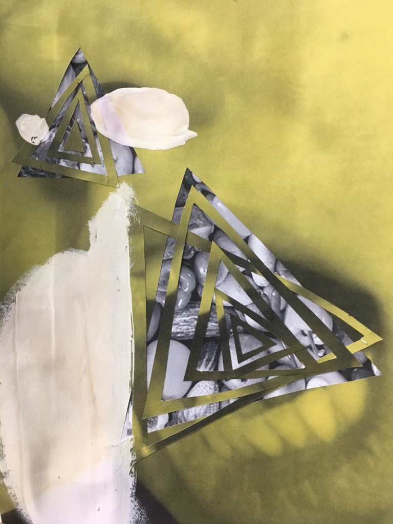
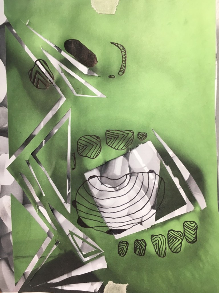
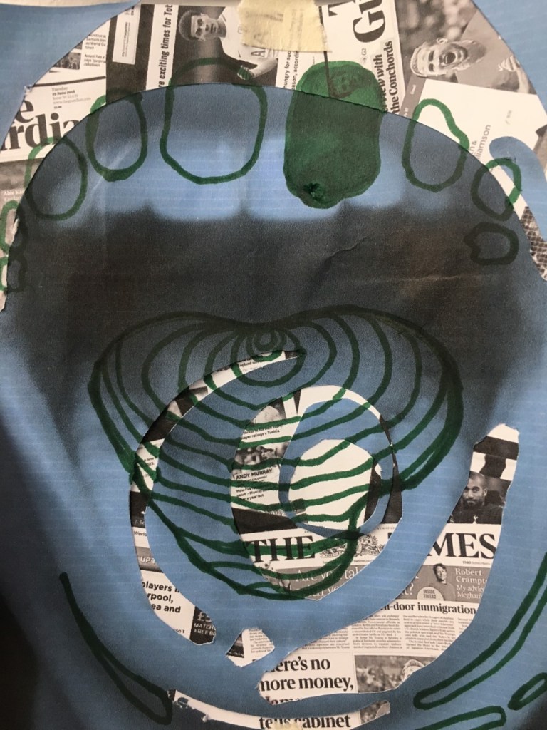
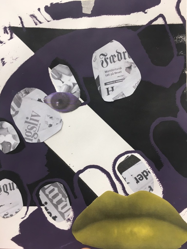
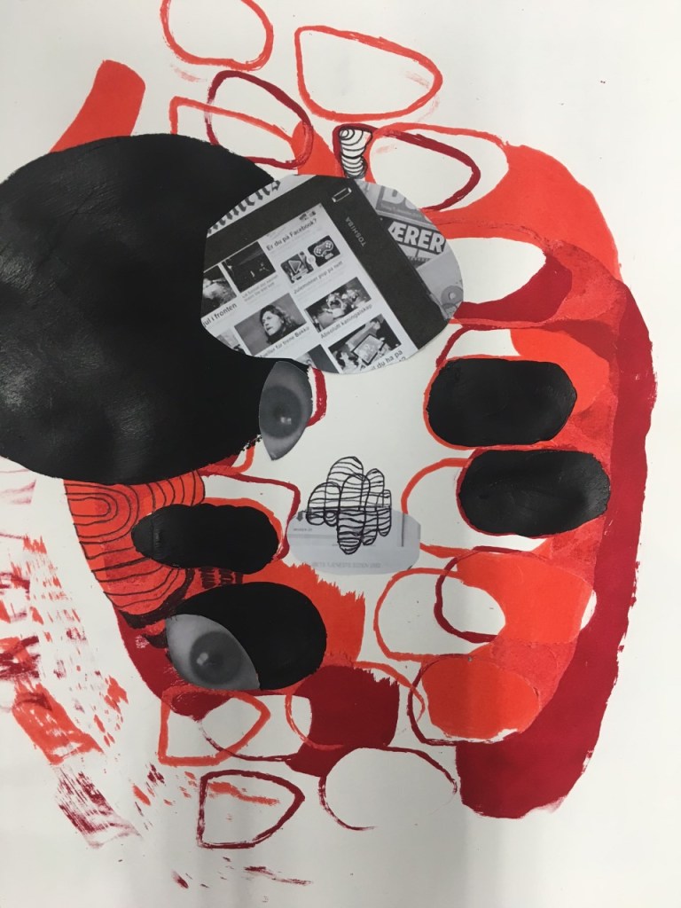
When using and experimenting with college I was still focusing on simplify and isolating parts of the body associated with the senses. Again I think the more simple compositions and shapes were the most successful and moving forward I wanted to incorporate my own images.

This first set of colleges also reminded me of some of Moyna Finnigan large scale college work.

Using all three of the elements in combination I felt produced the most interesting compositions. The layering of the different media made the work feel more resolved however I felt like I need to contextualise my work a bit more through research surrounding consumption of media, drugs, food etc.

Helen Chadwick: Piss Flowers

HND CONTEMPORARY ART PRACTICE (CAP 1) 

Helen Chadwick: Piss Flowers

The artist creates a humorous atmosphere while still maintaining her overall themes of the natural world. Her I find her use of materials the most interesting the process of making the work (casting the interior spaces left in the snow by urine). The contrast of taking such a natural process and trying to capture and solidify something so impermanent and unimportant as urine. I think the artist was trying to communicate the importance of detail within everyday life and how beauty and brilliance can be extracted from the simplest thing. 

Helen Chadwick was born in 1953 in Britain and became one of the first women artists to be nominated for the turner prize. She is best known for challenging and exploring the body in unconventional methods. Her work ranges from themes of science, myths, beauty, identity, femininity and the human body/form. She was associated with the feminist movement in the 1970s, specifically her earlier work where she addresses “The issue of the female body as a site of desire”. Her work protested and questioned the objectification of women and examined what exactly was gender and the role it plays in society.

https://www.richardsaltoun.com/artists/101-helen-chadwick/biography/

https://www.tate.org.uk/art/artists/helen-chadwick-2253

https://www.artscatalyst.org/artist/helen-chadwick

https://www.jupiterartland.org/artwork/piss-flowers

https://fineart.ac.uk/works.php?imageid=bt0005

DAYTODAY part 2

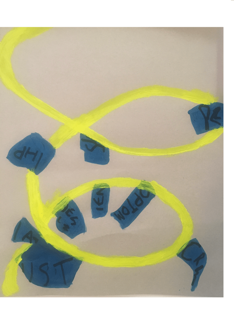
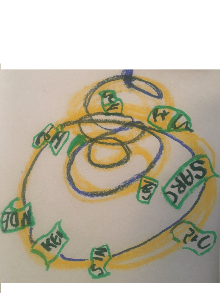
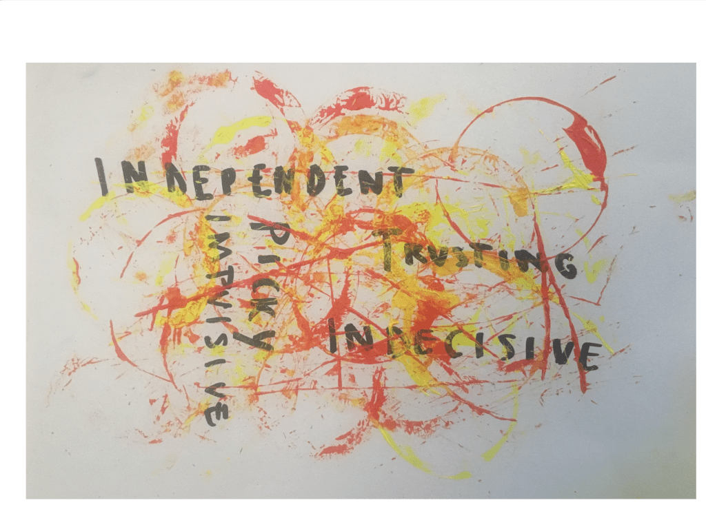
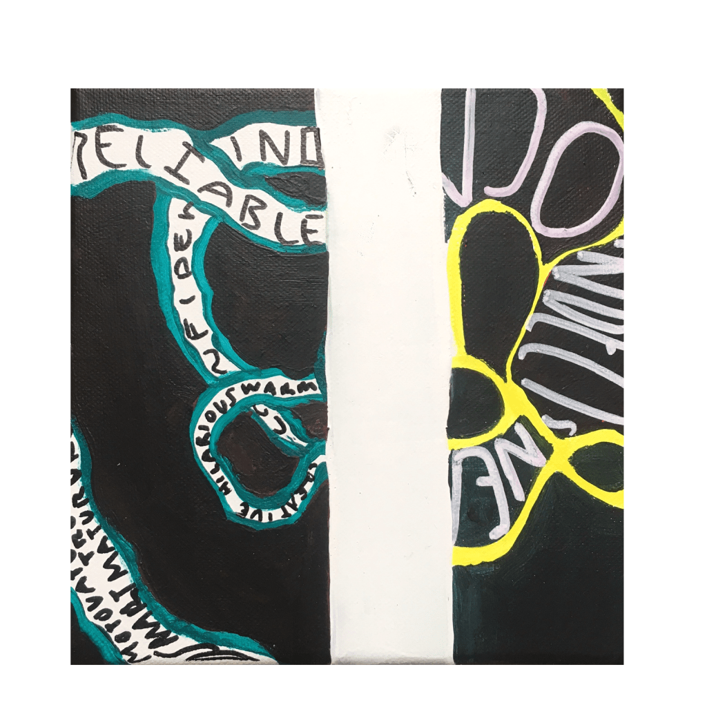
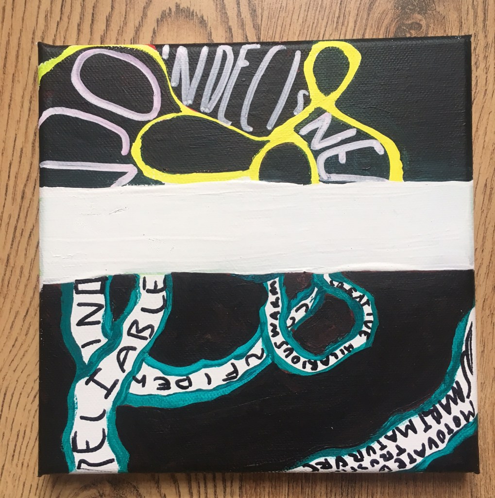
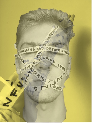
I took forward the first of my day today projects as I felt it had the most creative potential and strongest themes. I decided I wanted to focus on the changing of identity/self, specifically traits. I also wanted to highlight the contrast between self image and how other people see you.

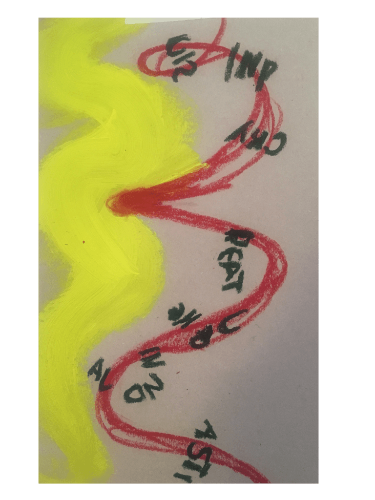
However I explored these ideas by going between working in 2d and 3d and back to 2d and so on. This way of working I used on another of the day today projects where I feel I produced the most work

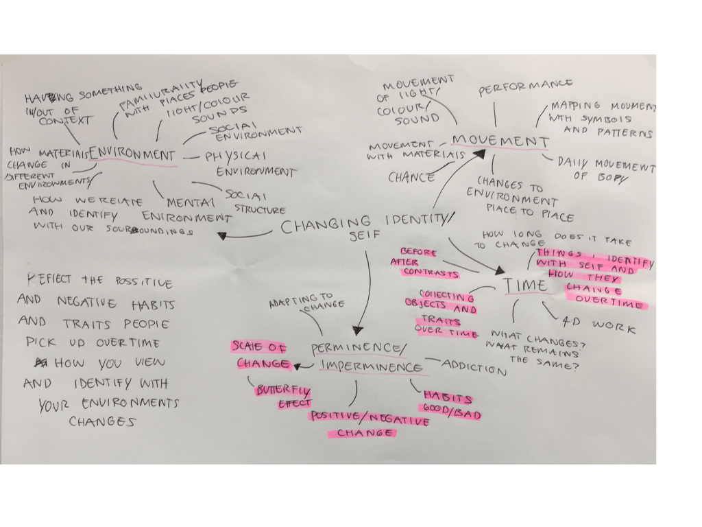
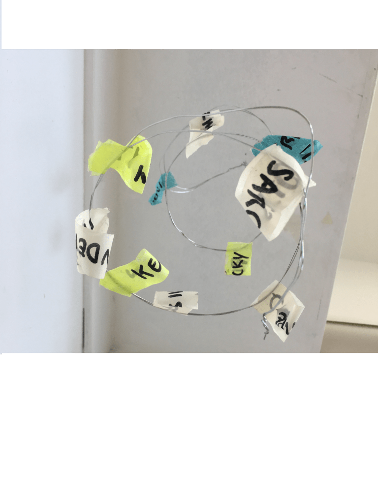
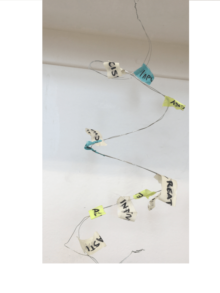
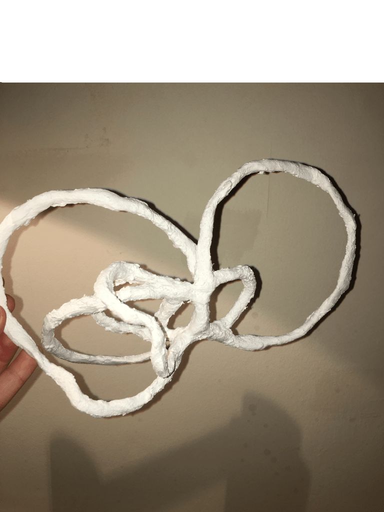
Initial visual response. Creating a structure to represent self then attaching traits I associate with myself
I then took images of the structure in different locations manipulating it as well as playing with light and contrast.

MODERN GALLERY VISIT

4/9/2019

Modern 2: Cut and Paste Exhibition

The exhibition focused around the history of collage and how it has been interpreted and used by different artists over time. I don’t often use college in my own practice but still found it to be enjoyable and gave me new ideas on how I could approach using it. The thing that struck me the most was the huge volume of work ranging from each decade and how the method changed and evolved over time.

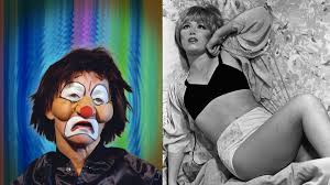
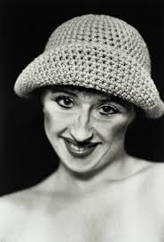
The artworks and artists I found were the most interesting from the exhibition were the ones associated to the feminist movement. Particularly the work of Hannah Höch and Hannah Wilke.

Related image

This collage is from a series of seventeen photos created and shown between 1924 and 1930. It layers and incorporates photographs of a baby body, a tribal mask and an eye from a magazine. It combines a multitude cultures each image bringing another layer of meaning to the piece. The hybrid figure is positioned on small feet, as if it is on display. The work is thought to be an ironic comment on the treatment of women in Weimar Germany. At the time they were being equated with primitive people, and treated as unimportant, while simultaneously being put on a pedestal. The geometric background references the work of the Dutch De Stijl group of modernist artists and architects, with Höch was associated with at the time.

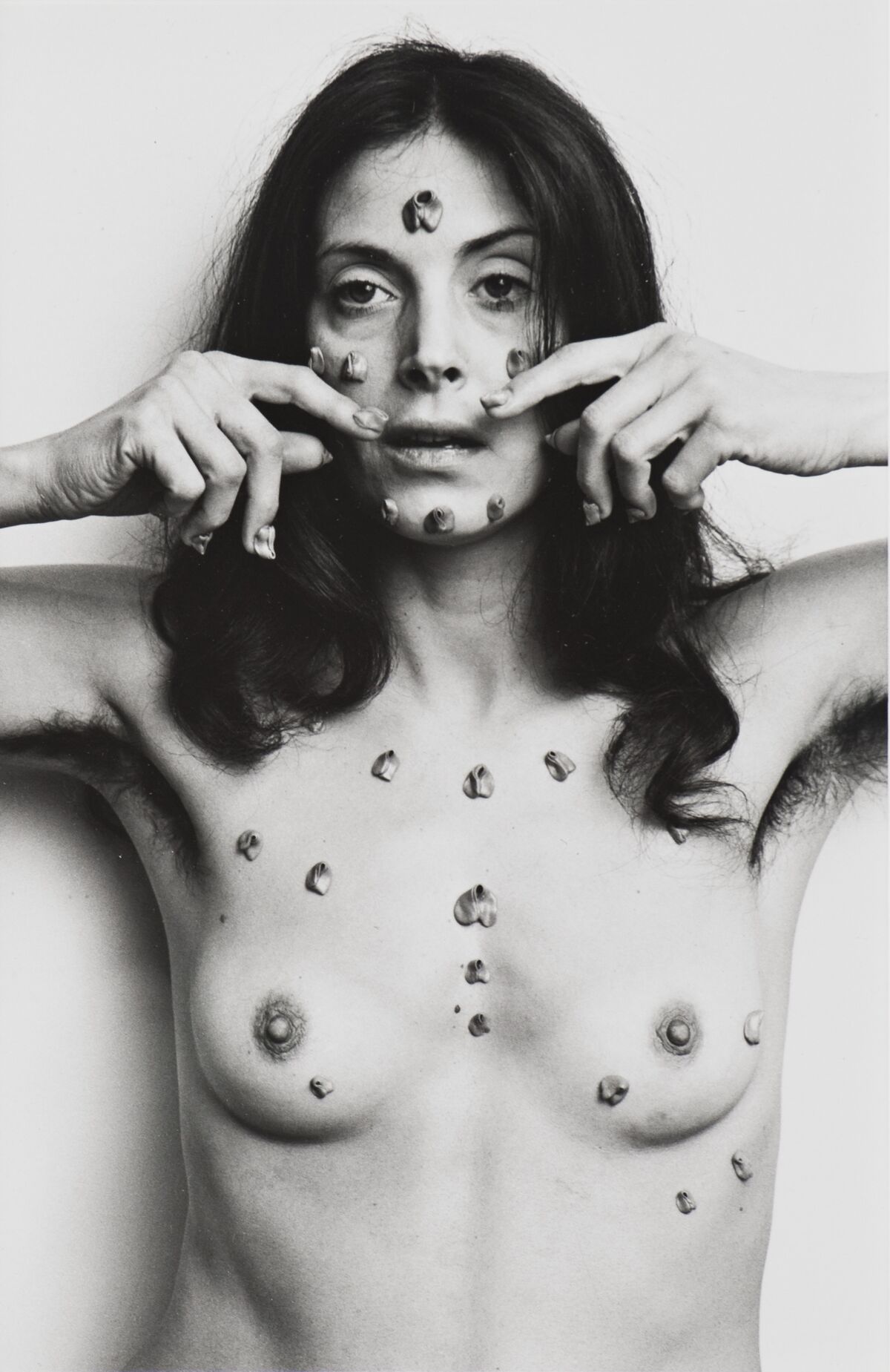
Hannah Wilke, S.O.S. Starification Object Series, 1974. © Marsie, Emanuelle, Damon and Andrew Scharlatt, Hannah Wilke Collection & Archive, Los Angeles. Licensed by VAGA at Artist’s Rights Society (ARS), New York, DACs, London. Courtesy of Hannah Wilke Collection & Archive, Los Angeles and Alison Jacques Gallery, London.

This work is taken from the S.O.S. Starification Object Series (1974-1975)
The artist explores stereotypes of the female body. She draws attention to the objectification of women in both art and pop culture. Using her own body put her at the cutting edge of performance art at the time, but her work was sometimes misread by critics as a celebration of her own beauty rather than the objectification of. The artist used a wide range of media; and her experiments with non-art material were not unusual for the time. This included: gum, erasers, chocolate, play-doh, cookie dough, and dryer lint.
Wilke’s work was a significant influence of feminist performance art of the 1970’s. Her work was also associated with postmodern art because of her rejection to fine art materials and how she challenge to traditional definitions of not only art but female art.

Modern 1: Here and Now

Image result for anya gallaccio roses edinburgh

The gallery excited the work of Anya Gallaccio, who is known for creating site-specific installations. She is also known for using organic materials as her working medium and often in large quantities, such as chocolate, whistling kettles, ice, sugar, candles, salt, Polaroid photographs and lead, she conveys the nature of change through the passage of time, the balance in life struck between growth and decay.

‘Red on Green’ shows the decay and destruction of 10,000 red roses laid in a rectangle upon the gallery floor. The Roses themselves are Fragrant, soft and velvety they have positive connotations of romance and decadence. However, over time they are slowly allowed to blacken and die. The sharp thorns and stems that lie underneath the petals are a reminder of death and the fragility of life and ageing. I liked the artists use of materials and the contrast of life and depth that is slowly revealed over the course of time. I find the ageing aspect of the work the most interesting making you question how you feel about the ageing and developing process. Her work often deals with these complicated themes of love, death,romance,aging, and youth.

“The extravagance of a pile of roses, which have their heads pulled off as an aggressive and obsessive gesture, along the lines of ‘loves me, loves me not”, is a passionate thing, but isn’t intended to be sentimental”

Image result for charles avery untitled diarrhea projection

The exhibition also showed the work of Charles Avery who is a Scottish artist from Oban. The work he is most renowned for is work entering around the description of an imaginary island through the use of drawings, sculptures and texts. The artists describes it as “The topology, cosmology and inhabitants of this fictional territory, from the market of the main town Onomatopoeia to the Eternal Forest where an unknown beast called the Noumenon is held to reside. The project can be read as a meditation on some of the central themes of philosophy of art-making, and on the colonization and ownership of the world of ideas.” This work like others from this exhibition focuses on themes of change, growth and decay.

The thing I find most interesting in this work is the theme of illusion running through it as well as how mesmerising the projection itself is to watch. The wings of the creatures are so thin and they reproduce and disappear by chance when they overlap and another. At some stage they flutter out of the box becoming larger before finally evaporating.