I think I engaged well with the 2d workshops and really enjoyed combining all of the taught elements – collage/paint/print. The workshops forced me to use my theme and imagery with methods of working I would have otherwise neglected (collage). As the project continued in the later weeks, I did have to pause on making work and return back to researching my theme in order to add context back to my work as I felt my work and the imagery I was using was becoming repetitive. When I was producing work I was doing so large volume without stepping back to evaluate on what elements were successful as much as I should have been in order to push the work in the right direction. In the end I did have about 3 or 4 pieces I felt had enough working to effectivity communicating my menacing theme. However, I wish I had managed my time better and not having that period where I felt stuck, I would have had more time to scale up more resolved work. Given more time I would have also liked to edit some of my work digitally and play around with layers and distorting the colours a lot more. I think the feedback I received from my crit was helpful as it highlighted other elements of my theme I could consider more and encouraged me to scale up my work as well as playing around with some of the existing imagery in photoshop.
Tag Archives: 2Dpractice
Consumption Development
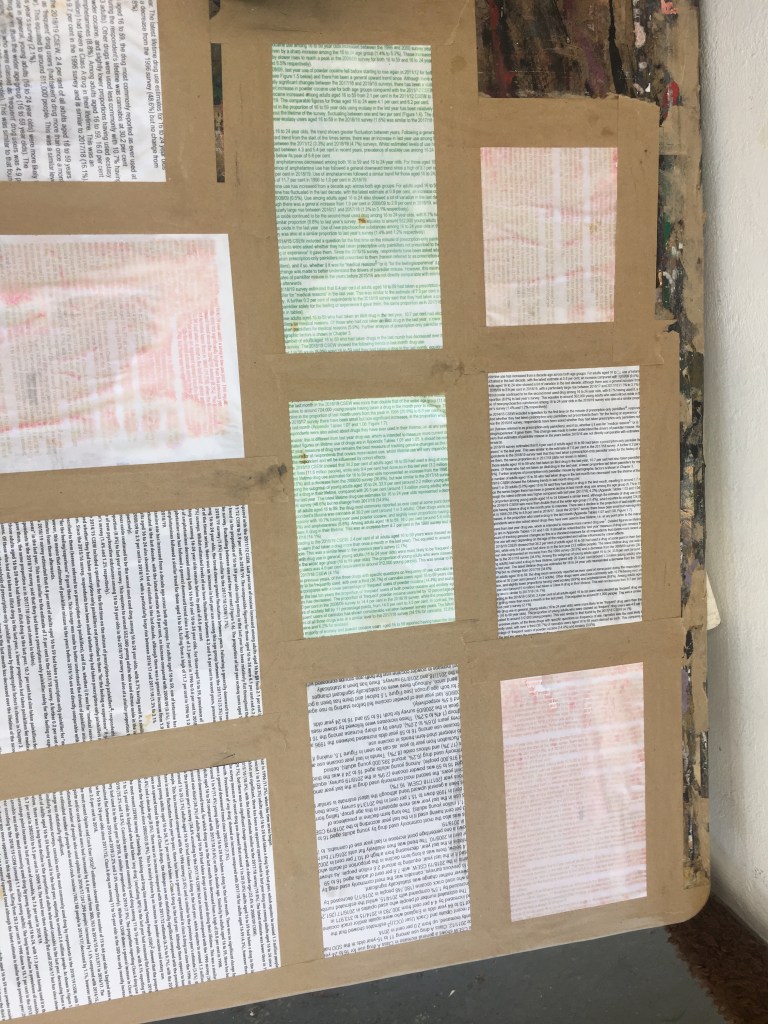
To further contextualise the work I was making I researched statistics surrounding drug and media consumption in the UK within the past 3 years. I printed out the statistics onto plain paper as well as existing prints before experimenting with them as a new layer to my work.
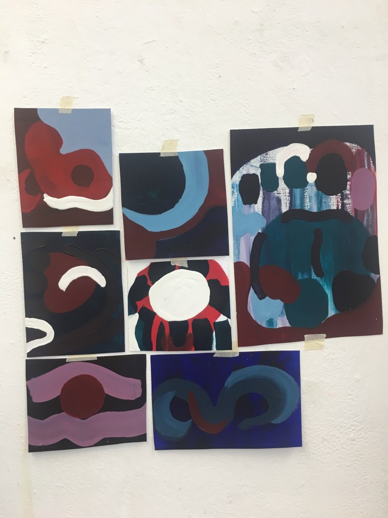
while the colour and composition within some of these paintings works I think they remain very flat and lack movement and depth.
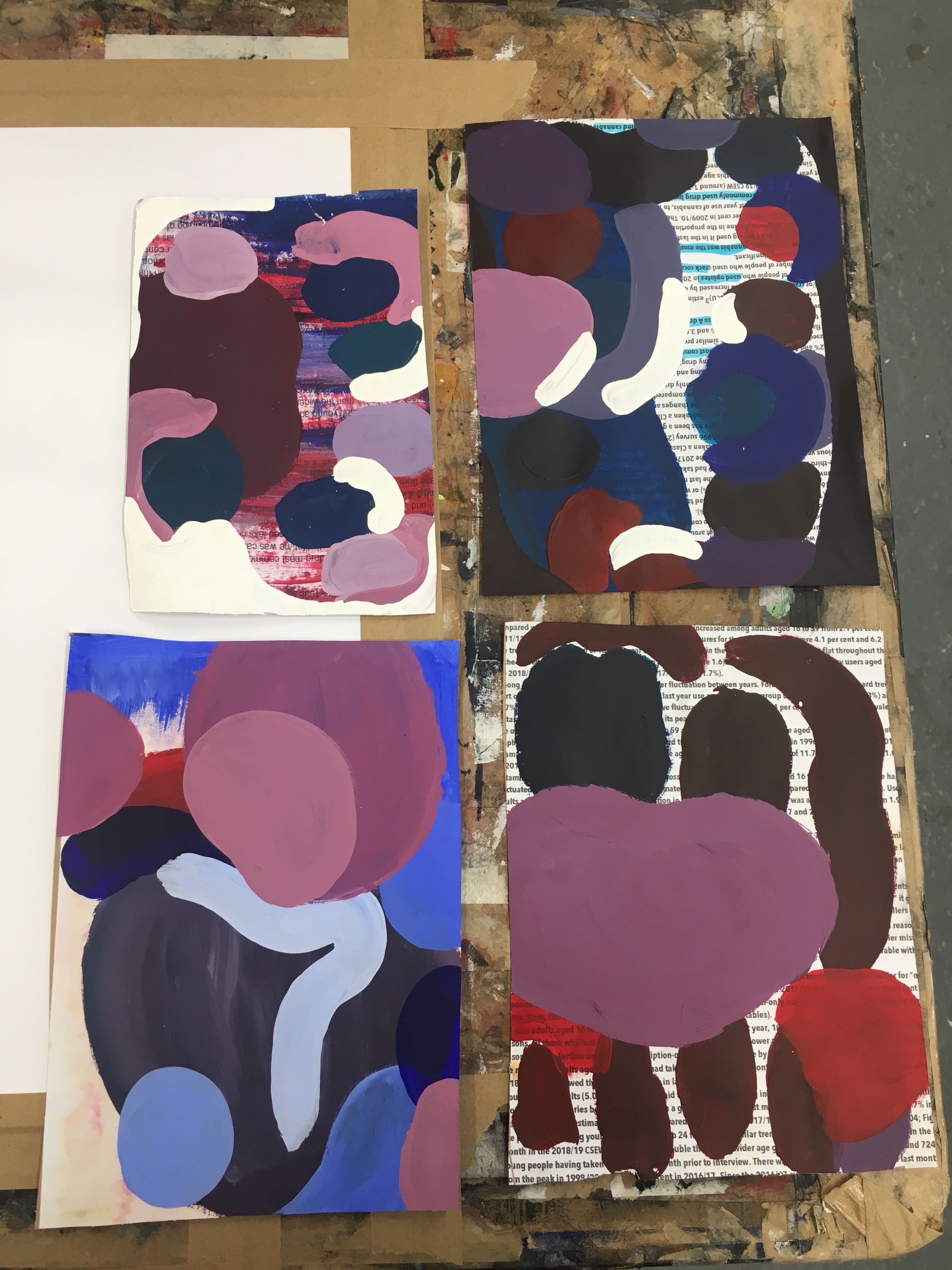
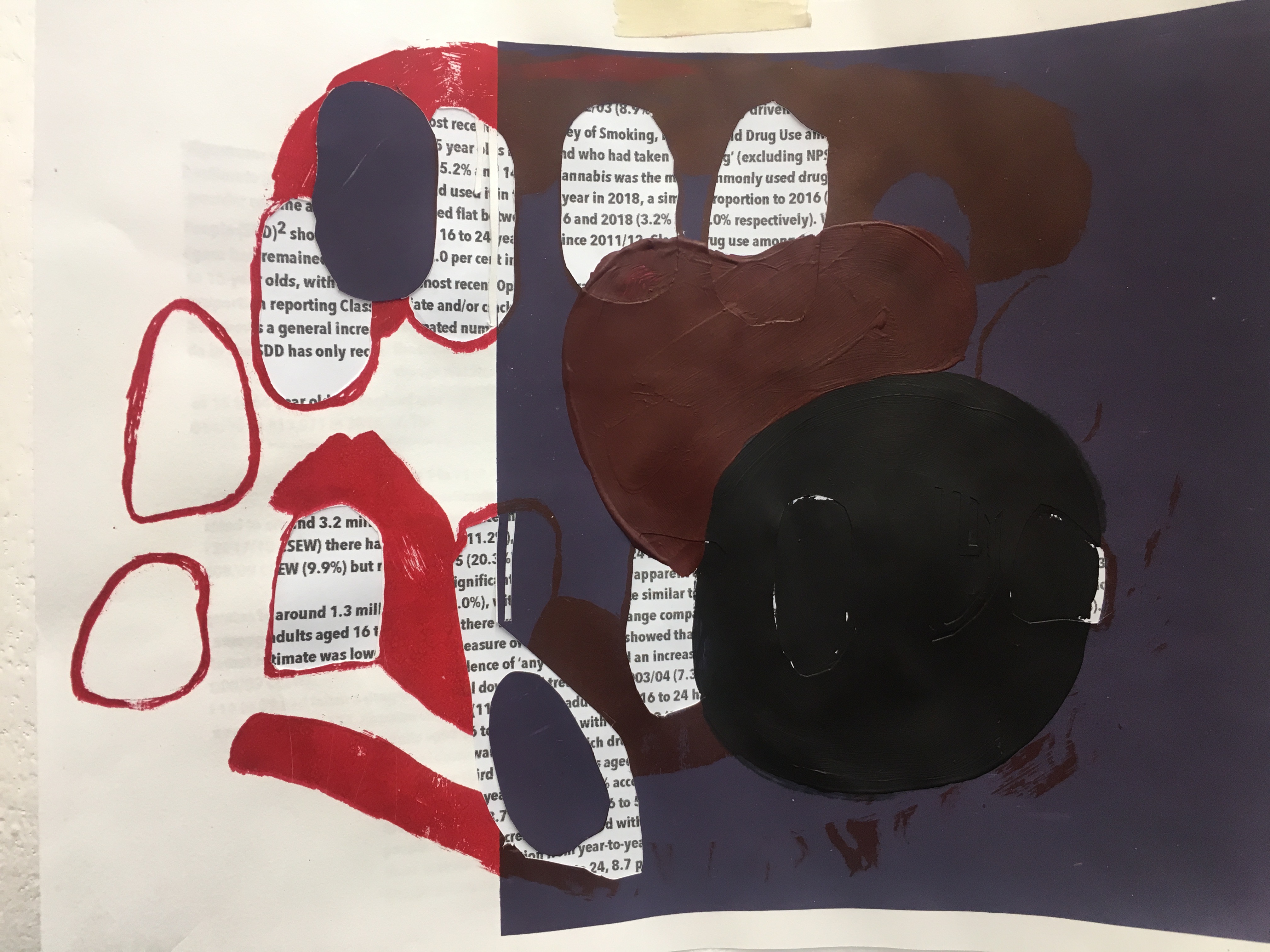
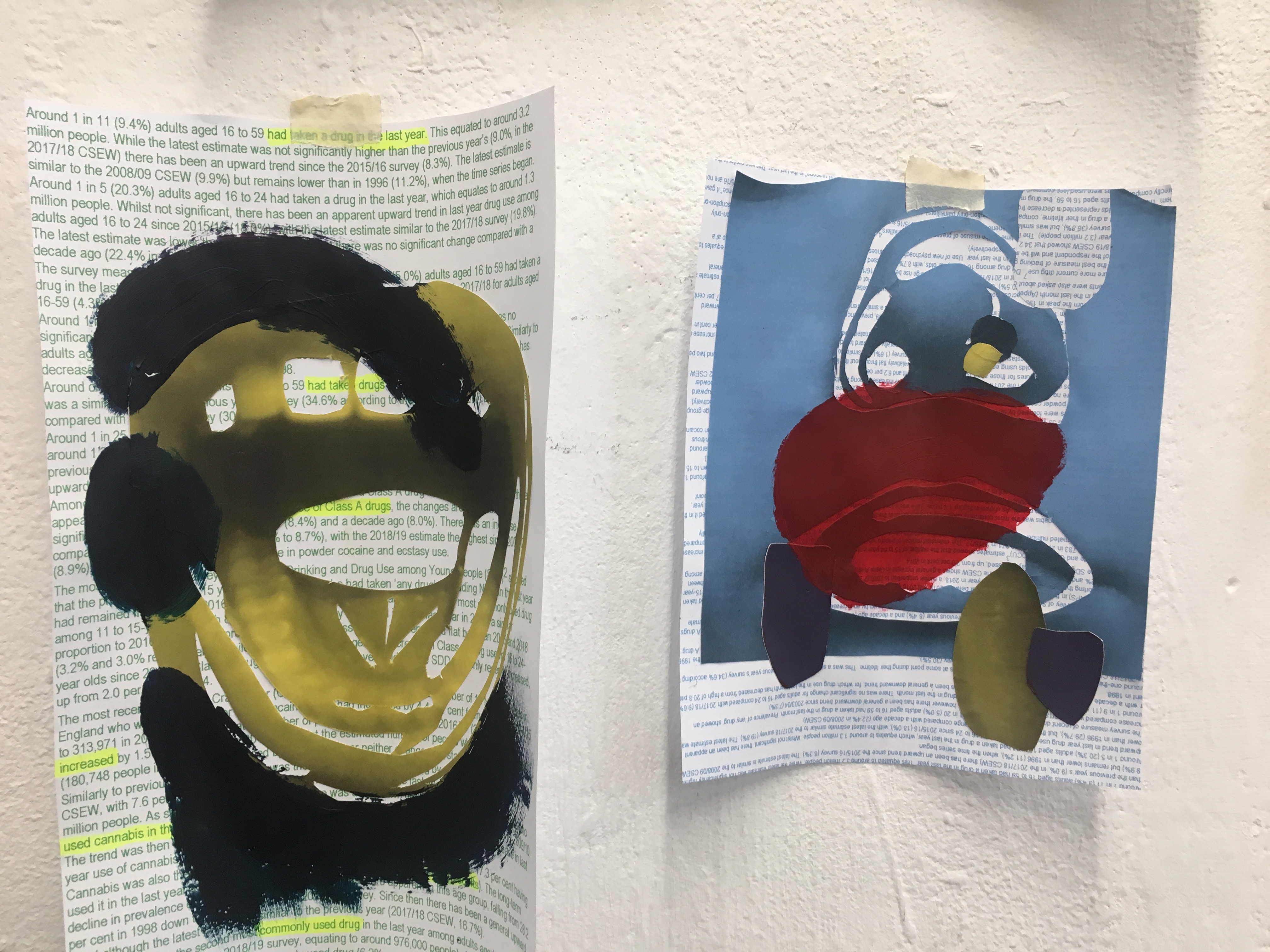
Using the statistics as prepared surfaces I was able to add another layer of meaning to my work, highlighting some of the words and statistics within the large overselling chunks of information
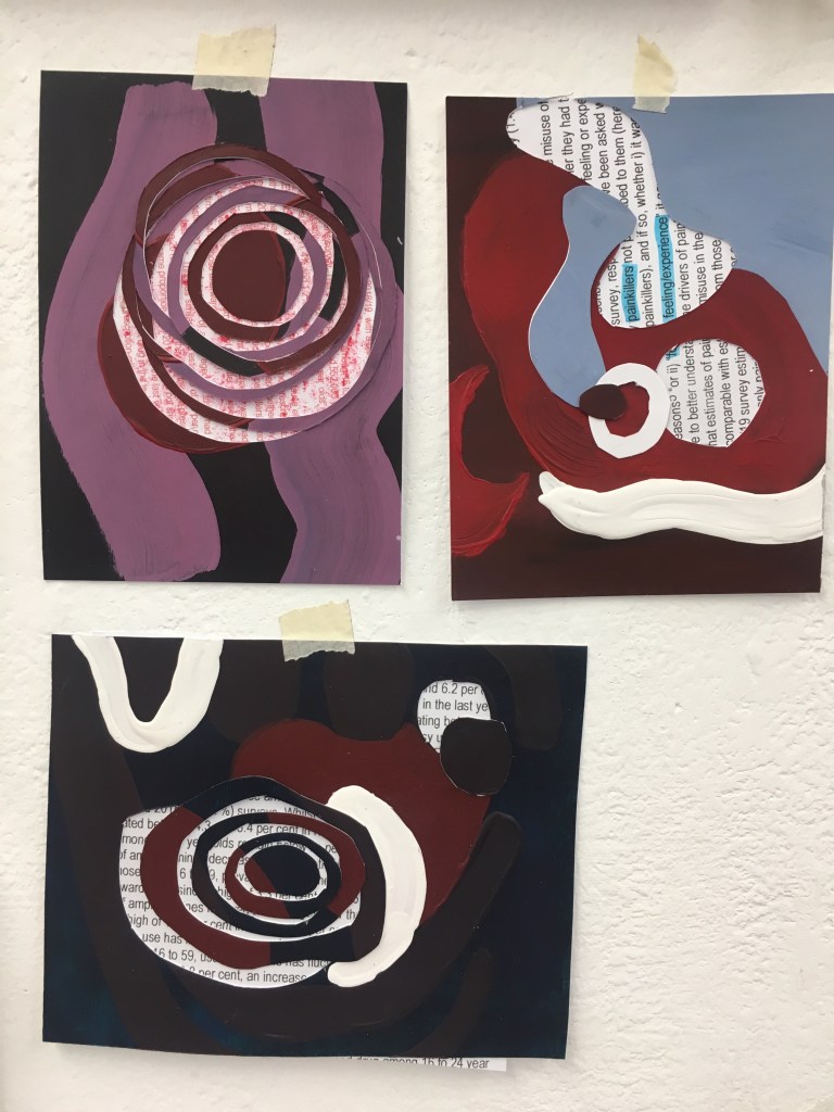
evaluation
Good use of research as well as a large variation of ideas. Simplifying and abstracting images works well as well as use of colour/pattern and layering collage/paint. The use of dark colours and imagery effectively conveys the ominous undertones and theme. Using the statistics added a depth of information to the work both literal and visually and was well integrated however the information could be made more obvious. The final presentation of work needs to be clearer on what is considered to be the more resoled and finalised work as on the wall it appears to erratic and difficult to navigate. Moving forward it would be interesting to experiment with digital and further explore movement and sound. Would also be interesting to scale up work in order for it to become more physically immersive and communicate the feeling of falling in/out of something (vortex).
2D practice
Project starting point
My initial idea and concept for the project surrounded consumption. specifically I wanted to focus on capturing the ways in which we consume as well as the different things we consume on a daily basis- media, food, drugs, information. I thought the best starting point when exploring consumption would be to focus on the senses taste, smell, hearing, sight, touch.
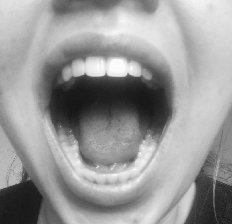
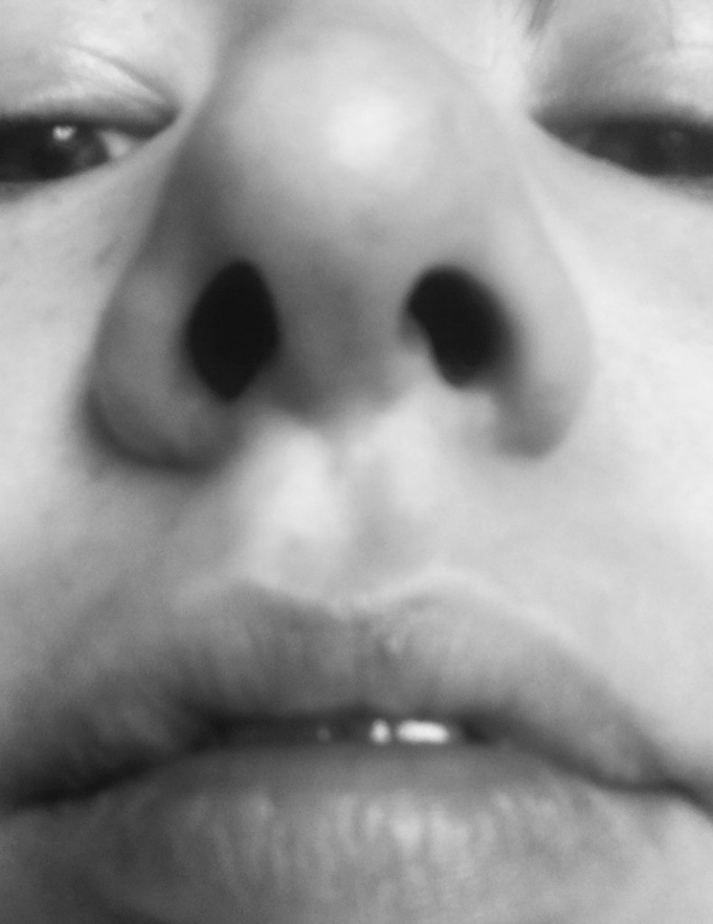
Having the senses as a visual starting point I gathered reference images to refer to before I started experimenting with different media and techniques. First taking images of myself before collecting a range of images from other people- ears, mouth, nose, eyes.
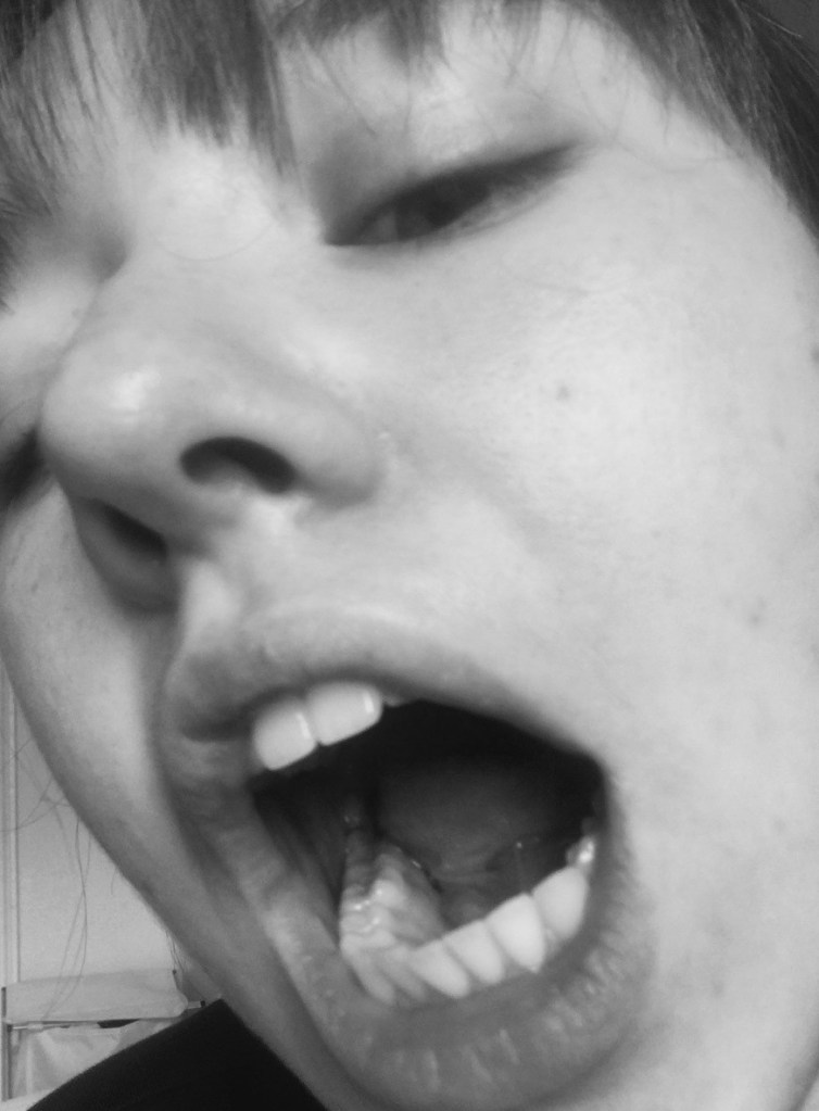
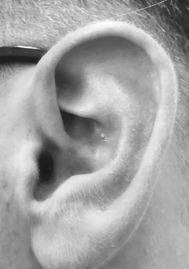
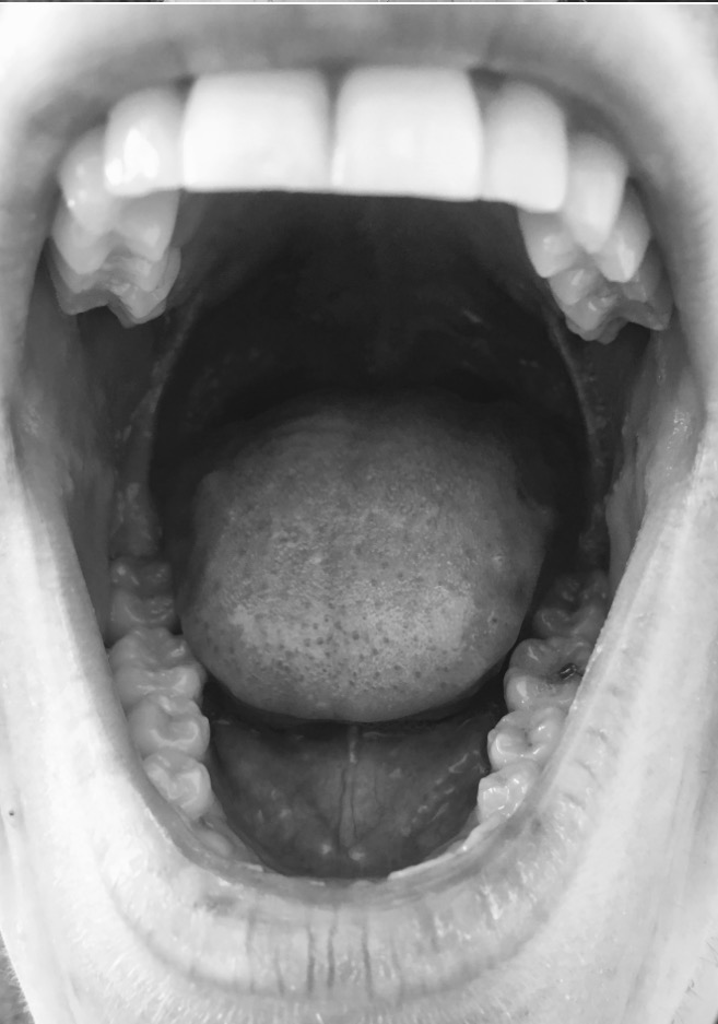
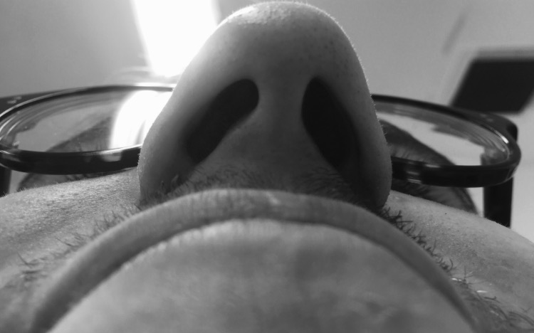
Wet Media Experiments
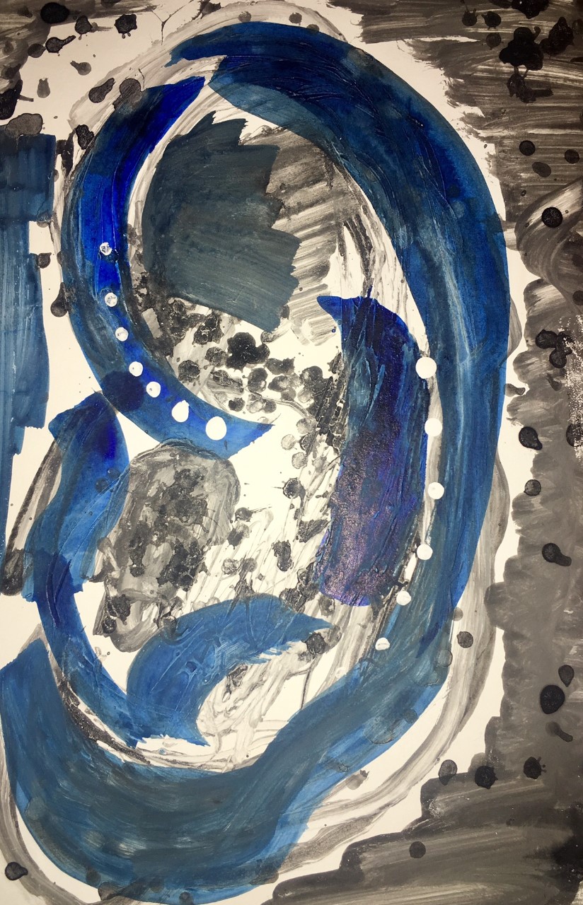
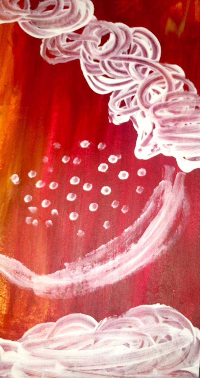
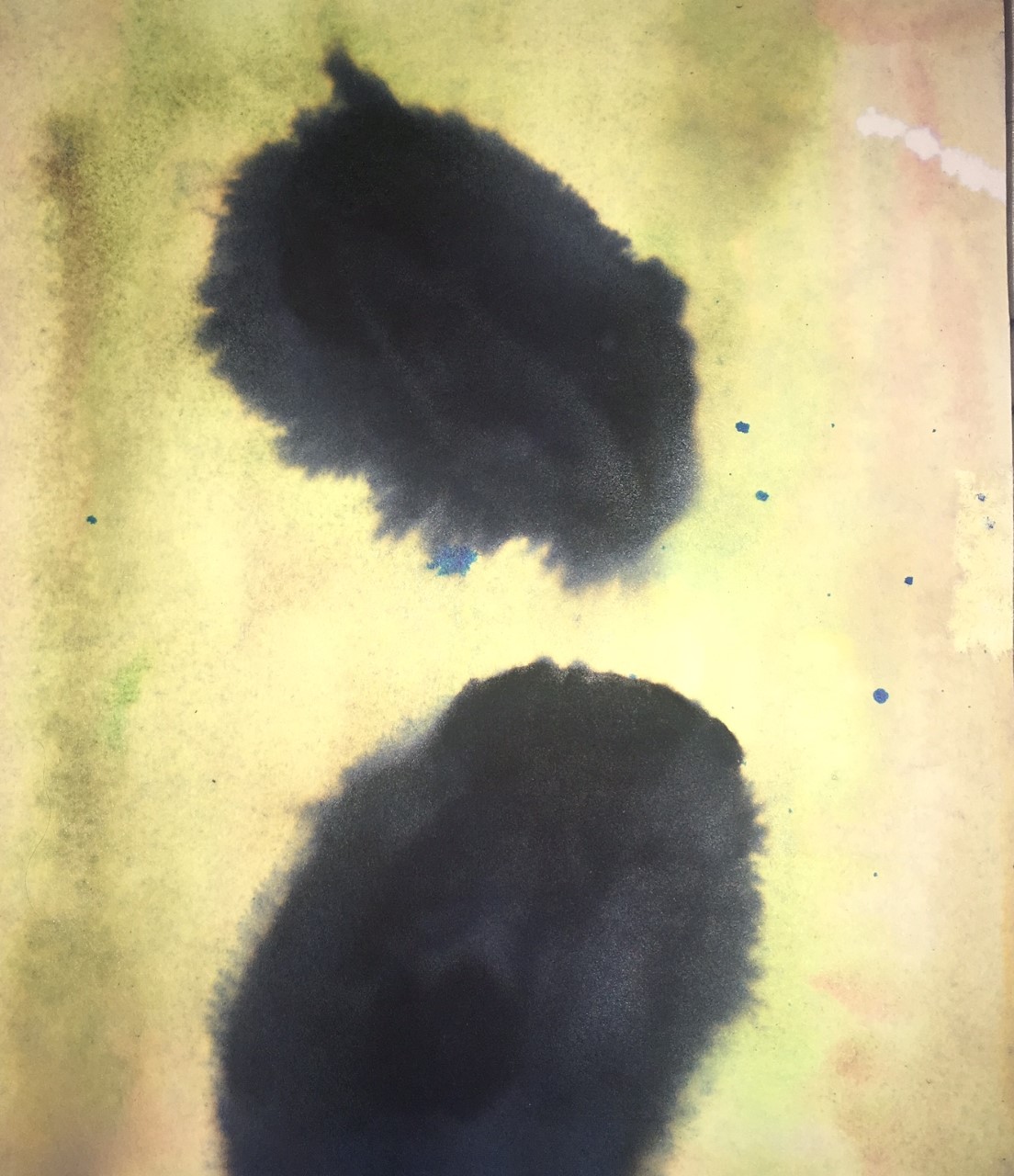
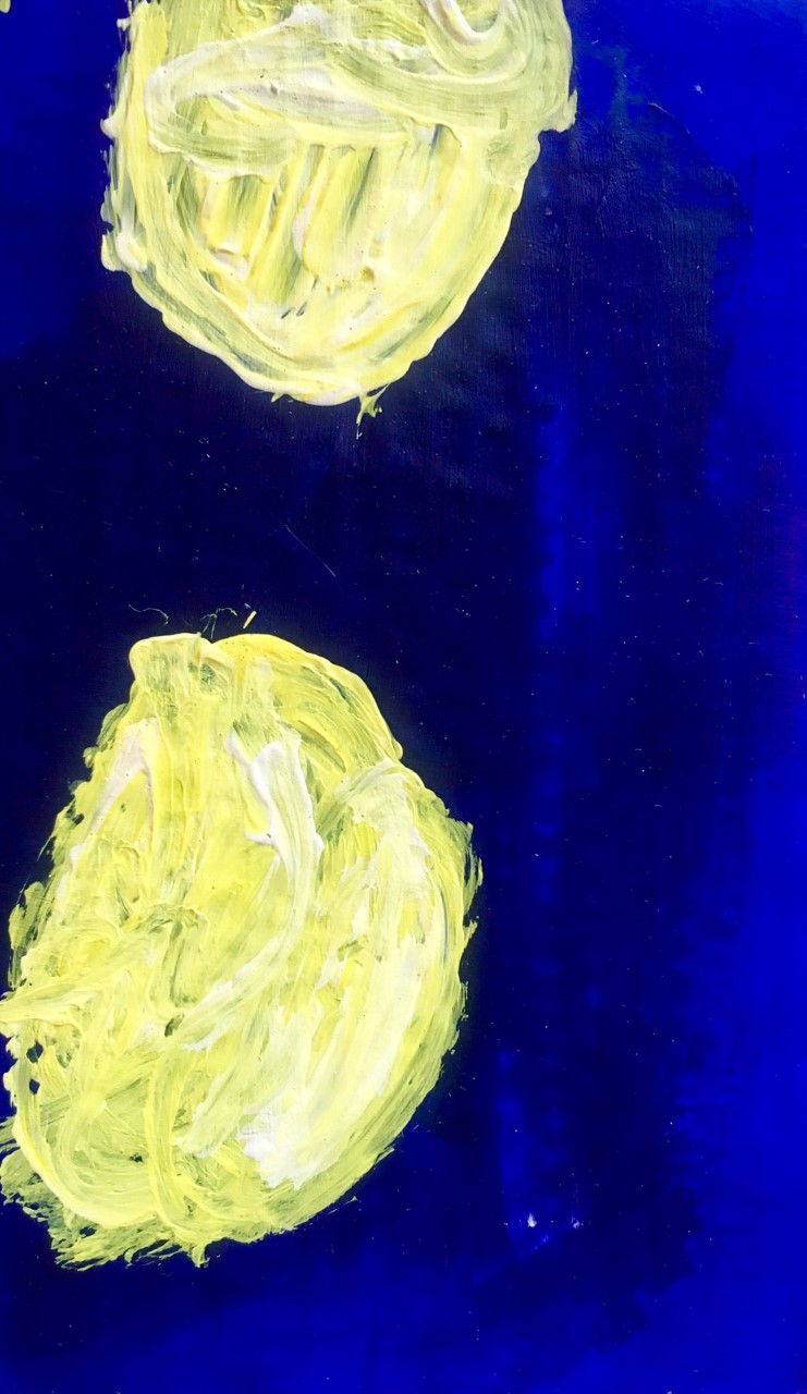
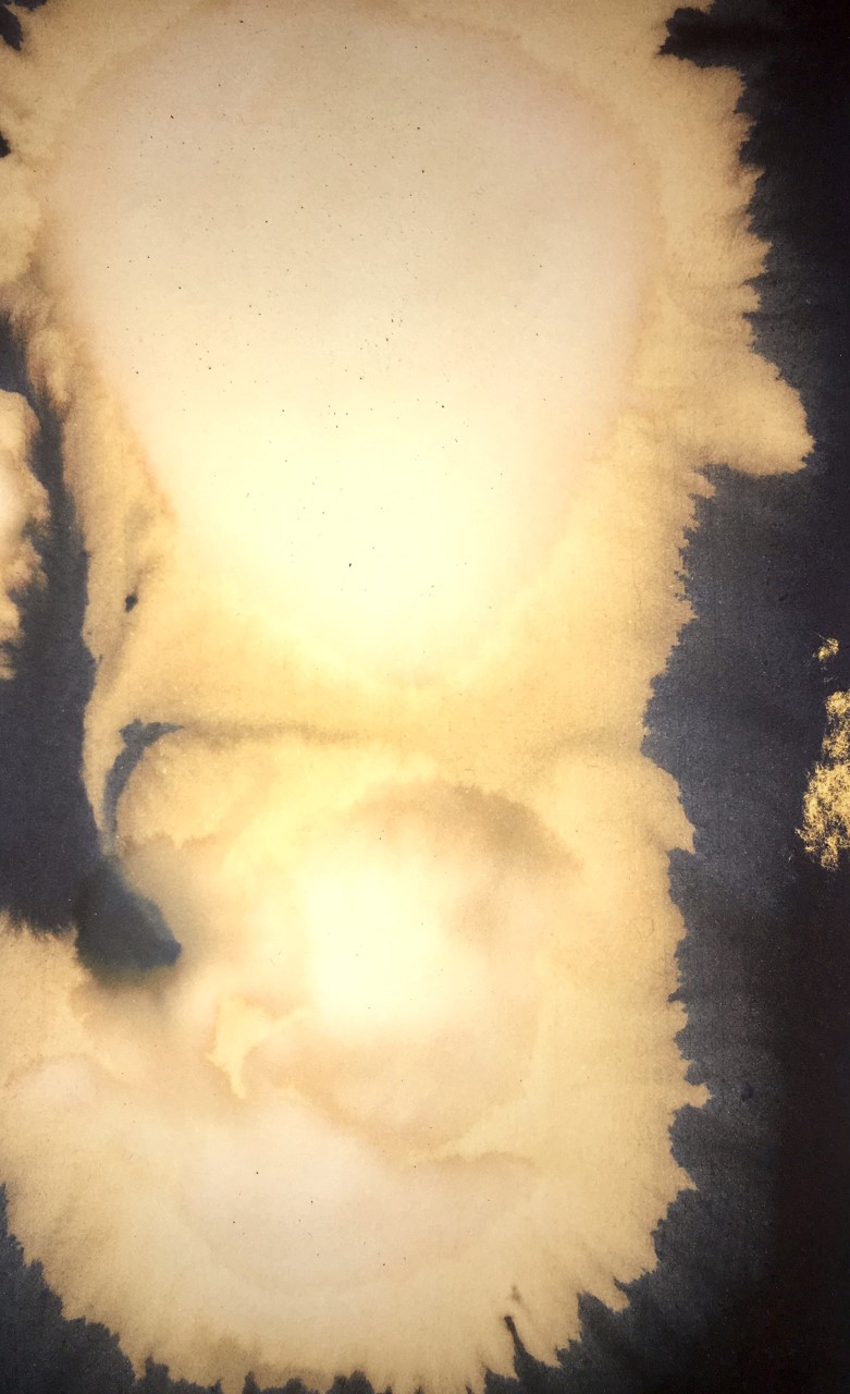
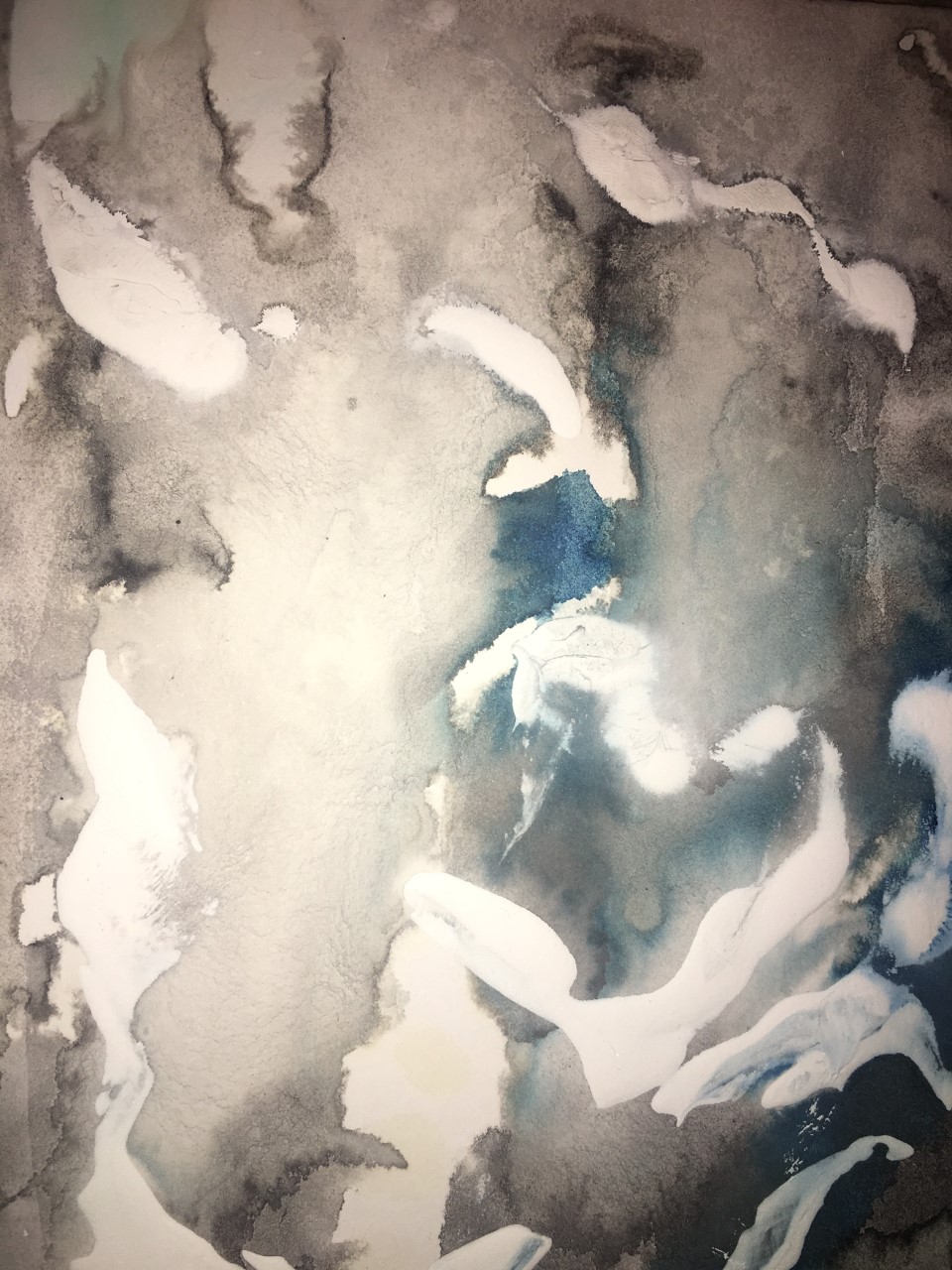
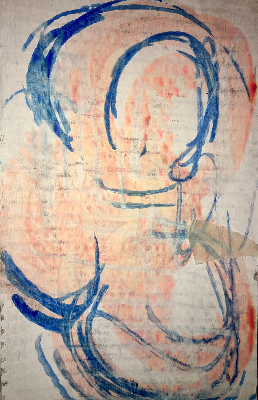
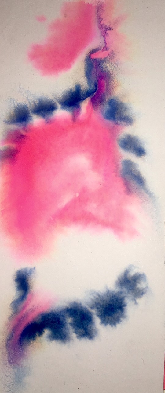
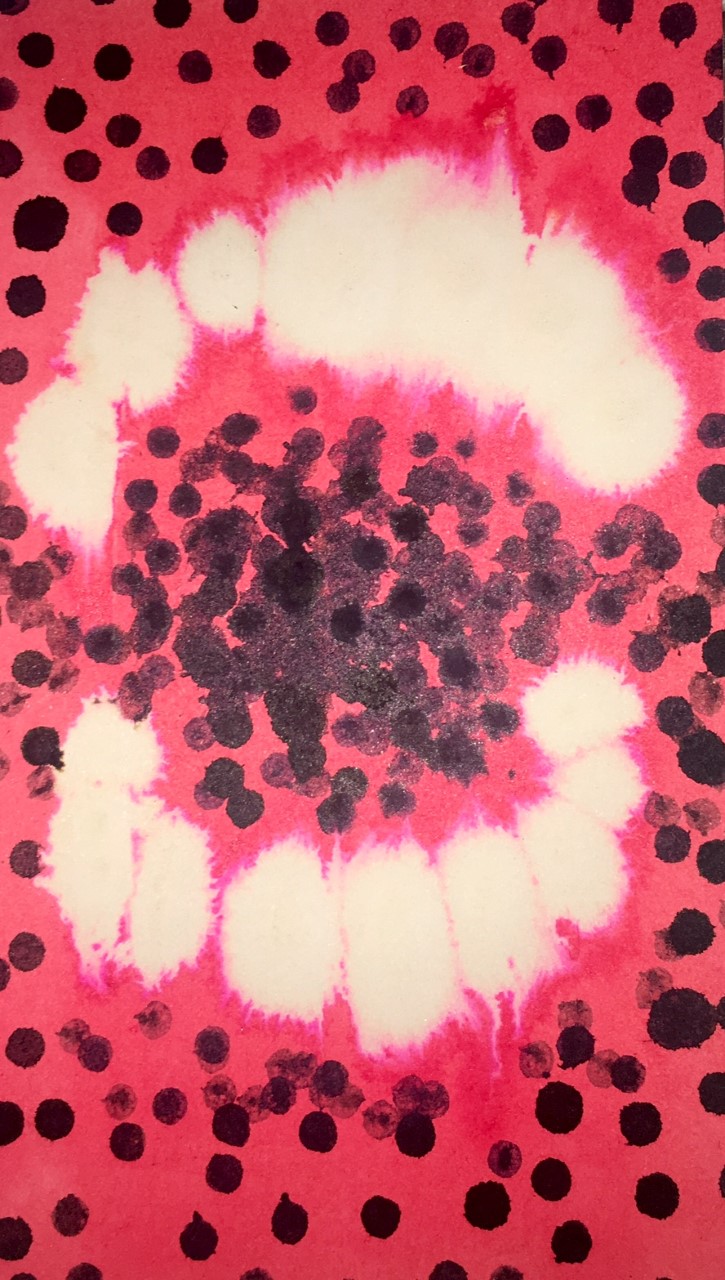
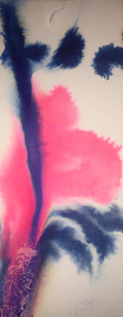
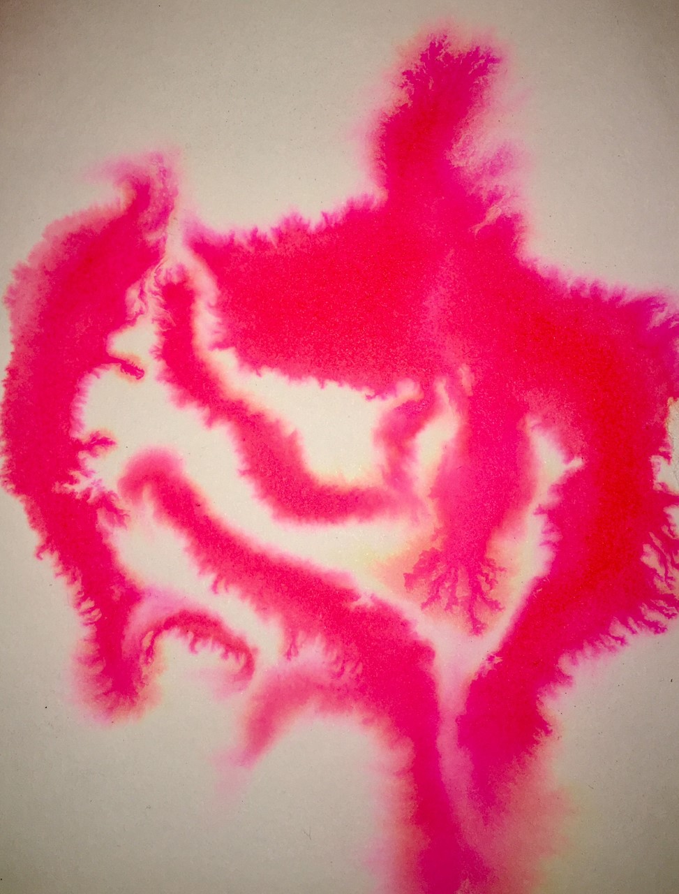
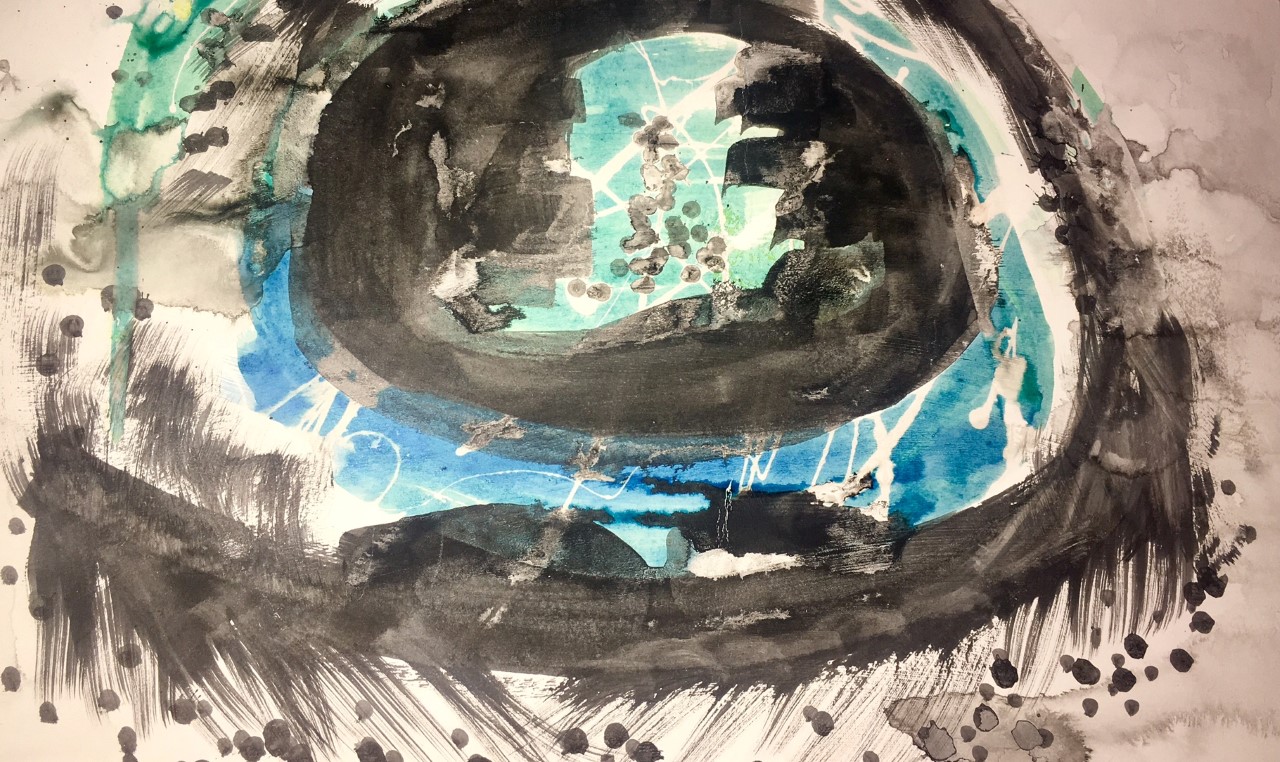
The first set of media experiments I think lacked the shapes and images I wanted to communicate however I liked how unpredictable using the ink was and the movement it could create.
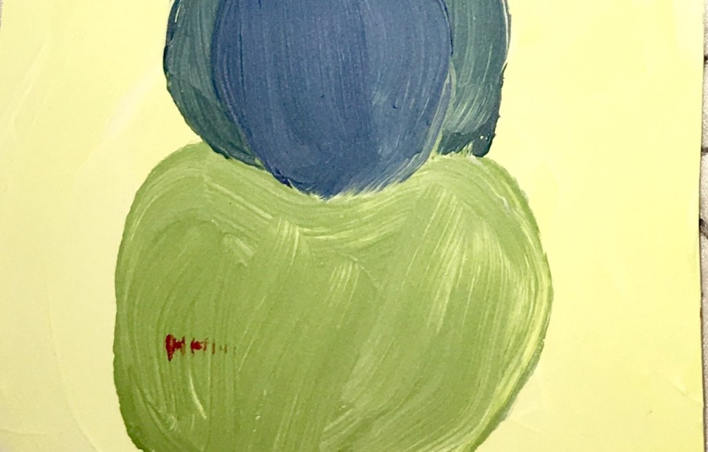
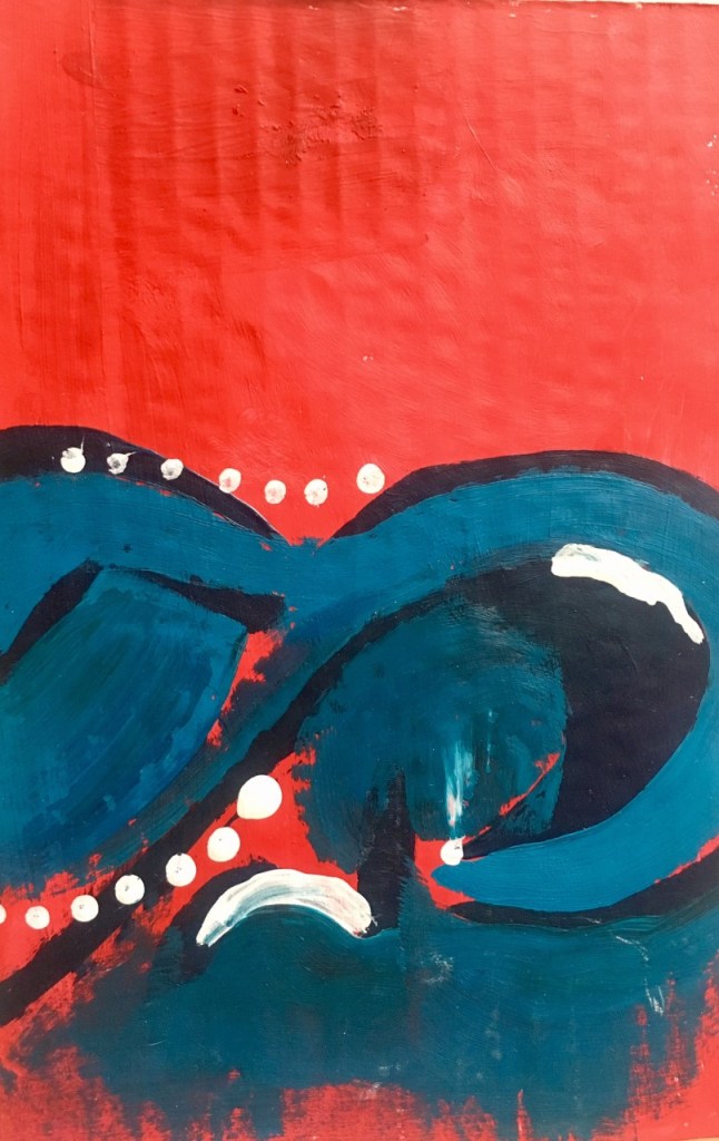
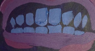
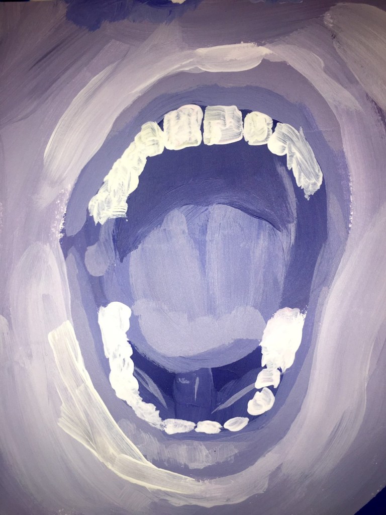
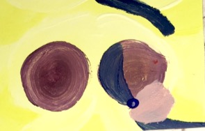
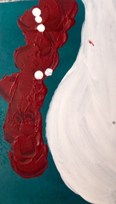
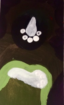
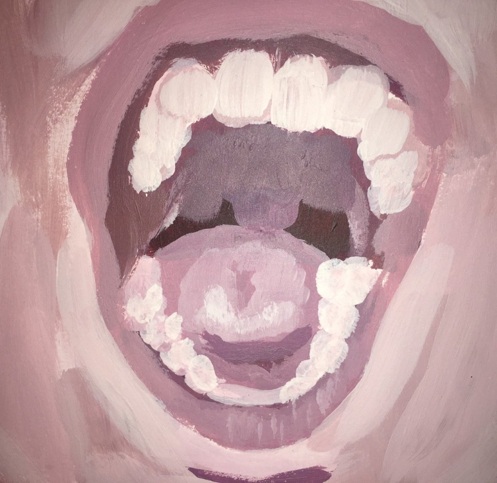
When I started using acrylic it was easier to communicate the shapes and images I wanted using mostly blocked coloured shapes. However I felt these images lacked depth and became very flat, this was enhanced by the similar colours I was using within each of the experiments.
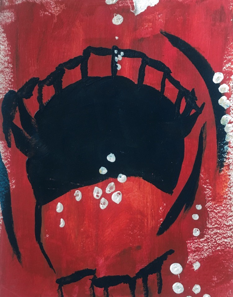
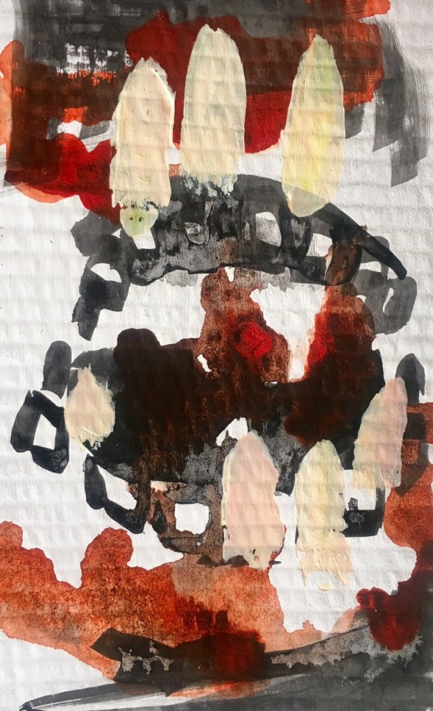
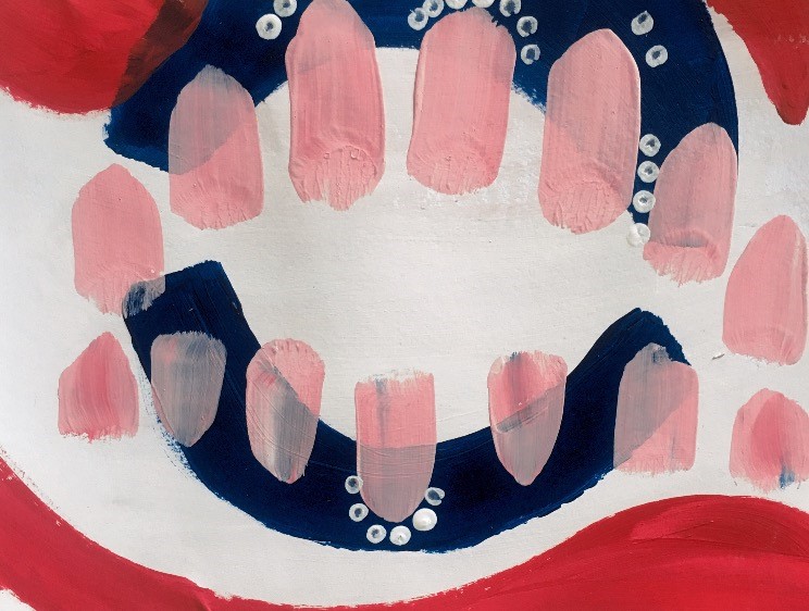
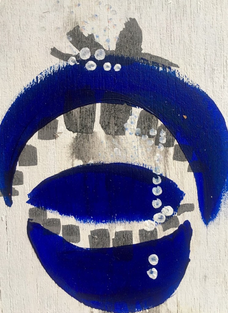
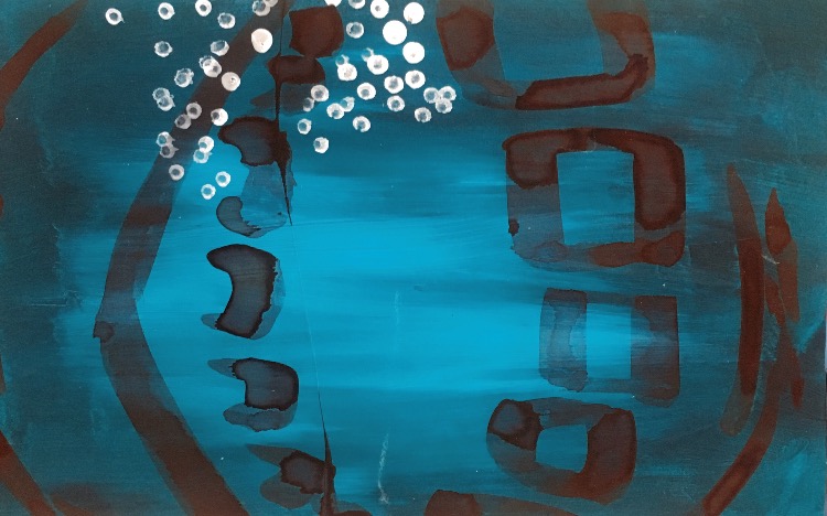
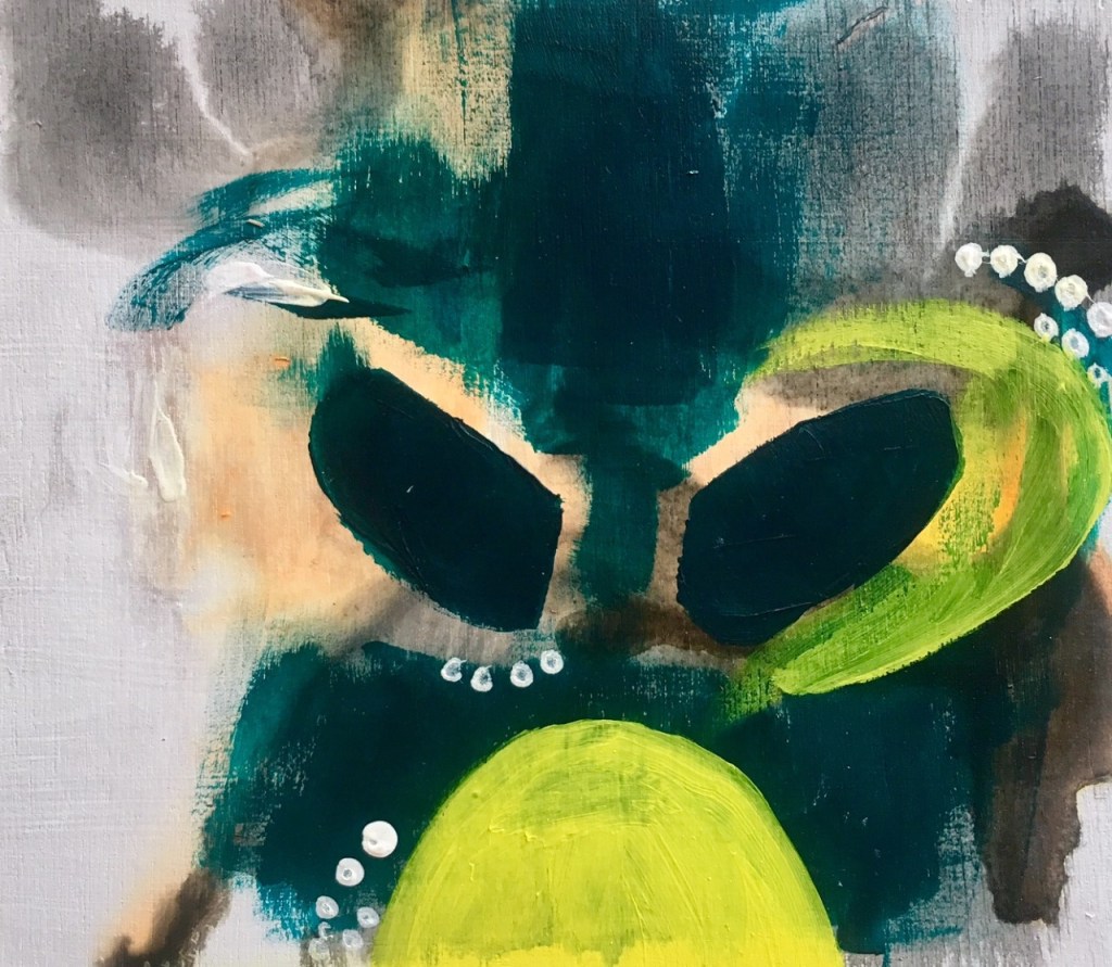
Braking up and spacing out the shapes allowed it to become more abstract and subjective. Layering the different colours and textures within the congestion added depth to the simplistic shapes.
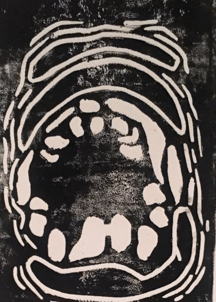
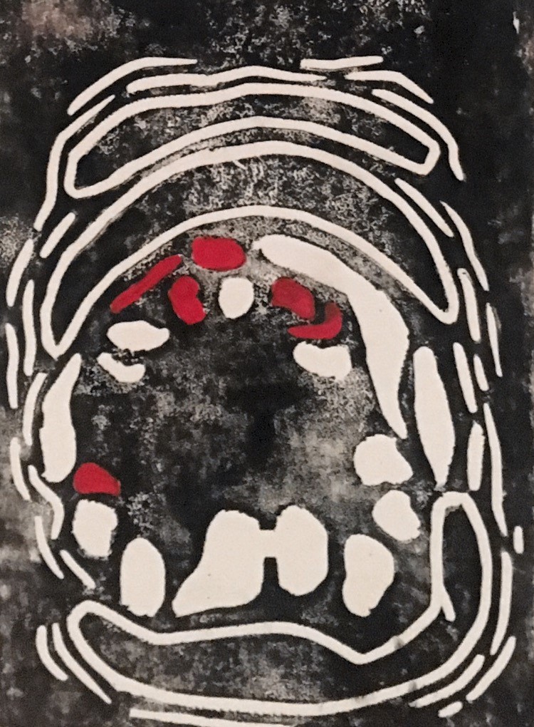
For screen printing I decided to use the image of the open mouth as inspiration as I felt it was the easiest to pick out and identify especially if I was going to be layering different prints and colours.
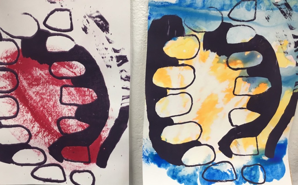
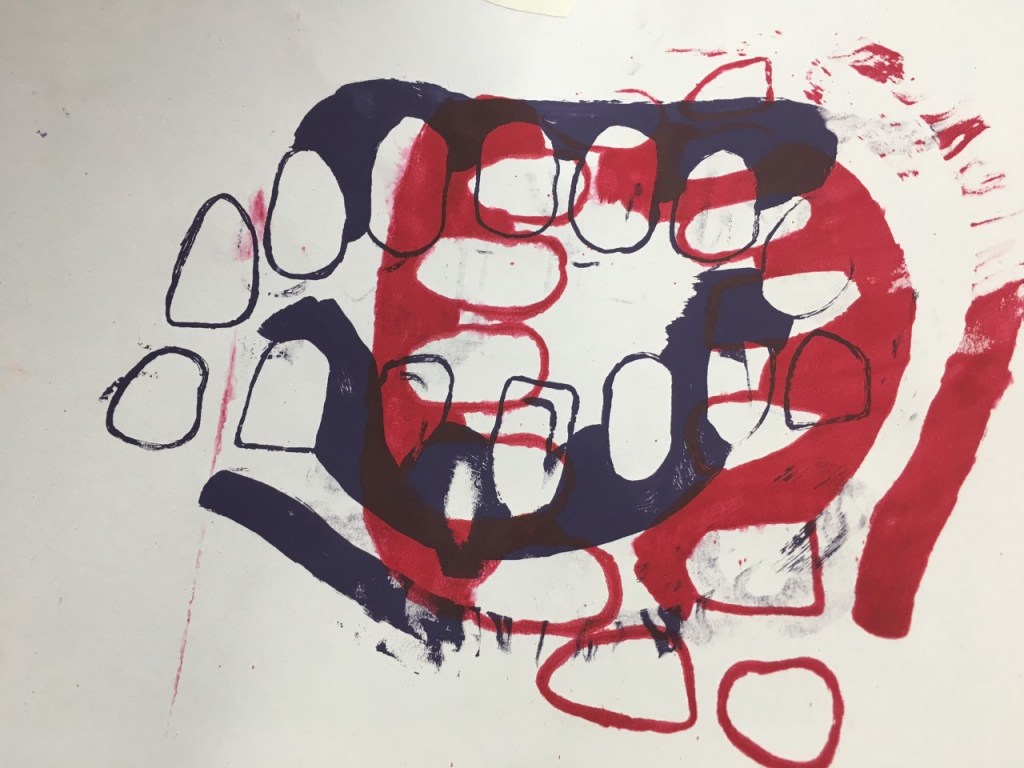
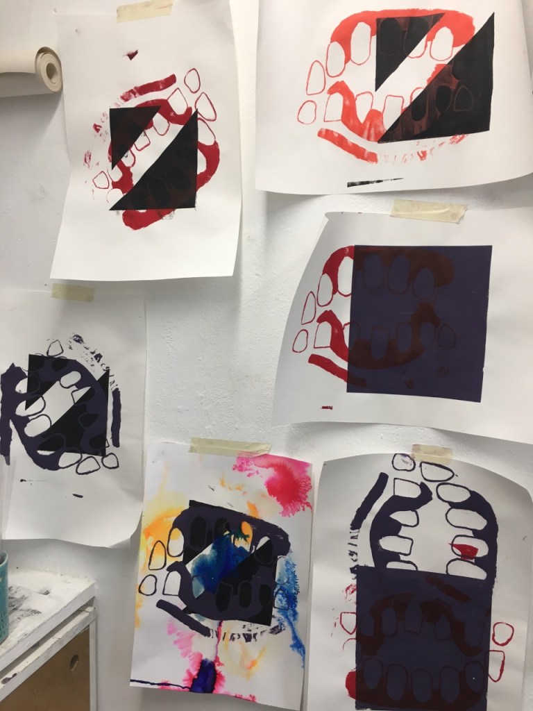
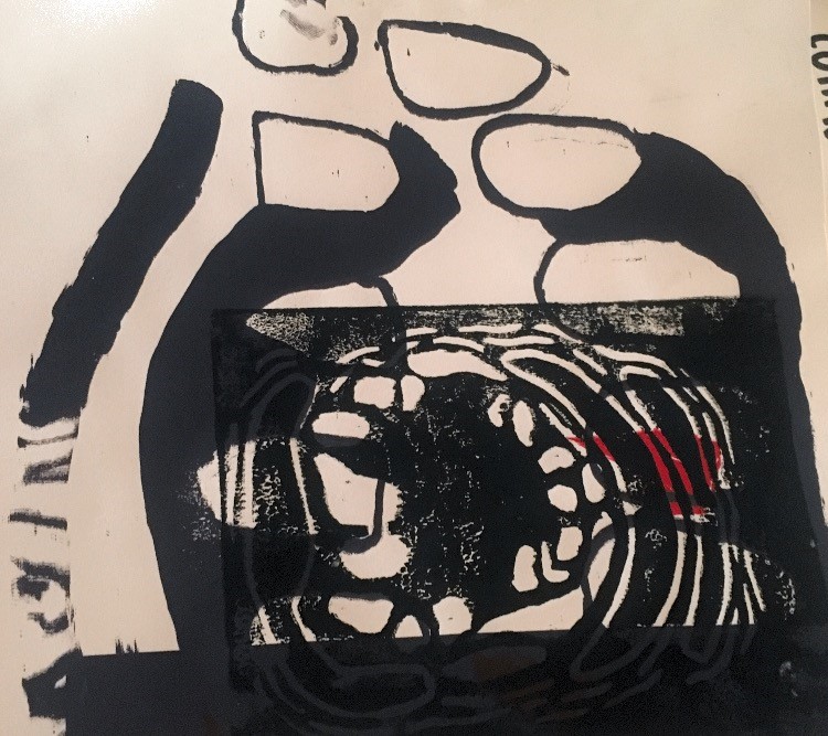
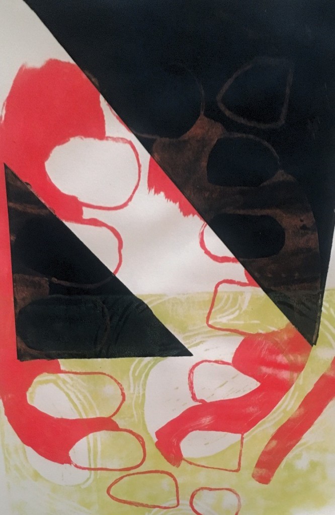
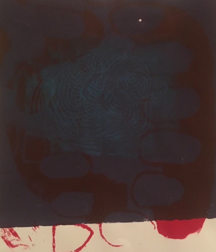
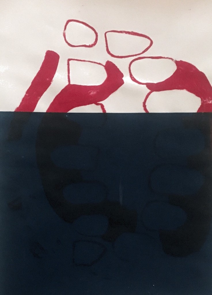
When I was printing I taped off angular shapes and used them as backgrounds before using screen printing on top just to add depth and break up the composition and shape. 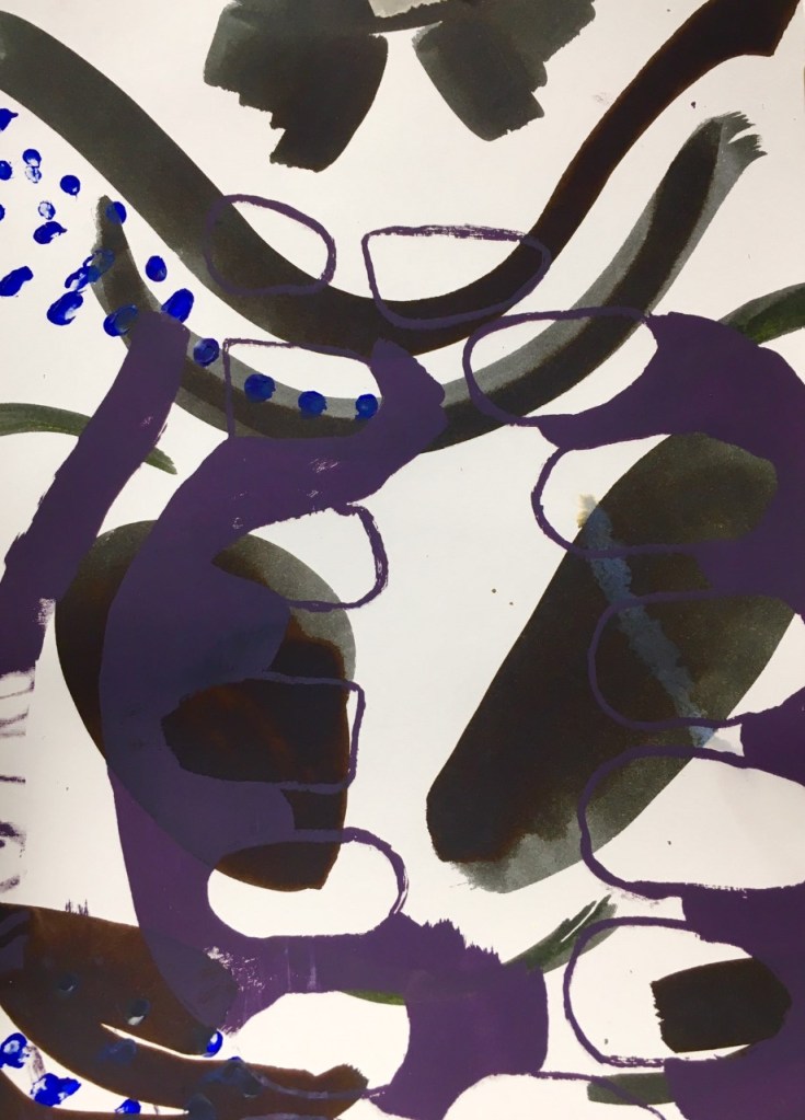
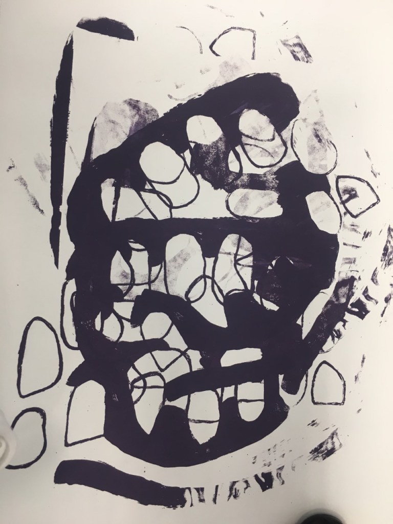
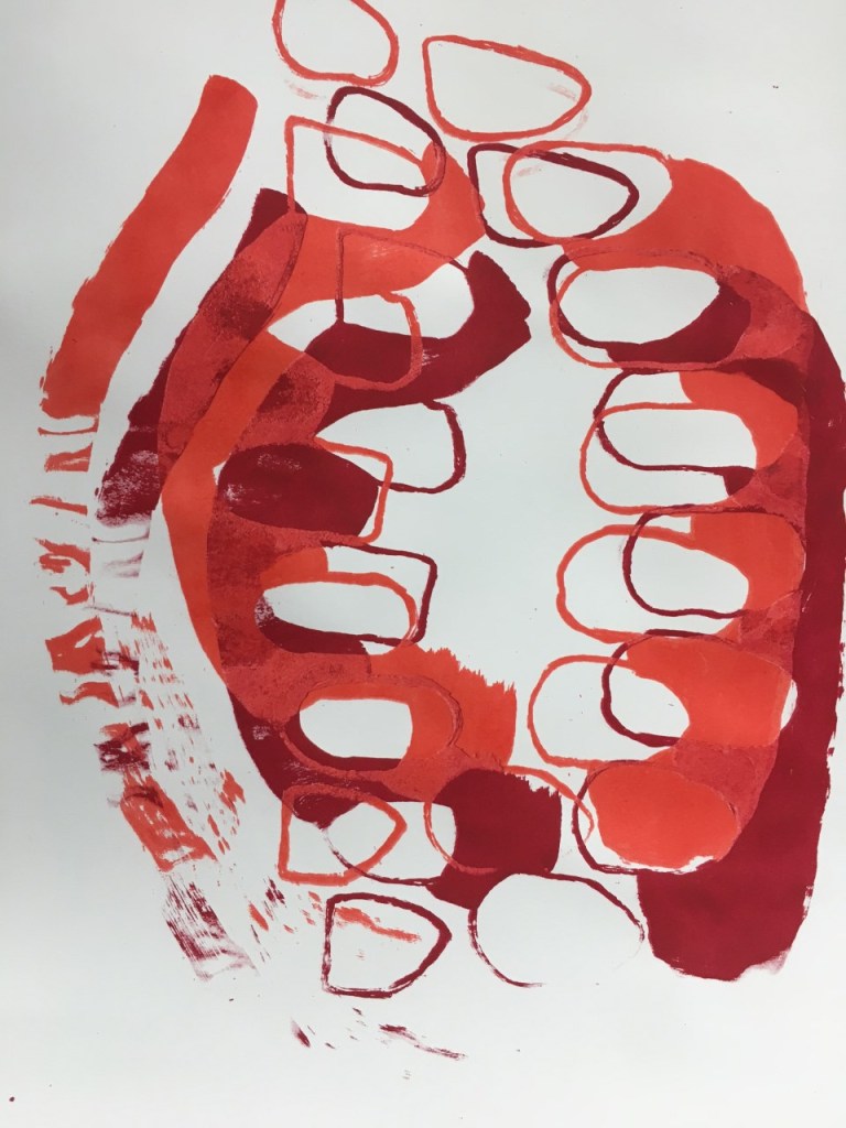
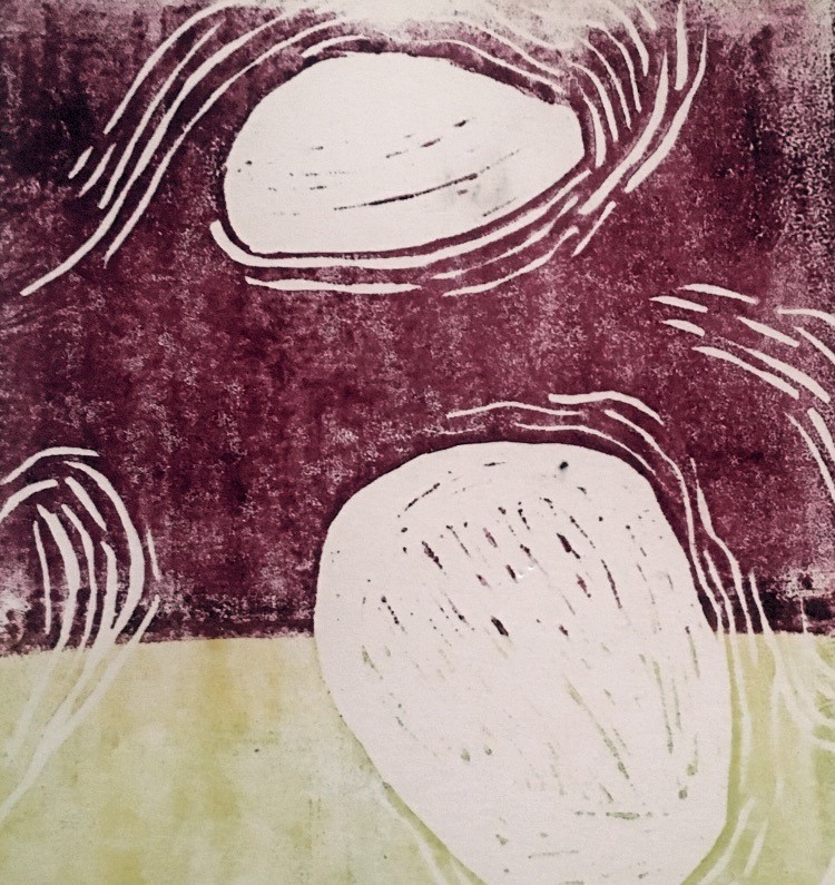
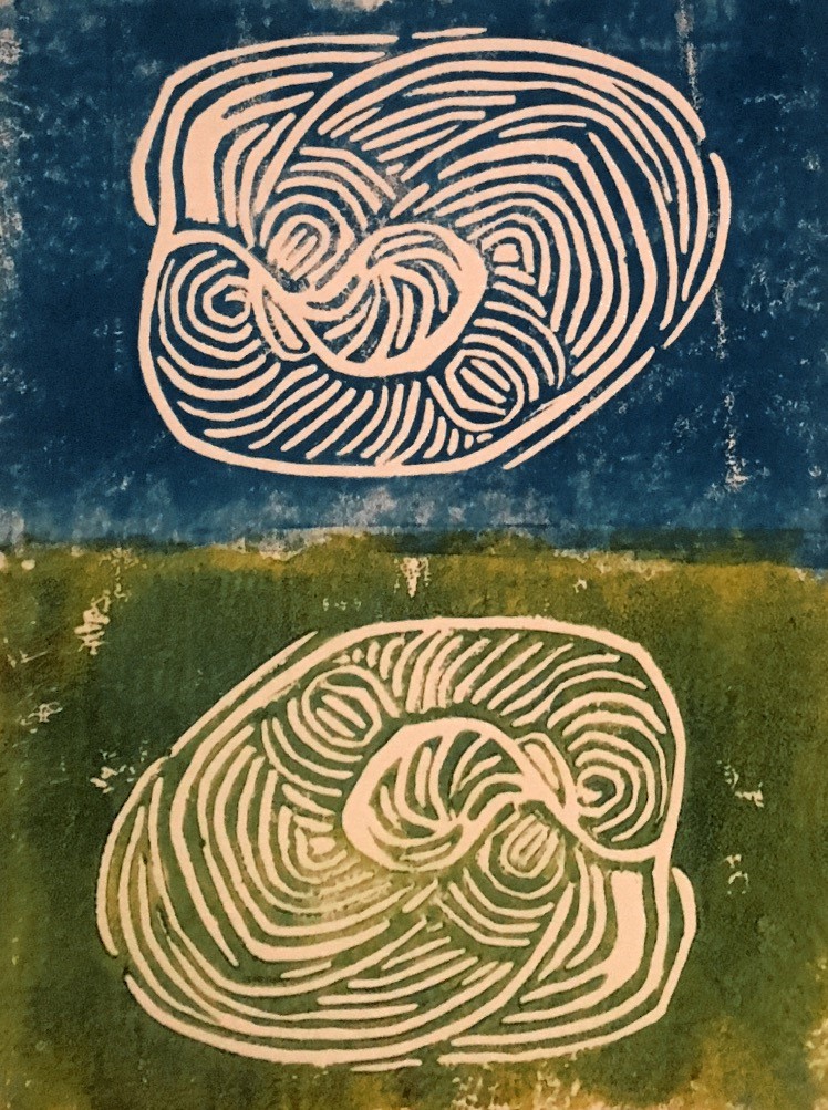
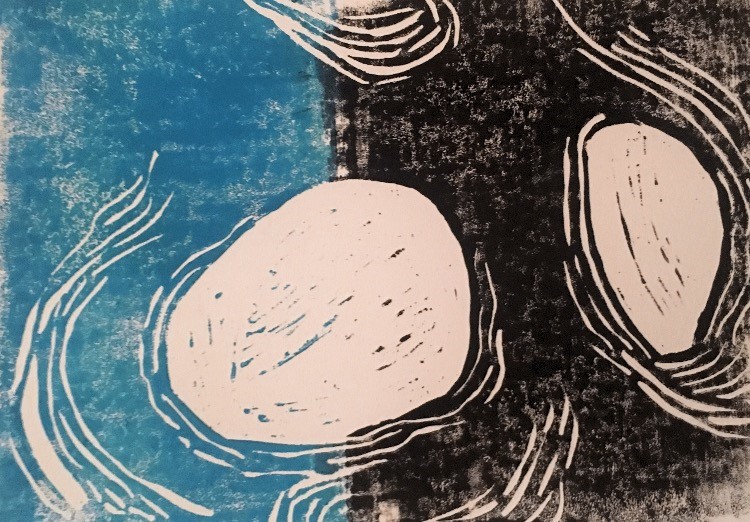
when experimenting with the lino printing I felt the more successful ones we’re the ones where I split up the print using 2 block colours. When I tried to layer these prints onto of the previous screen prints the composition became too muddled and complicated the shapes.
Collage
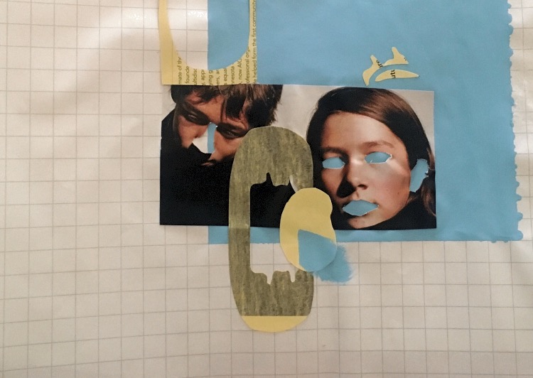
When using and experimenting with college I was still focusing on simplify and isolating parts of the body associated with the senses. Again I think the more simple compositions and shapes were the most successful and moving forward I wanted to incorporate my own images.
This first set of colleges also reminded me of some of Moyna Finnigan large scale college work.
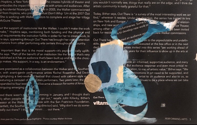
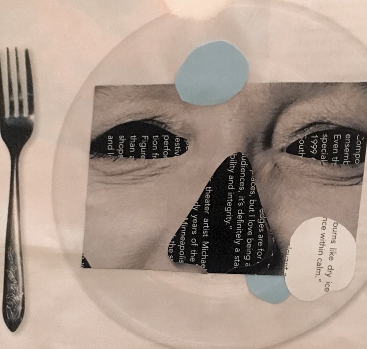
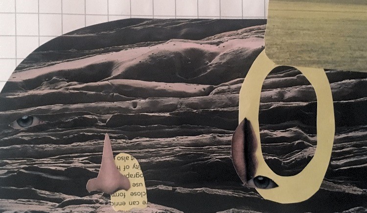
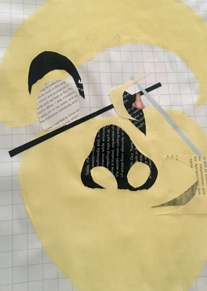
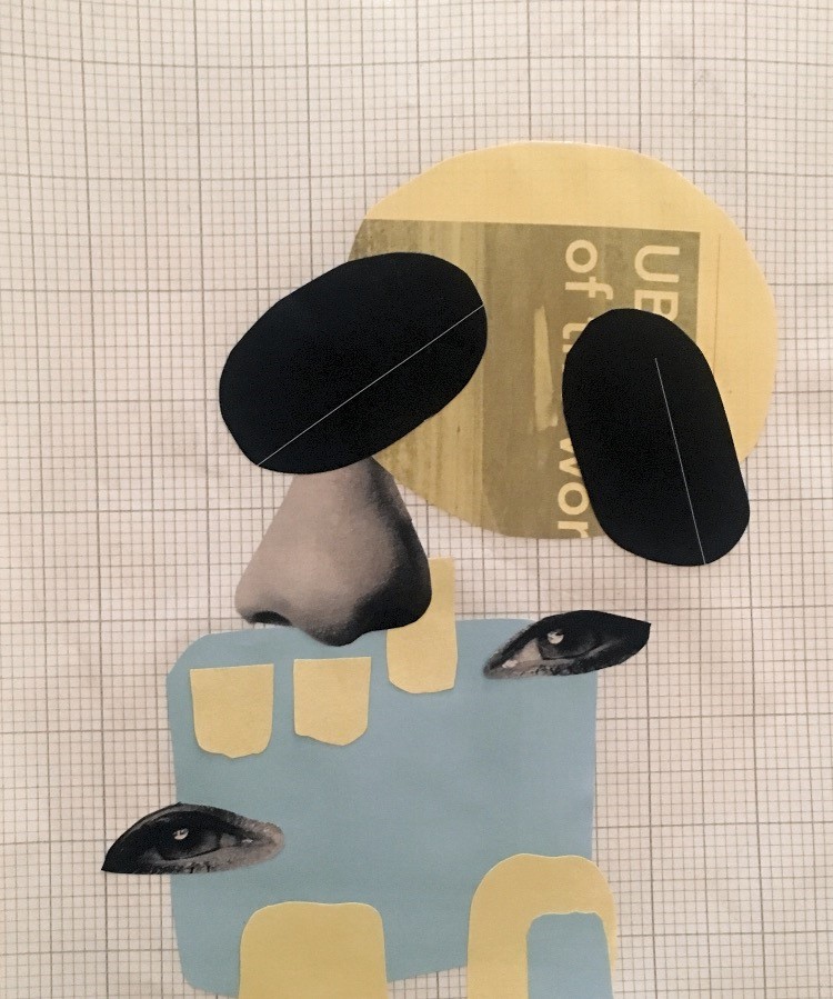
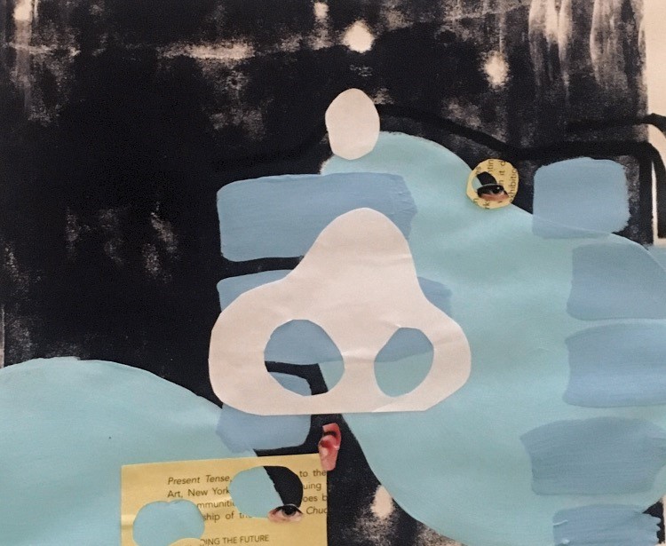
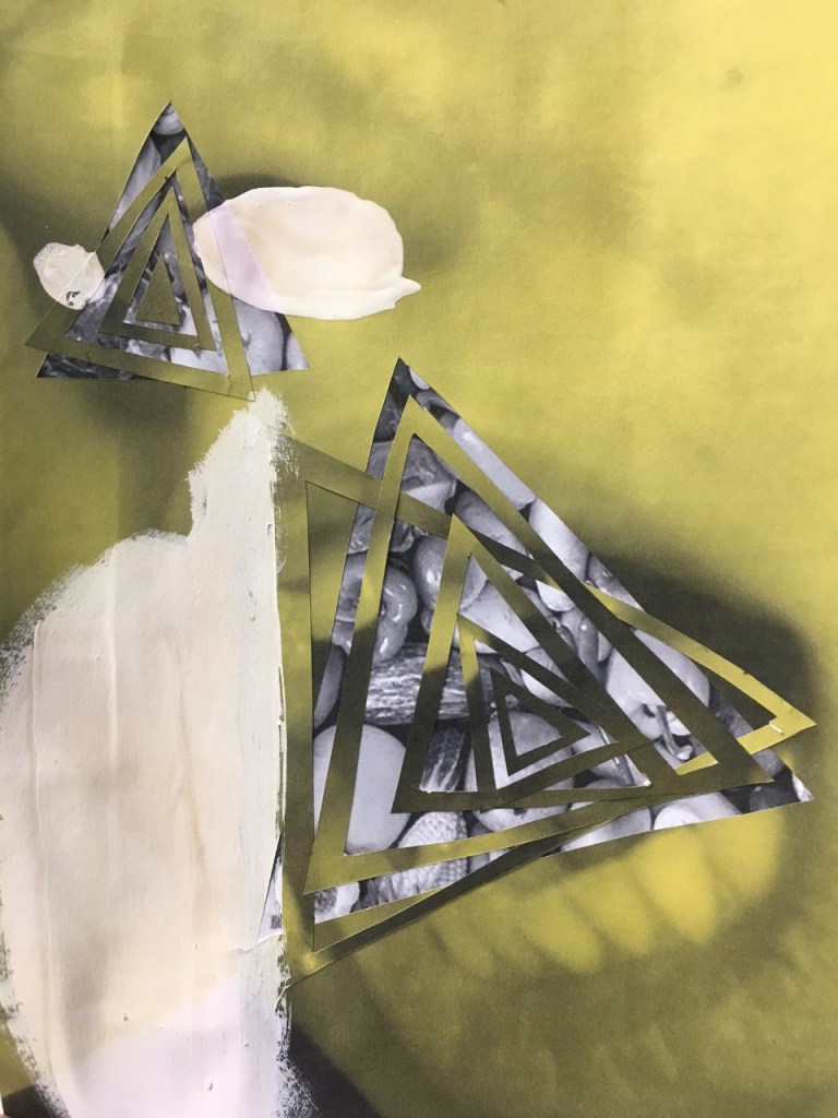
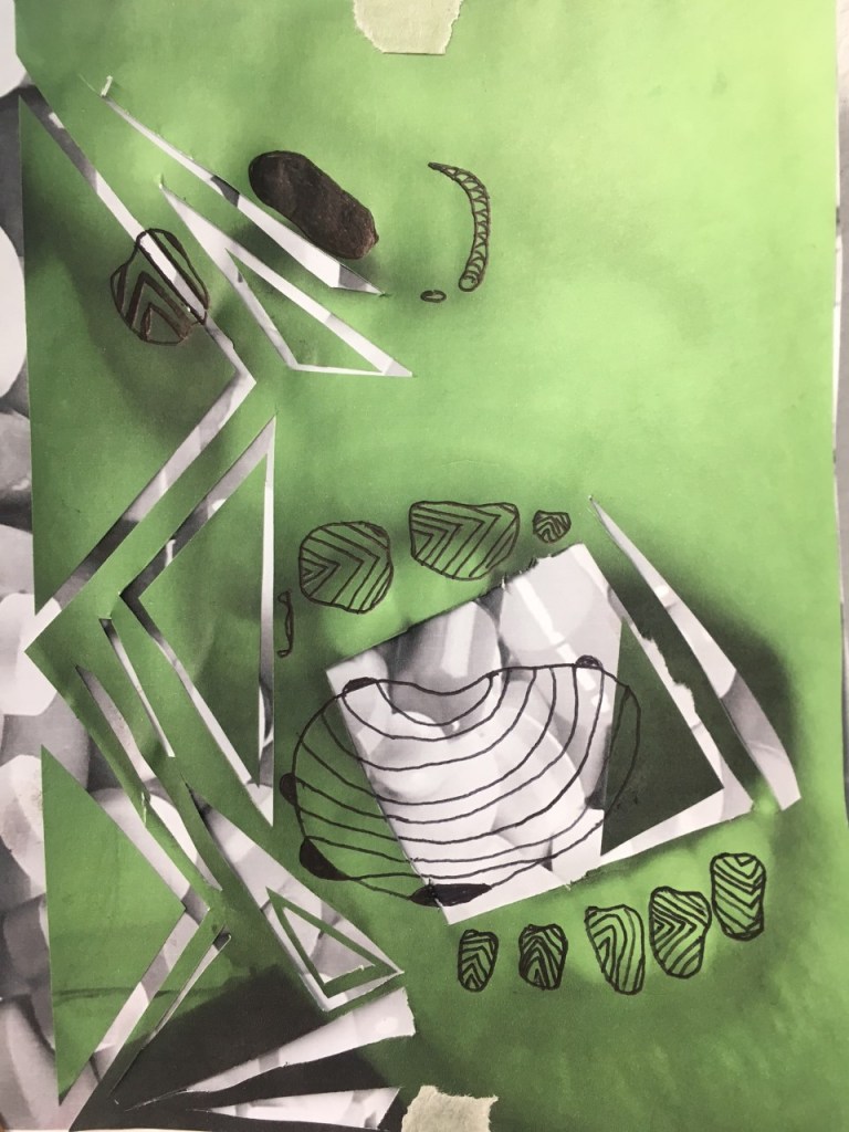
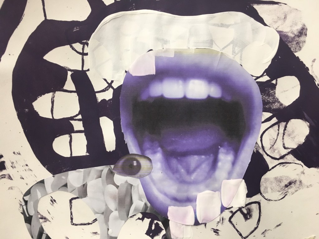
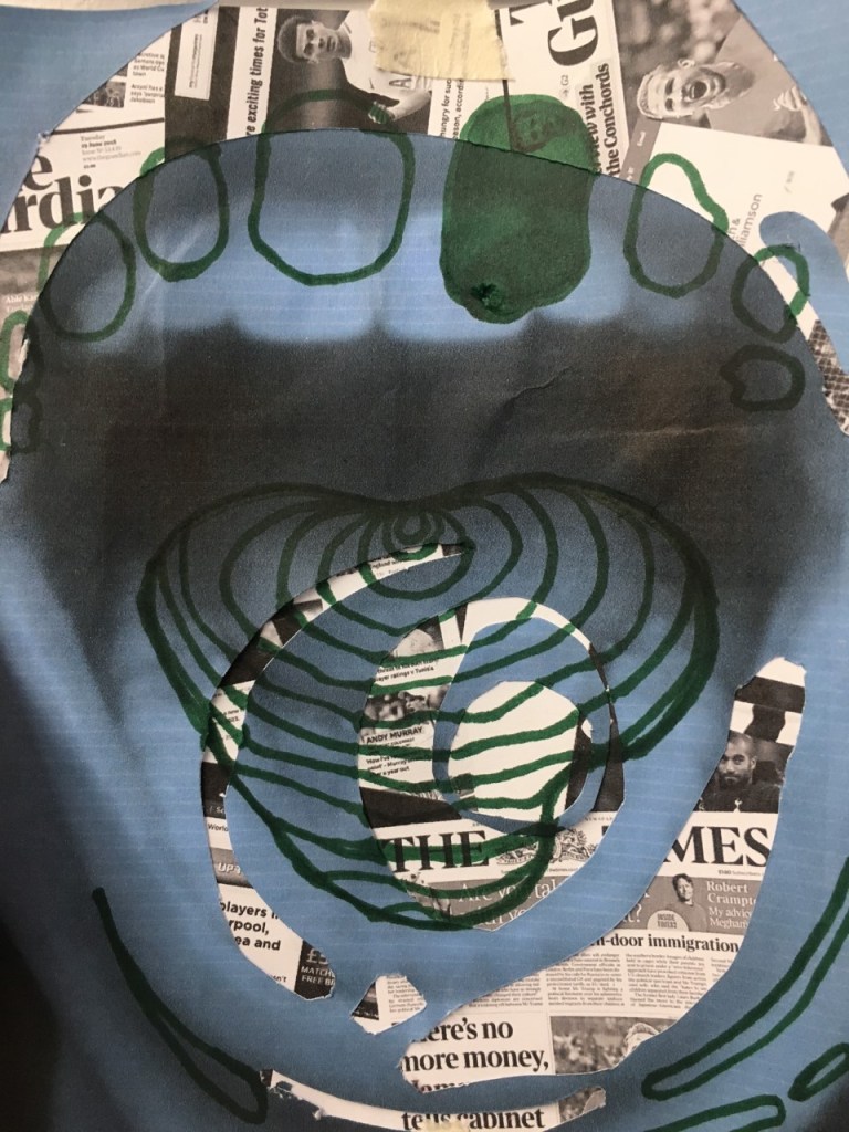
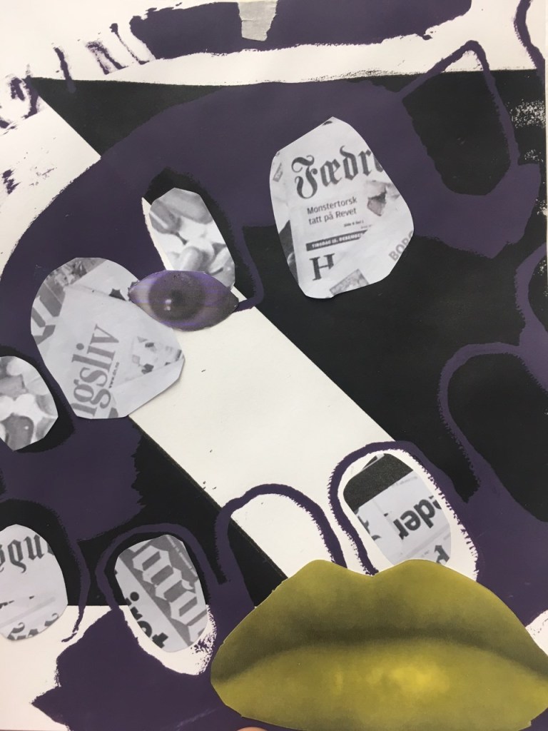
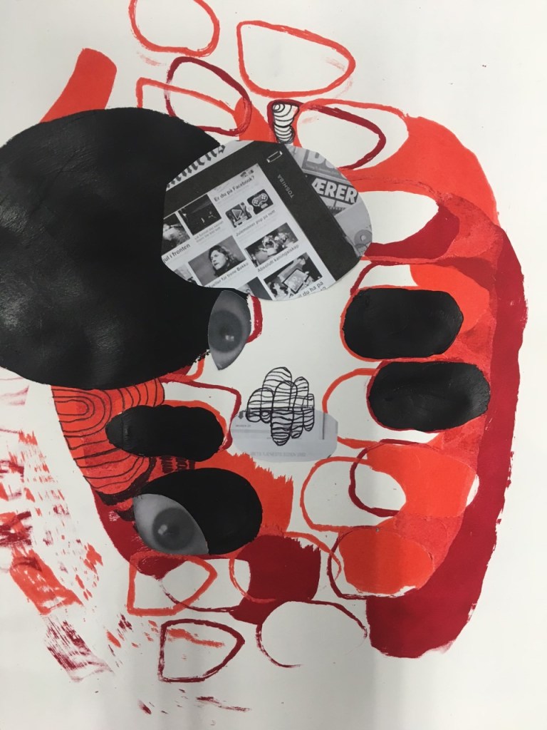
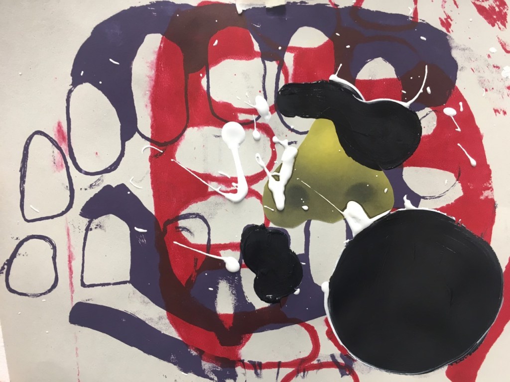
Using all three of the elements in combination I felt produced the most interesting compositions. The layering of the different media made the work feel more resolved however I felt like I need to contextualise my work a bit more through research surrounding consumption of media, drugs, food etc.
 CHARLEY MILLAR ART